Why Do People Prefer My Old Blog's Layout To Substack's?
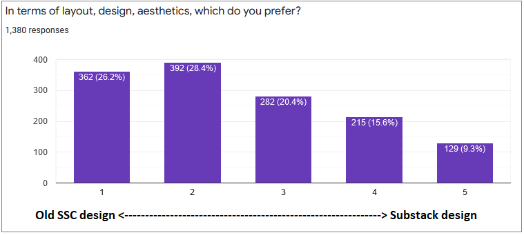
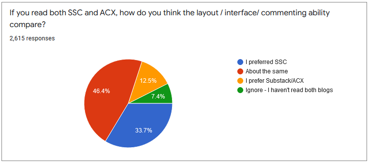
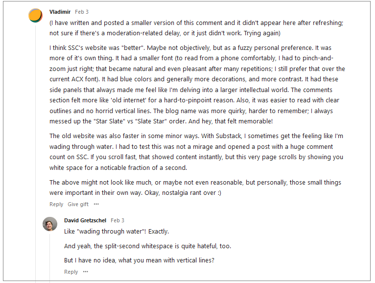
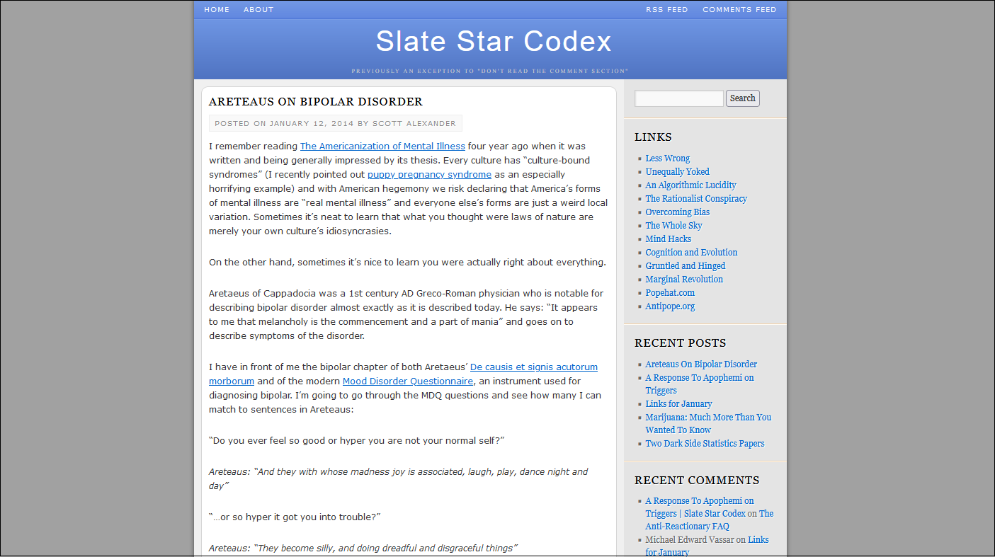
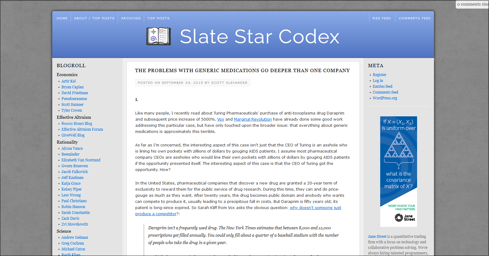
This keeps coming up. When I was first considering moving to Substack, I asked my readers what they thought. They thought various things, but one of them was they hated the layout. At some point I turned this into a formal survey, and: …yep, they preferred the SSC layout Last summer, I repeated the experiment, this time after I had made the switch: Last month, I wrote a post called Why Do I Suck, which discussed some people’s complaints about the blog. In the comments, lots of people said their main complaint was that Substack’s design was worse than SSC’s. EG: I think that all of this together is pretty strong evidence that most people prefer the old Slate Star Codex layout to the new Substack-mandated ACX. This is weird, because the old Slate Star Codex layout was - mostly something I threw together in a day or two. I am widely recognized as not having taste, and the only website I ever developed before this was a Geocities site that was even worse. A few of my web designer friends helpfully smoothed over some rough edges (in one case literally, Apple-style), but the basic design remained my amateurish rush job. Meanwhile, Substack is run by tech industry veterans who probably hired a team of really experienced designers and thought really hard about every aspect of their product. It doesn’t make any sense at all for me to do a better job than them. So what’s going on? Is it selection bias? My previous readership is, by definition, people who liked my old blog, so of course they like my old blog more than some new one? I’m including this because I know someone will bring it up in the comments if I don’t, but it seems unlikely; surely most people selected themselves in for the content, with the design a distant second. Is it something something mobile? I put no effort into optimizing my old design for mobile phones, so maybe that adds another layer of complexity. But I think at some point some web designer friend made a version that worked for mobile, so this can’t be too hard. Is the dichotomy not me vs. Substack, but WordPress (also a great tech company) vs. Substack? I think this explains some of it. But some of the people in the comments talked about the colors and layout in particular. Substack probably remembers the history of MySpace vs. Facebook. MySpace let people customize their page however they wanted, and most people made them into some sort of <blink>-tag-related monstrosity. Facebook gave everyone a consistent minimalist design that let people focus on the content, and took over the world. I’m not (exactly) questioning Substack’s decision not to make blog layout very customizable. But how come their standard non-customizable layout is (apparently) worse than my old layout? If they forced everyone into the standard non-customizable layout of 2015 SSC, would that be a straight utility gain? This may be a little too cute, but I can’t help but think of Whither Tartaria? In every art form, complicated colorful designs transition to “modern” minimalist designs over time. Whenever anyone asks, people say they hate the modern minimalist designs and wish they could go back to the complicated colorful ones. But for some reason nobody ever does. Is this just the Internet version of the same general phenomenon? You’re a free subscriber to Astral Codex Ten. For the full experience, become a paid subscriber. |
Older messages
Every Bay Area House Party
Wednesday, May 4, 2022
...
Open Thread 222
Sunday, May 1, 2022
...
Highlights From The Comments On Xi Jinping
Thursday, April 28, 2022
...
Book Review: A Clinical Introduction To Lacanian Psychoanalysis
Tuesday, April 26, 2022
...
Open Thread 221
Sunday, April 24, 2022
...
You Might Also Like
Rocket’s $1.75B deal to buy Redfin amps up competition with Zillow
Monday, March 10, 2025
GeekWire Awards: Vote for Next Tech Titan | Amperity names board chair ADVERTISEMENT GeekWire SPONSOR MESSAGE: A limited number of table sponsorships are available at the 2025 GeekWire Awards: Secure
🤑 Money laundering for all (who can afford it)
Monday, March 10, 2025
Scammers and tax evaders get big gifts from GOP initiatives on crypto, corporate transparency, and IRS enforcement. Forward this email to others so they can sign up 🔥 Today's Lever story: A bill
☕ Whiplash
Monday, March 10, 2025
Amid tariff uncertainty, advertisers are expecting a slowdown. March 10, 2025 View Online | Sign Up Marketing Brew Presented By StackAdapt It's Monday. The business of sports is booming! Join top
☕ Splitting hairs
Monday, March 10, 2025
Beauty brand loyalty online. March 10, 2025 View Online | Sign Up Retail Brew Presented By Bloomreach Let's start the week with some news for fans of plant milk. A new oat milk, Milkadamia Flat
Bank Beliefs
Monday, March 10, 2025
Writing of lasting value Bank Beliefs By Caroline Crampton • 10 Mar 2025 View in browser View in browser Two Americas, A Bank Branch, $50000 Cash Patrick McKenzie | Bits About Money | 5th March 2025
Dismantling the Department of Education.
Monday, March 10, 2025
Plus, can someone pardoned of a crime plead the Fifth? Dismantling the Department of Education. Plus, can someone pardoned of a crime plead the Fifth? By Isaac Saul • 10 Mar 2025 View in browser View
Vote now for the winners of the Inbox Awards!
Monday, March 10, 2025
We've picked 18 finalists. Now you choose the winners. ͏ ͏ ͏ ͏ ͏ ͏ ͏ ͏ ͏ ͏ ͏ ͏ ͏ ͏ ͏ ͏ ͏ ͏ ͏ ͏ ͏ ͏ ͏ ͏ ͏ ͏ ͏ ͏ ͏ ͏ ͏ ͏ ͏ ͏ ͏ ͏
⚡️ ‘The Electric State’ Is Better Than You Think
Monday, March 10, 2025
Plus: The outspoken rebel of couch co-op games is at it again. Inverse Daily Ready Player One meets the MCU in this Russo Brothers Netflix saga. Netflix Review Netflix's Risky New Sci-Fi Movie Is
Courts order Trump to pay USAID − will he listen?
Monday, March 10, 2025
+ a nation of homebodies
Redfin to be acquired by Rocket Companies in $1.75B deal
Monday, March 10, 2025
Breaking News from GeekWire GeekWire.com | View in browser Rocket Companies agreed to acquire Seattle-based Redfin in a $1.75 billion deal that will bring together the nation's largest mortgage
