Tedium - A Splash of Impatience 💦

Considering the splash screen that appears when you load something.

Hunting for the end of the long tail • June 24, 2023

Today in Tedium: It can feel weird to talk about modern computers without mentioning a key annoyance of using them. We never really talk about splash screens, but they’re always there. Many programs take a second to load—especially complicated ones like video editors or AAA games. So, we’ve come to accept that little pause that comes with loading them. We don’t like it, but we have to live with it. But why is this the convention? Where did it come from? And why is it so prevalent in many PC and mobile programs? Today’s Tedium considers the cultural legacy of splash screens, loading screens, and other types of time-delaying visual components. You may be looking at one right now. — Ernie @ Tedium

News Without Motives. 1440 is the daily newsletter helping 2M+ Americans stay informed—it’s news without motives, edited to be unbiased as humanly possible. The team at 1440 scours over 100+ sources so you don't have to. Culture, science, sports, politics, business, and everything in between—in a five-minute read each morning, 100% free. Subscribe here.

1,500

The speed, in bits per second, when loading an application onto a Sinclair ZX Spectrum from a cassette tape. In the days before hard drives or even floppy disks, data was stored in cassette formats, but these formats were significantly slower to load things into memory than modern computers, meaning you would be waiting for more than a minute for a program to load in full into the Spectrum’s 16k of RAM. (And this was actually significantly faster than the machine it replaced, which was only capable of 300bps!) The “splash screen” came onto the monitor slowly, and was accompanied by the noise the cassette deck made. Here’s one example for those who didn’t own a Speccy.

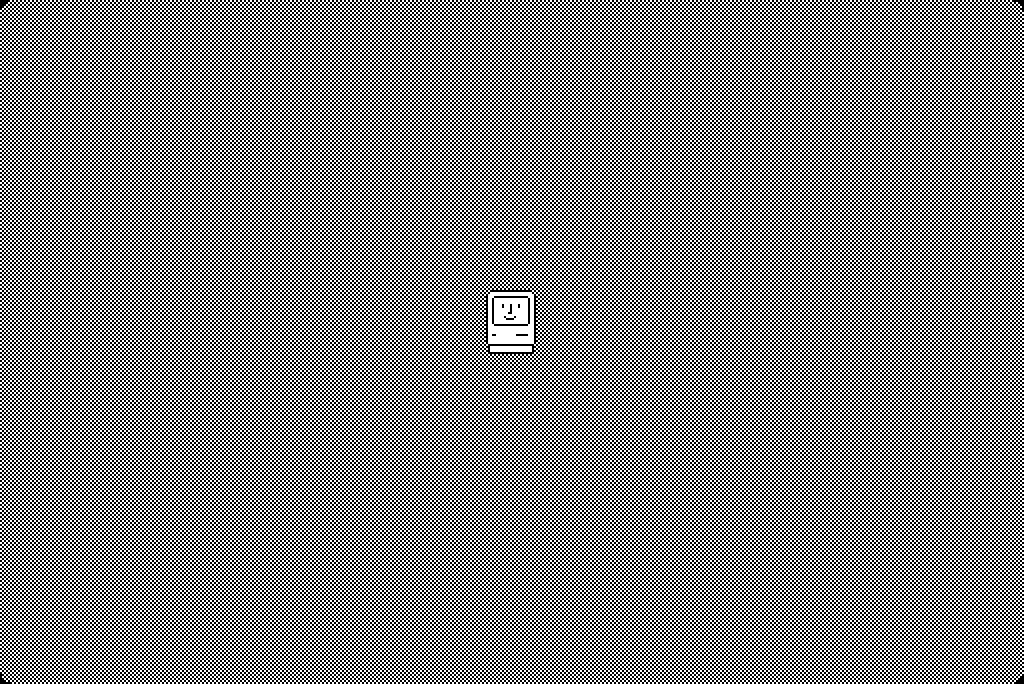
Mac OS Boot Screen

While not the first bootsplash, the bootsplash everyone knows.

The boot screen (a.k.a. the bootsplash), in many ways, set the tone for splash screens

When the original version of the Apple Macintosh first booted up with a simple picture of a smiling computer, it set the stage for many decades of computers that would expect users to patiently wait for their software to load.

Sometimes, the wait is a couple of minutes; sometimes just a few seconds. And while the Mac wasn’t necessarily first to this type of approach, the fact that it had a splash screen, basic as it was, was a big upgrade from other popular home computers of the time. Variants of the IBM PC would basically show you barebones BIOS screens before kicking you into a software prompt. The Commodore 64 turned on instantly, but it didn’t really take you anywhere. It gave you a line of introductory text and threw you into a dialog box … and, well, that was it.

But gradually, it would catch on, becoming known (particularly in the Linux world) as the bootsplash. Linux, as you probably know, has a way of showing you what’s happening behind the scenes at you attempt to load your operating system. Other operating systems do similar things—a modern MacOS machine booted in verbose mode often tells you in painstaking detail how it’s trying to connect to and enable various components that it needs before it drops you into the interface.

These screens exist because the software is actually doing something in the background. They’re not for show, and the operating systems are arguably the most complex applications many computers might even run.

A video showing every bootsplash Ubuntu has ever had.

There’s often no marketing or copyright information in these boot screens, in part because they aren’t there to market the tool to the user but to explain what’s happening. Often, a maximalist approach is not preferred. Windows used to be a little more maximalist with its boot screen designs, but now they’re much more Apple-like. Likewise, many Linux distros, like Ubuntu, keep things simple.

In many ways, a splash screen serves two purposes—it helps to convey information about the program that we’re using, particularly copyright and author information; and it gives the screen something to do while the program it’s running is loading into RAM, gradually trying to catch up to the user.

While many modern programs no longer need them, plenty still do, in large part because complexity is rising. They’re even common to see on smartphones, where they appear in a blink of an eye before you load whatever game you’re trying to play.

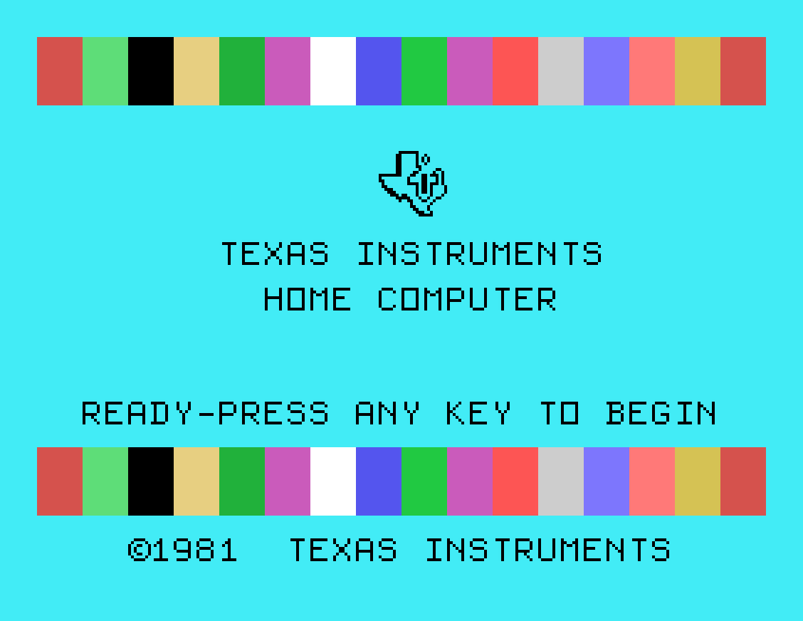
TI 994a

The TI-99/4a, an early example of a bootsplash.

So, where did this idea come from? I’ve been on the hunt for an exact point where I can say these screens started to appear, and I think the Macintosh and Microsoft Windows are probably a key starting point in the mainstream. It’s not particularly clear where things started, though I think the TI-99/4 boot screen, dating to 1979, is a good example of one that predates the Happy Mac.

But I think the truth is that their roots emerged from other mediums, particularly television and film.

Books have covers, but they also have title pages. In many ways, the load screen is the title page of software.

Films have used title cards since nearly the beginning (film innovator and noted racist D.W. Griffith used them heavily), with some of them exquisitely branded. They serve a clear purpose—they are used to display copyright information (unless it’s forgotten), to add context that isn’t otherwise on the screen, and in the days before sound, they were commonly used to convey dialogue.

A similar concept to the splash screen, the splash panel, has existed in comic books since at least the 1960s—especially in Manga. These pages, which became very common in the ’90s, are often used to build dramatic weight at the beginning of a comic, or around the point of a cliffhanger.

I think in some ways, having a pause in the action can be a quite powerful thing, especially in the right setting. It builds tension, which in the right setting can make the end result more powerful. The problem is, in a multitasking world, it can feel like a huge annoyance.

“A splash screen basically tells me, in very clear-cut terms, that my time is worth nothing whatsoever. It’s a fresh reminder that users’ needs don’t count as much as programmer convenience does. The customer can wait—we’ve got more important things to do … like show you this test-pattern with our programmers’ names on it.”

— Kas Thomas, a technical writer who at the time worked for Adobe, writing in a blog post about his feelings on the ubiquity of splash screens on popular applications, such as products made by Adobe. “When I fire up Photoshop (or OpenOffice, or any other pathetically oversized mountain of bloatware), it should just violently start, before I’ve even raised my coffee cup to my mouth,” he added. Thomas didn’t only focus on Adobe in his writing, but his comments did suggest a certain harsh edge that end users feel about splash screens of all kinds.

GIMP Splash Screen

The GIMP splash screen may be annoying, but at least it looks visually interesting.

Do splash screens on applications constitute a too-annoying annoyance?

When a splash screen pops up, often a 30-second pop explaining who the authors and creators of a given application are, it comes off as something of a break in the action.

Programs that take a particularly long time to load (often video editors and image-editing programs like Photoshop, GIMP, and DaVinci Resolve)

And for years, that’s been a frustration for people trying to get something done. Way back in 1996, readers were complaining about this very issue to InfoWorld columnist Ed Foster, in disbelief that they spent money on top-of-the-line computers, only to get held back by long-loading splash screens:

Splash screens, as they are most commonly called, are the graphic logos that display while the program is loading and identify the program while reminding you about the soft-ware publisher’s copyright restrictions. For those of us who can’t chew gum and think at the same time, splash screens seem pretty harmless. A program would presumably not load much faster if the splash screen wasn’t displayed, so what’s the problem?

Let’s let the real multitaskers explain it for themselves. “I’ve got a Pentium-133 sitting on my desk, 16MB of RAM, and a 17-inch monitor that gives me enough screen real estate to have three or four windowed programs displayed,” wrote one reader. “I’m running OS/2 Warp, Windows NT, or Windows 95 (depending on the project), so I can actually multitask rather than task-switch. It’s great! I can check my mail while compiling an application, and I can even start my Web browser and check out a site that was mentioned in the E-mail I just read.

“I’m doing nothing new,” the reader continued,”and the possibilities are endless; until some bozo writes an application that has a splash screen which stays on top while the application finishes loading—preventing me from working on anything else.”

The response to Foster’s column was so strong that he wrote a follow-up about a month later where he found himself navigating a mixture of gripes (his column was called The Gripe Line, after all) and defenses of the practice.

“The user needs to be assured that the program is actually loading properly,” a programmer explained to Foster. “If the user does not see visible indicators that the program is loading, the user may try launching the program again or may conclude that the program is hung.”

They’re right, after all, but for people who know this already, it’s understandable why they might want to turn them off.

A good middle ground, in my view, emerged with later operating systems, like MacOS and Windows 10. Rather than hit you with a splash screen, you got a bouncing icon in the dock to suggest the program was loading, meaning that a splash screen isn’t actually necessary if you have a dock or taskbar nearby. Of course, those splash screens existed anyway.

While loading is often seen as a reason for splash screens, the fact that splash screens existed in the early years of the Web, where you weren’t exactly taxing processor power to load a site, suggests that it wasn’t the only reason they existed. After all, if anything, the loading screen, often made in Flash, often took significantly longer to load than the actual website.

In more recent years, the splash screen has evolved into a mobile phenomenon, with many smartphone apps using the opportunity to brightly brand themselves before you load up the program that is also heavily branded. Some programmers over the years have spoken out against these tools. Cyril Mottier, a noted Android programmer, once wrote a whole essay arguing that splash screens were useless on mobile programs.

“Spending time on ensuring applications are opened rapidly would have been a better option,” Mottier wrote.

Five examples of splash screens that exemplify the style

Finding splash screens online isn’t the world’s easiest job. Unfortunately, we lost a good repository for them on Sourceforge a couple of years ago. The examples I have here come mostly from the GUIdebook Gallery of graphical user interfaces, with a couple sampled via the Internet Archive. (If you have any favorites or not-so-favorites, please share!)

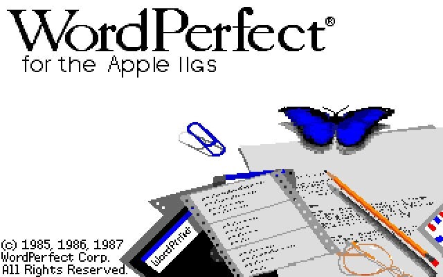
Word Perfect Apple I Igs

WordPerfect was one of the early examples of a word processor that straddled the line between a text-based tool in a GUI world—arguably not very well, if you were using WP 5.1 when Windows 3.1 first came out. Here’s an example of what it looked like in its Apple IIgs variant. As GUIdebook shows, this was actually as exciting as WordPerfect’s splash screens got.

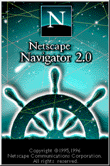
Netscape Navigator

It’s forgotten about today, but even web browsers had splash screens at one point. Netscape Navigator’s splashes stand out because they managed to convey a consistent corporate style through much of their history, emphasizing the concept of navigation through the high seas of the internet. Netscape got a lot wrong during the browser wars, but the visual appearance of their splash screens, first with the ship’s helm and later with a lighthouse, was not one of those things.

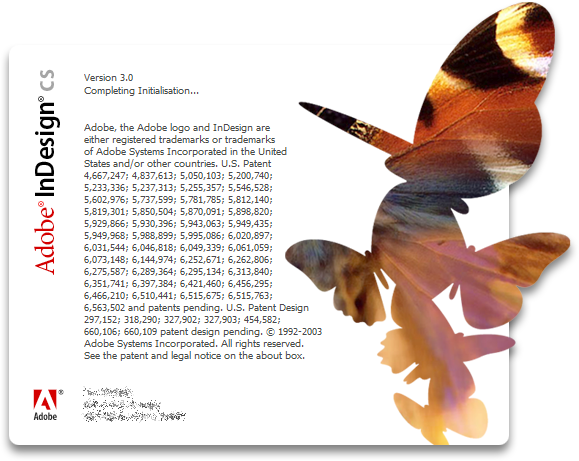
Indesign CS
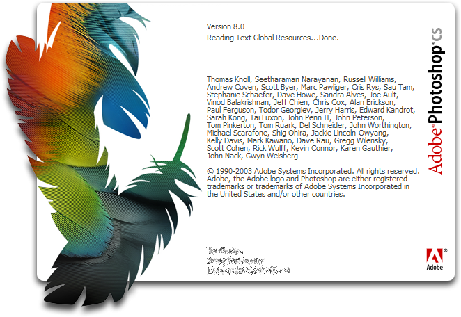
Photoshop CS

Adobe applications, then and now, tend to use a very distinct visual style, where they all share a theme and get dramatically redesigned with every single version. Because there are so many applications, they tend to stick to a distinct theme. In the 1990s, they tended to stick to a more clip-art style, but by the early 2000s, the art became more abstract, and attempted to show what the tools were capable of. If you ask me, the sweet spot was the original version of the Adobe Creative Suite, which found ways to make the splash visuals look like one piece.

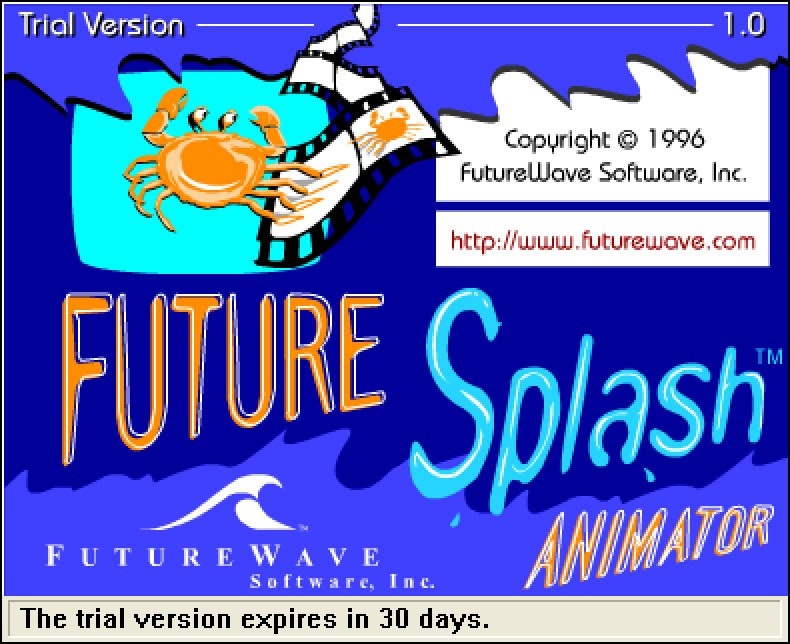
Future Splash Animator

There’s a tendency for application splashes to get more boring over time as they tend to be swallowed into the corporate gullet. No better example of this exists than the splash screen for Future Splash Animator, later known as Flash. The second version of the application gained the highly corporate art style of its later parent, Macromedia, and during its final period, under the ownership of Adobe, it looked like a corporate tool that allowed for no creativity whatsoever. But the first version looked like fun, like something you would want to use.

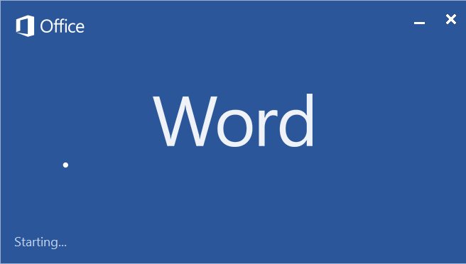
Microsot Word 2013

In recent years, splash screens have become more spartan in nature, especially those developed by Microsoft. (I’d argue that Adobe has gotten more interesting, on the other hand.) For fans of minimalism, this might actually be kind of preferred. The one exception is the Mac version of Office: Almost as if to emphasize its unique development history, the splash screens on the Word and Excel for the Mac have a different corporate language and arguably feel more clever and inviting.

Of course, loading screens didn’t necessarily need to be boring or dull. It may have been in part because of a patent filing that ensured that anyone who wanted to use loading screens couldn’t get clever with them—harming, specifically, the video game industry.

In 1995, Namco filed a patent for loading an auxiliary game program in the midst of another game. The company used this technique in the PlayStation version of Ridge Racer, allowing players to load up Galaxian while the game loaded.

“Unnecessary wastage of time can be prevented by first loading the smaller, auxiliary game program code into the games machine, before the main-game program code is loaded, then loading the main-game program code while the auxiliary game is running,” the filing, patented in 1995, stated.

The problem is, when a company files something for themselves, the rest of the industry can’t benefit from it. There are cases where a company shares a patent it files with the rest of the industry—the three-point seat belt being a famous example—but they are few and far between.

This filing was a damaging one to the industry, because the patent filing essentially blocked outside video game manufacturers from trying to develop less-boring loading screens.

Think about it. If this patent filing didn’t exist in the height of the PlayStation era, it’s possible we might have seen game designs that didn’t just keep us waiting with static images.

This patent in retrospect was seen as a bad patent by many observers. The Electronic Frontier Foundation noted that the idea was not only obvious, but that it had existed for nearly a decade before Namco filed its patent. There was even a tool for the Commodore 64, Invade-a-Load, that allowed programmers to add a Space Invaders-style game to their load screens if they so chose.

“As for the auxiliary game patent, it simply describes the idea of loading a separate game while the player waits for the main game,” commentator Elliot Harmon wrote. “Namco gave no information of value in return for its monopoly on auxiliary games.”

Just imagine, if Adobe decided to give us a chance to draw something on its loading screen in Photoshop, instead of throwing us straight into delay-ville.

Increasingly, though, software developers are trying to make these processes a little less distracting and frustrating and a little more fluid. Google, for example, has begun branding its many Android apps to have animated splash screens, with the goal of making “startup a more consistent and delightful experience.”

9To5Google has been keeping track of Google’s progress in adding these animations, which rolled out gradually with the release of Android 12.

Admittedly, loading an Android app on a fast phone is not a two-minute affair, and often happens with only a very slight delay. Unlike on a desktop, you aren’t competing with six other apps that are already open.

But I do think that splash screens could potentially be made with slightly more interactivity to make them more palatable. After all, they are our introduction to these tools, the starting point that takes us on an adventure, of sorts.

--

Find this one an interesting read? Share it with a pal!

And thanks again to 1440 for sponsoring.

Share this post:

follow on Twitter | privacy policy | advertise with us

Copyright © 2015-2023 Tedium LLC, all rights reserved.

Disclosure: From time to time, we may use affiliate links in our content—but only when it makes sense. Promise.

unsubscribe from this list | view email in browser | sent with Email Octopus

Older messages

Freeloader Culture 🍗

Wednesday, June 21, 2023

Reddit has a problem with freeloaders. And free-riders. Here's a version for your browser. Hunting for the end of the long tail • June 21, 2023 Today in Tedium: In many ways, the internet is a

Tuned Out 📻

Tuesday, June 20, 2023

The rise and fall of kids' radio, both thanks to Disney. Here's a version for your browser. Hunting for the end of the long tail • June 14, 2023 Hey all, Ernie here with a refreshed take on a

A Seismic Stock Shift 📸

Tuesday, June 20, 2023

Why AI could shift stock photos forever. Here's a version for your browser. Hunting for the end of the long tail • June 17, 2023 Hey all, Ernie here with a piece I recently wrote for the Substack

Bad News Beepers 📟

Monday, June 12, 2023

Why did beepers have a drug-dealer reputation? Here's a version for your browser. Hunting for the end of the long tail • June 07, 2023 Today in Tedium: There's always a point of constant debate

Friction, Baby 🐌

Monday, June 12, 2023

The case for building a “friction tunnel.” Here's a version for your browser. Hunting for the end of the long tail • June 10, 2023 Today in Tedium: I think, in many ways, one of the biggest

You Might Also Like

GCP Newsletter #433

Monday, January 13, 2025

Welcome to issue #433 January 13th, 2025 News Official Blog Vertex AI Introducing Vertex AI RAG Engine: Scale your Vertex AI RAG pipeline with confidence - Vertex AI RAG Engine is a fully managed

Spyglass Dispatch: It's Political & Personal

Monday, January 13, 2025

On Meta's Moderation Changes • Inside DOGE • Zuck Slams Apple (Again) • Apple's Muted 2025 • CES 2025 Recap The Spyglass Dispatch is a newsletter sent on weekdays featuring links and commentary

$200 to invest today... (USA Only)

Monday, January 13, 2025

Join me in investing in blue chip art on Masterworks, and you will receive $200 to invest on the platform. Not kidding. Founder interview coming soon! ͏ ͏ ͏ ͏ ͏ ͏ ͏ ͏ ͏ ͏ ͏ ͏ ͏ ͏ ͏ ͏ ͏ ͏ ͏ ͏ ͏ ͏ ͏ ͏ ͏

The Sequence Knowledge #468: A New Series About RAG

Monday, January 13, 2025

Exploring key concepts of one of the most popular methods in generative AI solutions. ͏ ͏ ͏ ͏ ͏ ͏ ͏ ͏ ͏ ͏ ͏ ͏ ͏ ͏ ͏ ͏ ͏ ͏ ͏ ͏ ͏ ͏ ͏ ͏ ͏ ͏ ͏ ͏ ͏ ͏ ͏ ͏ ͏ ͏ ͏ ͏ ͏ ͏ ͏ ͏ ͏ ͏ ͏ ͏ ͏ ͏ ͏ ͏ ͏ ͏ ͏ ͏ ͏ ͏ ͏ ͏ ͏ ͏

How a Kafka-Like Producer Writes to Disk

Monday, January 13, 2025

We take a Kafka client, call the producer, send the message, and boom, expect it to be delivered on the other end. And that's actually how it goes. But wouldn't it be nice to understand better

FAQs: The AI Consultancy Project

Monday, January 13, 2025

This is how we'll help you become an AI Consultant ͏ ͏ ͏ ͏ ͏ ͏ ͏ ͏ ͏ ͏ ͏ ͏ ͏ ͏ ͏ ͏ ͏ ͏ ͏ ͏ ͏ ͏ ͏ ͏ ͏ ͏ ͏ ͏ ͏ ͏ ͏ ͏ ͏ ͏ ͏ ͏ ͏ ͏ ͏ ͏ ͏ ͏ ͏ ͏ ͏ ͏ ͏ ͏ ͏ ͏ ͏ ͏ ͏ ͏ ͏ ͏ ͏ ͏ ͏ ͏ ͏ ͏ ͏ ͏ ͏ ͏ ͏ ͏ ͏ ͏ ͏ ͏ ͏

⚡ THN Weekly Recap: Top Cybersecurity Threats, Tools and Tips [13 Jan]

Monday, January 13, 2025

Your one-stop-source for last week's top cybersecurity headlines. The Hacker News Cybersecurity Recap The cyber world's been buzzing this week, and it's all about staying ahead of the bad

My 3 must-buy CES 2025 gadgets

Monday, January 13, 2025

Alarming iPhone bug; Router-based VPN; 90-second vision test -- ZDNET ZDNET Tech Today - US January 13, 2025 Mcon magsafe phone controller Three CES 2025 products I'd buy as soon as they'd take

⚙️ Meta's copyright struggles

Monday, January 13, 2025

Plus: Achieving data center efficiency ‌ ‌ ‌ ‌ ‌ ‌ ‌ ‌ ‌ ‌ ‌ ‌ ‌ ‌ ‌ ‌ ‌ ‌ ‌ ‌ ‌ ‌ ‌ ‌ ‌ ‌ ‌ ‌ ‌ ‌ ‌ ‌ ‌ ‌ ‌ ‌ ‌ ‌ ‌ ‌ ‌ ‌ ‌ ‌ ‌ ‌ ‌ ‌ ‌ ‌ ‌ ‌ ‌ ‌ ‌ ‌ ‌ ‌ ‌ ‌ ‌ ‌ ‌ ‌ ‌ ‌ ‌ ‌ ‌ ‌ ‌ ‌ ‌ ‌ ‌ ‌ ‌ ‌ ‌ ‌ ‌

Post from Syncfusion Blogs on 01/13/2025

Monday, January 13, 2025

New blogs from Syncfusion Top 5 React Chart Libraries for 2025 By Gowrimathi S Explore the top 5 React chart libraries with a comparison of their features, pros, and cons to boost your data