Hello everyone, The internet has been abuzz about one thing and one thing only—two rich men wrestling each other in a cage for no good reason. This week we're talking about absolutely nothing to do with them. I even refuse to say their names.
Instead, this week we're talking about doubling conversion rates with one word, boosting revenue by 12-22% with an add-on, and a creative pattern interruption.
Let's dive in!
–Neal
|
Together with Segment We've been using Segment at DC for almost four years. It's one of my favorite tools. (Particularly now as we're swapping around our analytics and email tool stack and Segment makes that a 10x easier process.)
Why do I love it? Segment:
1. Simplifies tracking. Instead of needing to log every event with 8 different tools, I instead use Segment to do it once. It then sends data to all the tools we use, like Amplitude, Customer.io, Facebook Ads, Google Ads, and Intercom.
2. Empowers the marketing team. Once you have Segment installed, the marketing team can decide to add a new tool without bugging an engineer to install it. And in my experience, engineers hate doing things for marketers.
3. Pumps data from various tools into others. For example, use Segment to pump data from Intercom and Customer.io into Amplitude where we then analyze our data.
Because of Segment, we're able to make informed, data-driven decisions. We have the data we need in the tools we need them. We're also able to make personalized email campaigns.
And we massively cut down on engineering resources needed on the team to handle integrating with a dozen different APIs on an ongoing basis. And Segment is free for early-stage startups. Apply for the Startup Program → |
|
|
1. Specificity leads to tangibility and certainty Insight from Ed Fry of Mutiny.
Mutiny, a website personalization tool, doubled their conversion rate on their homepage with a single word change.
Absurd, I know. Normally we wouldn't even recommend an A/B test so small unless you have tons of traffic.
What did they do? They changed the button text on their homepage hero from "See it on your site" to "See it on your homepage." That's it.
The button links through to their live website demo. You enter your URL, and they let you play around with personalizing your website for different audience segments.
This demo has two benefits: - It lets you "try before you buy," alleviating a lot of objections or concerns, and
- Nothing explains your product better than just seeing it in action.
Now, you'd think the difference between "site" and "homepage" is minimal, but the word "homepage" is a lot more tangible and specific. Even our website has hundreds of pages. I can't clearly picture our "website" in my head.
However, I do know what our homepage looks like. I know how valuable our homepage is. And when I do hit the demo, I'm already primed to enter the URL of our homepage, rather than stopping to think which page would be best to test. Uncertainty is a conversion killer. So remove as much of it as you can. The lesson here? Words are powerful. Use ones that prime and remove uncertainty. |
2. Package add-ons to increase revenue by 12-22% Insight from Patrick Campbell (Profitwell). Profitwell has collected over 10 million pricing data points for SaaS products.
One thing they've found is that companies that offer "add-ons" (aka upsell) can boost revenue by 12-22% relative to when they just include them into base tiers. And boost LTV by 18-54% by increasing average order value and retention rates. Ironically, this happens even when that feature was previously included for free in a tier. But how do you choose which features to include and which to make add-ons? Here Patrick recommends the Rule of 40%: - List each feature in a spreadsheet.
-
Assign a % to each feature based on the % of users who use that feature monthly.
- If it's used by less than 40% of users, consider turning it into an add-on.
- Often this could be integrations, analytics, or priority support—supplemental things that aren't core to the experience for most users.
Just make sure you don't do this with a "core" feature that most people use—or else people will likely be upset or just not sign up in the first place. There are a few reasons why this add-on strategy works; -
It makes the initial price lower, making them more likely to continue down the funnel.
- Once they've already said "yes" to the base plan, a quick add-on that increases the price by 10-20% is a quick "sure, why not." It's the equivalent of the grocery store impulse buy candy bar.
- It means they get the features they want without needing to upgrade to the higher tier and feeling like they're paying for a bunch of stuff they don't need.
Try this out; it could be a meaningful boost in revenue. |
3. Diving into Nood's ad
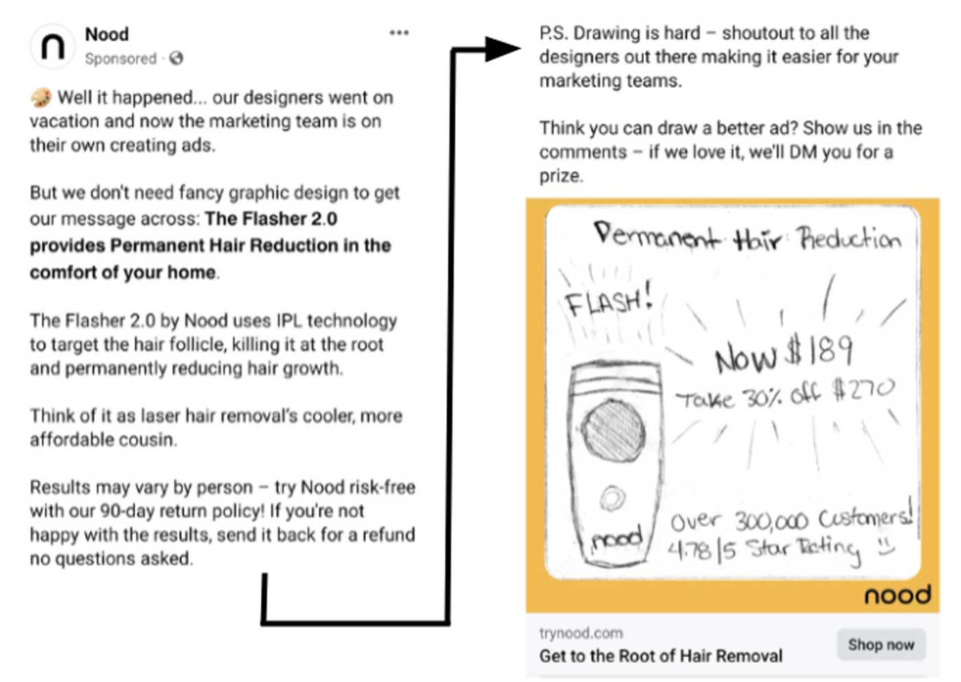
Insight from Joyce at DC. Us marketers are nerds. We love judging the ads in our feeds. Like this Facebook ad from Nood, the makers of hair removal products. Let’s break down what makes it so effective. |
This stopped me (Joyce) in my tracks for a few reasons: First, the creative is a black and white hand-drawn image—a far cry from every other sleekly designed ad on Facebook and a good example of a pattern interrupt. It also made me wonder, "What exactly is going on here?" That brings us to the copy, which takes a “story first, product second” approach. Take a look:
“Well it happened… our designers went on vacation and now the marketing team is on their own creating ads.” Nothing about the actual product until the next line. “But we don’t need fancy graphic design to get our message across: The Flasher 2.0 provides Permanent Hair Reduction in the comfort of your home.”
This is a clever and entertaining way to sell your product, no flashy visuals needed.
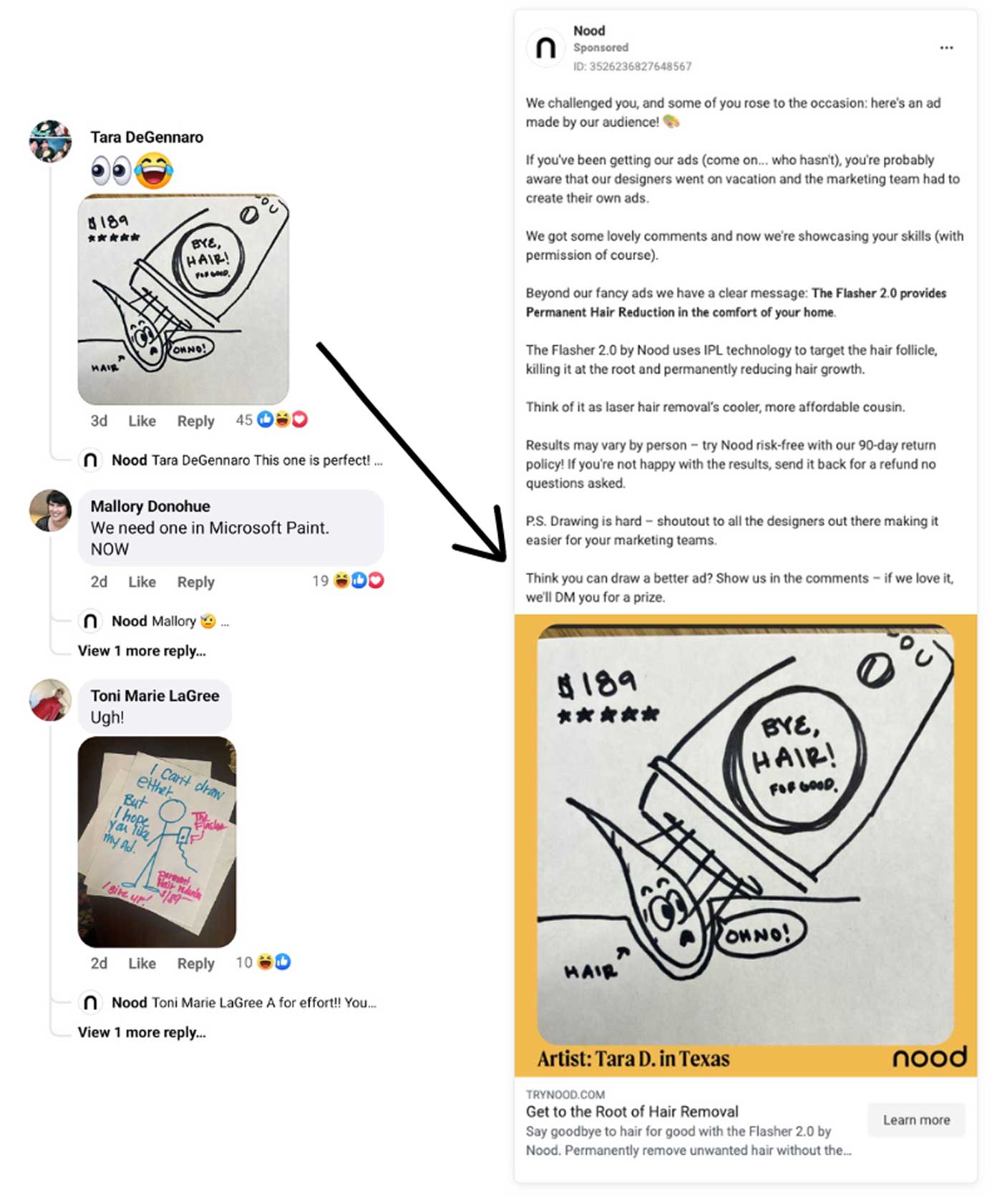
And even though the ad copy is long, people actually read it all. You can tell because it ends with Nood inviting readers to draw a better ad for a chance to win a prize. And plenty of people actually shared their drawings in the comments!
Taking full advantage, Nood repurposed one for a retargeting campaign. |
Ricky from Trailer Park Boys would say that’s "4 birds getting stoned at once." The ad:
- Sells Nood’s product
- Incentivizes people to engage
- Generates creative for future ad campaigns
- Personalizes the brand to make it more fun
|
Community Spotlight
This week we're giving the spotlight to a few of our Growth Program and Un-ignorable alum. Find out about the cool stuff the founders and marketers in our community are up to below. -
Orçun Seviğ is Head of Growth at Artboard Studio, a platform that makes it easy for designers and marketers to automate design tasks and create more stunning visuals. With the help of the Growth Program, Orçun and his team recently rebuilt Artboard Studio’s website!
-
Wojtek Skalski founded the boutique agency Skalski Growth, which helps early-stage startups set up their acquisition stacks to get more customers. Wojtek uses the principles taught in the Growth Program to create frameworks that also align with his 10+ years of growth experience.
-
Dennis Geelen from the first cohort of Un-ignorable shared Neal's 3 "happy accidents" that allowed Demand Curve to be founded. Check out the story here.
-
Eric Partaker also from the first cohort of Un-ignorable, just hit 100k followers on LinkedIn after 6 months. Congrats Eric!
Want to see your name in the next issue of the Growth Newsletter? Share about your work and any of your recent growth marketing wins here. |
|
|
News you can use: Tool we recommend: Drata*
Don’t let compliance get in the way of sales. With powerful automation, step-by-step workflows, and expert support, Drata puts compliance on autopilot so you can focus on sales, not on security reviews. With over 400 5-star G2 reviews, you’ll see why 2,000+ customers, including Notion and Lemonade, choose Drata to automate compliance for SOC 2, ISO 27001, GDPR, and 11 other frameworks.
Growth Newsletter readers get 10% off and waived implementation fees. Book a demo to see automation in action. *Sponsored by Drata
|
|
| What did you think of this week's newsletter?
😍 Loved it | 😄 Great | 🙂 Good | 🤷♀️ Meh | 🤬 Bad
If you enjoyed this, please consider sharing it with a friend. These newsletters take hours to make each week, so it really helps when you share us with fellow founders and marketers.
Who's Demand Curve?
We’re on a mission to help make it easier to start, build, and grow companies. We share high-quality, vetted, and actionable growth content as we learn it from the top 1% of marketers. We democratize senior growth knowledge. How we can help you grow: -
Read our free playbooks, blog articles, and teardowns—we break down the strategies and tactics that fast-growing startups use to grow.
- Enroll in the Growth Program, our marketing course that has helped 1,000+ founders get traction and scale revenue.
Check out our Sprints: short video courses that are laser-focused on a topic in growth.
Want to build an audience of buyers? Join the waitlist for the Un-ignorable Challenge. -
Are you a funded startup looking to grow? Our agency, Bell Curve, can be your strategic growth partner.
Get your brand in front of our audience by sponsoring this newsletter.
See you next week.
— Neal, Grace, Joyce, Dennis, and the DC team. |
|
|
© 2023 Demand Curve, Inc. All rights reserved. 4460 Redwood Hwy, Suite 16-535, San Rafael, California, United States
Unsubscribe from all emails, including the newsletter, or manage subscription preferences. |
|
|
|


