Tedium - Tales Of 𝑻𝓎𝕡𝐄 ⌨️

A few of the stories that gave us modern digital typography.

Hunting for the end of the long tail • July 26, 2023

Today in Tedium: Typography has been one of the key ways that the computer has distinguished itself from more traditional physical forms. Here’s what I mean: In the 1930s or 1940s, if you wanted to change a font on a newspaper or magazine, you had to use a completely different set of blocks of metal type, and that process of switching blocks took time. Now, it’s a matter of literally selecting an item in a menu or changing a line of your CSS code. You can do it in real time without even thinking about it. It’s pretty wild how easy it is to change a font these days considering how hard it had been previously. But the steps that got us to our typographically friendly digital world could at times be particularly painful, due to a handful of gatekeepers that put their thumbs on the scales of the market. Today’s Tedium talks type. — Ernie @ Tedium

Today’s issue of Tedium is sponsored by SetApp. Be sure to give them a look!

Looking for a little help in figuring out your approach to productivity? If you’re a Mac user, be sure to give Setapp a try. The service makes available hundreds of apps that can help you get more focused, simplify complex processes, even save a little time—all for one low monthly cost. Learn more at the link.

1885

The year that the earliest reference to “The quick brown fox jumps over the lazy dog” appeared in a newspaper. Commonly associated with computers due to its appearance in Microsoft Windows and other operating systems, the terminology was in use way back when because of what the sentence actually did: It’s a sentence that includes every letter of the alphabet.

Metal Type

(Mr Cup/Fabien Barra/Unsplash)

The fateful decision that probably made typography on graphical user interfaces suck a lot less

Over its nearly 25-year history, lasting from 1981 to 2005, the Seybold Desktop Publishing Conference, also known as Seybold Seminars, don’t have the computer-history pedigree of massive tradeshows like Comdex or CES. It was a fairly narrow, niche affair, focused on the art of print design and the way that computers could push it forward.

But there was a time that technology giants took this event seriously, because of the outsize role that desktop publishing played in the computer industry at the time. In 1989, it was a niche that mattered.

And in 1989, it was where a schism between three brand-name technology companies appeared.

Tensions were high, as highlighted by what the CEO of one of those companies, Adobe cofounder John Warnock, reportedly said during a speech: “That’s the biggest bunch of garbage and mumbo jumbo. … What these people are selling you is snake oil!”

Who were the snake oil slingers? Why, Apple and Microsoft, of course. The two dominant operating system providers had announced a collaboration at the even around a new type of outline-based typography technology, TrueType. And according to Apple: The Inside Story of Intrigue, Egomania, and Business Blunders, Warnock was upset.

He had reason to be, as the collaboration between Apple and Microsoft—Apple was offering a free, open license of a technology it developed to Microsoft in hopes that it would use it for its next operating system—threatened his company. Adobe, before it became known for its popular (and arguably too dominant) Creative Suite, had built its name upon a programming language for the electronic publishing called PostScript.

This technology was fundamental to the desktop publishing industry, allowing for accurate printing of graphics, offering a basis for laying out vector graphics, including typography, that would look the same on screen as they did on a printer—a key element of “what you see is what you get” (WYSIWYG) publishing.

But it had some weaknesses: The type on a screen was not anti-aliased, as it was primarily intended as a rendering language for printers. (TrueType, on the other hand, was built with both screens and printers in mind.)

But beyond technical differences, there were also ownership considerations. Adobe’s licensing was strictly proprietary prior to the TrueType announcement, meaning that it threatened to be a bottleneck for future graphical innovation on computers. It was a good place to be when your market was just desktop publishers, but the problem was that the market was expanding at the time and an “open” approach to standardization was simply better for everyone.

Still, it could have meant bad news for Adobe. As Inside the Publishing Revolution: The Adobe Story put it, “It was an emotional moment for all of Adobe, not just Warnock. The company was under attack, and one of its attackers was a former ally.”

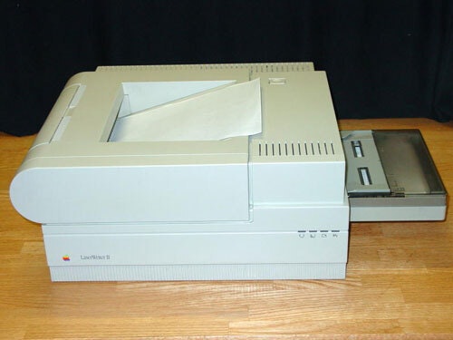
Laser Writer II

The Apple LaserWriter II. Adobe and Apple had a close relationship thanks in part to the LaserWriter series of printers, which used PostScript. (Wikimedia Commons)

That ally was Apple, which had worked closely with Adobe on its LaserWriter printers and whose operating system had proved fundamental to Adobe’s legacy. Suddenly, the company that helped build Adobe looked like it was about to kill it—and that’s certainly how Warnock took it.

But it’s worth keeping in mind the innovation itself before pulling out the pitchforks. TrueType, even as it may have frustrated Adobe to no end, was ultimately a good thing for the technology industry, because even with its technical deficiencies compared to PostScript, it was good enough for many. And there were some advantages, too: PostScript was initially designed to allow for very general rendering of vector-style fonts, with the more sophisticated rendering happening with the printer. Now, Apple and Microsoft had embraced a technology that allowed for high-quality screen displays along with having decent printing capabilities. They were two different approaches to solving a related, but not the same, problem.

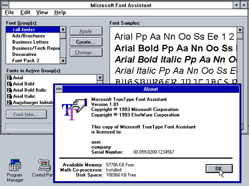
True Type Font Pack

An example of TrueType in Windows 3.1. Despite its close association with Windows, Apple actually developed the TrueType technology, not Microsoft—though Microsoft did develop many of the fonts that became famous as TrueType fonts. (via WinWorldPC)

And TrueType’s uptake with Windows, starting with Windows 3.1 solved some big problems. Example: Early limitations in memory and specification meant that initial laser printers, which relied on fonts using PostScript, didn’t have the level of font support that modern printers do. In fact, some manufacturers turned that limitation into a business model.

Jim Hall, a longtime manager at HP’s Idaho facility who headed up the development of the earliest LaserJet printers, wrote in a history of the printer line that HP had initially treated fonts in the same way it treats printer cartridges today:

Fonts were a challenge for the first LaserJets. Semiconductor memory was very expensive and customer font requirements very fragmented. For those reasons, we elected to offer a limited number of “built-in” fonts and supply the rest in optional font cartridges. This satisfied mainstream users, kept the printer cost low and still gave customers a way to satisfy their special font requirements. Font cartridges (and fonts) became another responsibility for [HP employee] Janet Buschert. Through her efforts, this soon became a major business in its own right with more than 25 different cartridges at prices ranging from $150 to $330 each. It remained a good business for us into the early ’90s when Microsoft started bundling fonts with their Windows operating system.

It turns out that, despite Microsoft’s font-bundling removing a revenue source for HP, the company actually saw it as a good thing, per Hall.

“This was a huge advantage to HP in that it mostly solved our font problem and made WYSIWYG much better by ensuring matching screen and printer fonts,” he said.

The battle between Adobe and Microsoft pushed Adobe to innovate, and it created Adobe Type Manager to allow users to have nice-looking anti-aliased fonts on screen that also had all of the printing advantages of PostScript. And while PostScript certainly couldn’t win over first-time home computer users with a paid font rendering tool, it held onto its higher-end business users, which still purchased Adobe Type Manager for use with Adobe’s Type 1 fonts.

In practice, the schism between Adobe and Microsoft was a case of a market self-selecting itself. It allowed for high-quality typography to go mainstream—driven by Microsoft’s use of TrueType in Windows, which was basically a value add to the operating system—while still leaving room for Adobe in the market, as most desktop publishing firms used Adobe Type Manager, because their focus remained on the printed page. That decision might have looked like a threat to Adobe, but in reality, there was still room for everyone to thrive.

By the late ’90s, the cold war ended in a truce: Adobe and Microsoft came to collaborate on a successor typography technology called OpenType, which effectively merged support between TrueType and Type 1 fonts.

While not having anywhere near the profile of later conflicts, the typography conflict between Adobe, Apple, and Microsoft pushed things forward in much the same way as the conflict over putting Flash on the iPhone.

96ppi

The default pixel density of Microsoft Windows, which was set out of a general belief that pixel density needed to be higher than that used on the printed page. This decision allowed for larger fonts on screen, but created an imbalance between both traditional printed pages and competing operating systems built with desktop publishing in mind, like the Apple Macintosh. (I wrote about this debate in 2018.)

Core Fonts

Arial, Georgia, and Verdana were three of the fonts Microsoft set aside for the web. Arial predates Windows by a few years, but the other two were specifically set aside for this endeavor.

The tyranny of the “safe font”: How Microsoft left web typography high and dry

If you have ever dabbled in web design or email design, you may be familiar with the term “web-safe fonts.”

This is, essentially, a concept that refers to the limited default palette of standard web typography, which is defined not so much by what looks best but what can guaranteed to appear on most users’ computers.

For most users, the number of standard fonts is extremely low, with maybe about a dozen standbys that could be found between Windows and different versions of MacOS.

In a way, web design was defined in its early years by this concept of design safety, the idea that you could only use what was allowed for the least common denominator. It’s a big part of the reason people hated Internet Explorer so much—it defined the parameters around which people could design web pages, and because it was not standards-based, there was no guarantee the design you created would work anywhere else.

For a few years, the influence that Windows had on our font options was largely positive for the printed word, beyond the reasons of TrueType I mentioned above. Unless you were working as a professional publisher or graphic designer and having to trade fonts around to ensure consistency, the idea of having fonts that you could add on the fly seemed like a good solution. (Like clip art, you could buy boxes of software with thousands of fonts on CD in the early 1990s.)

But the internet created a problem for typography. Thanks to the way web browsers were designed, web page designers could literally use any font on any website, but there would be no guarantee that anyone using that site could actually see the fact that you used Papyrus for your body copy because you’re a monster.

And as with TrueType nearly a decade prior, it fell on Microsoft’s back to create a way for this to all make sense. In 1996, the company created an initiative called Core Fonts for the Web, a series of 11 basic fonts that Microsoft thought would be enough for the entire internet to use. It licensed them in a way that made it possible for end users to take advantage of them in any way you wanted. Most of them were introduced with Windows 95, and included at least two fonts that have arguably shaped internet culture in gigantic ways—Comic Sans and Impact.

Microsoft licensed some fonts, had its in-house designers create others, and also worked with a group of high-profile typographers (such as Matthew Carter, the designer of Verdana and a straight-up legend in digital typography) to build new typefaces.

You have seen all of these faces many times in your life, because Microsoft put them there and encouraged competitors like Apple to use them. But Microsoft’s typographers, much like Microsoft itself at the time, did not do open source, which meant that whenever Microsoft stopped giving the fonts fresh attention, they would wither.

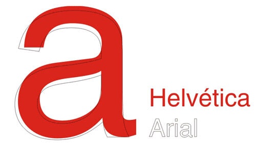
Helvetica vs Arial

The differences between Helvetica and Arial are subtle but noticeable. (via Wikimedia Commons)

Typography licensing is complex—so much so that when Arial, the poor man’s Helvetica used by Microsoft in Windows, literally came to life partly in an attempt to avoid Helvetica’s licensing fees on an IBM laser printer.

And in 2002, Microsoft shuttered the program that gave the internet its basic typographical tenor, out of concerns around licensing—something Ars Technica notes may be related to the decision by some Linux distributions to share the fonts, which again, the entire internet needed.

This was one of those calls that seemed like a small bit of bad news back then, but much worse over time.

In an essay for CNET, Opera Software’s then-CTO, Hakon Wium, criticized the fact that Microsoft shut down the program, as it prevented any new innovation with fonts on the web—in part because they could not be modified.

“The fonts have served us well. They’ve improved both aesthetics and interoperability on the Web, and they look good in a wide range of sizes,” Wium wrote. “Unfortunately, Microsoft decided to close the project in 2002. The fonts are still available for anyone to use, but not to change. It is illegal to add support for more non-Western scripts.”

And there were other problems, too. Fonts like Verdana were built to be readable at small sizes on low-resolution screens. By the late 2000s, this was largely not the problem it once was as most screens were LCD and higher resolutions were growing increasingly common. But Verdana persisted anyway, including (much to my personal frustration) in the IKEA print catalogs.

And it wasn’t until 2009, when standardization efforts came into play and a startup named Typekit fully exploited the potential of typography on the web that this problem was solved—and further built upon by sites like Google Fonts, which emphasized open licensing for its fonts, helping avoid many of the typography headaches Microsoft created for the web.

Typekit’s neat trick was that it added DRM and licensing to webfonts, which was the thing holding up internet typography’s uptake. (It’s now owned by Adobe, which changed its name to Adobe Fonts in 2018. What’s that you hear about full circles?)

In a way, writing is its own form of design. Rather than visually laying out the words in the places where they’re supposed to go, you’re designing clusters of words and having them go together in interesting ways.

Perhaps you keep the sentences short for emphasis. Perhaps you write longer, more in-depth language, full of flowery prose and noisy anecdotes, to test the shape of the phrases in the context of your broader work.

Sometimes, rhythms appear. Those rhythms can pulsate through a piece and become a motor with which to drive a reader forward.

But the one missing element of writing as a “design” of sorts is the idea of typography. Which tools like TrueType made possible.

I had used the non-graphical word processor WordPerfect previously, but my first use of a graphical word processor was GeoWrite, a component of the early Microsoft Windows competitor GeoWorks, which I’m still a huge fan of today. It was not a part of the PostScript/TrueType wars, but it had good taste nonetheless. Early on, it licensed its fonts from a type foundry named URW, and it used the foundry’s name was used directly in the product—and in ways arguably more inventive than anything Microsoft did, as the DOS-based GUI had a banner-maker and an illustration program.

(Side note: URW apparently inspired an important tactic for testing typography: the word “hamburgevons.” This nonsense word is a great way for typographers to test the dimensions of a font. The reason for this has a lot to do with the basic elements of the word, which has every basic stroke type covered, including stems, rounded strokes, and diagonal characters. It is a great way of testing a font for width. So why Hamburgevons? One theory, as posed by author Simon Garfield in Just My Type: A Book About Fonts, is that the URW Type Foundry was based in Hamburg. Other words fulfill this basic requirement, however, with a few common examples being the even stranger “hamburgefonstiv” and the less-strange “champion.”)

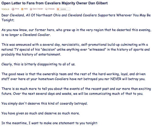
Comic Sans Lebron Letter

A bad font can undermine an entire argument. Think back, for example, to the paper tiger open letter that Cleveland Cavaliers owner Dan Gilbert wrote to LeBron James in 2010, in which he criticized the integrity of a hometown hero for choosing to go to another team in an effort to win a championship. It was a brutal, mean note. But it was undermined because the entire thing appeared in Comic Sans.

Comic Sans, of course, was one of the 11 “core fonts” from which Microsoft thought the web could be built.

Likewise, standard typography, drilled into our heads by MLA style manuals and college professors trying to mandate a degree of consistency across papers, kills creativity in many ways, all in the name of standardization.

And you know, there are places where design just shouldn’t play a role and should just get out of the way. I don’t need my word processor to style my content, I can do it myself, thanks.

So maybe someone else needs to hold the handlebars when it comes to typography in computing, sometimes.

But the fact that we have the option is just massive—massive like the giant companies whose technology helped to shape the Bézier curves of those fonts.

--

Find this one an interesting read? Share it with a pal! And don’t forget to check out the offer we have from SetApp.

Share this post:

follow on Twitter | privacy policy | advertise with us

Copyright © 2015-2023 Tedium, all rights reserved.

Disclosure: From time to time, we may use affiliate links in our content—but only when it makes sense. Promise.

unsubscribe from this list | view email in browser | sent with Email Octopus

Older messages

Floppy Flop 💾

Saturday, July 22, 2023

A floppy-disk pioneer spent the late '70s collecting unemployment. Here's a version for your browser. Hunting for the end of the long tail • July 22, 2023 A quick note to readers: Tedium is

Tamper Evident 🫙

Wednesday, July 19, 2023

Why your salsa jar has a button in the middle of its lid. Here's a version for your browser. Hunting for the end of the long tail • July 19, 2023 Today in Tedium: As we pointed out in our recent

Message In A Bottle 💬

Sunday, July 16, 2023

What the instant messenger wars can teach us about right now. Here's a version for your browser. Hunting for the end of the long tail • July 12, 2023 Today in Tedium: There's a certain problem

Running With The Devil 🤘

Sunday, July 16, 2023

How Jersey got a devil of its own. Here's a version for your browser. Hunting for the end of the long tail • July 15, 2023 Hey all, Ernie here with a continuation of our partnership with Mountain

Let The Internet Be Grimy 💨

Saturday, July 8, 2023

Clean online experiences are a trap. You want the messy ones. Here's a version for your browser. Hunting for the end of the long tail • July 08, 2023 Today in Tedium: I don't feel particularly

You Might Also Like

WP Weekly 226 - Launches - New Elementor Theme, WP 6.8 in April 2025, Automattic Scale Back

Monday, January 13, 2025

Read on Website WP Weekly 226 / Launches 2025 has just started, and there is a slew of new launches like Hello Biz Theme, Meta Box Lite, FooConvert, Affililink, and more. Also, the next WordPress 6.8

SRE Weekly Issue #459

Monday, January 13, 2025

View on sreweekly.com A message from our sponsor, incident.io: Effective incident management demands coordination and collaboration to minimize disruptions. This guide by incident.io covers the full

Saving One Screen At A Time 🖥️

Monday, January 13, 2025

Why the screen saver stopped being so in-your-face. Here's a version for your browser. Hunting for the end of the long tail • January 12, 2025 Today in Tedium: Having seen a lot of pipes, wavy

Software Testing Weekly - Issue 253

Monday, January 13, 2025

Software Testing Weekly turns 5! 🥳 View on the Web Archives ISSUE 253 January 13th 2025 COMMENT Welcome to the 253rd issue! Oh my, time flies! It's hard to believe this week marks 5 years since I

CES 2025 - Sync #501

Sunday, January 12, 2025

Plus: Sam Altman reflects on the last two years; Anthropic reportedly in talks to raise $2B at $60B valuation; e-tattoo decodes brainwaves; anthrobots; top 25 biotech companies for 2025; and more! ͏ ͏

PD#608 Mistakes engineers make in large established codebases

Sunday, January 12, 2025

You can't practice it beforehand ͏ ‌ ͏ ‌ ͏ ‌ ͏ ‌ ͏ ‌ ͏ ‌ ͏ ‌ ͏ ‌ ͏ ‌ ͏ ‌ ͏ ‌ ͏ ‌ ͏ ‌ ͏ ‌ ͏ ‌ ͏ ‌ ͏ ‌ ͏ ‌ ͏ ‌ ͏ ‌ ͏ ‌ ͏ ‌ ͏ ‌ ͏ ‌ ͏ ‌ ͏ ‌ ͏ ‌ ͏ ‌ ͏ ‌ ͏ ‌ ͏ ‌ ͏ ‌ ͏ ‌ ͏ ‌ ͏ ‌ ͏ ‌ ͏ ‌ ͏ ‌ ͏ ‌ ͏ ‌ ͏ ‌

C#539 A detailed look at EF Core’s JSON Columns feature

Sunday, January 12, 2025

Comparing it with the traditional tables with indexes ‌ ‌ ‌ ‌ ‌ ‌ ‌ ‌ ‌ ‌ ‌ ‌ ‌ ‌ ‌ ‌ ‌ ‌ ‌ ‌ ‌ ‌ ‌ ‌ ‌ ‌ ‌ ‌ ‌ ‌ ‌ ‌ ‌ ‌ ‌ ‌ ‌ ‌ ‌ ‌ ‌ ‌ ‌ ‌ ‌ ‌ ‌ ‌ ‌ ‌ ‌ ‌ ‌ ‌ ‌ ‌ ‌ ‌ ‌ ‌ ‌ ‌ ‌ ‌ ‌ ‌ ‌ ‌ ‌ ‌ ‌ ‌ ‌ ‌

RD#488 How to avoid issues with custom Hooks

Sunday, January 12, 2025

Using them carelessly can lead to many problems ‌ ‌ ‌ ‌ ‌ ‌ ‌ ‌ ‌ ‌ ‌ ‌ ‌ ‌ ‌ ‌ ‌ ‌ ‌ ‌ ‌ ‌ ‌ ‌ ‌ ‌ ‌ ‌ ‌ ‌ ‌ ‌ ‌ ‌ ‌ ‌ ‌ ‌ ‌ ‌ ‌ ‌ ‌ ‌ ‌ ‌ ‌ ‌ ‌ ‌ ‌ ‌ ‌ ‌ ‌ ‌ ‌ ‌ ‌ ‌ ‌ ‌ ‌ ‌ ‌ ‌ ‌ ‌ ‌ ‌ ‌ ‌ ‌ ‌ ‌ ‌ ‌

Daily Coding Problem: Problem #1666 [Easy]

Sunday, January 12, 2025

Daily Coding Problem Good morning! Here's your coding interview problem for today. This problem was asked by Amazon. Given n numbers, find the greatest common denominator between them. For example,

🛜 Here's What Happens to Old Websites — Features the Pixel Should Copy From Samsung's One UI 7

Sunday, January 12, 2025

Also: What Instagram Needs to Compete With TikTok, and More! How-To Geek Logo January 12, 2025 Did You Know Mount Wingen, located near Wingen, New South Wales in Australia, is better known as Burning