Tedium - Weird HTML Hacks 🕸️

When the web was young, we made it up as we went along.

Hunting for the end of the long tail • November 24, 2023

Today in Tedium: As an experienced survivor of the email wars, I have seen many things over years that logically should not work, but ultimately pull off unexpected and weird tricks. Some of these are absolutely necessary because of code failures created by larger entities who failed to properly implement proper HTML code, or more egregiously, forced users to create code that was the opposite of elegant, just to get a reasonably desirable result. But some of these hacks were actually kind of brilliant and worth remembering for their sheer inventiveness. After all, we weren’t going to let Internet Explorer get in the way of a good design, right? Today’s Tedium talks about HTML hacks—whether structural or technical—that carried us through at a time when there were no guarantees that our webpages were going to work. We’re listing them out. Here’s ten. — Ernie @ Tedium

Remember when our browsers defaulted to gray backgrounds? That was weird, right?

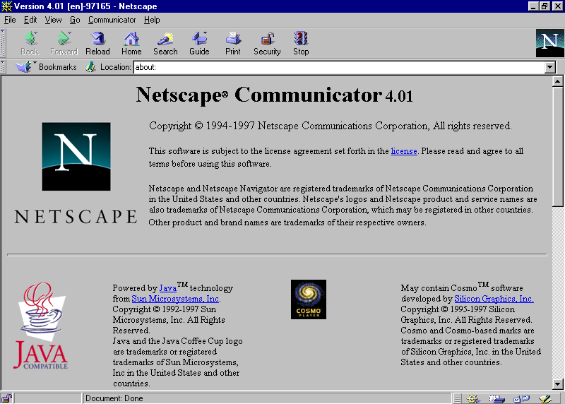
1. The Netscape Navigator 4.0 @import hack

Perhaps the first true HTML hack as we know them today, this is very much the purest form of the tactic, which generally is used to prevent code from running which, based on valid HTML or CSS standards, should work, but because of implementation gaps on the browser end, allow the layout to be prevented from working correctly.

As the CSS Cookbook notes, this hack effectively works by loading two HTML files, one of which will not work in Netscape:

<link rel="stylesheet" type="text/css" media="all" title="Basic CSS" href="/basic.css" />

<style type="text/css" media="all">
@import "/css/advanced.css";
</style>

What’s interesting about this is the reason it doesn’t work. As the book explains, Netscape fought hard for a competing standard, JSSS, to win out over CSS, but the World Wide Web Consortium went another direction, leading to a heavily rushed CSS implementation in Netscape 4, which came out in the summer of 1997. That meant it worked terribly, especially compared to later browsers, and that meant

(One side effect of this is that if you disable JavaScript in the browser, it also disables CSS—something that is not true of most web browsers.)

This book was a key element of convincing a generation of Web developers that they didn’t have to wait for CSS.

2. Using HTML tables for layout

So if we step back and talk about the web browser, Here was this amazing technology and people wanted to do more with it than what was technically allowed on the tin.

One of those people was David Siegel, and he came to the Web as a traditional designer. Designers have a tendency to break convention, and Siegel effectively took something that was built to hold data in a semantic format, the HTML table, and … decided to use it to build layouts.

Yes, yes, everyone did it (and in the email world, everyone still does), but it is the definition of a hack—and Seigel was one of the first to find it.

In his book Creating Killer Web Sites, he explained how he decided to flout convention, which presumed that HTML’s visual appearance would be determined by the browser owner, to build better looking websites:

I threw my HTML book in the trash and started from scratch. I figured out a bunch of tricks to get around structural markup and make pages the way %anted them to look. I began using images to lay out pages in two dimensions, rather than one. When tables became available, I poured columns of test in them. I reduced the colors and made the file sizes small and—guess what? - people came! The numbers actually broke my access counter.

As Jay Hoffman of The History of The Web explains, this was perceived as a huge no-no, because HTML and XML purists felt that design and code structure should not mix. (It also busted accessibility, a realistic concern that took years to repair.) But the idea of a portal that could be visually shaped by the developer was clearly valuable, and it’s probably up there with responsive design in terms of homegrown ideas that reshaped the internet forever.

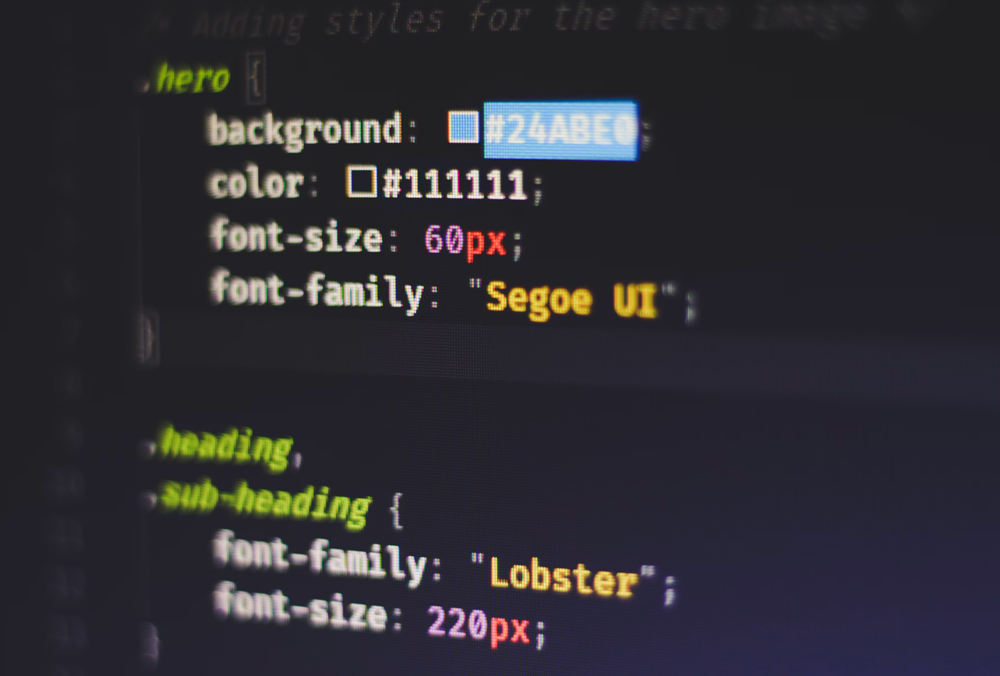
A modern display of CSS, which didn’t have to rely on such terrible hacks. Side note: Could you imagine being so desperate to get your website working that you just put random characters in the editor to see what happens? (Ferenc Almasi/Unsplash)

3. Putting an underscore in front of a CSS style

It sounds silly, but this was a really important feature for a lot of developers during the Internet Explorer era. The reason for this is that IE often did things counter to every other web browser. A famous example of this is the box model. While the W3C intended for the width of a box to exclude the border and padding, Internet Explorer did not account for paddings and borders, leading to significant differences between browsers.

At the time IE6 first came out, Microsoft dominated the browser market, so it wasn’t an immediate problem, but as the browser got older, it necessitated a number of weird hacks, of which the underscore hack was one. The tag invalidated the CSS, but it only hit IE6, so it was effective if you were only targeting that browser.

.class {
    width: 300px;
    _width: 320px;
    padding: 10px;
}

Lots of other weird hacks like this existed as well. For example, the !important tag could be morphed to only work in IE7 and below if you put another exclamation point at the end of the word.

There was no reason it should have worked, but hacky, incorrect HTML features like these were often necessary because Internet Explorer was so explicitly dominant.

For irony’s sake, here’s a PNG of a non-transparent Internet Explorer logo, on a background associated with transparency.

4. Using AlphaImageLoader to make PNGs transparent

We take it for granted today, but there was a time when the most popular web browser in the world did not correctly support PNG files, one of the most popular file formats on the internet.

Despite IE having support for PNGs since version 4, it did not properly render PNGs in many cases, and was often quite broken, with the most egregious problem being the lack of transparency support in Internet Explorer 5 and 6.

As blogger Jeff Starr of Perishable Press writes, the use of Microsoft’s proprietary AlphaImageLoader filter, a technique Microsoft invented that no other browser-maker used—a common theme for Microsoft. As Starr wrote:

Fortunately, there are plenty of hacks and workarounds designed to “fix” IE’s PNG image-display problem. Unfortunately, every currently available solution requires the use of Microsoft’s proprietary AlphaImageLoader transparency filter.

As he shows in his example of the filter, it was possible to completely get around Microsoft’s poor support using this method:

.png {
    cursor: pointer;
    no-background: none;
    /* filter applies only to IE5+/Win */
    filter:progid:DXImageTransform.Microsoft.AlphaImageLoader(enabled='true', sizingMethod='fixed', src='http://domain.tld/path/image.png');
}
.png[class] {
    /* [class] applies to non-IE browsers */
    no-background: url(http://domain.tld/path/image.png) no-repeat;
}
* html .png a {
    /* make links clickable in IE */
    position: relative;
    z-index: 999;
}

Small feature gaps like these really slowed down developers, who had to account for these hacks during the late 2000s and early 2010s.

Outlook 2003, one of the primary tools that relies on conditional comments. Fun fact: Outlook 2003 actually renders HTML better than most recent versions of Outlook. Who knew?

5. Conditional Comments

At some point, all of these hacks, as annoying and as necessary as some of them might be, required intervention from Microsoft to help make them somewhat manageable.

That intervention came in the form of conditional comments, which essentially were a non-standard use of HTML comments to basically add additional meeting to a feature that was not meant to convey development information. Here’s an example:

<!--[(if expression) (IE version)]> 
<p>Can’t believe you still use Internet Explorer!</p>
<![endif]-->

First introduced with Internet Explorer 5 and still required for more ambitious email designs in the Windows version of Microsoft Outlook, the technique became increasingly popular as people tried building for newer generations of web design.

Jens Oliver Meiert, a web-standards advocate, argued against the use of conditional comments—and, surprisingly, in favor of more esoteric hacks. In a 2007 post, he wrote:

No matter how you use CC, it will be necessary to adjust the HTML of each and every document or template once you focus on other Internet Explorer versions. This happens even if you’re the most visionary master of web development and there’s otherwise no need to update the structure of your documents. Remember that you strive for consistent separation of structure and formatting.

Essentially, Microsoft had to introduce an HTML hack to allow for older HTML hacks to continue to be useful as the company slowly evolved its web browser.

Conditional comments were removed after IE9, but a JavaScript feature, called conditional compilation, could be used instead.

(Brett Jordan/Unsplash)

6. Scalable Inman Flash Replacement (sIFR)

The concept of web-safe fonts, as we’ve written about in the past in Tedium, were the direct result of a failure on the part of Internet Explorer to properly allow different types of fonts. (In fact, the company created an initiative, Core Fonts for the Web, which essentially discouraged people from painting outside the lines, then let the initiative die out.)

But paint outside the lines was something that people did, and often. And one of the ways that people did that were with font-replacement techniques that made it possible to

Enter Shaun Inman, who came up with the idea to replace fonts with small Adobe Flash files, built on demand, that replicated the fonts you actually wanted to use on your website. He had the spark, but it was Mike Davidson, a current executive at Microsoft, who made it sing. Davidson—who has spent time at companies like Twitter, NBC News, and Disney (where he famously helped make ESPN an early web design powerhouse)—made it possible with sIFR for the fonts to essentially scale as necessary, making the tool useful to lots of web designers for a time. (Later developers, like the programmer Mark Wubben, improved it even further.)

At the time he released sIFR in 2004, Davidson pointed out that what he had built was essentially a solution to a problem that standards bodies have done little about—the need to allow fonts not owned by the end user to display in fancy formats:

With this newfound ability to display true versions of typefaces in web browsers, you’d think typography on the web would be exploding. Well it’s not. Why? Because no one has solved the second problem yet: how to deliver custom typefaces to people who don’t have them installed.

This obviously was a way station to a real solution, and one that did not last in large part because Flash did not make the leap to mobile. It took another half a decade for a real solution to the font problem to show itself.

(Justin Morgan/Unsplash)

7. The preheader text hack

HTML is quite often a massive pain to manage when you code email, and since many messages are developed for marketing purposes, they often require a memorable tag or two for marketing purposes. Often, that’s the subject line, but there’s another one, called the preheader, that effective works as the subhed or deck to the email.

If you don’t work in email marketing, you probably don’t realize how important this tag actually is, and also that it can be somewhat inelegant for the tag to, say, pull up an HTML tag.

Enter the preheader text hack. This thing is designed to do one thing: Add some extra space between your intended preheader, usually the first text in the email, and any unrelated content. How does it work? Essentially, you put a bunch of HTML character codes between the message and the next text passage.

It’s taken a lot of forms over the years, but here’s the version that the email firm Litmus recommends:

<div style="display: none; max-height: 0px; overflow: hidden;">
Insert hidden preheader text here.
</div>
    
<!-- Insert &#847;&zwnj;&nbsp; hack after hidden preview text -->
<div style="display: none; max-height: 0px; overflow: hidden;">
&#847; &zwnj; &nbsp; &#8199; &shy; &#847; &zwnj; &nbsp; &#8199; &shy; &#847; &zwnj; &nbsp; &#8199; &shy; &#847; &zwnj; &nbsp; &#8199; &shy; &#847; &zwnj; &nbsp; &#8199; &shy; &#847; &zwnj; &nbsp; &#8199; &shy; &#847; &zwnj; &nbsp; &#8199; &shy; &#847; &zwnj; &nbsp; &#8199; &shy;
</div>

Anything to get you to read our next email.

You got chocolate in my nightmares!

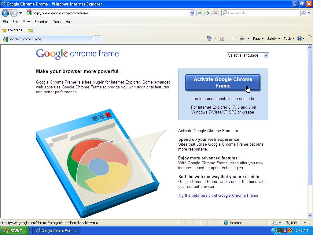
8. Google Chrome Frame

In many ways, this is more a competition hack than an HTML hack, but it’s an endlessly clever solution to a real problem that: Some people, especially in offices with tough IT departments, wanted to use more modern browsers, but these companies were reliant on technologies built around IE6 that did not work with any other browser. It could have prevented Chrome’s success, so they solved the problem by creating a browser plugin that literally replaced your IE6 renderer with a modern Chrome one.

As Google explained about the plugin in a 2014 blog post:

But in 2009, many people were using browsers that lagged behind the leading edge. In order to reach the broadest base of users, developers often had to either build multiple versions of their applications or not use the new capabilities at all. We created Chrome Frame—a secure plug-in that brings a modern engine to old versions of Internet Explorer—to allow developers to bring better experiences to more users, even those who were unable to move to a more capable browser.

There were competitive reasons to do this besides increasing Chrome’s uptake. Google was working on tools like Google Wave and YouTube that required HTML5 features, and having to support IE6 was holding them back.

Ultimately, the browser-in-a-browser trick worked extremely well, as Chrome became utterly dominant in the five years that the plugin was on the market.

(Rubaitul Azad/Unsplash)

9. The Webkit-only selector hack

When Apple’s Safari web browser was first released, it was a breath of fresh air for web developers. Built on a ground-up engine rooted in the open-source community, it had stronger support for HTML and CSS standards than many other browsers of its kind upon its initial release. (Anyone who loves rounded corners in CSS should know Safari had them first.)

It still does—and for people who code emails, it is beautiful in most cases because Apple Mail, which uses WebKit, generally just works.

But as time has gone on, it’s gained some problems. One of the biggest is the fact that Apple’s Safari release schedule is generally built around Apple’s Mac and iOS release schedules, meaning it lags behind the rest of the industry. On top of that, Apple has been accused at times of ignoring bugs or holding back features that would undermine its competitive position.

As a Reddit user put it a couple of years ago in a viral thread: “Oh my god. Even when they implement an API, it’s riddled with bugs they never fix. Or they do it fine, then break it later.”

So when users have to write some Safari specific CSS code to work around Apple, they do this:

@supports (-webkit-appearance:none) {}

It should be noted that this works in early versions of Chrome, which started on Webkit.

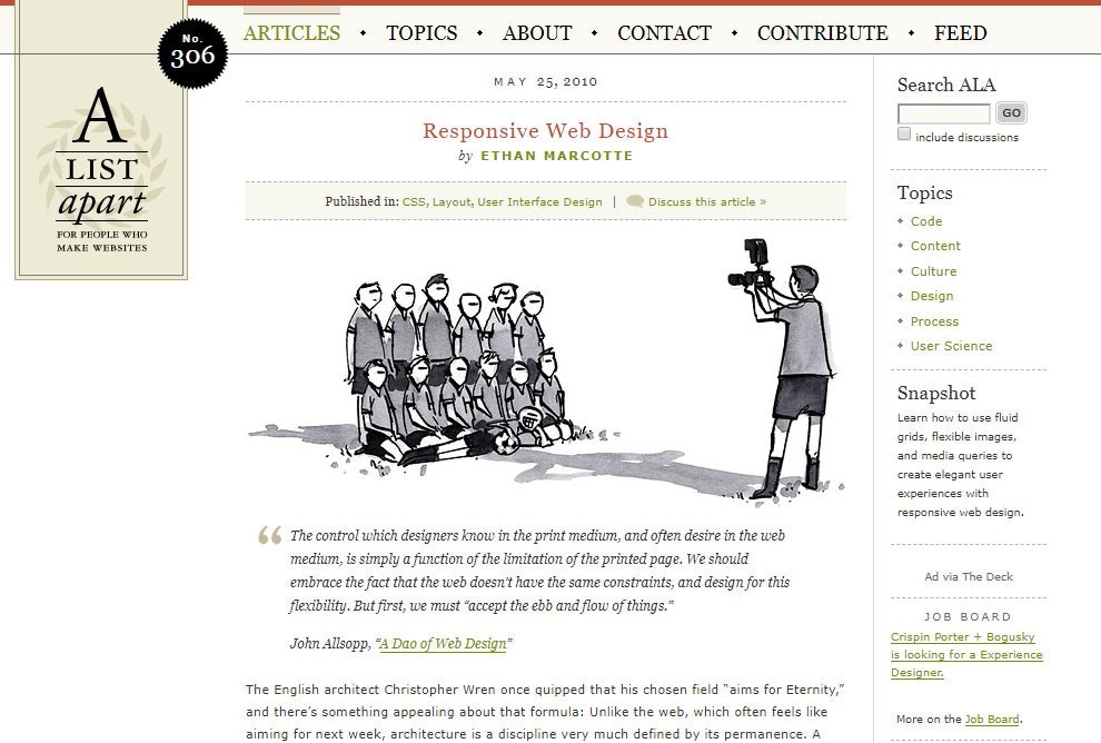
Secretly the most important digital article of all time. (via Web Design Museum)

10. Responsive design

In many ways, responsive design is a hack that ended up getting a corner office in the realm of HTML.

To understand how responsive design is so important to the way web design works, it’s important to understand that there was a major debate happening in web design throughout the 2000s. Essentially, everyone wanted to have a good way to design webpages with three columns that went all the way to the bottom. This was a layout that worked well using traditional HTML tables, but wasn’t technically semantic and did not work using CSS.

A number of solutions emerged during this period, many faking it with fake columns enforced by a background image. Eventually, the interest in responsive design turned into grid-based layout, something that CSS came to support.

The point that held this up was browser support, particularly on the Internet Explorer front, but eventually as smartphones became popular, the “Holy Grail layout,” as it was long called, no longer made sense. People suddenly had to invest lots of money in mobile websites that they did not have to previously.

But then Ethan Marcotte, a web developer and writer for A List Apart, came along and pointed web designers towards a new holy grail—the use of media queries to reposition websites to match the format. This looked like magic when it first came out, in part because it used web technologies that were being ignored by most web developers, particularly media queries.

It was a hack just like HTML tables were, but unlike HTML tables, it actually worked within the parameters of what the HTML standards folks wanted. It ultimately changed web design forever—for the better.

It’s fascinating to me that the intentions of HTML and how it actually works ended up differing so dramatically.

In many ways, to hear HTML tables maverick David Siegel explain it, the standards bodies wanted HTML to work like RSS—where design had no bearing on the final product, where the user ultimately was the driver. Other protocols created around the same time as HTML, like Gopher, worked like this.

But that philosophy clearly lost, in large part because of two things: First, it deeply underestimated how creative the internet’s users were, and second, it was a complete nonstarter for the commercial internet, which (for understandable reasons) leans heavily on visual language.

For decades, design nerds and user interface pros tried to put their imprint on the internet, despite all the weird code that required. It’s impressive that they actually pulled it off, given all that.

Today, I was trying to do something with some code I was working on—to put a transparent gradient over a block of text to make it fade out. This is trivial in standard HTML and CSS, but I was working in email. I tried seemingly a dozen things, but eventually I found my solution—in the form of a random HTML table glitch, highlighted by a StackOverflow commenter way back in 2009, that should not work, but somehow does.

“I know, I deserve a downvote for this,” the guy wrote. I disagree.

--

Find this one an interesting read? Share it with a pal! And back at it again in a couple of days!

Share this post:

follow on Twitter | privacy policy | advertise with us

Copyright © 2015-2023 Tedium, all rights reserved.

Disclosure: From time to time, we may use affiliate links in our content—but only when it makes sense. Promise.

unsubscribe from this list | view email in browser | sent with Email Octopus

Older messages

Bubble Busters 💬

Thursday, November 23, 2023

Apple deserves blame for a recent Android messaging drama. Here's a version for your browser. Hunting for the end of the long tail • November 22, 2023 Bubble Busters The recent security drama

Ruminating On Replies 💬

Wednesday, November 22, 2023

The reply guy is evolving into a new form. Here's a version for your browser. Hunting for the end of the long tail • November 21, 2023 Ruminating On Replies The “reply guy,” the internet-native

Making Magnetic Media 💾

Saturday, November 18, 2023

How 3M dominated floppies, then gave it away. Here's a version for your browser. Hunting for the end of the long tail • November 17, 2023 Hey all, I know you're all obsessed with the palace

When Tools Unlock New Paths 🔧

Friday, November 17, 2023

How embracing two new tools gave me a lot of new ideas. Here's a version for your browser. Hunting for the end of the long tail • November 16, 2023 When Tools Unlock New Paths Don't just keep

Slamming Into Painted Boulders 🎬

Friday, November 17, 2023

Warner Bros. Discovery's warped motivations get the best of it. Here's a version for your browser. Hunting for the end of the long tail • November 14, 2023 Slamming Into Painted Boulders In the

You Might Also Like

🤳🏻 We Need More High-End Small Phones — Linux Terminal Setup Tips

Sunday, November 24, 2024

Also: Why I Switched From Google Maps to Apple Maps, and More! How-To Geek Logo November 24, 2024 Did You Know Medieval moats didn't just protect castles from invaders approaching over land, but

JSK Daily for Nov 24, 2024

Sunday, November 24, 2024

JSK Daily for Nov 24, 2024 View this email in your browser A community curated daily e-mail of JavaScript news JavaScript Certification Black Friday Offer – Up to 54% Off! Certificates.dev, the trusted

OpenAI's turbulent early years - Sync #494

Sunday, November 24, 2024

Plus: Anthropic and xAI raise billions of dollars; can a fluffy robot replace a living pet; Chinese reasoning model DeepSeek R1; robot-dog runs full marathon; a $12000 surgery to change eye colour ͏ ͏

Daily Coding Problem: Problem #1618 [Easy]

Sunday, November 24, 2024

Daily Coding Problem Good morning! Here's your coding interview problem for today. This problem was asked by Zillow. Let's define a "sevenish" number to be one which is either a power

PD#602 How Netflix Built Self-Healing System to Survive Concurrency Bug

Sunday, November 24, 2024

CPUs were dying, the bug was temporarily un-fixable, and they had no viable path forward ‌ ‌ ‌ ‌ ‌ ‌ ‌ ‌ ‌ ‌ ‌ ‌ ‌ ‌ ‌ ‌ ‌ ‌ ‌ ‌ ‌ ‌ ‌ ‌ ‌ ‌ ‌ ‌ ‌ ‌ ‌ ‌ ‌ ‌ ‌ ‌ ‌ ‌ ‌ ‌ ‌ ‌ ‌ ‌ ‌ ‌ ‌ ‌ ‌ ‌ ‌ ‌ ‌ ‌ ‌ ‌

RD#602 What are React Portals?

Sunday, November 24, 2024

A powerful feature that allows rendering components outside their parent component's DOM hierarchy ‌ ‌ ‌ ‌ ‌ ‌ ‌ ‌ ‌ ‌ ‌ ‌ ‌ ‌ ‌ ‌ ‌ ‌ ‌ ‌ ‌ ‌ ‌ ‌ ‌ ‌ ‌ ‌ ‌ ‌ ‌ ‌ ‌ ‌ ‌ ‌ ‌ ‌ ‌ ‌ ‌ ‌ ‌ ‌ ‌ ‌ ‌ ‌ ‌

C#533 What's new in C# 13

Sunday, November 24, 2024

Params collections support, a new Lock type and others ‌ ‌ ‌ ‌ ‌ ‌ ‌ ‌ ‌ ‌ ‌ ‌ ‌ ‌ ‌ ‌ ‌ ‌ ‌ ‌ ‌ ‌ ‌ ‌ ‌ ‌ ‌ ‌ ‌ ‌ ‌ ‌ ‌ ‌ ‌ ‌ ‌ ‌ ‌ ‌ ‌ ‌ ‌ ‌ ‌ ‌ ‌ ‌ ‌ ‌ ‌ ‌ ‌ ‌ ‌ ‌ ‌ ‌ ‌ ‌ ‌ ‌ ‌ ‌ ‌ ‌ ‌ ‌ ‌ ‌ ‌ ‌ ‌

⚙️ Smaller but deeper: Writer’s secret weapon to better AI

Sunday, November 24, 2024

November 24, 2024 | Read Online Ian Krietzberg Good morning. I sat down recently with Waseem Alshikh, the co-founder and CTO of enterprise AI firm Writer. Writer recently made waves with the release of

Sunday Digest | Featuring 'How Often People Go to the Doctor, by Country' 📊

Sunday, November 24, 2024

Every visualization published this week, in one place. Nov 24, 2024 | View Online | Subscribe | VC+ | Download Our App Hello, welcome to your Sunday Digest. This week we visualized the GDP per capita

Android Weekly #650 🤖

Sunday, November 24, 2024

View in web browser 650 November 24th, 2024 Articles & Tutorials Sponsored Why your mobile releases are a black box “What's the status of the release?” Who knows. Uncover the unseen challenges