The Growth Newsletter #161 Remote OK’s upsells. Viral promos. Optimal pricing pages. |
Quick note: I'll be at ETH Denver this week to explore the community of web3 weirdness. If you're going, I hope to see you there!
Topics for the day: Remote OK’s upsells. Viral promos. Optimal pricing pages. Let's dive in 🐋
– Neal |
Thanks to our sponsors for keeping this newsletter free for all of you! Check them out :) |
|
|
Brought to you by The Headturner, a fun weekly newsletter about earning attention in today’s noisy world. Featuring:
🥊 Battle of the Headlines: One story, two headlines. Who did it best?
💡 Stay Relevant: Genius/wacky campaigns from brands staying top of mind.
🕵️ In Profile: If this person can get a NYT feature, so can you!
😆 Just for Laughs: These are either a meme, or about to become one…
New issues drop every Wednesday and take only 4-5 minutes to read.
Subscribe now, free.
|
|
|
Brought to you by ContentShake AI—the top writing tool for small teams.
A typical content writer can pump out maybe 10, solid, SEO articles per month. That's after doing a bunch of keyword research and topic brainstorming. Semrush (the go-to SEO tool) has created an AI writer that pumps out ready-to-rank content up to 12x faster than a typical writer. Grow your search traffic exponentially faster. Try ContentShake AI for free. |
|
|
Want to be featured in front of 93,089 founders and marketers? Learn more here–booking into Feb. |
|
|
1. The upsell power of Remote OK
Insight derived from Remote OK.
Remote OK is a remote-only job board with ~3M page views and 1.1M unique visitors per month. (Note, I know this because their analytics are completely public, which is a genius idea for a job board.)
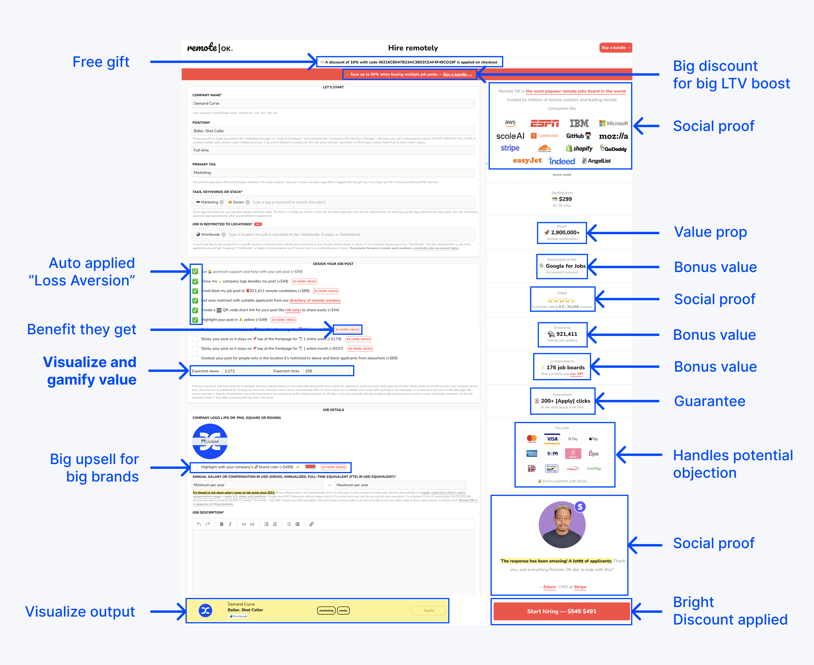
Their purchase page is an upsell and CRO gold mine. Let’s dive into it: |
Some key things to pull from this: -
A ton of upsells. Massively increasing the LTV of each purchase. And they frame the upsells directly to the benefit you’ll get (and likely care about most). Bonus that a few of them are auto-applied so you have to click to remove them (and remove views), triggering loss aversion.
- A ton of social proof. Testimonials. Big name companies. Lots of positive reviews.
-
A ton of objection handling. The number one concern job posters have is whether the job will get seen by many people and get applicants.
Creating a job post requires quite a bit of work for the poster. Lots of form fields that will take quite a bit to fill out. All of the above elements help encourage people to put in the effort by proving to them it’s worth the effort.
Use this page for inspiration for your checkout page. Check out our landing page teardowns for more inspiration. |
|
|
2. How to run a promo people talk about
Insight from Contagious by Jonah Berger. Promos work thanks to urgency and scarcity. You give people a reason to act now. But most promos cause people to just quietly use them. Few cause people to talk about them. Wharton professor Jonah Berger's research tells us how to make a promo that people tell others about: Make it big 5% off = meh 50% off = whoa Big discounts are more share-worthy because: - They’re more helpful than small ones. A 5% discount is barely helpful.
- They’re remarkable. They’re surprising, impressive, and exciting.
Note: People judge a deal based on the original price. Don't just say 50% off. It requires math. Don't make them do math. Always show the original price. Limit availability Urgency causes action. Scarcity causes desire. Ideas: - Limit time. Example: Deal last 37.5 hours.
- Specific, unrounded numbers are more believable and remarkable.
- Limit total quantity. Example: Limited to the first 420 copies sold.
- Limit quantity per customer. Grocery stores love this one. It makes it seem more valuable. And it’s a suggested quantity to buy, also know as “quantity anchoring.”
-
Limit quantity at different discount tiers. Start at 50% for first 100. 40% for next 100. And so on. Creates urgency and shows social proof from past sales.
- Limit to "members only.” Example: Prime Days.
Note: If the promo isn't limited, it's interpreted as the regular price.
Apply the Rule of 100 $5 Product: $3 off seems like nothing. But 60% off seems like a lot. $10,000 Product: 10% off seems minimal. But $1,000 off seems like a lot. Rule of 100: -
Price < $100: use a % discount.
- Price > $100: use a $ discount.
Make it obvious and public We mimic the behavior of others. Make the popularity of your promo obvious. - Show a site notification every time someone purchases during the promo.
- Display how much people have already saved during the promo.
-
Limit quantities and display how many are left.
- Automatically tweet for every sale.
- Encourage social sharing in exchange for a bonus gift after the purchase.
|
|
|
3. How to optimize your pricing page
Insight derived from Kyle Poyar and modified. The Pricing page is arguably the most important page on a SaaS site. Everyone wants to know: - What this gonna cost me?
- How much am I gonna get?
- How do costs scale?
-
Is this a good deal?
Here’s Kyle Poyar’s (and our) advice on how to optimize it:
#1. Benefits > features. Do not just copy-paste the pricing table you used internally. Instead of “ZOOM, Slack, and Google integration” do “Connect existing ways of working to Miro with 100+ apps and Integrations like ZOOM, Slack, and Google Drive.”
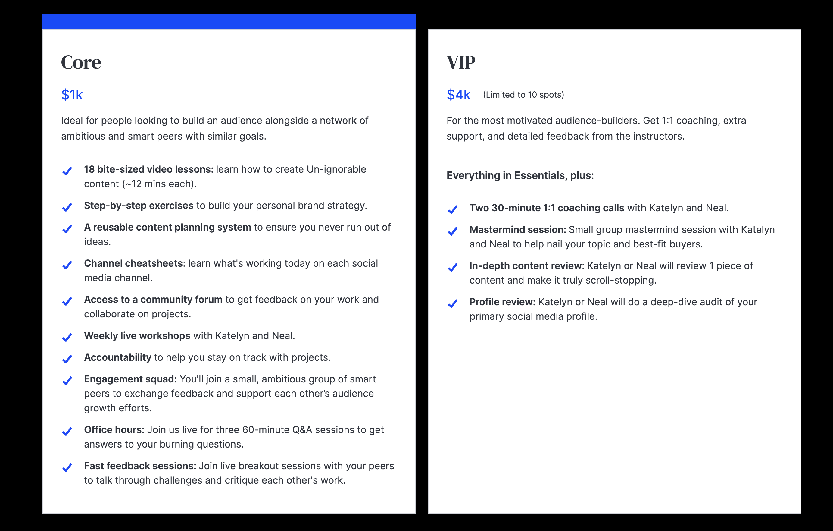
Here’s how we did it for Un-ignorable: |
#2. Reinforce the key value props over and over again. People visit your pricing page quickly and are often barely familiar with what you sell. Hammer in your value props over and over in the pricing table. Treat it like a marketing page.
#3. Handle objections. Add testimonials, reviews, FAQs, and social proof (logos, # of users, etc), and handle the biggest objections your salespeople hear on calls with leads.
#4. Don’t use jargon or acronyms. No one knows what an MTU is. Don’t use internal terms. Instead, use terms that are commonly used by your customers. If you must have something potentially confusing, add a tooltip explanation. #5. Leverage behavior psychology. - Anchor: Offer a higher tier to get buyers to trade up, or to cause them to perceive lower tiers as a deal. Hence the VIP plan above.
-
Guide: Highlight the most popular plan to visually guide buyers to select it. Ex: “Recommended” or “Most popular.” Above we used the blue bar on the Core tier.
- Deal effect: Make certain tiers look like a bargain by playing with price points and features across tiers. For example, 2x the price gets you 5x of the “core thing.”
#6. Don’t overwhelm. Don’t have 10 pricing options; do 2-4. Don’t list 100 different features; do 3-10 of the top ones and bold key details. You can list all the features in a big matrix below the main table.
#7. Price annual plans based on lifetime value. As mentioned in Newsletter #141, instead of doing the standard “2 months free,” base the annual price on the average retention of a monthly user. If retention is 5 months, price it at 6 or 7 months. If retention is 20 months, then don’t offer annual plans (like Netflix). Treat your pricing page/table like royalty. It’s one of the most important conversion elements. |
|
|
News you can use: Service we recommend: Portless
Struggling with inventory delays and cash flow issues? Tired of waiting 45-60 days for your products to arrive from China? Meet Portless—the game-changer for DTC and ecomm brands: -
Direct Shipping: Ship directly from China to customers in just 6 days (in 55+ countries).
- Local Touch: Custom packaging and local tracking through carriers like USPS and Canada Post.
- Cost-Effective: Slash cargo shipping fees and boost gross margins by up to 40%.
-
Cash Flow Boost: Say goodbye to tied-up cash flow in inventory. Unlock frozen funds within days.
Eliminate overstocks and stockouts, safeguard your cash flow, and enjoy 3-5 day replenishments for your best-sellers. Go Portless today *Sponsored by Portless |
|
|
Want to be featured in front of 93,089 founders and marketers? Learn more here–booking 4 weeks in advance. |
|
|
What did you think of today's newsletter? |
😍 Loved it: Forward to a friend, write a testimonial, or send a reply (a 😍 will do!). 🤷♀️ Meh: You can unsubscribe here, or manage your subscription here. 🤔 I'm new here: You can join the party here. |
|
|
In case you're new: Who's Demand Curve?
We’re on a mission to help make it easier to start, build, and grow companies. We share high-quality, vetted, and actionable growth content as we learn it from the top 1% of founders and marketers. |
|
|
© 2024 Demand Curve, Inc. All rights reserved. 4460 Redwood Hwy, Suite 16-535, San Rafael, California, United States
Unsubscribe from all emails, including the newsletter, or manage subscription preferences. |
|
|
|


_01HMS9589F198HFTBJCYE1PA64.jpg)
