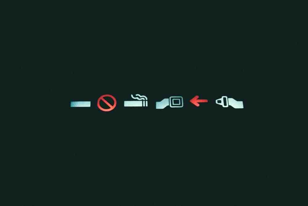
Tedium - Circles And Slashes 🚫

No, Ghostbusters didn’t invent the red circle-slash.

Hunting for the end of the long tail • March 09, 2024

Today in Tedium: Recently, I heard someone talking about the red circle and slash, and it made me realize something—how little we actually talk about the red circle and slash, one of the most obvious symbols around. It’s used for all sorts of use cases. If you search the U.S. Patent and Trademark Office’s trademark archive, you will find all sorts of cheesy or weird logos that reference this simple tool of negation and prohibition. It is literally the easiest way to add visual language to something else that already exists, and turn it into a logo or bumper sticker. And the reason is, simply put, that it’s well understood. Does it have a name? A purpose? Did someone specifically invent it? How did it become so common, and why is it so clear what it means, despite the fact that seemingly nobody talks about it? Today’s Tedium considers the unusually common red circle and slash. — Ernie @ Tedium

Is your iPhone packed to the gills with old photos? The new CleanMyPhone might be your solution. This tool, by the makers of CleanMyMac, helps make it easy to separate an outtake from a keeper—and save a bunch of space in the process. Click here for a free trial, iPhone fans.

“It’s likely that our fortuitous association with this friendly red circle-backslash symbol helped to pave the way for our band’s logo over the years. In America at least, I’m sure that the Ghostbuster symbol and the ‘No Parking’ graphic image helped to defuse any possible antagonism from religious groups. We were never antagonists—we were simply the antithesis of the symbol we were slashing: you won’t find religion in this house.”

— Greg Graffin, the lead vocalist of Bad Religion and an evolutionary biologist, writing in his memoir, Punk Paradox, about his band’s decision to use the circle-backslash symbol around a Christian cross, which was a simple, evocative logo for the band.

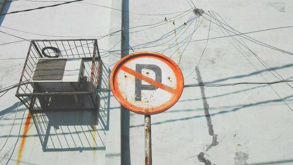
(JJ Shev/Unsplash)

The symbolism of the circle-slash was less obvious than you might think

When I thought about the red-circle slash, which is meant to signify that something is off limits, my first thought was of its journey to the popular lexicon. It is a very simple sign, but it is also distinct from putting a red X on top of something, as one might have seen in the past.

So I looked around, and realized I had a problem: This is such a well-known, broadly used symbol that it can be hard to describe by the layperson. And because so few people think of such things, I only found a few people pondering what we should actually call this thing.

I was not the first person to face this problem. Back in 2016, teacher and syndicated columnist Rob Kyff, writing in the Hartford Courant, was drawn to the same question I was when he spotted this description of the issue:

Many protesters were wearing identical stickers with a “Ghostbusters” circle with a slash through the center of the circle to show they oppose Senate Bill 14.

Everyone in the room, and everyone reading this article, knows the symbol implied by this passage. It is an extremely simple symbol, perhaps one of the simplest you will find. So the fact that a whole 12 words are required to describe this to a general audience in a newspaper, one of which evokes a popular movie, seems wasteful and unnecessary.

Kyff said his journey proved futile. “Some phrases, such as ‘no symbol’ and ‘no circle,’ have other meanings, and some, such as ‘circle slash,’ don’t show up at all,” he noted.

Making this even more complicated is the symbol’s ubiquity. It shows up in numerous forms, and is so common that people use it in images that they trademark. In terms of its ubiquity, it is probably up there with the traffic light and the stop sign, two things that we know how to describe.

And it appears to have the same roots as both of those objects, which were created for traffic purposes. A Detroit police sergeant, Harry Jackson, gets the credit for the stop sign’s distinctive octagon, according to the 1949 guide “This Terrible Traffic Problem,” though he had financial support from the Michigan Auto Club. The 1949 document, developed by the Traffic Society Association of Detroit, described how controversial the signs actually were. (Sample phrase: “Others seemed to think it was an invasion of a driver’s liberty.” Wonder where you’ve heard that kind of phrasing before.)

Meanwhile, the electric traffic light, as we think of it today, was developed by Lester Wire (great name) of Salt Lake City, Utah, while we later saw three-signal versions developed by Garrett Morgan (whose design wasn’t like the modern one) and William Potts (whose design was). These were American inventions, but one look for the circle-slash in the archives of U.S. newspapers shows the well goes dry for any references before the 1970s or so.

There’s a reason for that, and that reason is that the idea is not an American one.

“The authors found that some symbols, such as ‘telephone,’ ‘no smoking,’ and the conventional U.S. ‘exit’ sign, were understood by almost all the subjects tested. Yet other symbols, such as ‘blind alley,’ ‘do not block,’ and ‘break glass,’ were understood by only 20-25 percent of the subjects. Not only were some symbols not understood, several symbols were given a meaning opposite to that which was intended. Thus, ‘no exit’ or ‘blind alley’ was interpreted as ‘exit’ or ‘safe area’ by almost all subjects who gave a definition for this symbol.”

— A passage from The Development and Evaluation of Effective Symbol Signs, a document produced by the National Bureau of Standards to discuss the issues around making effective signage. This passage discusses a study, dating to the late 1970s, in which people were asked to determine what they were supposed to see based on the symbol they were looking at.

(Jimmy Ofisia/Unsplash)

The crossed-out circle reflects a rare success story for the design-by-committee crew

Differences between Europe and the United States abound, but one of the most important? Language. Despite Europe and the U.S. being similar in geographic size, the U.S. mostly uses a single language, while European countries use around 24 official languages and many more spoken, but not considered official.

When road systems were built out, this actually affected the way each handled them. The U.S. built a system that more or less assumed you could read English, with signs covered in English words. Europe, meanwhile, relied on symbols.

This created problems for tourists in particular. As Hal Foust, the automotive editor for the Chicago Tribune, put it starkly in a 1962 op-ed:

The million Americans who visit Europe each year have little difficulty reading the foreign traffic signs. The half million Europeans visiting here are not so fortunate. Americans, notoriously ignorant of languages other than their own, obligate the visitors to read English to be able to drive here.

Foust, see, had taken multiple vacations to Europe not long before writing his op-ed, and he saw the differences first-hand. He was able to drive throughout the continent, no problem. Good luck doing that here if you’re not fluent in English.

What did they do differently that American planners clearly failed to implement? Easy: A consistent system of symbols.

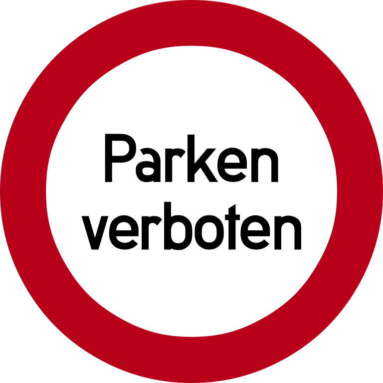
It took the Europeans a while to figure this out, too, but eventually, they did. Case in point: Here is a recreation of a “no parking” road sign in Germany, circa 1929:

(Wikimedia Commons)

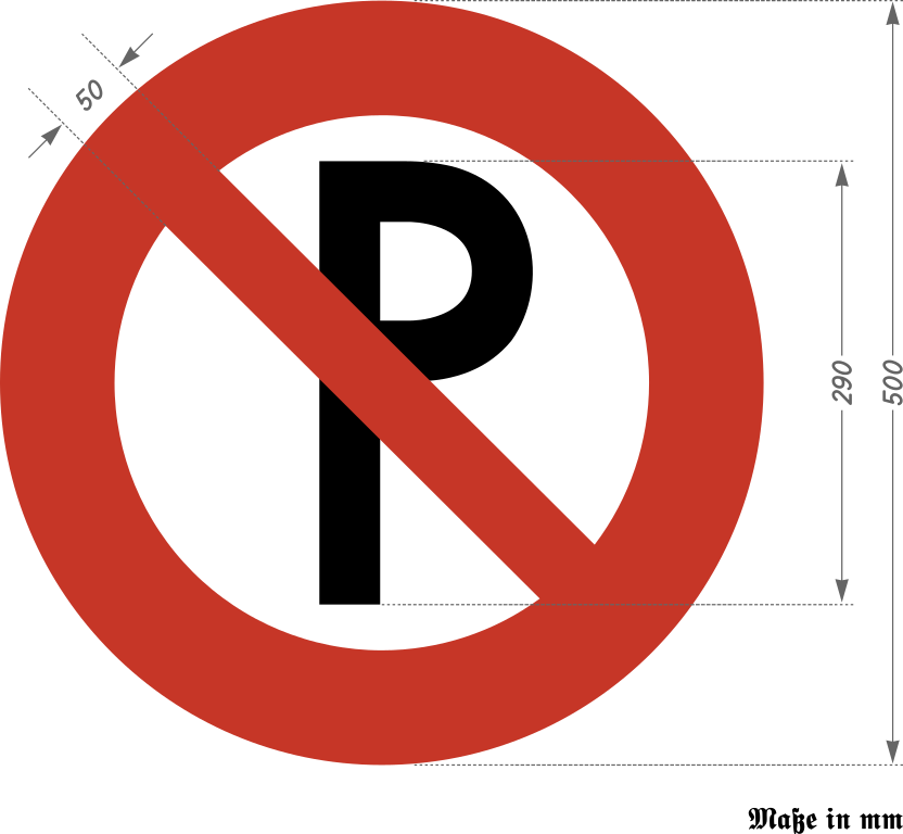
And here is an updated version of said sign, circa 1937:

(Wikimedia Commons)

Hey, that’s the symbol we’re looking for! So, something must have happened in the meantime, right?

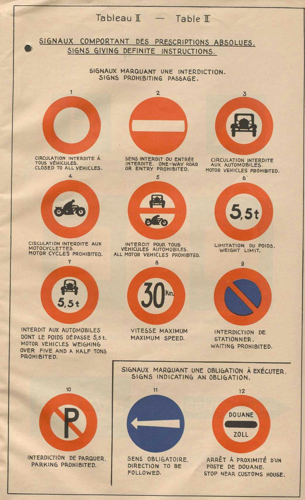
Yes, that would be correct, and that something took place in March 1931, when the League of Nations, attempting to manage the sudden explosion in road traffic, convened a Convention Concerning the Unification of Road Signs in Geneva, Switzerland. The meeting worked from a piecemeal selection of informative symbols that created consistency across borders. The modus operandi of the event, from its proceedings:

A system of road signalling should protect the motorist against danger and prevent him from infringing the traffic regulations. Motorists were familiar with the triangle as a danger sign and the circle as an informative sign. It would be advisable, therefore, to adopt these shapes, together with a very simple code of symbols.

The circle’s precedent, while not standardized, was nonetheless enough of a starting point that it eventually won the day. The issue was debated heavily by a subcommittee at the event in charge of “waiting prohibited” and “parking prohibited” signs. Nobody was happy with existing proposals. Eventually, in a compromise that turned out to be a new solution entirely, both signs ended up with a diagonal red stroke.

(United Nations Geneva)

This symbol became the “interdiction” symbol, after a French word for prohibition. But it was not the only term the symbol has fallen under since then, with a few others including the “universal no,” the “general prohibition sign,” and the “circle-slash.”

Starting in the 1930s and through World War II, this symbol-driven approach found firm footing throughout Europe, but in North America, it was a tougher sale. Many key symbols finally made their way over starting in the early 1970s, as officials figured out that maybe our signs shouldn’t just be giant words that people who don’t speak English won’t understand.

Once they did, it became such a dominant symbol that just over a decade after its American debut, it became a key part of the brand identity of one of our most popular and enduring movies.

About that movie, though …

1984

The year that the International Standards Organization included the general prohibition sign in its ISO 3864 safety standards, officially taking the signage away from the roads and into more general use. Notably, this is also the year a certain blockbuster made the symbol even more pervasive in American popular culture.

(Willian Justen de Vasconcellos/Unsplash)

The Ghostbusters slash is not up to ISO specs

So, here’s something you definitely haven’t considered regarding the immensely popular film series Ghostbusters, which is about to see the fifth installment in its 40-year history premiere later this month: Despite its significant role in popularizing the circle-slash in popular culture, that circle-slash setup is actually not up to spec.

See, there are two important things that circle-slashes tend to do that the original Ghostbusters logo does not do:

  • The slash goes left to right in most cases, rather than right to left

  • The slash is supposed to go 45 degrees on the dot

There are some smaller things, admittedly: The line should be a bit thinner, and should be thinner still in the slash area than the circle itself. (There has traditionally been back and forth on whether the interdicted object should expand outside the boundaries, but I will leave that debate to sign-designing subcommittees.)

Ultimately, I will concede that people looking at this logo are not thinking to themselves, “wow, what a horrible logo, I will never think of Dan Aykroyd the same way again.”

Note how the angle of the slash on the Ghostbusters: Frozen Empire movie poster is slightly higher than in the logo on the vehicle. Maybe the ISO got to them?

The interesting thing is that whoever is designing the Ghostbusters logo in the modern day appears to have realized the design was off far enough to distract pedants, because later versions of the logo shifted the angle of the logo ever so slightly. While it’s not exactly 45 degrees on the dot, it’s closer than it once was. If I saw a Ghostbusters logo on a street sign, I would not force the vehicle to stop in horror in response to its overly thick lines.

A small amount of credit to the graphic designers of the world, who know that this pervasive logo design has slowly been driving us crazy since the Reagan administration.

1990

The year the “no smoking” symbol, perhaps one of the most prominent uses of the circle-slash, became a permanent fixture on all U.S. domestic flights. The symbol, a variant of the original designed by the graphic design association AIGA and the U.S. Department of Transportation in 1974, has done a lot to reinforce our view of circles and slashes as signifiers that things aren’t allowed.

What strikes me as fascinatingly difficult about this topic from a research standpoint is that the shaky nomenclature around it makes it hard to uncover its exact roots. It is one of the world’s most common symbols, used in all sorts of settings, and somehow it doesn’t have a consistent name. Which means, all too often, you’re stuck describing it based on its visual characteristics, rather than where it came from.

(Gus Raballo/Unsplash)

It is a great example of how visual language shows the flaws in how we look for information online. After all, here is this symbol, used basically everywhere, in varied contexts far beyond its primary use in road signage, and people endlessly struggle to describe it.

This circle-meets-slash combo raises a question: At what point do things become impossible to find online—not because they’re too rare or uncommon, but because they’re too ubiquitous? Where their present-day use cases drown out all examples of the past hiding around somewhere?

Even with all the technical innovations we’ve seen, the internet still surprises us with what it makes hard to find.

--

For this piece, I want to thank a couple of folks who responded when I made the call for this on Bluesky and Mastodon, including Pavel Samsonov, who kicked off a fascinating thread on this topic on Stack Exchange—one of whom, Claus Colloseus, wrote a killer answer to the question. Additionally, a shout out to Terence Eden, who correctly identified the source of the image right away. All of you gave this piece a kick in the right direction.

Find this one an interesting read? Share it with a pal! And if you need to clean out your old pics, give CleanMyPhone a spin.

Share this post:

follow on Twitter | privacy policy | advertise with us

Copyright © 2015-2024 Tedium, all rights reserved.

Disclosure: From time to time, we may use affiliate links in our content—but only when it makes sense. Promise.

unsubscribe from this list | view email in browser | sent with Email Octopus

Older messages

Save Our Emulators 🎮

Wednesday, March 6, 2024

Nintendo strong-arms an emulator into submission. Here's a version for your browser. Hunting for the end of the long tail • March 06, 2024 Save Our Emulators Nintendo's strong-arming of the

When The Ware Isn’t Firm 🚗

Monday, March 4, 2024

A car review underlines the pitfalls of shipping with early firmware. Here's a version for your browser. Hunting for the end of the long tail • March 04, 2024 When The Ware Isn't Firm A viral

Luster Lost 📰

Saturday, March 2, 2024

Why physical objects decay, but digital objects won't. Here's a version for your browser. Hunting for the end of the long tail • March 02, 2024 Hey all, Ernie here with a refreshed piece from

Missing The Human Touch 👎

Thursday, February 29, 2024

Are tech and creativity breaking up thanks to AI? Here's a version for your browser. Hunting for the end of the long tail • February 29, 2024 Missing The Human Touch Tech and creativity once had a

When Stewards Go Astray 💔

Wednesday, February 28, 2024

WordPress' owner may be at risk of threatening the platform's trust. Here's a version for your browser. Hunting for the end of the long tail • February 28, 2024 When Stewards Go Astray A

You Might Also Like

Android Weekly #650 🤖

Sunday, November 24, 2024

View in web browser 650 November 24th, 2024 Articles & Tutorials Sponsored Why your mobile releases are a black box “What's the status of the release?” Who knows. Uncover the unseen challenges

PHP 8.4 is released, Dynamic Mailer Configuration, and more! - №540

Sunday, November 24, 2024

Your Laravel week in review ͏ ͏ ͏ ͏ ͏ ͏ ͏ ͏ ͏ ͏ ͏ ͏ ͏ ͏ ͏ ͏ ͏ ͏ ͏ ͏ ͏ ͏ ͏ ͏ ͏ ͏ ͏ ͏ ͏ ͏ ͏ ͏ ͏ ͏ ͏ ͏ ͏ ͏ ͏ ͏ ͏ ͏ ͏ ͏ ͏ ͏ ͏ ͏ ͏ ͏ ͏ ͏ ͏ ͏ ͏ ͏ ͏ ͏ ͏ ͏ ͏ ͏ ͏ ͏ ͏ ͏ ͏ ͏ ͏ ͏ ͏ ͏ ͏ ͏ ͏ ͏ ͏ ͏ ͏ ͏ ͏ ͏ ͏ ͏ ͏ ͏ ͏

Lumoz RaaS Introduces Layer 2 Solution on Move Ecosystem

Sunday, November 24, 2024

Top Tech Content sent at Noon! How the world collects web data Read this email in your browser How are you, @newsletterest1? 🪐 What's happening in tech today, November 24, 2024? The HackerNoon

😼 The hottest new AI engineer

Sunday, November 24, 2024

Plus, an uncheatable tech screen app Product Hunt Sunday, Nov 24 The Roundup This newsletter was brought to you by Countly Happy Sunday! Welcome back to another edition of The Roundup, folks. We've

Transformers are Eating Quantum

Sunday, November 24, 2024

DeepMind's AlphaQubit addresses one of the main challenges in quantum computing. ͏ ͏ ͏ ͏ ͏ ͏ ͏ ͏ ͏ ͏ ͏ ͏ ͏ ͏ ͏ ͏ ͏ ͏ ͏ ͏ ͏ ͏ ͏ ͏ ͏ ͏ ͏ ͏ ͏ ͏ ͏ ͏ ͏ ͏ ͏ ͏ ͏ ͏ ͏ ͏ ͏ ͏ ͏ ͏ ͏ ͏ ͏ ͏ ͏ ͏ ͏ ͏ ͏ ͏ ͏ ͏ ͏ ͏

Retro Recomendo: Gift Ideas

Sunday, November 24, 2024

Recomendo - issue #438 ͏ ͏ ͏ ͏ ͏ ͏ ͏ ͏ ͏ ͏ ͏ ͏ ͏ ͏ ͏ ͏ ͏ ͏ ͏ ͏ ͏ ͏ ͏ ͏ ͏ ͏ ͏ ͏ ͏ ͏ ͏ ͏ ͏ ͏ ͏ ͏ ͏ ͏ ͏ ͏ ͏ ͏ ͏ ͏ ͏ ͏ ͏ ͏ ͏ ͏ ͏ ͏ ͏ ͏ ͏ ͏ ͏ ͏ ͏ ͏ ͏ ͏ ͏ ͏ ͏ ͏ ͏ ͏ ͏ ͏ ͏ ͏ ͏ ͏ ͏ ͏ ͏ ͏ ͏ ͏ ͏ ͏ ͏ ͏ ͏ ͏ ͏ ͏ ͏

Kotlin Weekly #434

Sunday, November 24, 2024

ISSUE #434 24th of November 2024 Hi Kotliners! Next week is the last one to send a paper proposal for the KotlinConf. We hope to see you there next year. Announcements State of Kotlin Scripting 2024

Weekend Reading — More time to write

Sunday, November 24, 2024

More Time to Write A fully functional clock that ticks backwards, giving you more time to write. Tech Stuff Martijn Faassen (FWIW I don't know how to use any debugger other than console.log) People

🕹️ Retro Consoles Worth Collecting While You Still Can — Is Last Year's Flagship Phone Worth Your Money?

Saturday, November 23, 2024

Also: Best Outdoor Smart Plugs, and More! How-To Geek Logo November 23, 2024 Did You Know After the "flair" that servers wore—buttons and other adornments—was made the butt of a joke in the

JSK Daily for Nov 23, 2024

Saturday, November 23, 2024

JSK Daily for Nov 23, 2024 View this email in your browser A community curated daily e-mail of JavaScript news React E-Commerce App for Digital Products: Part 4 (Creating the Home Page) This component