Tedium - Hooked On Clarendon 💡

The very common font that kicked off a redesign.

Hunting for the end of the long tail • October 05, 2024

Hooked On Clarendon

I saw a font recently, and it inspired me to kick off work on a full redesign. The funny part: It’s the most common font, ever.

So, I’m not sure if you’ve done the math—I certainly have—but Tedium is closing in on its tenth anniversary. It hits in about three months, at the beginning of January.

And naturally, I’m seeing this as an excuse to do a redesign. I didn’t think I was doing one a month ago, but one day in the middle of last month, I spotted something that caught my eye.

It was a font. It wasn’t just any font. It was the font. A typographic classic. Art in angles. A rare example of a traditional serif I like, in part because of its versatility and the fact that it also shares numerous aspects with slab-serif fonts. And one you’ve likely seen if you’ve gone to a state park at some point.

A portrait of Robert Besley, typographic icon turned London ambassador. (artuk.org)

Clarendon. It’s one of the most famous typefaces in the world, developed by Robert Besley, the rare example of a typographer who went into politics. Later in his life, he was the Lord Mayor of London, a ceremonial role akin to an ambassadorship. (Why don’t more cities have ambassadors?)

But he’s ultimately known for what he did for a day job. In the 1840s, working at a type foundry at a time when “foundry” meant literal wooden blocks, Besley built the typeface that became Clarendon. It’s not the first font, but it’s definitely one of the first that helped us on the road to typographic style.

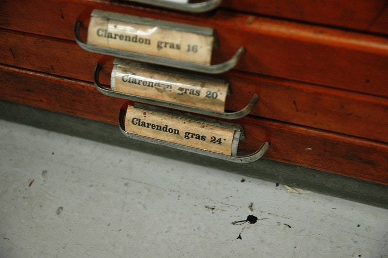
Presumably these drawers are filled with metal type. (Stephen John Byrde/Flickr)

Besley was so early to the medium of design that he literally owned one of the first copyrights for a work of design, under the U.K.’s Ornamental Designs Act of 1842, which was one of the first copyright laws of its kind, and one that set up some of the first examples of things we take for granted today—like an expiration date for owning a design. It allowed copyrights on designs for their visual flair rather than their function—which seems like a good sign that Clarendon is a work of art.

The patent didn’t last long—people kept ripping off his font! But it nonetheless makes it a fascinating specimen of ownership.

The font, known for its large, flat edges, but soft, clean angles, has survived into the modern day in part because it scratches a lot of itches. It is the rare font that looks amazing in feature layouts and in body copy. And given the literal number of words on this website, body copy matters a lot.

I saw it used by a nonprofit, and my mind suddenly began racing with the possibilities for what this site could be next. And that’s honestly the kind of feeling I want to have, because it means that I’m excited about what I’m doing. It is hard, sometimes, to feel super-excited about something you’ve been doing for so long. Burnout is real. But I have worked hard to not let myself fall victim to it. I think the mixture of disciplines is a big reason I haven’t.

If I get sick of writing, I just do a redesign—and that’s enough to rekindle the spark.

Clarendon started as wood type, moved over to metal, and made the jump to digital. It’s sold by a variety of foundries. (Jessica Feiss-Hill/Flickr)

Anyway, back to Clarendon. Now, despite the fact that the wooden typeform has long been in the public domain, this is not necessarily true of faces you’ll see online. One look at MyFonts shows that, just as with Times, Clarendon has been commercialized by large typography houses that started with metal type and went digital. They add little variation to the original, but make it valuable (and copyrightable) by building a million variants.

In other words, just because they’re selling a copyrighted Clarendon doesn’t mean the concept of Clarendon is copyrighted. Their version is. But the nice thing about this is that it means that there are many direct riffs on the original. In fact, one openly licensed Clarendon-style font is readily available: Indestructible Type’s Besley, a typeface on Google Fonts that I ultimately will be going with.

Offered under an open-source license, it is actually built from the ground up for digital formats like mine. And it has a killer italic font.

Speaking more broadly, the concept for the redesign is simple: One font, used well, with elements that celebrate the fact that the archive is massive, arguably one-of-a-kind. A little less absurdism with the visuals, which I think my prior typography choices have contributed to. This time, literally every piece of type on Tedium’s redesigned site is going to be Clarendon, specifically the Besley modernization of it.

I also want to get away from so many rounded rectangles, while bringing in flavors from earlier Tedium site layouts.

(The email is a different beast and one I likely will handle with pretty basic typography updates. Fact is, email templates are hard to get right, and I have two that work.)

A sample of the grid and the typeface in the new design I’m working on. Under construction, though I’m sharing my work on my Mastodon profile.

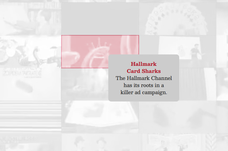
But it’s not just going to be typography. I’m still working out the design details, but my plan is to build a header that celebrates our weird little feat. The idea I came up with was this. I have literally hundreds of GIFs that I have gathered from sources obscure and mainstream, which together make up a grayscale aesthetic that is unlike anything else on the internet. Pretty much all those images are exactly the same size: 650px by 270px. That makes them very griddable, so I have been experimenting with putting them in an interactive grid. (It will likely be a desktop only feature, unless someone has figured out a way to make smartphones show hover functionality.)

I have been obsessing over this grid concept the past few days. And honestly, when I first got the interactive elements working, where the data from the data file pulled into the website, I was just in awe. I had never seen all this work in aggregate in this way before. (It’s not even all of it!) It blew my mind.

This was the reminder I needed about this thing I’ve been building for the past ten years—I started on it only a few weeks after I shut down ShortFormBlog a decade ago this month—is special.

It’s not the individual articles. It’s the scope. It doesn’t quite have the history of Clarendon, but it’s getting there.

Tyopgraphy-Free Links

We’ve spent too much time talking about a CMS project that just makes people mad this week. Let’s point out the awesomeness of the fact that Eleventy, the excellent static site generator, just hit its 3.0 mark. Zach Leatherman, the guy who runs it, is a class act.

Asheville is a wonderful city, and it breaks my heart to see what’s happened to it of late. Lazy Game Reviews, the well-known retro technology YouTuber, was a victim of the horrible flooding and damage from Hurricane Helene. He’s fine, even if his house or collection may not be, but he thinks you should support others in much worse shape.

There was once a time when Apple could have gone completely modular, in the form of a device called the Jonathan, a prototype that was built around an array of standard-sized boxes on a set grid. (If you know your history, you might know the TI-99/4A tried something similar.) At 512 Pixels, Stephen Hackett reveals a letter sent during its late-’80s development defending the project before Apple went another direction entirely.

--

Find this one an interesting read? Share it with a pal! And help us keep our work paywall-free by giving us a nudge on Ko-Fi.

Back at it in a day or two.

Share this post:

follow on Twitter | privacy policy | advertise with us

Copyright © 2015-2024 Tedium, all rights reserved.

Disclosure: From time to time, we may use affiliate links in our content—but only when it makes sense. Promise.

unsubscribe from this list | view email in browser | sent with Email Octopus

Older messages

When Benevolence Fades 😾

Thursday, October 3, 2024

The WordPress saga could hurt FOSS as a whole. Here's a version for your browser. Hunting for the end of the long tail • October 03, 2024 When Benevolence Fades The WordPress situation devolves

Entering The Fray 👎

Sunday, September 29, 2024

The risks critics face when becoming artists themselves. Here's a version for your browser. Hunting for the end of the long tail • September 29, 2024 Today in Tedium: If you're someone who

The Paywall’s Final Frontier 🔒

Saturday, September 28, 2024

Could CNN's planned paywall be a harbinger for free online news? Here's a version for your browser. Hunting for the end of the long tail • September 28, 2024 The Paywall's Final Frontier

Content Fighting Systems 🔥

Thursday, September 26, 2024

WordPress' founder pulls out the nuclear option. Here's a version for your browser. Hunting for the end of the long tail • September 25, 2024 Content Fighting Systems The co-founder of

Party In The Rear 📺

Monday, September 23, 2024

How the rear projection television got flattened. Here's a version for your browser. Hunting for the end of the long tail • September 22, 2024 Today in Tedium: These days, it's common to see a

You Might Also Like

⚙️ Special Edition: Eric Xing and the Age of AI Empowerment

Saturday, October 5, 2024

We met up with Dr. Eric Xing to talk about the realities of AI. ‌ ‌ ‌ ‌ ‌ ‌ ‌ ‌ ‌ ‌ ‌ ‌ ‌ ‌ ‌ ‌ ‌ ‌ ‌ ‌ ‌ ‌ ‌ ‌ ‌ ‌ ‌ ‌ ‌ ‌ ‌ ‌ ‌ ‌ ‌ ‌ ‌ ‌ ‌ ‌ ‌ ‌ ‌ ‌ ‌ ‌ ‌ ‌ ‌ ‌ ‌ ‌ ‌ ‌ ‌ ‌ ‌ ‌ ‌ ‌ ‌ ‌ ‌ ‌ ‌ ‌ ‌ ‌ ‌

🐍 New Python tutorials on Real Python

Saturday, October 5, 2024

Hey there, There's always something going on over at Real Python as far as Python tutorials go. Here's what you may have missed this past week: Python 3.13: Cool New Features for You to Try In

Largest-Ever DDoS Attack Just Occurred—3.8 Tbps in Just 65 Seconds!

Saturday, October 5, 2024

THN Daily Updates Newsletter cover Mastering Spring Boot 3.0 ($31.99 Value) FREE for a Limited Time A comprehensive guide to building scalable and efficient backend systems with Java and Spring

Re: No more spam!

Saturday, October 5, 2024

If you are tired of getting spam texts and phone calls, I have a new discovery that you need to read about. It's a service called Incogni, and I'd recommend it to any iPhone Life reader

📧 Implementing the Outbox Pattern

Saturday, October 5, 2024

​ Implementing the Outbox Pattern Read on: m​y website / Read time: 8 minutes The .NET Weekly is brought to you by: Visually Building API-Driven Applications with Postman Flows ​ Explore how Postman

JSK Daily for Oct 4, 2024

Friday, October 4, 2024

JSK Daily for Oct 4, 2024 View this email in your browser A community curated daily e-mail of JavaScript news Understanding CommonJS vs. ES Modules in JavaScript JavaScript has undergone significant

🕹️ 10 Tips for When PSN Isn't Working — Should You Buy Office 2024?

Friday, October 4, 2024

Also: What to Know About eSims, and More! How-To Geek Logo October 4, 2024 Did You Know It's true, in space no one can hear you scream; sound travels via the vibration of atoms (such as the atoms

iOS Dev Weekly - Issue 681

Friday, October 4, 2024

Back to our regular scheduled programming this week! ⌚ View on the Web Archives ISSUE 681 October 4th 2024 Comment Last week's downtime on Curated set me thinking about this newsletter and about

SWLW #619: A Startup Founder to Scaleup CEO’s Journey, "Owner Mode" beats "Founder Mode", and more.

Friday, October 4, 2024

Weekly articles & videos about people, culture and leadership: everything you need to design the org that makes the product. A weekly newsletter by Oren Ellenbogen with the best content I found