Why Housing Watchers Should Learn Python Programming
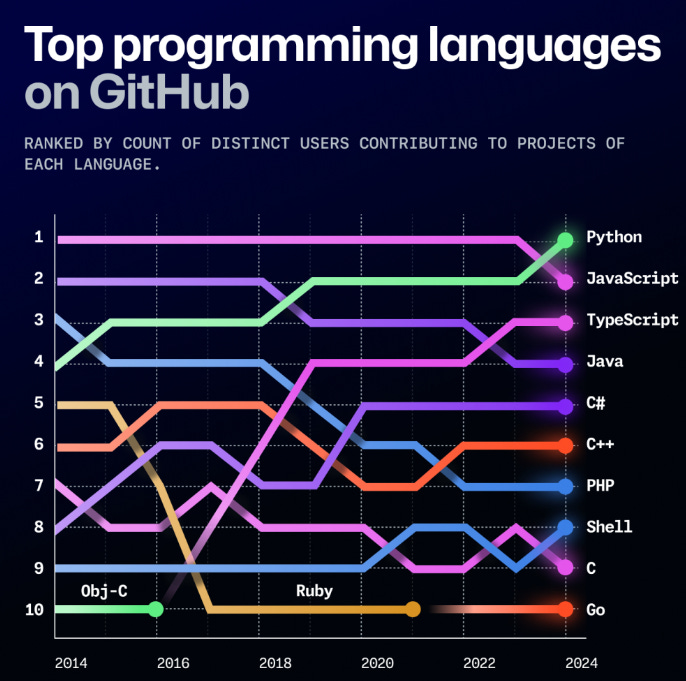
Welcome back to Home Economics, a newsletter about the American housing market. Below my brief comments, today’s guest post is by Martin Wong of Autonomous Econ. What tools do you use to analyze data? After being an Excel jockey for most of my career, I've switched over to using Python—a coding language—over the last year. Almost all of the analysis you see here at Home Economics is now powered by Python. I can't tell you how much learning to code (with a big helping hand from ChatGPT) has changed my view—about the kind of work I can do, and even about the future of work itself. Today guest post—by Martin Wong, the author of Autonomous Econ—should be helpful for anyone who, like me, wants to find insights from large data sets but comes from a non-technical background. I hope you find his gentle introduction to Python here helpful. Martin Wong: Why Python?I had zero interest in computer programming growing up and leaned more toward Economics and Political Science during my high school and university years. If you had told me at graduation that I would one day work as a Data Science Consultant in a tech firm and use Python programming daily, I would have been completely confused. But I’m glad that’s how my career turned out. Python is a free, open-source, general-purpose programming language designed with an emphasis on code readability. Its potential is immense for everyday data and business analysts—including those working in the housing market—not just computer scientists. Python is the language of AI and Machine Learning, and it has taken the top spot this year among programming languages.
Source: GitHub—the leading public repository for open-source code. In my first job as a macroeconomic forecaster, I encountered numerous roadblocks with traditional paid software like EViews, MATLAB, and tools such as Excel. I couldn’t create a map chart or automate many of my data extraction and analysis tasks. Python can handle all of this and much more¹. You can use it to:
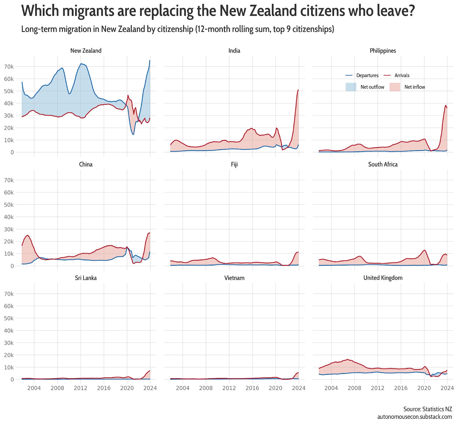
The great thing is, you can learn Python 10x faster today than I did five years ago, thanks to tools like Claude and ChatGPT. These AI assistants act as personalized coding tutors, providing templates for anything you want to accomplish. Having Python knowledge means gaining a future-proof skill that frees you from reliance on paid third-party tools for tasks like those mentioned above. Data visualization is a fantastic starting point for learning Python in an engaging way because it allows you to work with datasets that interest you. Along the way, you’ll learn many core concepts, including data wrangling, functions, conditional statements, and loops. In this post, I will demonstrate four ways to enhance your data visualizations using only Python. Small multiples Small multiples are an excellent way to manage the dreaded spaghetti plot—those plots where you have too many lines and can’t make out a clear trend. This plot is essentially a matrix of smaller, individual plots, making it easier to see the patterns across categories. Python makes creating these plots straightforward. You can design a single template plot and then map or loop your data over it to generate the same plot for different categories. Below is an example I created to visualize the net inflows and outflows of permanent and long-term migrants in New Zealand.
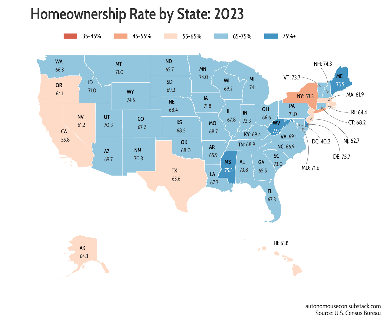
Link to source code. Using small multiples, I can easily see trends for each citizenship and determine whether net inflows or outflows are driven more by departures or arrivals. This approach also makes it easier to compare absolute levels across citizenships, which would be more difficult with a visualization like a stacked area plot. The possibilities for chart design are endless, including customizations for colors, fonts, and styles. However, if you’re feeling lazy, there are also libraries that generate beautiful plots right out of the box². Maps Plotting data onto maps has always been challenging, but it is worth learning because maps are universally engaging. Fortunately, Python offers libraries that handle geospatial data easily, eliminating the need for expensive GIS software. For example, you can quickly build choropleth maps using libraries like Plotly. Here is a map I created to visualize home ownership data, which I extracted from FRED (using Python!) for all states.
Link to source code. I had the flexibility to make simple enhancements that made the map more intuitive. For instance, I added annotations to display values directly on the map, so users don’t have to constantly jump back to the legend. Additionally, having a binned legend with an appropriate color palette conveys the message that low home ownership is subjectively bad (in red). If you’re interested, I wrote a deep dive on building geo maps with Python here. Animation plots Dynamic storytelling plots have become increasingly popular with the shift away from print media. There are excellent examples from @Alvin Chang at Big Charts. Python offers libraries that enable the creation of transitions and animations, either within a single plot or between multiple plots. You can even display text dynamically, helping to tell a story and highlight important events. I was able to create this basic animation plot in a couple of hours from the home ownership data. It could be polished further by using smoother animations for the lines and adding text annotations to tell a story.
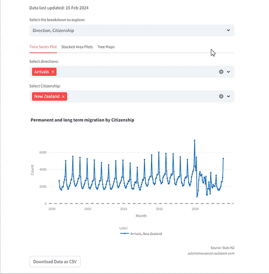
Link to source code. Animation plots are certainly novel, and Python allows you to make them without having to learn web development or Java. Interactive dashboards Interactive dashboards are another data visualization tool that you can build with Python without needing web development skills. They are best used as a data exploration tool rather than for publication, as they place the burden on the reader to extract insights. When you have a large and interesting dataset, it allows you and highly engaged users, such as business stakeholders or journalists, to dive deeper into the data. You can easily host the dashboard on the web and share the URL with anyone, like my dashboard on migration flows in New Zealand.
Built with Streamlit: link to dashboard. How you can start your Python journey As you can see, Python is very versatile as a tool for data visualization. If you’re interested in starting your journey with Python, I would recommend this tutorial from Kaggle to learn the fundamentals interactively. Beyond that, I suggest using ChatGPT and a Google Colab notebook (for running code) to learn in a personalized way tailored to what you want to achieve. The Python Graph Gallery is a great resource if you need inspiration for data visualization projects. Of course, I also regularly share basic tutorials for charts (like the ones above) and other Python hacks for everyday data analysts on my Substack. Martin is a data science consultant. Over at Autonomous Econ, he helps analysts with little training in data science harness the power of Python in their work. 1 The exception is R but Python is generally better at connecting with a wide variety of tools and systems due to its extensive libraries for tasks like web scraping, automation, and API integration. 2 Both Seaborn and Plotly offer useful templates for creating polished designs right out of the box. Plotly also provides the added benefit of generating interactive plots by default
Home Economics is a reader-supported publication. Please consider upgrading to a paid subscription to support our work. Paying clients receive access to the full archive, forecasts, data sets, and exclusive in-depth analysis. This edition is free—you can forward it to colleagues who appreciate concise, data-driven housing analysis.
|

Older messages
Five Innovations that Could Upend the Housing Market
Wednesday, November 20, 2024
Don't overlook technology's role in shaping housing demand–and supply. Here are five technologies that will make a difference. ͏ ͏ ͏ ͏ ͏ ͏ ͏ ͏ ͏ ͏ ͏ ͏ ͏ ͏ ͏ ͏ ͏ ͏ ͏ ͏ ͏ ͏ ͏ ͏ ͏ ͏ ͏ ͏ ͏ ͏ ͏ ͏ ͏
Happy News
Tuesday, November 5, 2024
Paternity leave and guest authors ͏ ͏ ͏ ͏ ͏ ͏ ͏ ͏ ͏ ͏ ͏ ͏ ͏ ͏ ͏ ͏ ͏ ͏ ͏ ͏ ͏ ͏ ͏ ͏ ͏ ͏ ͏ ͏ ͏ ͏ ͏ ͏ ͏ ͏ ͏ ͏ ͏ ͏ ͏ ͏ ͏ ͏ ͏ ͏ ͏ ͏ ͏ ͏ ͏ ͏ ͏ ͏ ͏ ͏ ͏ ͏ ͏ ͏ ͏ ͏ ͏ ͏ ͏ ͏ ͏ ͏ ͏ ͏ ͏ ͏ ͏ ͏ ͏ ͏ ͏ ͏ ͏ ͏ ͏ ͏ ͏ ͏ ͏ ͏
The Week in Review
Sunday, October 20, 2024
Week of Oct 7 — Buyers brighten, inflation eases ͏ ͏ ͏ ͏ ͏ ͏ ͏ ͏ ͏ ͏ ͏ ͏ ͏ ͏ ͏ ͏ ͏ ͏ ͏ ͏ ͏ ͏ ͏ ͏ ͏ ͏ ͏ ͏ ͏ ͏ ͏ ͏ ͏ ͏ ͏ ͏ ͏ ͏ ͏ ͏ ͏ ͏ ͏ ͏ ͏ ͏ ͏ ͏ ͏ ͏ ͏ ͏ ͏ ͏ ͏ ͏ ͏ ͏ ͏ ͏ ͏ ͏ ͏ ͏ ͏ ͏ ͏ ͏ ͏ ͏ ͏ ͏ ͏ ͏ ͏ ͏
The Week in Review
Saturday, October 5, 2024
Week of Sept 30th — Payrolls pop ͏ ͏ ͏ ͏ ͏ ͏ ͏ ͏ ͏ ͏ ͏ ͏ ͏ ͏ ͏ ͏ ͏ ͏ ͏ ͏ ͏ ͏ ͏ ͏ ͏ ͏ ͏ ͏ ͏ ͏ ͏ ͏ ͏ ͏ ͏ ͏ ͏ ͏ ͏ ͏ ͏ ͏ ͏ ͏ ͏ ͏ ͏ ͏ ͏ ͏ ͏ ͏ ͏ ͏ ͏ ͏ ͏ ͏ ͏ ͏ ͏ ͏ ͏ ͏ ͏ ͏ ͏ ͏ ͏ ͏ ͏ ͏ ͏ ͏ ͏ ͏ ͏ ͏ ͏ ͏ ͏ ͏ ͏ ͏
The Week in Review
Sunday, September 15, 2024
Week of Sept 9 — Housing sentiment sags, Prices plod ͏ ͏ ͏ ͏ ͏ ͏ ͏ ͏ ͏ ͏ ͏ ͏ ͏ ͏ ͏ ͏ ͏ ͏ ͏ ͏ ͏ ͏ ͏ ͏ ͏ ͏ ͏ ͏ ͏ ͏ ͏ ͏ ͏ ͏ ͏ ͏ ͏ ͏ ͏ ͏ ͏ ͏ ͏ ͏ ͏ ͏ ͏ ͏ ͏ ͏ ͏ ͏ ͏ ͏ ͏ ͏ ͏ ͏ ͏ ͏ ͏ ͏ ͏ ͏ ͏ ͏ ͏ ͏ ͏ ͏ ͏ ͏ ͏ ͏
You Might Also Like
Weekend: Introducing the Butt Mullet Dress 👀
Sunday, March 9, 2025
— Check out what we Skimm'd for you today March 9, 2025 Subscribe Read in browser Header Image But first: Join the waitlist for a new premium Skimm experience Update location or View forecast
Starting Thursday: Rediscover Inspiration Through Wordsworth
Sunday, March 9, 2025
Last chance to register for our next literary seminar starting March 13. March Literary Seminar: Timothy Donnelly on William Wordsworth Rediscover one of the most influential poets of all time with
5 little treats for these strange and uncertain times
Sunday, March 9, 2025
Little treat culture? In this economy?
RI#266 - Down the rabbit hole/ What is "feels-like" temp/ Realtime voice tutor
Sunday, March 9, 2025
Hello again! My name is Alex and every week I share with you the 5 most useful links for self-improvement and productivity that I have found on the web. ---------------------------------------- You are
Chaos Theory: How Trump is Destroying the Economy
Sunday, March 9, 2025
Trump's erratic, chaotic governing style is dragging down the economy ͏ ͏ ͏ ͏ ͏ ͏ ͏ ͏ ͏ ͏ ͏ ͏ ͏ ͏ ͏ ͏ ͏ ͏ ͏ ͏ ͏ ͏ ͏ ͏ ͏ ͏ ͏ ͏ ͏ ͏ ͏ ͏ ͏ ͏ ͏ ͏ ͏ ͏ ͏ ͏ ͏ ͏ ͏ ͏ ͏ ͏ ͏ ͏ ͏ ͏ ͏ ͏ ͏ ͏ ͏ ͏ ͏ ͏ ͏ ͏ ͏ ͏ ͏ ͏
Chicken Shed Chronicles.
Sunday, March 9, 2025
Inspiration For You. ͏ ͏ ͏ ͏ ͏ ͏ ͏ ͏ ͏ ͏ ͏ ͏ ͏ ͏ ͏ ͏ ͏ ͏ ͏ ͏ ͏ ͏ ͏ ͏ ͏ ͏ ͏ ͏ ͏ ͏ ͏ ͏ ͏ ͏ ͏ ͏ ͏ ͏ ͏ ͏ ͏ ͏ ͏ ͏ ͏ ͏ ͏ ͏ ͏ ͏ ͏ ͏ ͏ ͏ ͏ ͏ ͏ ͏ ͏ ͏ ͏ ͏ ͏ ͏ ͏ ͏ ͏ ͏ ͏ ͏ ͏ ͏ ͏ ͏ ͏ ͏ ͏ ͏ ͏ ͏ ͏ ͏ ͏ ͏ ͏ ͏ ͏ ͏ ͏ ͏
“Hymn of Nature” by Felicia Dorothea Hemans
Sunday, March 9, 2025
O! Blest art thou whose steps may rove ͏ ͏ ͏ ͏ ͏ ͏ ͏ ͏ ͏ ͏ ͏ ͏ ͏ ͏ ͏ ͏ ͏ ͏ ͏ ͏ ͏ ͏ ͏ ͏ ͏ ͏ ͏ ͏ ͏ ͏ ͏ ͏ ͏ ͏ ͏ ͏ ͏ ͏ ͏ ͏ ͏
Claim Your Special Men's Health Offer Today!
Sunday, March 9, 2025
Subscribe to Men's Health today! Men's Health logo Get stronger, smarter, better 1 year of print mag + digital mag access Men's Health Magazine is the essential read for active, successful,
The 2025 Color Trends You *Should* Be Wearing Right Now
Sunday, March 9, 2025
They pack a playful punch. The Zoe Report Daily The Zoe Report 3.8.2025 The 2025 Color Trends You *Should* Be Wearing Right Now (Trends) The 2025 Color Trends You *Should* Be Wearing Right Now They
6 Most Common Tax Myths, Debunked
Saturday, March 8, 2025
How to Finally Stick With a Fitness Habit. Avoid costly mistakes in the days and weeks leading up to April 15. Not displaying correctly? View this newsletter online. TODAY'S FEATURED STORY Six of