You are reading Creativerly, the weekly digest about creativity and productivity-boosting tools and resources, combined with useful insight, articles, and learnings from the fields of design and tech. The newsletter built for the creative community.
Hey and welcome to issue #78 👋
I am back from my holidays, recharged, freshly motivated, new ideas, and ready to bring you another issue of Creativerly packed with creativity and productivity-boosting tools and resources. Taking some time off is always great if you are feeling a somehow creative block, or just looking for new ideas, new approaches to tackle your next project. What are your tactics to clear your mind when you feel stuck? Do you just go for a walk or listen to some music? Let me know!
As you might already know from previous issues of Creativerly, I like to introduce you to other newsletters I came across and like to read. During my holidays I got in contact with Falak Sher who is writing the Indie Letters newsletter. Indie Letters is a highly curated list of marketing knowledge, tools & learning resources sent out twice a week to improve your marketing diet. So if you are a curious marketer, want to sharp your marketing, or just want to dive into marketing, make sure to check out Indie Letters.
If you have recommendations or feedback, drop me an email or a tweet. For now, enjoy the newsletter! 🥰
Apps, Software, Tools
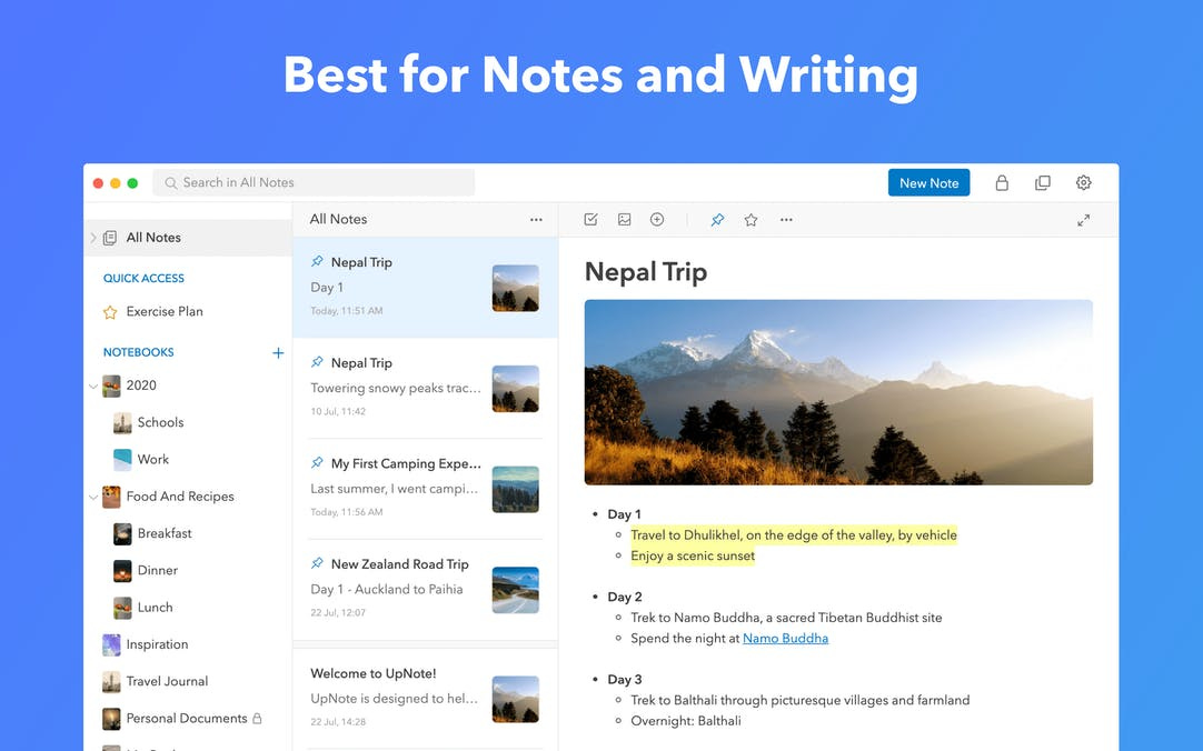 |
Upnote →
Upnote came to my eye because it is one of the few gorgeous looking note-taking apps which is already available cross-platform for MacOS, iOS, and Windows (with Android development already under way). Upnote features a clean UI which I love since note-taking and writing should be distraction-free. That is one of the reasons why my current go-to note-taking tool is Workflowy. But since Upnote looks really promising, with a nice feature-set, cross-platform, I am going to test it out over the next couple of weeks, and I have to say I am excited for it.
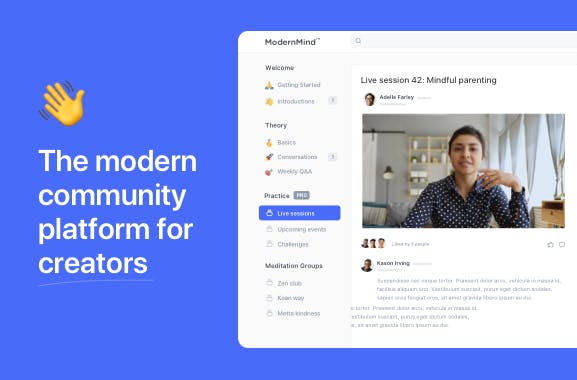 |
Circle →
I followed the Circle journey for quite some time and I am really excited about their official launch. Circle is a modern community platform which brings together all your memberships, discussions, and content. If you are running a bigger Facebook-Group you should definitely consider moving it to Circle. It is private, secure, thoughtful designed, with a great UX, and top-notch features. I am pretty sure we will see a lot of Facebook-Groups making the switch in the near future.
 |
Walling 2.0 →
Walling got already shared in Creativerly couple of months ago. But now they just released version 2.0. When I first introduced Creativerly's subscribers to Walling I liked their approach of capturing ideas, notes, todos, etc. and turn them into visualized collaborative walls. This was kind of fresh air in the productivity tool space (Milanote kind of has a similiar approach for capturing ideas and notes). It is not my kind of workflow to visualize my ideas and notes, but Walling looks, without a doubt, gorgeous. I know many creative people who like to structure their projects in a more visualized way, so Walling might be worth trying out.
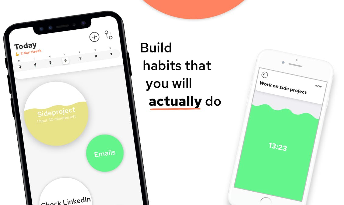 |
Today →
Working across multiple side-projects can be hard because you might loose your focus. To stick to your projects and start making progress habits might do the trick for you. But, building up habits might also be hard. Today is a neat app (available for both, iOS and Android) which helps you to build up habits from your to-dos, so you are able to keep pushing your side-projects further. Everyone is working at their own pace, but having a tracking tool like Today to set up habits which actually help you make progress with your projects, is a great idea in my opinion. You do not have to hustle, you can achieve a lot by just doing a little every single day.
Goods & Gadgets
 |
Xiaomi Mi 10 Ultra →
In my opinion we reached the Smartphone-Peak. Apple, Samsung, and Huawei are delivering top-notch and top-priced smartphones year after year. But, we shouldn’t underestimate other manufactures such as OnePlus or Xiaomi. Xiaomi might not be a name familiar to everyone, but they are also building impressive tech. The Mi 10 Ultra comes with a 108-megapixel camera, 48-megapixel periscopic telephoto camera, 48-megapixel main camera, 20-megapixel ultra-wide camera, and 12-megapixel portrait camera. With the first, you get hybrid zoom up to 50 times as well as 8K capture mode. What’s more, the second camera boasts an optical zoom of 10x, a hybrid zoom of 120x, and 8K video capture. Furthermore, the 20MP lens has a 128º field of view. That is one hell of impressive.
 |
DriveSlide →
The DriveSlide is a gadget I never knew I would need until I stumbled across their kickstarter campaing. It is a two-piece, sliding and locking laptop attachment, which holds your hard drives and hubs. Every now and then I work with my laptop, sitting on a couch, in my bed, or on a very small table in a café. Since I use an external hard drive most of the time, it is somehow annoying to always place it somewhere next to me, on my lap, or directly on my laptop, which makes typing just a mess. So I am pretty excited about DriveSlide which gives me the possibility to lock my hard drive onto my laptop I do not have to worry about it anymore. “DriveSlide is made up of two pieces: the Lock and the Key. The Lock stays adhered to the back of your laptop while the Key lives on your accessory. For a quick and easy hold, simply slide the Key into the Lock. By rotating the Key, you’ll securely lock your accessory into place.” Love this!
Useful Resource
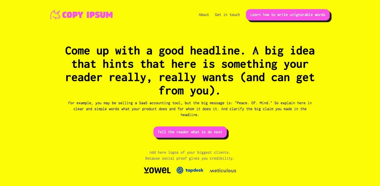 |
Copy Ipsum →
Writing really good copy to attract potential clients or customers on your landing page or website is hard. I always find myself in an endless revision loop when I decide to update the copy on my websites. Miguel Ferreira put together a neat copywriting/landing page template. It is super easy to understand and well-structured. Big plus: If you are a webflow user you can simply clone this template!
Mental Wealth
➢ Weighing the Risk: Be Open to the Outcome, Not Attached to It – “One of the truest markers of adulthood is that you can come up with a plan and stick to it. It’s a sign that you’re thinking ahead, that you have a good sense of what you need to do to get where you want to go. The problem for many of us is we become so obsessed with the plan that we fear any derailments and distractions that might happen along the way. It’s a problem because those unknowns are where we, as creatives, tend to gain the most value. My business partner and I learned this firsthand in 2013 when we set out to travel the country on a two-month speaking tour of the U.S. At the time, we had just completed graduate school and we had mutually decided that GFDA, then our midnight-oil-consuming passion project, deserved to be more than just a fling. With butterflies in our stomachs, we upgraded our commitment level to promise ring.”
➢ How to simplify your design – “Companies are in constant pursuit of building simple and usable products. More features, new technologies, and advanced capabilities but still in a lightweight and simple to use format. More often than not, making it simple is the hardest thing there can be. We can define simple - as something that is easily understood or done; presenting no difficulty. Simplicity is a subjective, things that appear simple for one person will not be perceived identically by another.”
➢ Come for the Network, Pay for the Tool – “The uneasy Web 2.0 truce between social networks, legacy media, and brands is falling apart. Once it was held together by ad tech. But advertising spends keep going up, brand content is at peak saturation, and audiences are slowly but surely evacuating the big social media companies. Can the three forces — social media, content, and commerce — find a new way relate to each other? Here enters the question of community. As high quality content and effective brand strategy move down the long tail, “community” has become an important concept for every post-Web 2.0 player. Crypto token holders, influencer fanbases, DTC brand customers, creator audiences, and new social networks are all often referred to as communities, and each has a stake in developing community for itself.”
➢ How To Read More — A Guide – “I am one of those annoying people that reads a lot of books. In 2018, I set out to read 52 books (a book for every week) and I ended up reading 58 in total. I then challenged myself to double it in 2019 to 100 books, I finished 101 that year. We’re just over halfway through 2020 and I’ve read 46 books (or so, as my Goodreads tells me). Here’s my advice: don’t have a reading goal, it’s actually quite distracting and you end read things just for the sake of it. Instead, read what interests you greatly. I’ve stopped counting how many books I have read and it turns I’m unknowingly reading more instead. It would be fair to point out that I spent half of last year and the start of this year travelling so I had time, and also that I am a voracious reader. I will forgo watching the latest TV show and socialising online for a good book. I carry whatever I am reading with me to most places. You’d be surprised how many pockets of time there are in a day (waiting in line, for a friend, an extra 20 minutes here and there) to read a book instead of scroll a screen.”
Typeface of the Week
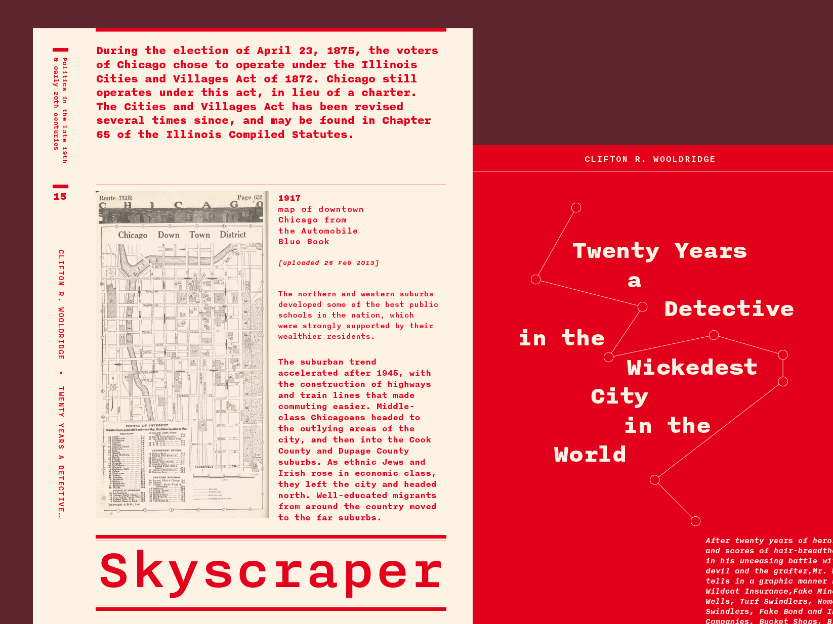 |
Nitti is a monospaced typeface designed by Pieter van Rosmalen between 2008–2012 and published through Dutch foundry Bold Monday. The design was influenced by the original grotesques of the nineteenth century. Nitti is available in five weights with matching italics.
Twitter thoughts
Till next time! 👋
Support: You have a friend who is looking for inspiration, news about design, and useful tools and apps? Forward this newsletter to a friend or simply share this issue and show some support. You can also show some love by simply clicking the button down below and keep this newsletter a sustainable side-project by buying me a coffee. ☕️ 🥰


