You are reading Creativerly, the weekly digest about creativity and productivity-boosting tools and resources, combined with useful insights, articles, and learnings from the fields of design and tech. The newsletter built for the creative community.
Hey and welcome to issue #96 👋
For those of you who might have missed it, back on Thursday, December 16th I finally introduced a new content segment to Creativerly, that I have planned for quite some time: interviews. And to kick it off, I got the chance to interview a person I admire for the work she is doing, for quite some time, Noemi Stauffer from Fresh Fonts. In case you have missed the interview, you can read it right here.
Let me know how you liked the interview. I already got two more interviews in the pipeline, and on top of that, the list of people I want to interview is quite long. Also, if you have any suggestions for possible interview partners, just drop me an email and let me know.
Since 2020 comes to an end (finally), I am currently preparing my last issue of 2020 which will be sent out on December 27th and will feature some of my favorite tools, resources, and articles from the past year. I am very much looking forward to a new year, with new possibilities and opportunities. I got quite a lot planned for Creativerly, with my number one priority to move to Ghost and turn Creativerly into a full-fledged publication (I am nearly there, just some email issues I need to solve but then I am ready to move). Also, I am very much looking forward to starting a new year with all of you! Thank you for your ongoing support, I deeply appreciate it.
If you have recommendations or feedback, drop me an email or a tweet. For now, enjoy the newsletter! 🥰
Apps, Software, Tools
Brainio →
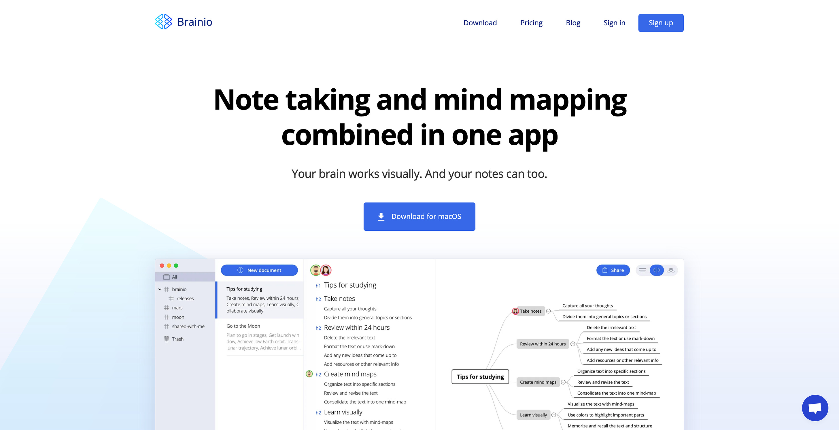
Do you like to set up mindmaps when working on different projects? But also want to take some notes while setting up those mindmaps? All in one tool? Brainio might worth a try for you. Brainio is a super interesting note-taking tool, that combines markdown note-taking with visual mindmaps. Markdown is a great way for note-taking apps to focus on the core of what matters: your writing. It lets you format text super quickly, without ever touching your mouse, it is simple and delivers a clean structure. Mind mapping has been a popular and powerful technique aimed at improving learning capability. During my studies, we used Mind maps quite frequently to outline our projects while working across teams. While I definitely see the benefit of using mind maps during project outlines, it is not a technique I use very often anymore. Anyway, it is super interesting to see how a digital tool executes this functionality. Our brain does not think linearly or sequentially like a computer, it thinks multilaterally, and it also works visually. That is one big reason, why outliner apps such as Worfklowy, Roam, or Dynalist are so incredibly popular for quick note-taking use cases. Since our brain also works visually, mind maps enable your brain to make great leaps of understanding and imagination through association. Brainio is also ready for collaboration since you can share documents with other people and collaborate in real-time. Brainio is available for Mac and Windows, they have a free plan which seems great for choice for both individuals and collaborative purposes. Mindmaps allow you to see the big picture but also focus on detail when you need it. So, maybe give Brainio a try to see if it works for you.
Stack Browser →
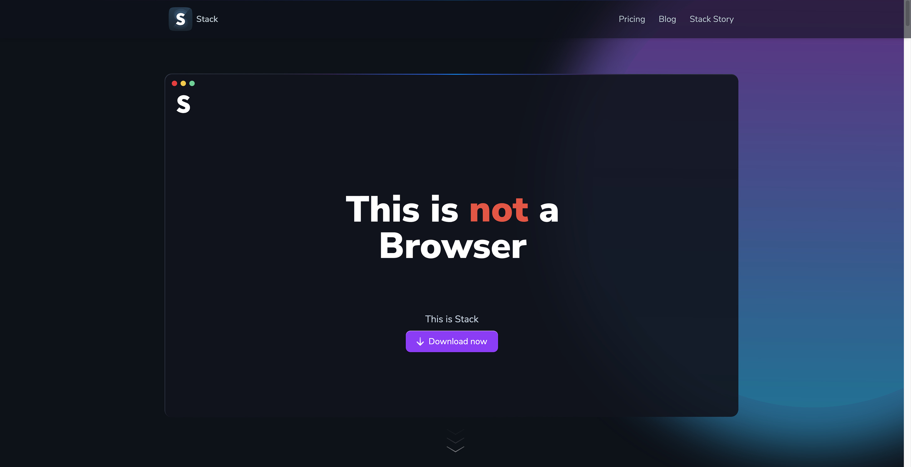
I recently wrote about Sidekick browser, which focuses on a new approach to working on the web. Stack seems to be an even more exciting browser, well they say it is not a browser. Just like Sidekick, Stack turns your tabs into apps. But, and here comes the biggest difference not only to Sidekick, but to all major browsers, Stack uses cards for all your websites and web apps. Those cards are aligned side-by-side, and all those cards are structured and managed within stacks and with all your stacks you create a space that feels like 3d operating system. That is a super creative approach in my opinion since I think if you are working across a lot of tabs such an approach of using cards side-by-side could be a real productivity boost. But it does not stop there. Stack also features a shortcut to quickly move across all your cards, stacks, and spaces, just hit CMD + L and you will get a neat interface, you probably already know from other tools like Notion or Superhuman. Another great feature, Stack lets you open multiple accounts side-by-side, so you can open as many accounts of the same application as you need. On top of that, Stack respects your privacy, by blocking ads and trackers. Stack is not a browser, neither it’s just a computer program, but it’s an idea, the idea to make our new virtual home pleasant and human. I am definitely going to give Stack a try because I find the idea extremely interesting, and I would like to see how it fits within my workflow.
Lingo App →
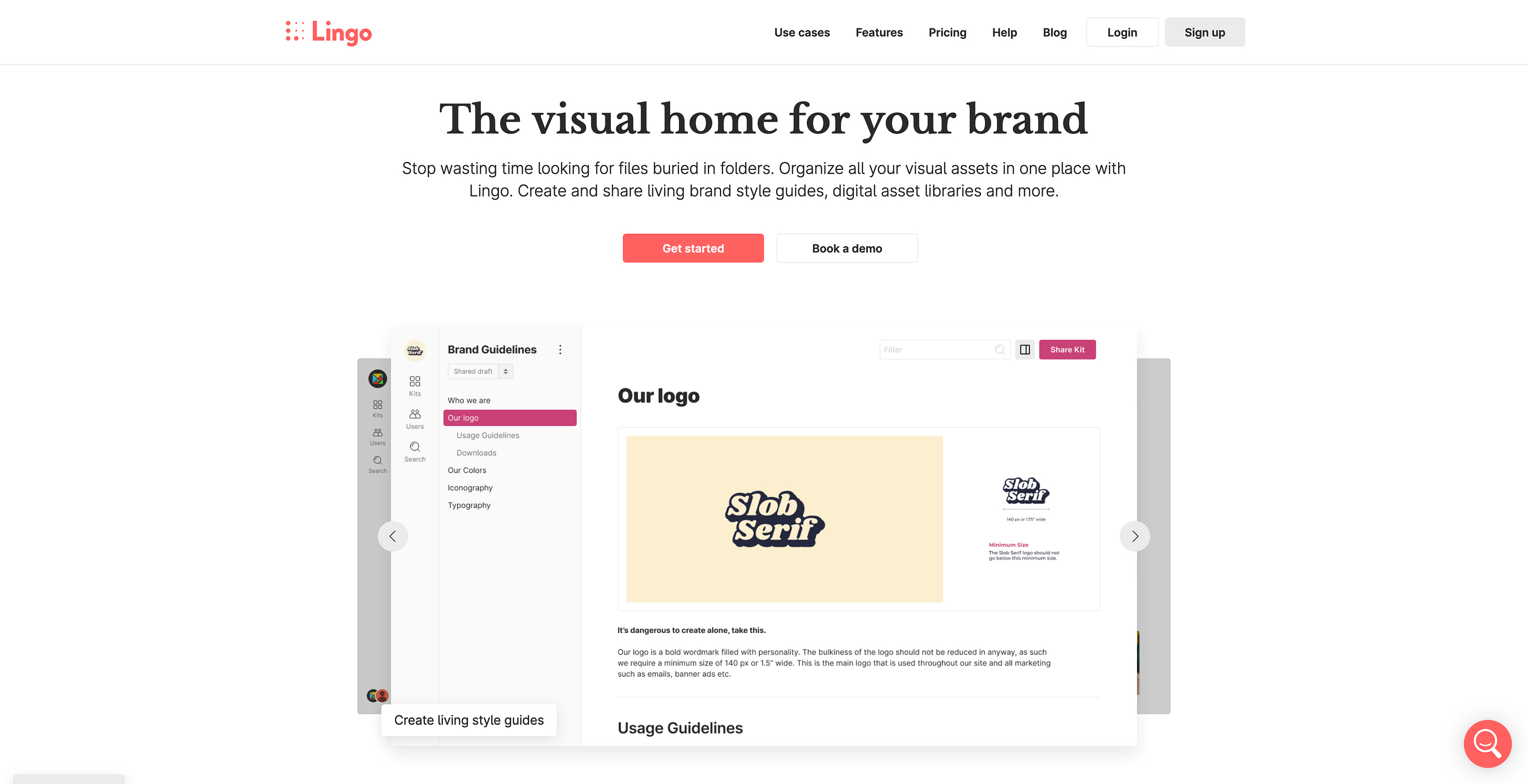
Lingo creates a visual home for your brand. When your company grows, also the number of files and visual assets keeps on increasing. Important files can quickly get buried in folders. With Lingo those times are over. Lingo creates a neat place and dashboard for all your visual assets. A huge plus of Lingo, it lets you easily share brand style guides, digital asset libraries, and more. Use Lingo‘s flexible canvas to build different types of asset libraries, all and everything in one single tool. This will boost your productivity and ensure that your team will bring all of your visual assets together and keep brand consistency. No matter if you want to share your assets with only your team or clients, companies, the whole world, since you can keep your visual assets private, public, or password protected. If you are looking for a tool to create a brand style guide, a design system manager, or a digital asset library, Lingo could be your number one tool for all of those use cases.
Blocs →
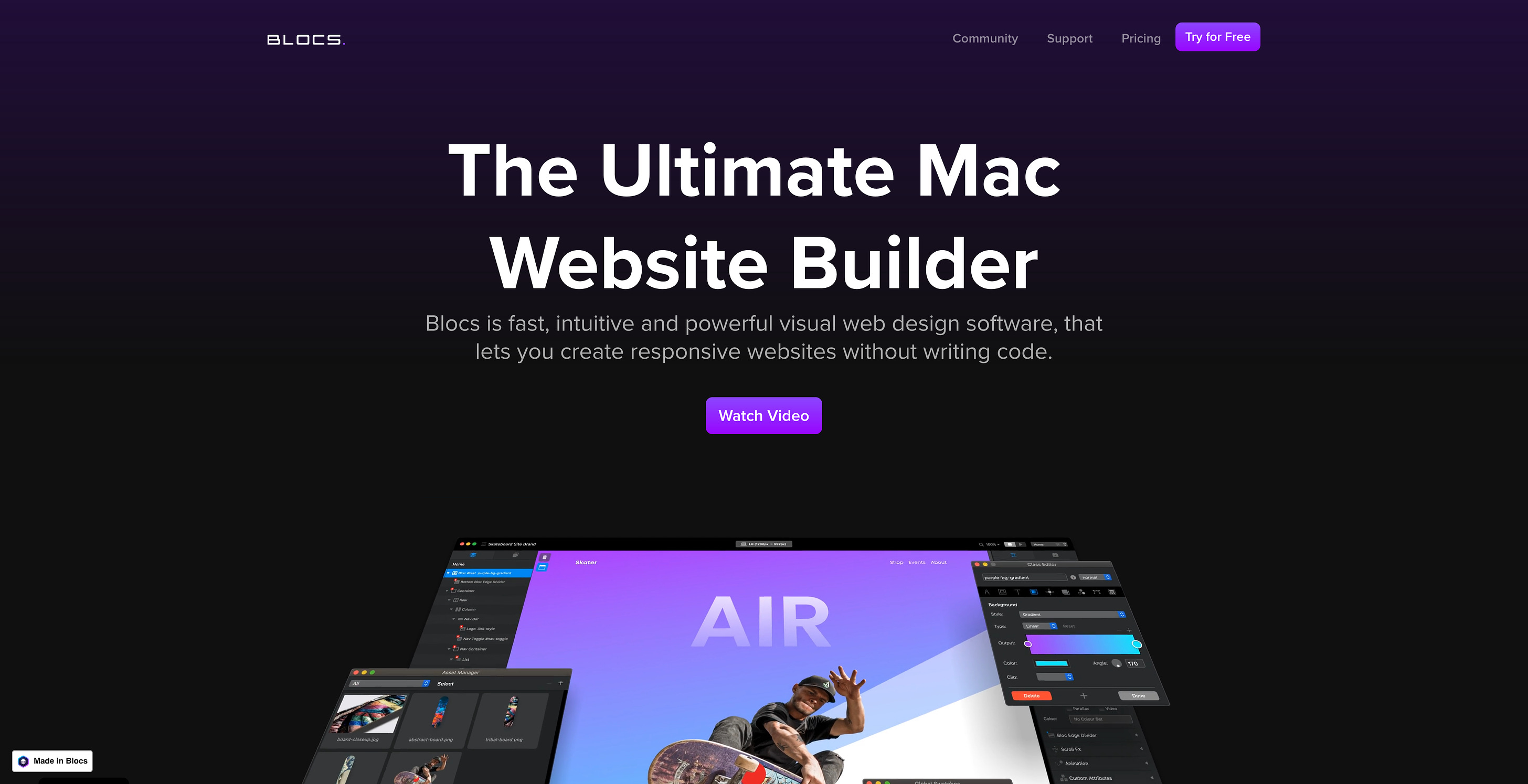
Back in issue 92 of Creativerly, I wrote about Universe (for Mac) a website builder that launched first on iOS and now is also available for Mac. Blocs is another website builder for the Mac. Maybe some of you will ask yourself, why should I use anything else than Webflow as my preferred website builder. Well, although Webflow is an incredible no-code tool, it definitely has a certain learning curve. Website builders just like Blocs are fast, intuitive, and powerful visual web design software, that lets you create responsive websites without writing code. Blocs works on the concept of stacking pre-built sections to create fully coded, responsive web sites. It’s incredibly fast and a very natural way to build. Therefore, Blocs is also way easier to use than any other website builder, since you basically just start building without digging through loads of tutorial videos to get started. I am a big fan of such tools since website builders just like Blocs enable nearly everyone to build websites completely visually. This opens up loads of opportunities, for designers, makers, indie hackers, and solopreneurs. Blocs is intuitive. It lets you a wide range of eye-catching animations and parallax scroll effects to any element with just a few simple clicks. On top of that, you can control and expand the functionality of the websites you build with a range of powerful and easy to integrate user interactions. Definitely give it a try!
Useful Resource
Artify Illustrations →
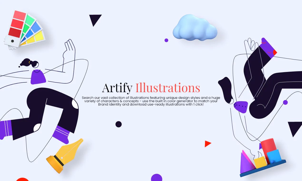
The use of illustrations on product landing pages and websites became incredibly popular. Therefore, quite a lot of creators decided to launch illustration packs which you then can use on your own websites and landing pages. Artify Illustrations are one of the best-looking and well-designed illustrations currently available. Artify illustrations feature 5000+ unique illustrations available for download in high-quality PNG files as well as vector sources, there are over 70 illustration styles from high-quality 3D styles to minimalistic and abstract lines. On their website, you can search their vast collection of illustrations and download use-ready illustrations with 1 click.
Mental Wealth
➢ Your Lifestyle Has Already Been Designed – “Well I’m in the working world again. I’ve found myself a well-paying gig in the engineering industry, and life finally feels like it’s returning to normal after my nine months of traveling. Because I had been living quite a different lifestyle while I was away, this sudden transition to 9-to-5 existence has exposed something about it that I overlooked before. Since the moment I was offered the job, I’ve been markedly more careless with my money. Not stupid, just a little quick to pull out my wallet. As a small example, I’m buying expensive coffees again, even though they aren’t nearly as good as New Zealand’s exceptional flat whites, and I don’t get to savor the experience of drinking them on a sunny café patio. When I was away these purchases were less off-handed, and I enjoyed them more.”
➢ Slack Is the Right Tool for the Wrong Way to Work – “In 2016, I interviewed an entrepreneur named Sean who had co-founded a small technology startup based in London. As with many organizations at that time, Sean and his team relied on e-mail as their primary collaboration tool. “We used to have our Gmail constantly opened,” he said. Then they heard about a slick new instant-messenger service named Slack that promised to streamline office communication: “There was this hype, so we decided to try it.” Once the team switched to the tool, the rate of back-and-forth messaging intensified, eventually reaching a stressful peak when a demanding client insisted on the ability to directly communicate with Sean’s employees using Slack. The team soon burned out, and two engineers quit. In desperation, Sean moved the company off Slack. When I spoke with him, some time had passed since this incident, but the memory of the service’s omnipresent notification ping remained strong. “I hear that sound, it gives me the shivers,” he said.”
➢ Learn like a teacher-scientist, think like a product manager, work like a designer – “Recently, I’ve been saying designers should be thinking more like product managers but continue to solve problems through the work of design. I‘ve extended this to learning, because as designers we seem to be tackling increasingly complex problems. I coined this phrase because there’s something powerful about expressing learning, thinking and working in simple terms — particularly in the context of solving complex and risky problems counterintuitively fuelled by curiosity and learnings from a diverse range of topics.”
➢ Sometimes you have to let the user go – “In design and business, we talk a lot about retention: How we can keep the customers? And preferably as long as possible? I propose a considerably different approach: The best way to keep the customers is to make it easy for them to leave. Don’t cling, let them go. However, there’s more to the story. The difficulty of unsubscribing may indicate other challenges in the organization, its culture, and values. This, in turn, relates to how the organization relates to its customers. Therefore, this is a story about relationships and trust.”
Last Week Quick Bits
Facebook has a 'Hate Bait Dashboard' ranking its most problematic publishers
Europe’s new antitrust rules will annoy, not topple, Big Tech
FTC kicks off sweeping privacy probe of nine major social media firms
Brave Browser now offers a news reader that won't track your every move
Twitter thoughts
Till next time! 👋
Support: You have a friend who is looking for inspiration, news about design, and useful tools and apps? Forward this newsletter to a friend or simply share this issue and show some support. You can also show some love by simply clicking the button down below and keep this newsletter a sustainable side-project by buying me a coffee. ☕️ 🥰
Disclaimer: My posts may contain affiliate links. If you buy something through one of those links you won't pay a penny more, but I'll get a small commission, which supports this blog and also my side-projects. So consider buying something through my links. Thank you!
