Tedium - Big Email Energy 📪

Why some newsletters get cut off, and others don’t.

Hunting for the end of the long tail • December 22, 2020

Today in Tedium: As you may have figured out at this point, there are a handful of things I love—writing long articles, telling bad jokes, and obsessing over random bits of code. This is probably why I run an email newsletter, which is less than two weeks away from hitting its sixth anniversary. But as a newsletter writer who reads other newsletters, I notice things, and one of the things I noticed recently involved Platformer, a tech newsletter by former Verge journalist Casey Newton. Newton’s newsletter had a lot of good stuff in it, but Gmail had a problem with its length, and forced the newsletter to jump only halfway through … something that doesn’t happen very often to this newsletter, which is about as long as Casey’s. What gives? It turns out that is something of a “dark art” of email marketing that isn’t properly described to regular folks, even though it directly affects them and makes their lives a little harder. (And I know there’s interest because I tweeted about why I thought there was a “jump,” and people actually seemed interested.) So let me try to explain why this happens, for normal people. Today’s Tedium talks about the limits of the email newsletter trend. — Ernie @ Tedium

Today’s Tedium has a new sponsor that I’m personally quite excited to share, as I’m a big fan of their product: Explorer Cold Brew. Check ’em out:

Ernie’s new favorite thing: These super-concentrated bottles of coffee from Explorer Cold Brew. These little shots of energy (four caf levels, depending on mood) work well in a cocktail, over milk, or even black. Get a Starter Pack to try—you’ll love it.

Gmail Screen

(Stephen Phillips/Unsplash)

Explaining at a high level why Gmail clips an email’s wings

The great thing about newsletters right now is that, if you don’t want to worry about the technical junk, you don’t have to.

The next Casey Newton, if he or she wants to join Substack, just needs to redirect their audience and write. And because the financial incentives are different, they might be encouraged to hang loose, to write or link freely.

But lost in that equation is that, even as simple and as attractive as that equation is, email has technical limitations that even polished experiences like Substack are bound to run into.

One of those technical limitations is a code-size limit that is mostly associated with Gmail. You know the one I’m talking about. Google will put up a note that says [Message clipped] View entire message ….

The limit, which hits messages of around 102K in size (but has been known to affect even smaller messages in edge cases), can create problems for wordsmiths. Among them:

Fewer readers get to the end: The people you’re trying to reach with your message don’t stick with it because Gmail has given them a natural out. It’s kind of like you’re wasting your time.

Inaccurate metrics: Often, the tools that senders use to track things like open rate are buried at the bottom of the message, not the top. And if the message jumps, it means they may not capture all of their traffic metrics.

Bad customer experience: Also usually at the bottom is the unsubscribe link, which creates a conundrum: If someone is frustrated enough by a newsletter that they want to quit it, they now have to jump through multiple hoops to find the tool for quitting. On top of that, the user, once clicking the jump, may not get put in the spot where they were originally reading.

This is not a new phenomenon—in 2011, the popular email development tool Email on Acid featured a blog post about this issue. It’s a known entity among marketers who focus on email. But with the rising popularity of email as a medium for writers, it’s become particularly common, as email seems like an infinite medium. (It’s not.)

But not all jumps are created equal.

“The latest Android phones tend to have 6GB. A 32 times increase in a decade. Laptops have also leapt forwards in speed and memory. Sadly, no one on the Gmail team has noticed.”

— Blogger Terence Eden, a senior technology policy advisor for the United Kingdom’s Government Digital Service, discussing the 102K limit in Gmail from the perspective of an end user. Eden notes that technology has evolved significantly in recent years, but the hard limit on Gmail messages persists. “Bill Gates probably didn’t say 640KB ought to be enough for anyone—but someone in the bowels of Google sure as hell believes 102KB ought to be enough for any email,” he added.

Message Clipped

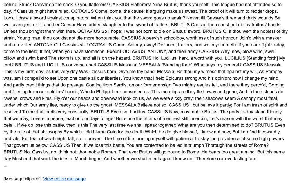
This screenshotted message got 18,630 words past Gmail before it clipped off.

The weird technical reasons one email gets cut off at 1,500 words and another doesn’t

The 102-kilobyte limit, on its own, still doesn’t explain why Casey’s message cut off halfway through, around 1,500 words, when I regularly send messages with more that 3,000 words that don’t hit that mark.

That doesn’t make any sense, right? I’d like to lay out a few technical factors for why that may be.

I’ll try to explain this as plainly as possible, so hopefully non-technical folks can understand it. (Fingers crossed this works.)

Magnetic Poetry

(Steve Johnson/Flickr)

1. You Write Too Much

I’m not going to lie, this is probably the most obvious one for many newsletter authors. But it’s not as cut-and-dry as you might think.

Based on the type of encoding your message uses, there is a theoretical limit to how long your email can be, if it’s just a giant block of text with no links or styling: Between 25,500 and 102,000 characters, with a lean on the latter if you just write stuff in English.

This is based on the fact that many messages in the modern day are encoded using UTF-8 encoding, which allow for a mixture of ASCII text and other Unicode characters. The first 128 characters of Unicode, mostly the original ASCII characters, take up one byte—but ones after that take up as many as four bytes. If your character use leans hard on em dashes, curly quotes, or Cyrillic, you might run into the limit a bit sooner.

With the average word length around 4.79 characters, so you could probably squeeze in 21,294 words into a single email, if you stick to standard Latin characters, and a minimum of 5,323 if you don’t.

I’m a journalist, I confirm things. And there is a play written by Shakespeare that is almost exactly this word count, Julius Caesar. So I did a test of Gmail’s jumping capabilities using this play, which takes up around 20,738 words (or 112,316 characters), and found that it published 18,630 of them before the jump (100,821 characters).

If you wanted, you could send people friggin’ 20,000-word blocks of text twice a week, and odds are good it may not even jump.

But it would have to be plain text. No links. And no curly quotes.

Design elements

(John Jennings/Unsplash)

2. Your Email Has Too Many Design Elements

One of the problems I’ve talked about with email in the past is that its design sensibility is much closer to Microsoft FrontPage than the design tactics that are used in the modern day.

And one of the byproducts of this state of affairs is the fact that emails use tables. Tables are code-heavy and overly complex. And while they often can be easier to figure out for the layperson than the complexities of vertically centering an object in CSS, they’ve essentially been misused all this time.

Additionally, there’s the problem that nearly all major email clients have (or at least did in the past)—a lack of support for CSS classes. That means that any additional visual styling in the newsletter—from links, to text, to objects—has to live inside the body of the newsletter itself, even if it shows up 100 times, like a link might. That’s wasteful, but it’s how email works in 2020.

These design elements add a lot of extra code to your average marketing email.

Links

(Dan Dennis/Unsplash)

3. Your Links Are Too Long

The first two problems are common and expected. But this one was a bit of a surprise when I was analyzing the code of Casey’s email and noticed that nearly all of the links were massive. And Casey uses a lot of them.

These aren’t the links you see in your browser after you click, but the ones in your email itself.

One issue that particularly affects Substack involves the links you use. Given that editorial emails often link like crazy, a lot of links can add a surprising amount of weight to an email, even compared to something like an image.

Here’s a quick explanation as to why: If you treat a link and an image as visual elements, the image is often far bigger. But as raw text, the HTML they take up is roughly the same size—a single HTML tag with a URL and some parameters. (Hyperlinks have closing tags; images don’t, but tend to use alt tags for descriptive text.)

Now, combine this with the fact that many emails use lots of links, those links tend to have a uniform look through CSS, and are often a key vehicle for tracking data such as UTM codes. Each of these elements can add extra weight to your message, despite how easy they are to put in.

But Substack had an additional problem that surfaced only when I stumbled upon Newton’s newsletter and wondered by it jumped so quickly. It wasn’t just that Newton used a ton of styled links; it was that the links themselves were incredibly large, averaging 400 or more characters because of the way that the company obfuscated the links, likely though its email distributor—which, based on the link structure, is Mailgun.

Now, at its root, Mailgun is a service for transactional emails, though it can certainly be used the way Substack is using it. The problem is, when every message is intended to be a transaction, it requires more detail to track, more than might be needed for, say, an editorial newsletter.

This means that every time Casey drops a link into his newsletter, he’s using up nearly half a kilobyte of his 102-kilobyte allocation. (By comparison, my links, which aren’t as obfuscated as Substack’s are, average less than 300 characters.)

This is a potential area of improvement for Substack.

At sign

(Steve Snodgrass/Flickr)

4. Your Readers’ Email Addresses May Be Too Long

This one, directly related to the last one, may sound bizarre, but I tested this theory with my pal Aram Zucker-Scharff, and there may be something to it.

Links in newsletters are often built with tracking in mind, and designed for tying individual users to individual email addresses, with UTM codes attached. One way that an email provider may be identifying you is by email address—but generally in a way that can be obfuscated, or hidden from view, with a goal of preventing fraud.

Zucker-Scharff and I tested a theory on email address length and realized that it’s possible that, thanks to how Substack does its links, the user’s email address might be embedded in every link. While we can’t directly prove it as we don’t have access to Substack’s internal systems, we believe it is because the links vary in size for each recipient’s address. And because of the number of links in a newsletter on average, this means someone with a long name or email address is likely to have longer links than someone with a shorter email address.

And when you’re talking a ceiling of just 102 kilobytes, each link adds up.

If Substack stored this information in a database, the link would be much shorter, but it would likely be less performant because it would require a database for every single URL. So rather than exponentially increase its infrastructure, Substack (or Mailgun) seems to have chosen just embedding the email address directly in the link.

White space

(Joe Woods/Flickr)

5. You Waste Too Much Space

But newsletter authors do have a way to fight back against all the frustrating limitations of HTML code, tables, long links, and the whole bit. And that’s by removing the white space from their emails.

Wait, white space?

Well, here’s the thing. With HTML, even the unused characters add space to the total size of the file—which means that if you are able to take the step to remove it, you can save something like 15 to 20 kilobytes from your 100K newsletter by simply getting rid of the additional space that is added when code is being built but generally isn’t needed when you’re just reading the finished result.

Before I send my messages, I use a tool like this. I could automate it, but I like doing it by hand. And it allows me to make sure that the code doesn’t get too big.

It’s what I do to help ensure my long rants (usually) don’t jump.

So, the question is, is this Casey Newton’s problem … or is it really Gmail’s? And should Gmail adapt?

Clearly, there are reasons why email has not modernized as much as other areas of the internet. For one thing, it carries a lot of legacy because of how it was designed. As I wrote the last time I covered this topic, marketing emails are built for the lowest common denominator, which means they get better very slowly. Email coding standards have only modestly improved in the six years since I got going.

In some ways, this problem is the making of the people who develop popular email clients, who have let the lowest common denominator hit such an embarrassing nadir.

Email clients should be developed more like web browsers, with frequent, transparent updates so that users know what improvements are being made, and efforts to degrade the experience for people with older clients. Web browsers used to be built like email clients are now, and that state of affairs gave us Internet Explorer 6.

To be fair, Google has tried to push email forward with its AMP for Email initiative, but in many ways, it feels like it’s solving the wrong problem. Professional publishers care about interactivity, sure. But more than anything, they don’t want their emails to show up incorrectly, because it affects their business and their livelihood.

Email doesn’t need more interactive stuff. It needs a barebones reset so that everyone is speaking the same language and the process of building an email is more manageable, not a bunch of new features that add onto the mess.

Is an arbitrary 102K limit, one that may possibly be a moving target, something that makes sense in an age when two-thirds of the messages people get in their inbox are straight marketing or editorial emails? I’d argue no.

You can point fingers all day when trying to suggest who might be to blame for this email mess. But it just points out that email may be an imperfect medium for what we use it for today.

The question is, who’s going to fix it?

--

Find this one an interesting read? Share it with a pal! Thanks to Casey Newton’s Platformer for unwittingly inspiring this piece.

And thanks again to my sponsor Explorer Cold Brew, which is really awesome and you should try. (That’s a personal recommendation.)

Share this post:

follow on Twitter | privacy policy | advertise with us

Copyright © 2015-2020 Tedium, all rights reserved.

Disclosure: From time to time, we may use affiliate links in our content—but only when it makes sense. Promise.

unsubscribe from this list | view email in browser | sent with Email Octopus

Older messages

The Gift Of 2020 🎁

Friday, December 18, 2020

A gift guide that doubles as a reminder of what we wrote this year. Here's a version for your browser. Hunting for the end of the long tail • December 18, 2020 Today in Tedium: It's sure been

Digital Decay 🔍

Wednesday, December 16, 2020

Why you shouldn't get your AltaVista history from Digital.com. Here's a version for your browser. Hunting for the end of the long tail • December 15, 2020 Today in Tedium: A quarter-century ago

Canadian Fakin’ 🇨‍🇦

Friday, December 11, 2020

How Canada got so good at generic products. Here's a version for your browser. Hunting for the end of the long tail • December 11, 2020 Hey all, Ernie here with another piece from Andrew Egan, who

All You Need Is Weird 🎵

Thursday, December 10, 2020

The weird inspirations that made The Beatles hugely successful. Here's a version for your browser. Hunting for the end of the long tail • December 08, 2020 Hey all, Ernie here with a refreshed

Hack Back To The Mac 🍎

Friday, December 4, 2020

A Hackintosh enthusiast's perspective on Apple Silicon. Here's a version for your browser. Hunting for the end of the long tail • December 04, 2020 Today in Tedium: I warned I was going to do

You Might Also Like

Software Testing Weekly - Issue 247

Tuesday, November 26, 2024

QA Job Hunting Resources 📚 View on the Web Archives ISSUE 247 November 26th 2024 COMMENT Welcome to the 247th issue! Today, I'd like to highlight a fantastic set of QA Job Hunting Resources.

🔒 The Vault Newsletter: November issue 🔑

Monday, November 25, 2024

Get the latest business security news, updates, and advice from 1Password. ͏ ͏ ͏ ͏ ͏ ͏ ͏ ͏ ͏ ͏ ͏ ͏ ͏ ͏ ͏ ͏ ͏ ͏ ͏ ͏ ͏ ͏ ͏ ͏ ͏ ͏ ͏ ͏ ͏ ͏ ͏ ͏ ͏ ͏ ͏ ͏ ͏ ͏ ͏ ͏ ͏ ͏ ͏ ͏ ͏ ͏ ͏ ͏ ͏ ͏ ͏ ͏ ͏ ͏ ͏ ͏ ͏ ͏ ͏ ͏ ͏ ͏ ͏

🧐 The Most Interesting Phones You Didn't See in 2024 — Making Reddit Faster on Older Devices

Monday, November 25, 2024

Also: Best Black Friday Deals So Far, and More! How-To Geek Logo November 25, 2024 Did You Know If you look closely over John Lennon's shoulder on the iconic cover of The Beatles Abbey Road album,

JSK Daily for Nov 25, 2024

Monday, November 25, 2024

JSK Daily for Nov 25, 2024 View this email in your browser A community curated daily e-mail of JavaScript news JavaScript Certification Black Friday Offer – Up to 54% Off! Certificates.dev, the trusted

Ranked | How Americans Rate Business Figures 📊

Monday, November 25, 2024

This graphic visualizes the results of a YouGov survey that asks Americans for their opinions on various business figures. View Online | Subscribe Presented by: Non-consensus strategies that go where

Spyglass Dispatch: Apple Throws Their Film to the Wolves • The AI Supercomputer Arms Race • Sony's Mobile Game • The EU Hunts Bluesky • Bluesky Hunts User Trust • 'Glicked' Pricked • One Massive iPad

Monday, November 25, 2024

Apple Throws Their Film to the Wolves • The AI Supercomputer Arms Race • Sony's Mobile Game • The EU Hunts Bluesky • Bluesky Hunts User Trust • 'Glicked' Pricked • One Massive iPad The

Daily Coding Problem: Problem #1619 [Hard]

Monday, November 25, 2024

Daily Coding Problem Good morning! Here's your coding interview problem for today. This problem was asked by Google. Given two non-empty binary trees s and t , check whether tree t has exactly the

Unpacking “Craft” in the Software Interface & The Five Pillars of Creative Flow

Monday, November 25, 2024

Systems Over Substance, Anytype's autumn updates, Ghost's progress with its ActivityPub integration, and a lot more in this week's issue of Creativerly. Creativerly Unpacking “Craft” in the

What Investors Want From AI Startups in 2025

Monday, November 25, 2024

Top Tech Content sent at Noon! How the world collects web data Read this email in your browser How are you, @newsletterest1? 🪐 What's happening in tech today, November 25, 2024? The HackerNoon

GCP Newsletter #426

Monday, November 25, 2024

Welcome to issue #426 November 25th, 2024 News LLM Official Blog Vertex AI Announcing Mistral AI's Large-Instruct-2411 on Vertex AI - Google Cloud has announced the availability of Mistral AI's