Hi! Dan here. How do you get unstuck on a project that you've left on the shelf for too long? It's so hard: you pick it up and you want so badly to start working on it again. But you can't quite bring yourself to get started because you don't even know how to begin. That's what today's essay from artist and designer Coleen Baik is all about. She teaches us how to make a "Whats' Next" deck—a collection of slides that can help you reestablish the context for your creative work, and pick up that project you’ve left on the shelf for so long. I hope you enjoy it!
When the pandemic hit NYC last March, I quietly set aside the animation I’d been working on. In fact, I all but stopped making art.
It was almost shocking how fluidly I went from 60 to 0 almost overnight. One day I was fully engaged in a fast and familiar routine. The next, I… just wasn’t. And I didn’t fight it. It felt natural, and yet inverse, somehow—like going back into the womb.
After the 2020 U.S. presidential elections and the rollout of the vaccines, I began to feel myself waking back up. There were small signals, like the tingling of nerves when a sleeping limb becomes sensate again: I found myself thinking about the animated short I had long set aside, wanting to finish it, put it out into the world, begin something else.
After almost a year of unplanned pause, this is the exercise I did to help me get back in the groove. What anchored it was a deck of slides, of all things—something that seems incredibly unpoetic and mundane for something so consequential and momentous.
And yet, I can’t emphasize enough how powerful and effective this work was in getting me re-oriented and back to speed. It helped me kick loose from a rut and jumpstart my next chapter.
I include a link at the end to a template in case you choose to explore something like this, yourself.
I began methodically with questions and provocations, owing perhaps to my decades-long career as a designer. I used Keynote to organize my thoughts, an app with which I explored product stories and created quick and dirty prototypes as a designer at Twitter many years ago. It’s a versatile tool with powerful transitional and bitmap-handling capabilities.
Slides force you to articulate thoughts in sequence, in the context of a narrative. It puts you into the mind-frame of connecting the dots for someone, of telling a story. A deck of slides must be clear, concise, and easy to follow in order to be effective. It’s ideal for communicating complex ideas.
At the same time, slides free you from the onus of up-front organization because they’re so easy to rearrange, reorder, and regroup. You can be pithy in the body while dumping longer thoughts into presenter notes to riff from. You can rely heavily on visuals.
1. Frame it
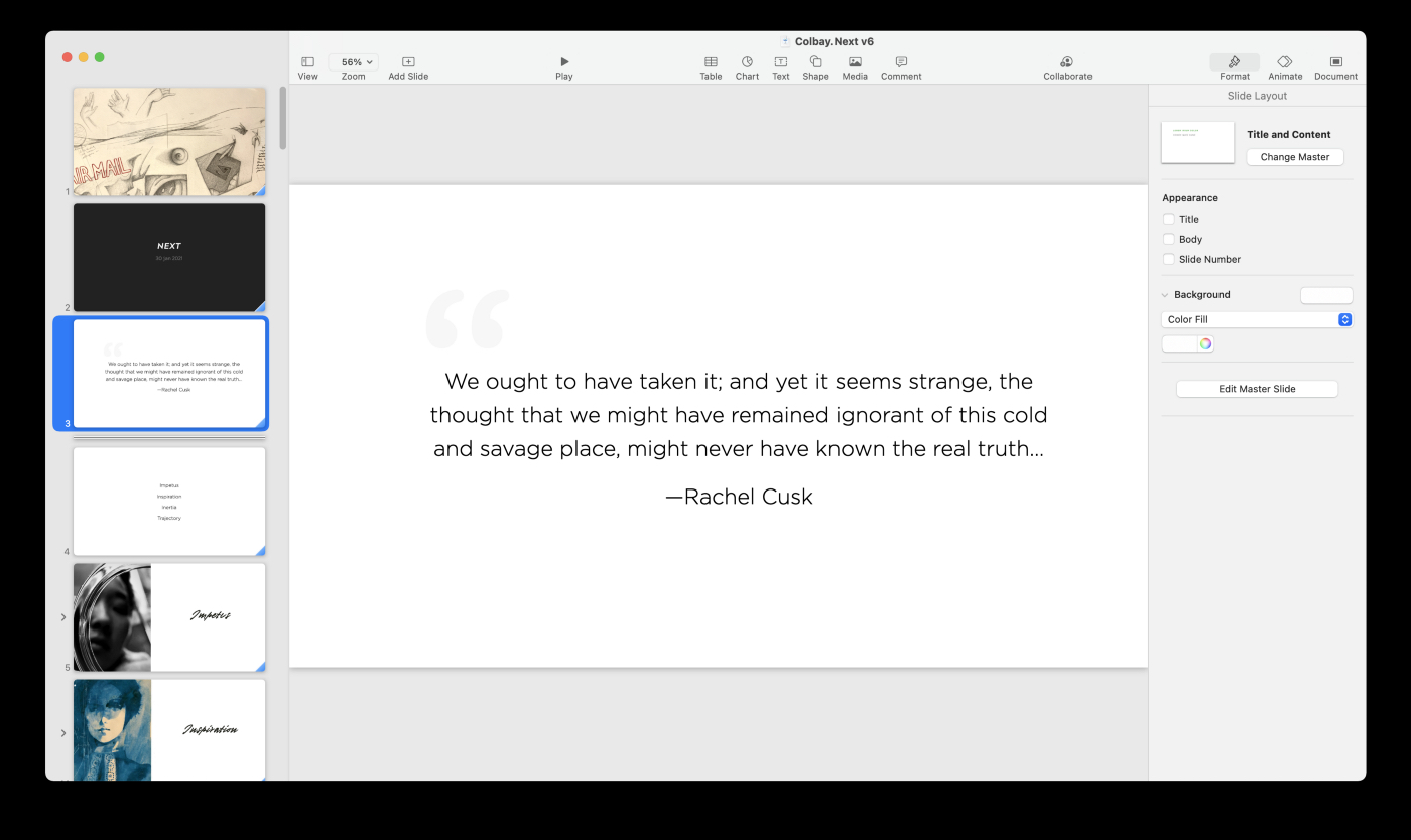
I like starting a deck with a quotation.
It helps set the stage and reminds me why I’m doing the exercise in the first place. Quotations are also great for addressing the ineffable and the emotional side of the “why.”
I ended up using an excerpt from The Last Supper by British writer Rachel Cusk. Given how careful I knew her to be with words, I was struck to find what initially read as a tautology (“real truth”). It led me to meditate on the idea of artistic integrity that felt deeply in accordance with the nature of this exercise.
2. Set an anchor
I wanted to address some big questions. What do I want to do now? How? Why? What does “success” look like?
First, though, I spent some time articulating why I wanted to do this exercise to begin with. That articulation put in place the beginnings of a structure to anchor myself (my point A) and set up expectations around outcome (my point B).
I knew that by the end, in addition to robust exploration of the big questions, what I wanted to end up with was a sort of future press release for myself as well as a synthesis of brainstorms and a loose plan for the year. The deck would serve as both a tactical as well as an aspirational primer. It would address the problem of what I perceived as drift; it would provide a compass and a direction.
3. Explore the map
In order to get a sense of how big the map was, I started out with a bunch of word and list dumps. I laid everything out on the table without regard for elegance or logic. The point was to see everything in one place, making evaluation more tractable.
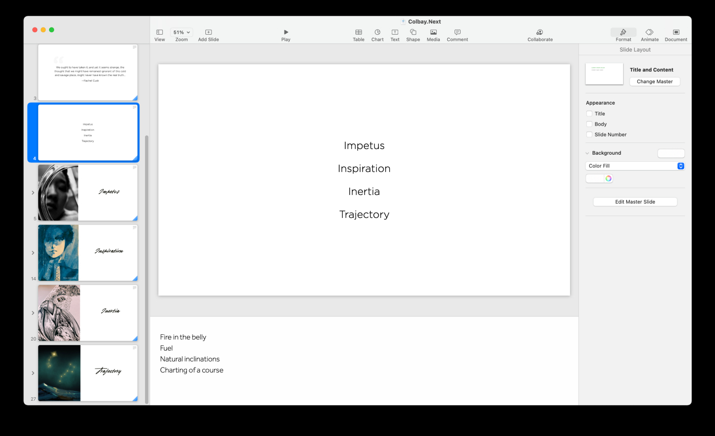
Once I felt I’d gotten everything down (what I want to do, what I don’t want to do, what I already do, risks, challenges, motifs, modalities…), I started grouping them into sections:
Impetus
Reasons I want to tell the stories I want to tell, make the kind of art I want to make
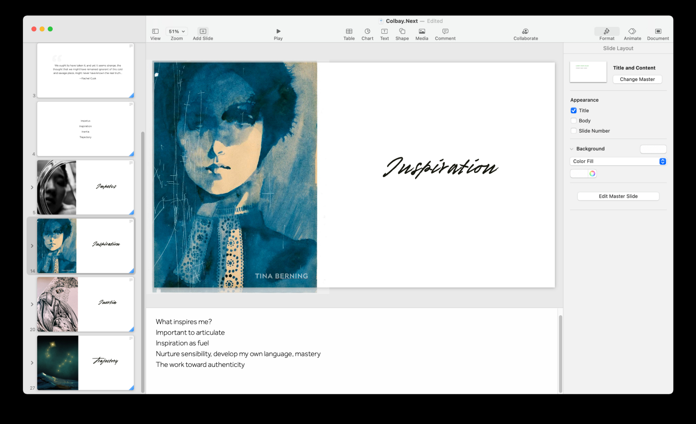
Inspiration
What I find resonant and how it influences my direction
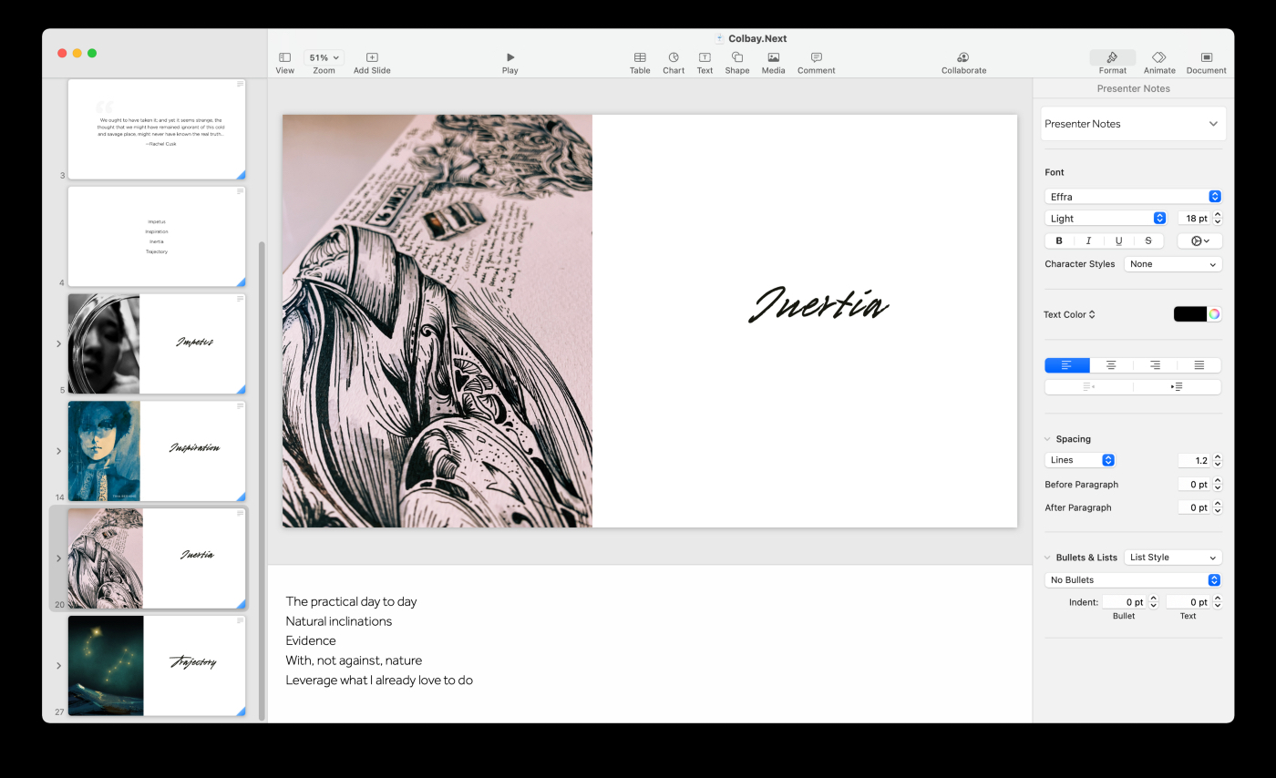
Inertia
What I already tend to do, what I enjoy doing, versus what I think I want to do
Trajectory
A flexible plan of short term executables plus longer-term aspirations
4. Impetus
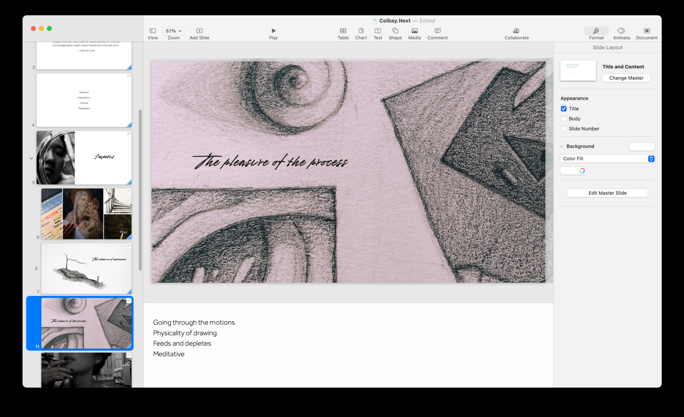
This section was about impetus: the fire in the belly, the “Why.” Why I want to illustrate and animate, why I want to tell stories in this way over, say, being on stage, or by designing houses.
These ended up being about five slides. They speak to how much pleasure I derive from the physical act of drawing, for instance, how rich my experiences have been, how much I want to share them, how ideal I think they are for visualization and synchronization with sound.
It was particularly important for me to speak in as concrete and simple terms as possible here as well as be brutally honest. That made me feel confident about the foundation upon which I’d build the rest of the inquiry.
For better or worse, I focused on the pleasures: of process, resonance, self-centering…
5. Inspiration
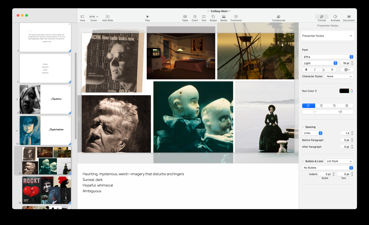
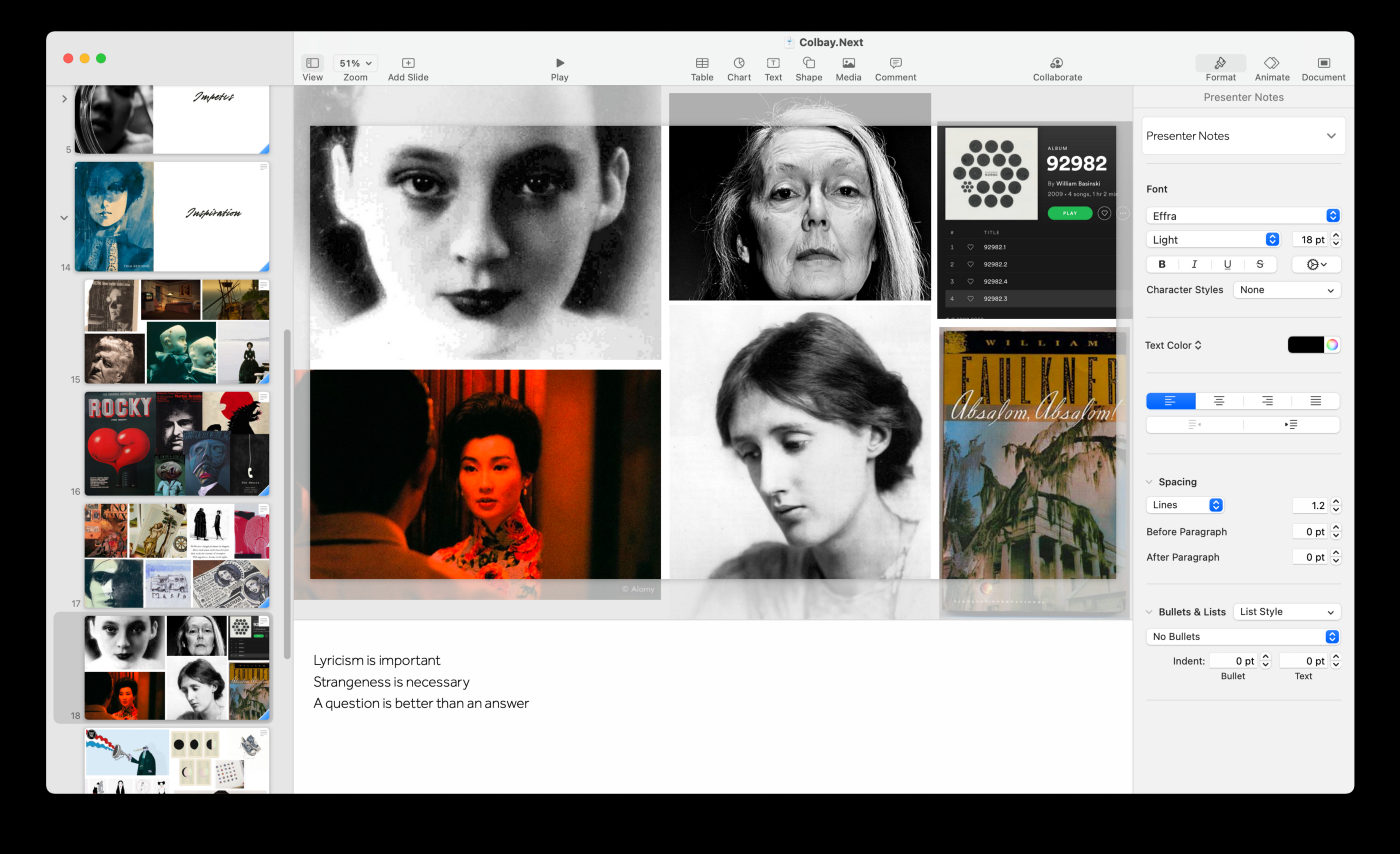
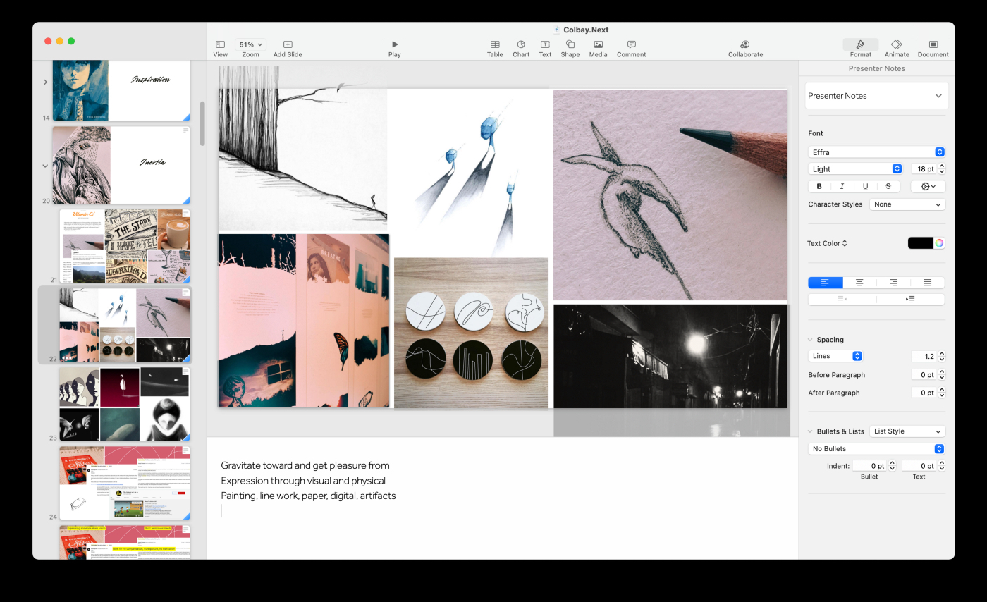
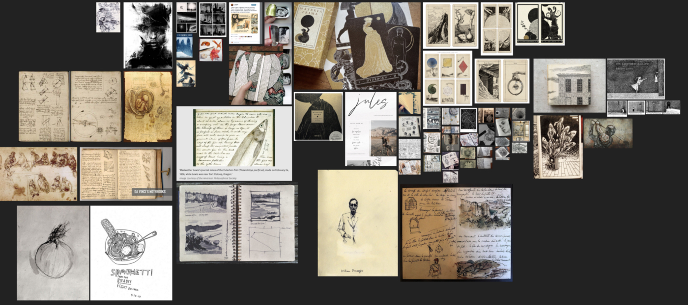
The “Inspiration” section is largely a gathering exercise of what kind of art I like, practices, and people I’m inspired by.
Once I gathered the evidence, I ruminated on how I thought these influenced me. I held it up against what I thought I wanted to make going forward.
By the time I was done with this section it was easier for me to verbalize my aesthetic preferences, my stylistic leanings, the kind of a response I wanted to evoke in an audience, and why.
6. Inertia
They’re not mutually exclusive per se, but I’ve often confused ideals with what I actually want to do.
Someone once told me that it was exponentially more productive to support a person at improving what they’re good at, versus at what they’re bad at.
This isn’t to say there’s no value in the latter, or that “what one is bad at” definitively couldn’t become a passion. But I’ve learned, through a lot of pain and frustration, that swimming upstream can be a misguided effort.
I once loved the idea of creating an immersive art exhibit with a web app component. I had a gorgeous vision for it — maybe one day I’ll approach it again — but when I tried to get it going back then it just felt like a slog. I hated how much code-writing it required and how little time it seemed to afford for actual art-making.
I learned that all slog and zero joy indicates a need for change in the work — either completely away from the project or simply its current form. It could also just be the wrong time.
After that experience, I’ve been more rigorous about vetting ideas. The task of discerning what I want to do, versus simply what I think I want to do, is nuanced, to say the least. (A topic that probably calls for exposition in a separate, dedicated issue.)
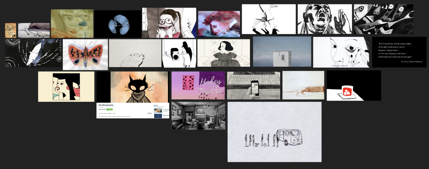
For now, this is an example of what I mean by “vetting:” I gathered examples of work that I felt I enjoy most, evidence of work I’ve followed through on, work I’m able to produce right now with a level of craft and quality. These went into four gallery slides. I sat with this information and did some free-form writing about what I thought this meant for work going forward.
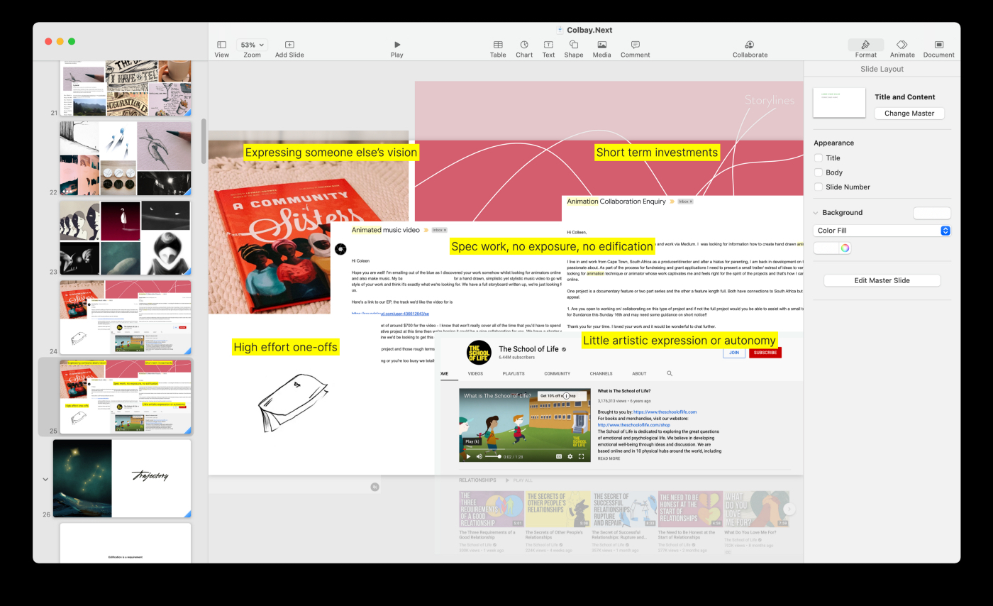
Next, I spent time thinking about what I might be tempted to work on given the opportunity, but ultimately felt would not contribute to a desirable trajectory.Being prepared to say no strengthens my commitment to my work. It makes turning something down not only easier and gives me peace of mind knowing that decision had been thoughtfully assessed as a part of a larger picture ahead of time.
This levies zero judgment against past work that doesn’t feel like a current fit. For instance, I may have greatly enjoyed projects the kind of which I want to deprioritize right now. I also give myself the flexibility to change my mind.
7. Trajectory
By this point, I’d canvassed and filtered ideas, sat with my motivations, taken stock of inspirations, and reviewed past accomplishments. It was time to take a stab at what I thought I wanted to do, shorter as well as longer-term.
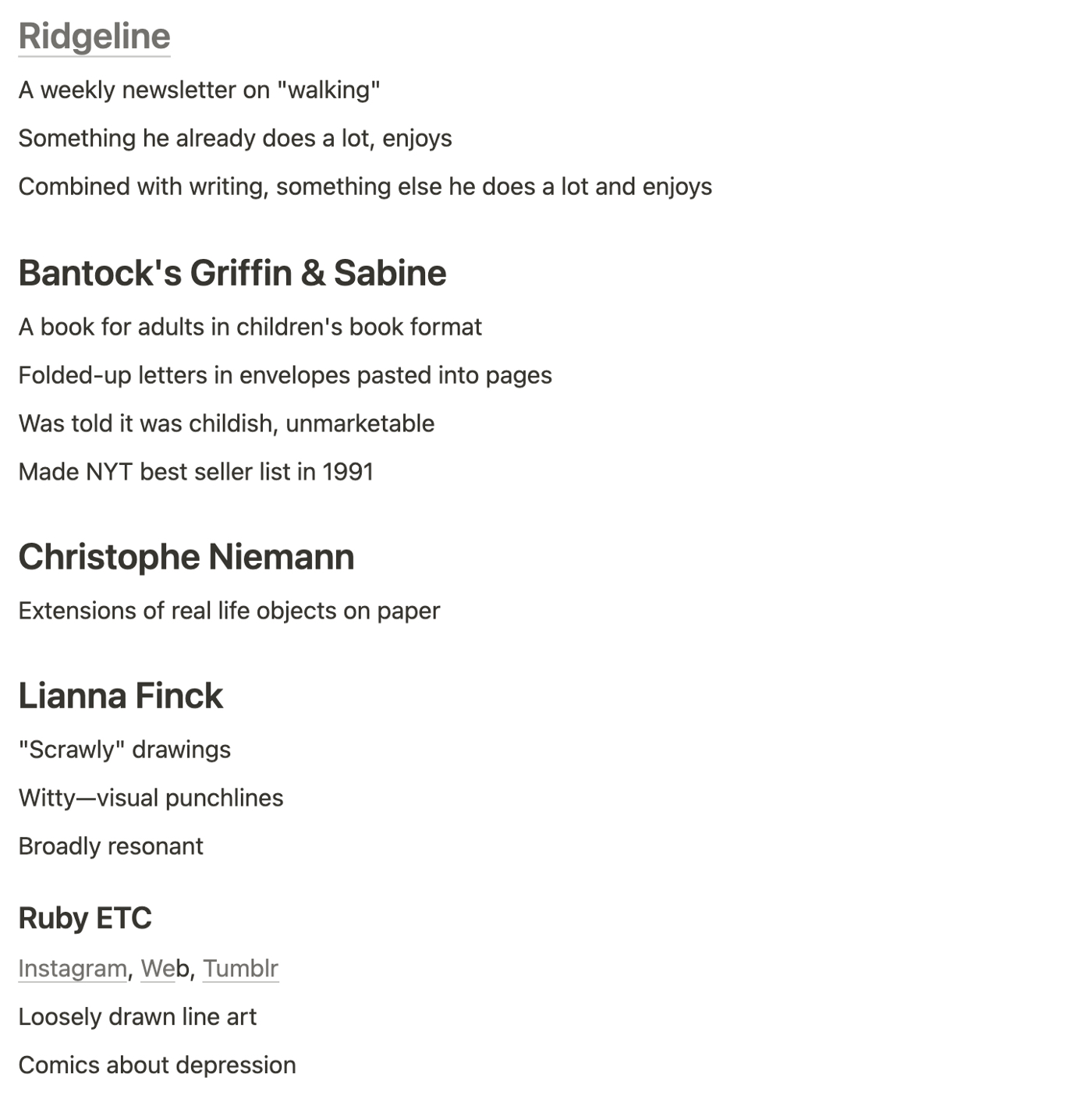
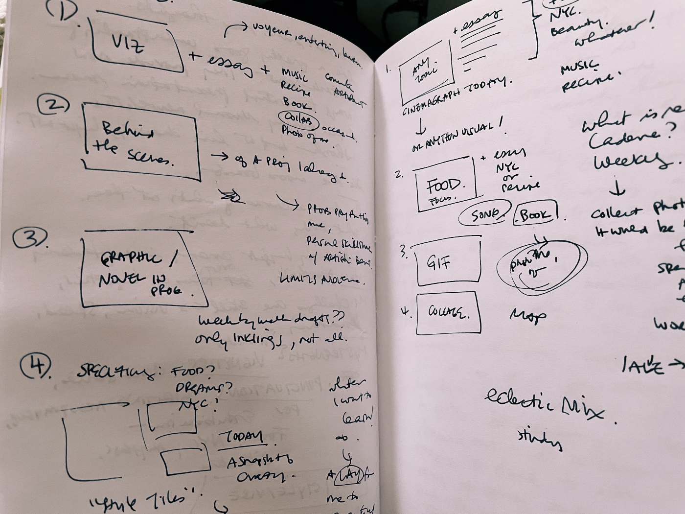
This was the meatiest section in the deck, requiring explorations outside of Keynote. I did a lot of writing and sketching to get myself going. For instance, to address insecurities, I made a “Sounds dumb but…” list of examples that at face might sound unworthy of pursuit but became successful. The descriptions lean toward simplistic and superficial to emphasize my point:
Marie Kondo — “organizing stuff”
Lianna Finck — “captioned doodles”
Nick Bantock — “picture books for adults”
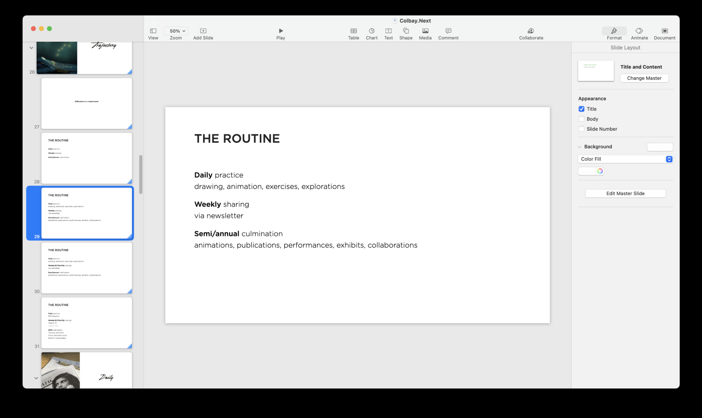
This shooed me away from self-critique so that I could focus on work I want to explore this year. I created mood boards and did “crazy eights” too. Both are processes I learned from the design world, used to flesh out potential project ideas (“The Line Between” came out of this exploration). For my actual plan of action, I started by outlining routines. What would I need to do right now for the projects that resonated most with me? I took what felt like familiar ground — every day — and built on it for weekly, quarterly, and annual projections.8. Proofing
Once I put an outline in place for routines, I took a few weeks to proof an idea or two. I’d done the mixing and kneading — now, will it rise? This would help me better understand how tractable an idea was versus just an ideal.
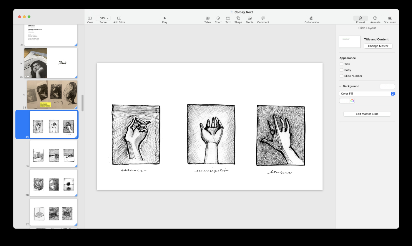
I went through the routines, produced actual content. I paid attention to whether it felt like an uphill battle or more like an enjoyable challenge; whether it felt natural or full of friction.
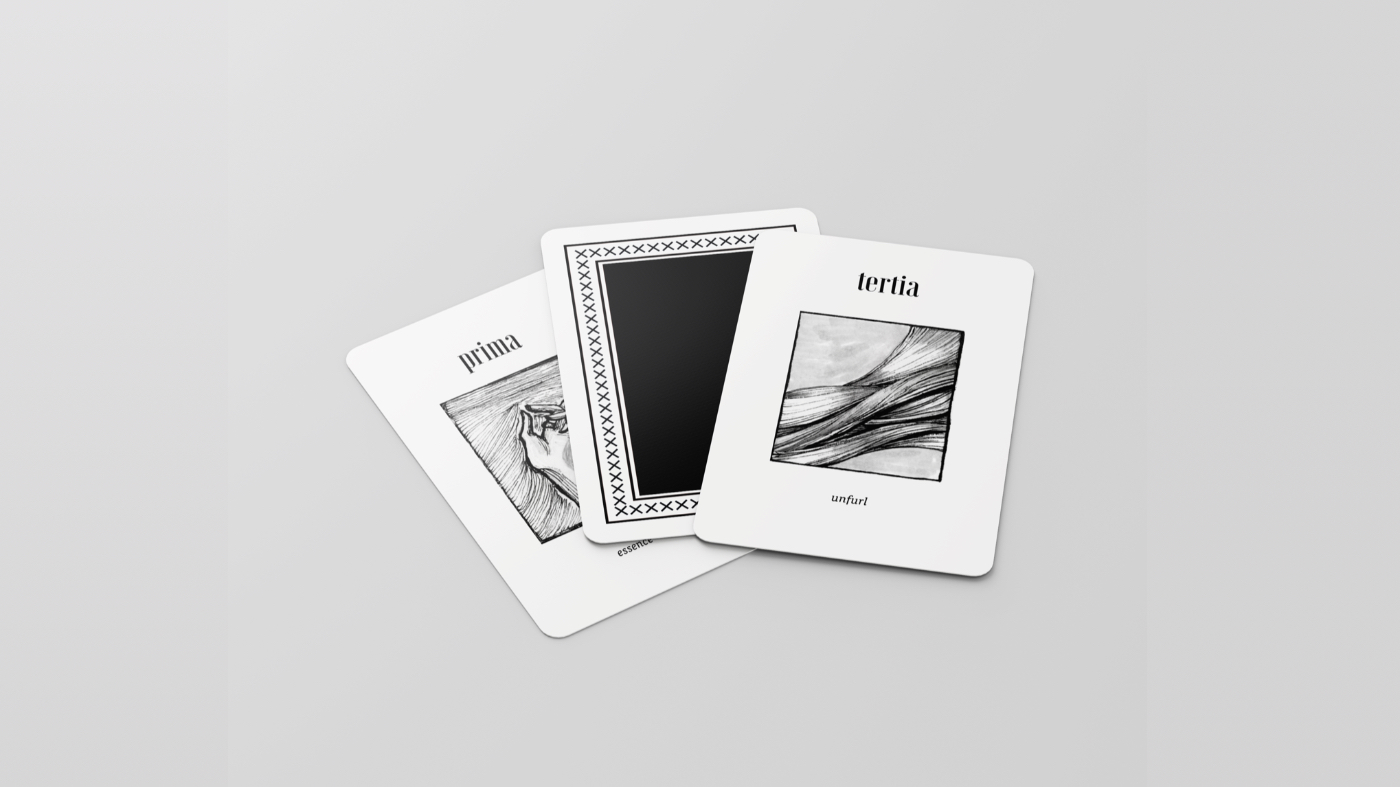
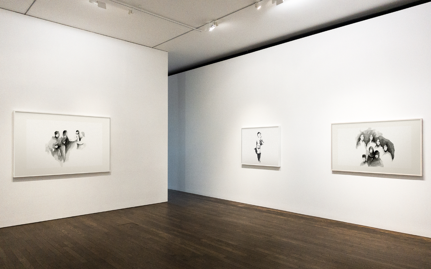
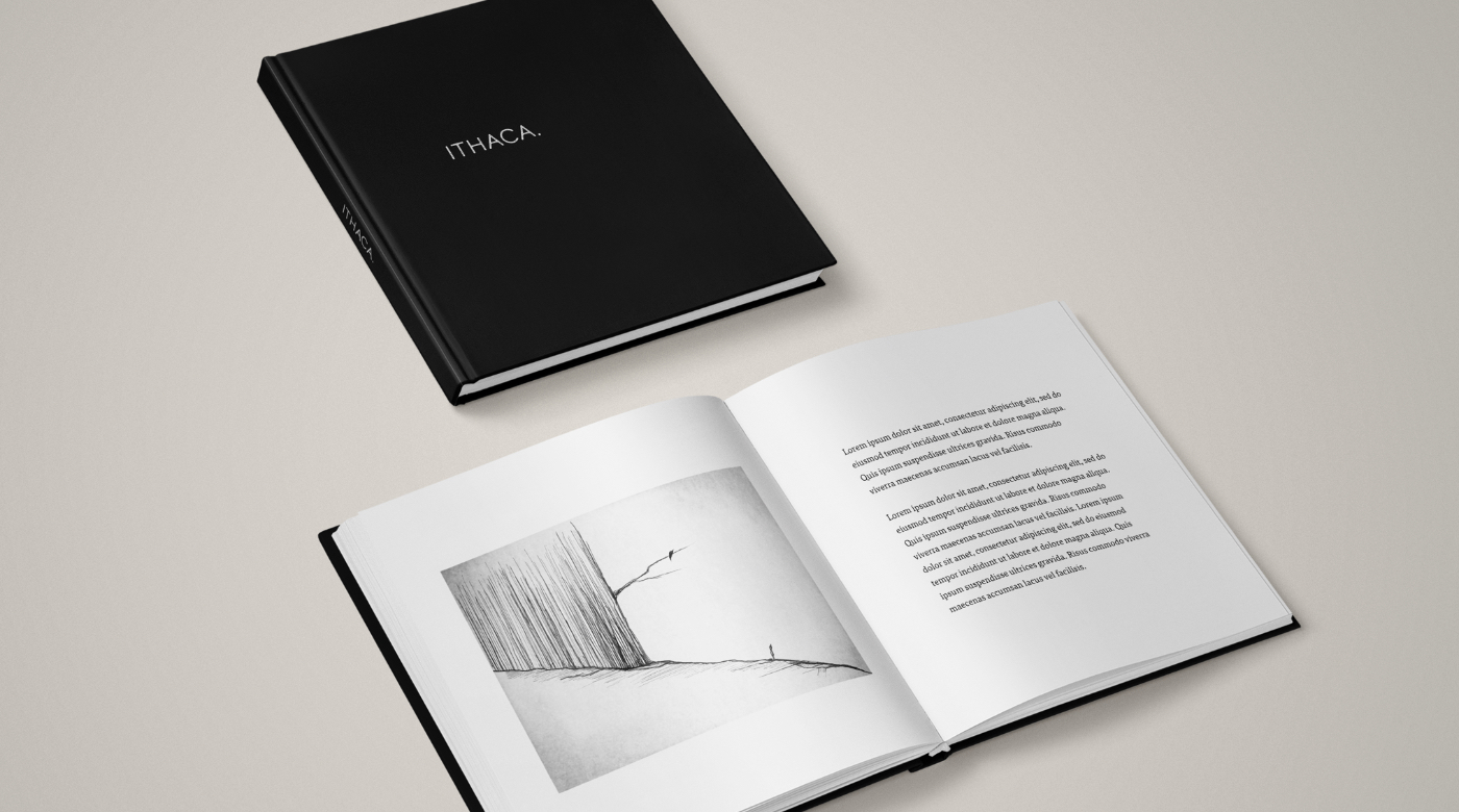
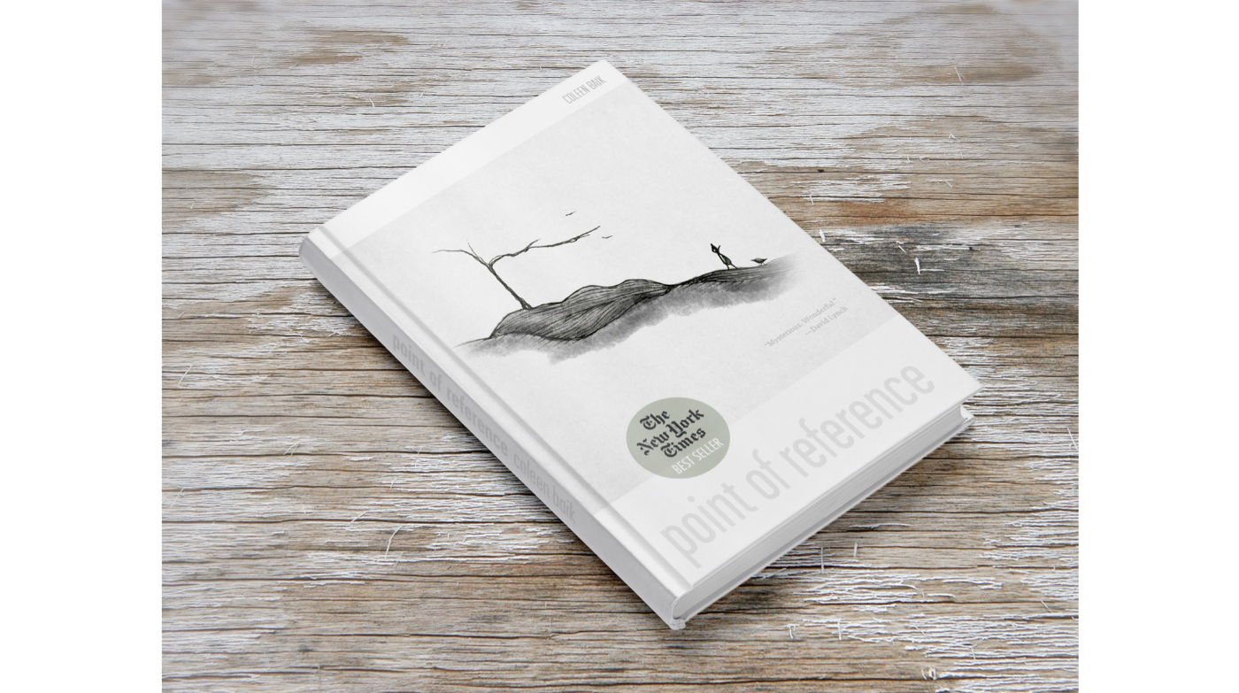
I then mocked the work up as finished artifacts. I used PSD mockup files I found online to bring them to life, which was a ton of fun:
Ink drawings imagined as oracle cards, watercolors as a gallery exhibit, sketch as poster print.
Illustrations as they might appear in publications.Lastly, I did my “future me” press release— and I went big. Why not? This is the place to dream.
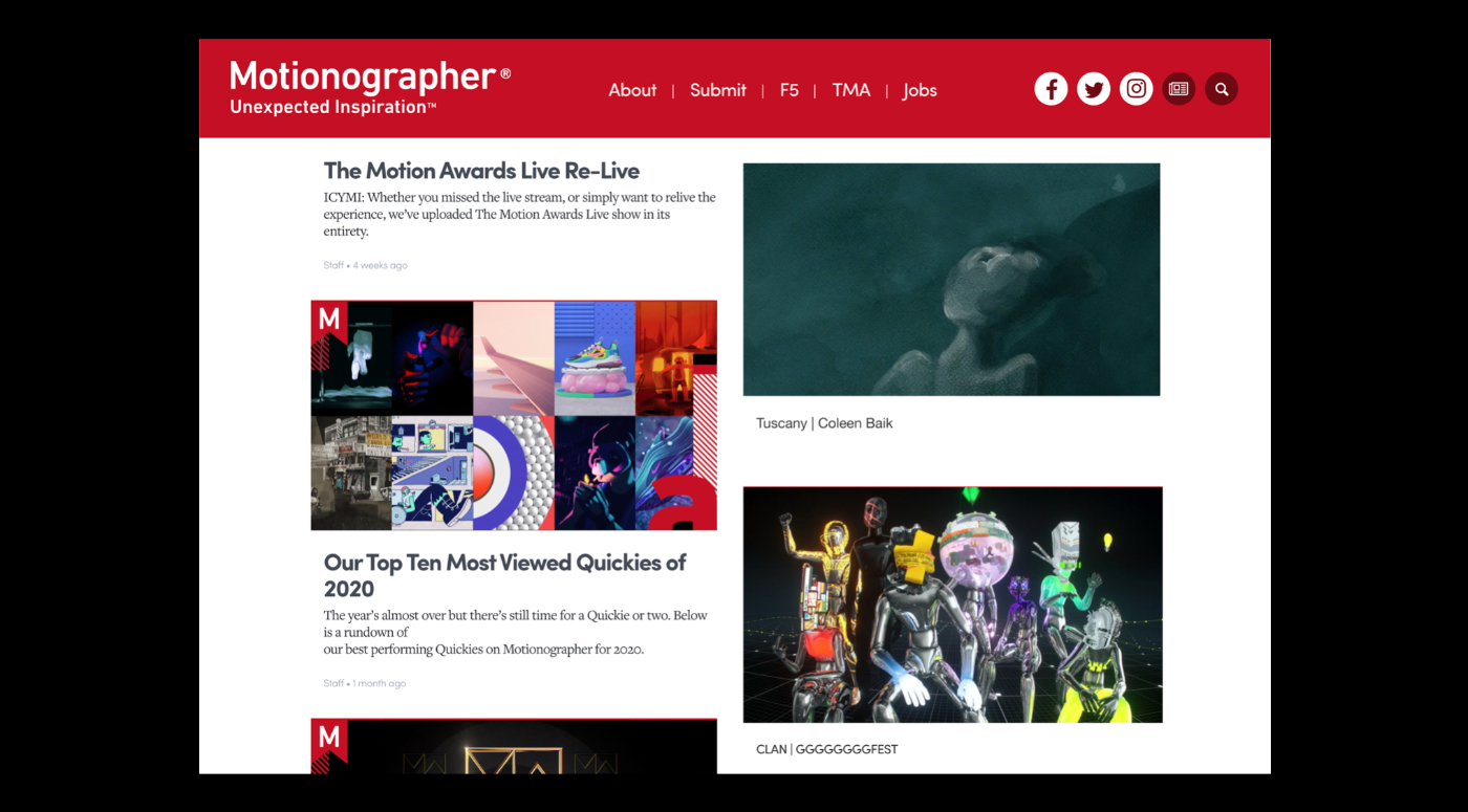
The future with a NYT best seller, a highlight on Motionographer…
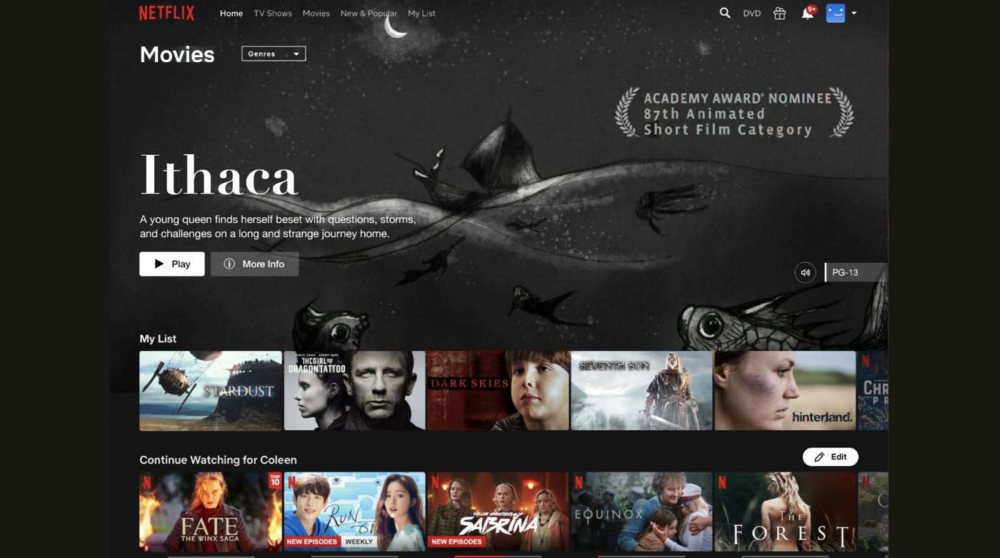
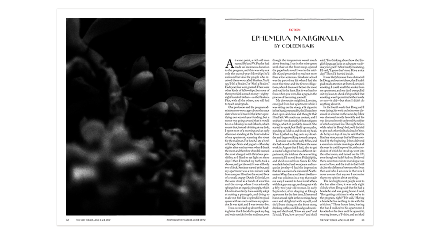
…a Netflix feature as an Academy Award nominee, a contribution to the New Yorker.
9. Present to someone you trust
When I had a solid deck together, I identified the remaining questions and challenges. Then I presented it to my partner, who’s a designer as well as an entrepreneur. It was important for me to find someone who could provide me with constructive, useful feedback, someone who was not going to just pat me on the back, who knows me well.
All told, I ended up with 87 mainly visual slides with a runtime of about 40 minutes. Although it wasn’t short, it held interest well, and it was fun to present.
A discussion followed, after which I had a very clear idea of how I would proceed and which projects I would pursue. The deck had served the purpose I’d expected it to serve, and that made me happy.
10. Get it done
Since then I’ve been focused on following through. I crossed my first point of culmination in early March—
The publication of my animated short, Tuscany.
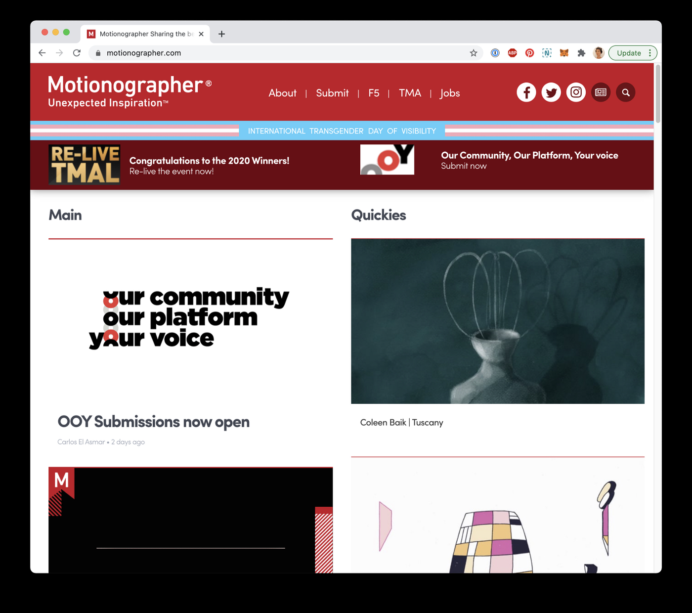
Shortly thereafter, the animation was also recognized by Motionographer, an institution among animators. It felt surreal to see an aspiration that I had literally mocked up, weeks prior, become a reality:
In sum
This exercise begins with some big questions. It requires a brain-dump, which should get filtered and explored through mood boards, lists, scribbles on napkins. It asks both an articulation of what one’s inspired to do, and what one doesn’t want to do. It leads to a flexible plan. It encourages defining what’s needed today to make the plan happen. It’s easy to revise. It makes room for dreams.
It helped me orient myself for both the short and the longer term, and I really enjoyed putting myself through it. An exercise like this might seem a bit involved for some, but the format is supremely flexible and lends itself well to abridgment or extension. They’re just slides after all.
Feel free to download this template to get started. Make it your own. Leverage it to give you a little fuel — to set you on the way from your point A to your point B. Lean on others. Execute, one day at a time.
I’ll be sharing more behind-the-scenes write-ups like this in my fledgling newsletter, The Line Between. Sign up to enjoy, every two weeks.
This post was originally published by UX Collective in April.

