Tedium - Down Is Up, Up Is Down 🔄

Why natural scrolling randomly emerged one day.

Hunting for the end of the long tail • December 29, 2021

Today in Tedium: Perhaps you don’t think of it this way, but the way that we interact with the objects we own is not necessarily a given. And this is proven when those not-a-given things change unexpectedly out of the blue. I wanted to talk about one of those things, a small but confusing shift to the way we use computers, a default that befuddles many, but others don’t mind. When it comes to “natural scrolling,” I fall deeply into the befuddled camp. Released with version 10.7 of Mac OS X just over a decade ago, the attempt to reinvent the way our mice and trackpads work felt like an unnecessary flip, but it’s still around a decade later, and most other operating systems now do it as well. Apple convinced people that its way of scrolling was “natural.” Now, while I missed the 10th anniversary of this subtle-but-not-so-subtle change by about five months, I still wanted to get my thoughts about it down way before the 15th anniversary. While the embers of 2021 are still emitting light, today’s Tedium looks back at the moment Apple flipped the way we scroll through things on our computers on its head. — Ernie @ Tedium

“Apple was very interested in it. They wanted to use it for their trackpad on their Macs. Once they accepted they were going to use it, [our technology] got lots of visibility inside of Apple. They realized that was what they wanted for the iPhone. It turned from a licensing deal to an acquisition deal pretty quickly. The whole process took about eight months.”

— Jeff White, the CEO of FingerWorks, a company that developed the multitouch capabilities that are now baked into touchscreens and trackpads the world over, in a 2013 interview with Technical.ly. FingerWorks was purchased by Apple in 2005, but interestingly, the company used its technology not to create innovative trackpads, but to create experimental ergonomic keyboards, including one model, the MacNTouch, that went directly over the keyboard on a PowerBook or MacBook, replacing the keys.

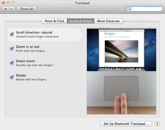
Natural Scrolling

You gotta admit, it’s a real Jedi Mind Trick to call this natural scrolling, right?!

Some important context around the moment that gave us “natural scrolling”

If you read any number of posts on websites, you’ll likely hear that the idea behind natural scrolling was that when the scrolling matches the direction of your fingers, you’re manipulating the screen, but when it doesn’t, you’re manipulating the page.

That sounds like a weird distinction, but after the release of touchscreens, this distinction became a really big deal, enough of an issue that Apple felt it was important to design a remedy.

Now, I don’t know about you, but I don’t think about scrolling a trackpad and scrolling a touchscreen in quite the same way. Some of this might be that I grew up with scroll wheels and trackpads, so I was familiar with the convention well before touchscreens came along. When I was 9, I had trouble remember what side was right and what side was left, but I was able to figure out the differences between scrolling on a trackpad and swiping on a touchscreen right away.

But if Apple was going to make a change like this, 2011 was the year to do it. To be clear, while the idea of swimming against the tide of what was allowable with scrolling was fairly unusual, at that point, the decisions were easy to frame in the context of what was coming next, rather than what had already happened.

The push to offer natural scrolling came about at a time when the iPad was still a relatively new (and fairly groundbreaking) product. And during the fall 2010 Apple Special Event where Jobs announced the changes, he characterized the shifts in Lion as taking some of the iPad’s best features and applying them to the Mac.

The interesting thing about the discussion around Lion, led by Jobs in one of the last major Apple product announcements in his lifetime (and also including an early Craig Federighi onstage appearance; it was his first full version of Mac OS since returning to the company in 2009), is that the thing that most people remember about the presentation is not the natural scrolling decision, which was somewhat glossed over, but Jobs’ edict that nobody would ever want to use a touchscreen on a laptop:

We’ve thought about this years ago. We’ve done tons of user testing on this and it turns out it doesn’t work. Touch surfaces don’t want to be vertical.

It gives great demo. But after a short period of time, you start to fatigue, and after an extended period of time, your arm wants to fall off.

It doesn’t work. It’s ergonomically terrible. Touch surfaces want to be horizontal—hence, pads.

In many ways, Jobs (and by extension, Apple) was thinking about this experimental human interface they built from the perspective of the end user, trying to figure out how it could apply some basic lessons about user interface design from the new hotness at the time (the iPad) to their existing systems (Lion).

Now, if it were me, I probably would have offered the touch capability, which gives great demo but also gave Apple competitors something to differentiate themselves with, but passed on the natural scrolling. But I’m not Steve Jobs.

This was but one small change in the context of a very large operating system update. (One other somewhat controversial change? The removal of scrollbars.) John Siracusa, the Apple writer and podcaster who for many years wrote in-depth reviews of each new version of Mac OS X for Ars Technica, put the situation perfectly:

[T]his is the most significant release of Mac OS X in many years—perhaps the most significant release ever. Though the number of new APIs introduced in Lion may fall short of the landmark Tiger and Leopard releases, the most important changes in Lion are radical accelerations of past trends. Apple appears tired of dragging people kicking and screaming into the future; with Lion, it has simply decided to leave without us.

There have been larger updates since—Big Sur, for example, is a massive overhaul that was so dramatic that some people thought it was a harbinger of a touch interface—but ultimately, Siracusa was right. It was a reframing of the way the Mac worked to be a little closer to Apple’s business objectives.

It just came with a really funky default along the way.

“I don’t get the sense that people are averse the change simply because it was made. Rather, I think OS X users have cottoned onto to the clear reality that the notebook and the tablet are not the same thing. The way we interact with the two devices is very different, a fact that natural scrolling doesn’t reflect.”

— Ricardo Bilton, a former blogger for ZDNet, discussing how users reacted to the shift in scrolling into a “natural” direction. In some ways, the resistance to the change reflects a hardened sense of thinking about how we use our computers. Some people are simply resistant to change!

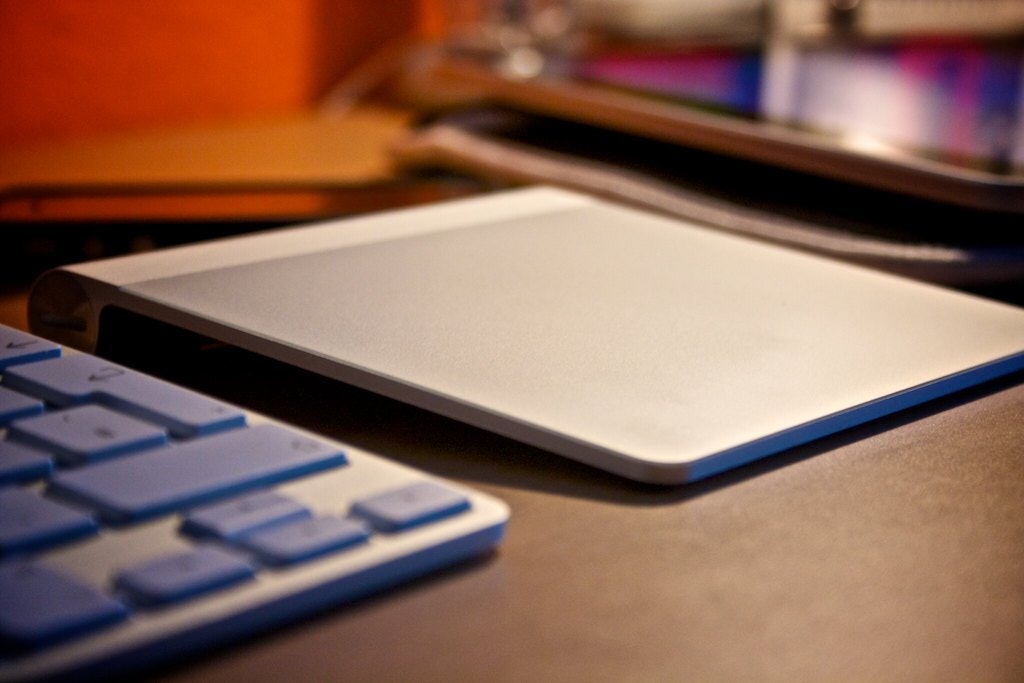
Magic Trackpad

The original Magic Trackpad. (macreloaded.com/Flickr)

The philosophical consideration around randomly switching a default like this

This is a deeper discussion than just an interface quirk that has existed for a full decade. To highlight that point, I’d like to switch OS ecosystems for a second. (With a quick side note to highlight just how quickly other ecosystems gave into to validating this bizarre user interface change. That you can do this in other operating systems is a testament to the power of Steve Jobs right there.)

If you’ve ever tried to get into the Linux ecosystem, you know the inevitable problem that arises the first time you use it, and in many ways it’s the opposite problem that emerges when you open up a new MacBook for the first time: There are too many choices.

The first choice that needs to be made is what distribution you’re going to run. Choosing something basic like Ubuntu is great for getting you going, but it can be somewhat limiting as you become skilled at using Linux. Arch is great for more advanced users that want the latest and greatest, but it can be more difficult to set up. And doing a search for the best Linux distribution can end in tears, like that time I went to Micro Center and spent half an hour trying to make sense of the physical KVM switches they sold. (I think I might have had a panic attack.)

But there are things that tend to be defaults in the way Linux works—the kernel, for one thing—even if seemingly everything else about the process is a little different.

In many ways, I think that Apple chose to add this unnecessary complexity to the way we scroll because it saw an opportunity to push users into a use case that would become more important for later generations of users, rather than only catering to those who came before them. Essentially, this default isn’t for you; it’s for your kids, who presumably will use a touchscreen long before they ever touch a trackpad.

User Flow

(Kelly Sikkema/Unsplash)

This is actually a philosophy discussed in a book that was released not long before the Jobs keynote where he showed off MacOS Lion: the 2009 book Nudge: Improving Decisions About Health, Wealth, and Happiness by Richard Thaler of the University of Chicago and Case Sunstein of Harvard Law School. Essentially, the book (which was recently updated) is discussing in a broader economic sense the way that decisions by the creator of a given system—they use the term “choice architect”—can help to influence certain types of decision-making. In an interview with Yale Insights magazine, Thaler put the idea of the change architect like this:

There are choice architects in virtually every environment. When a professor teaches a course, he is the choice architect. When somebody puts this magazine together, they will decide in what order the articles appear and what illustrations and photos accompany them that may or may not attract people’s attention. That’s a good example, because people are free to throw the magazine away. They are free to read whatever they want, but the magazine designer will have some influence on which articles they read, and in which order.

The secret is that people get a choice to follow or not follow the path forward, something that Sunstein and Thaler describe as “libertarian paternalism,” essentially the idea that free will is still allowed in the process of making a choice, but an option, called a “nudge” or a default, has been put in front of you by an economic force.

In this discussion, Apple is the choice architect, natural scrolling is the nudge, and the fact that it is an option that you can turn off makes it a form of “libertarian paternalism.”

And in case you were wondering, Sunstein and Thaler were thinking in this direction in the book, even if there are zero references to Apple, the company, in the book. From the intro:

When you get a new cell phone, for example, you have a series of choices to make. The fancier the phone, the more of these choices you face, from the background to the ring sound to the number of times the phone rings before the caller is sent to voice mail. The manufacturer has picked one option as the default for each of these choices. Research shows that whatever the default choices are, many people stick with them, even when the stakes are much higher than choosing the noise your phone makes when it rings.

Two important lessons can be drawn from this research. First, never underestimate the power of inertia. Second, that power can be harnessed. If private companies or public officials think that one policy produces better outcomes, they can greatly influence the outcome by choosing it as the default. As we will show, setting default options, and other similar seemingly trivial menu-changing strategies, can have huge effects on outcomes, from increasing savings to improving health care to providing organs for lifesaving transplant operations.

Now, one could argue that Apple makes a lot of choices that aren’t nudges, that go beyond simply being defaults and veer into harsher lines in the sand, where the paternalism isn’t quite so libertarian. A good example of this is the call not to put a touchscreen in its laptops despite the fact that it has some of the best touchscreen technology around. Another example is the inexplicable decision to not support trackpads with the iPad for many years, despite the fact that there was no technical reason they couldn’t work.

A more recent example of this, one I wrote about on MidRange just last week, involves the use of a tiny orange dot on Mac screens whenever a microphone is live—a useful default with no way to turn it off for 95 percent of users, but for the small percentage that rely on their computers for creative work, a potential show-stopper.

In this light, it’s nice that, in the case of natural scrolling, they gave the user a choice.

1996

The year Microsoft first sold the IntelliMouse, one of the first mainstream computer mice with a built-in scroll wheel. The wheel is now a basic element of many mice, and remains immensely popular today. The IntelliMouse Explorer, an upgraded version of the device, added one of the first optical sensors in a mainstream mouse. If anything, it set the direction of scrolling with mice and trackpads, only for Apple to attempt to redefine it nearly 15 years later. (Side note: Now there’s a device that needs an in-depth history written about it. Fortunately, as I was thinking that, I noticed that Benj Edwards had done just that for How-To Geek. Great work, past Benj.)

In many ways, we are creatures of habit, and by the time Apple hit us with natural scrolling, many of its users had been using scroll wheels and trackpads on their computers for a decade or longer. (Mac users who were not into the Microsoft IntelliMouse likely had to wait a bit longer.)

I think about this a lot when I try to use a new machine, and my first instinct is to try to get the keyboard settings the way I like them—set up like a Mac, so I can type a character like ∆ or § without skipping a beat.

As user interfaces go, we probably need a mixture of libertarian paternalism and guardrails. Without guardrails, we’re stuck in a “what do I do” debate about exactly what distro I put on this machine sitting in front of me, but when there are too many guardrails, things get prescriptive and people start complaining.

The solution? Offer a preferred solution, but give the end user a choice. Even if the preferred solution doesn’t feel particularly natural.

That’s libertarian paternalism in action for ya.

--

Find this one an interesting read? Share it with a pal!

And thanks again to our sponsor.

Share this post:

follow on Twitter | privacy policy | advertise with us

Copyright © 2015-2021 Tedium, all rights reserved.

Disclosure: From time to time, we may use affiliate links in our content—but only when it makes sense. Promise.

unsubscribe from this list | view email in browser | sent with Email Octopus

Older messages

You Know, For Kids 🕹

Wednesday, December 22, 2021

Making the case that kids and tech are made for one another. Here's a version for your browser. Hunting for the end of the long tail • December 22, 2021 Today in Tedium: Over the weekend, I finally

Old Stories, New Eyes 👁👁

Friday, December 17, 2021

A second opinion on Tedium's stories throughout 2021. Here's a version for your browser. Hunting for the end of the long tail • December 17, 2021 Hey all, Ernie here with a piece that's

Cut-Up Culture ✂️

Wednesday, December 8, 2021

How coupons became the dominant way to get a deal. Here's a version for your browser. Hunting for the end of the long tail • December 08, 2021 Today in Tedium: In a world where browser extensions

The Can That Always Can 💪

Friday, November 26, 2021

How WD-40 became the rust-defying chemical of choice. Here's a version for your browser. Hunting for the end of the long tail • November 26, 2021 Hey all, Ernie here with a piece from David Buck

Dead On Archival 🗞

Wednesday, November 24, 2021

The challenges we face with archiving shuttered newspapers. Here's a version for your browser. Hunting for the end of the long tail • November 24, 2021 ‌ With the support of Newspapers.com Hey all,

You Might Also Like

🔒 The Vault Newsletter: November issue 🔑

Monday, November 25, 2024

Get the latest business security news, updates, and advice from 1Password. ͏ ͏ ͏ ͏ ͏ ͏ ͏ ͏ ͏ ͏ ͏ ͏ ͏ ͏ ͏ ͏ ͏ ͏ ͏ ͏ ͏ ͏ ͏ ͏ ͏ ͏ ͏ ͏ ͏ ͏ ͏ ͏ ͏ ͏ ͏ ͏ ͏ ͏ ͏ ͏ ͏ ͏ ͏ ͏ ͏ ͏ ͏ ͏ ͏ ͏ ͏ ͏ ͏ ͏ ͏ ͏ ͏ ͏ ͏ ͏ ͏ ͏ ͏

🧐 The Most Interesting Phones You Didn't See in 2024 — Making Reddit Faster on Older Devices

Monday, November 25, 2024

Also: Best Black Friday Deals So Far, and More! How-To Geek Logo November 25, 2024 Did You Know If you look closely over John Lennon's shoulder on the iconic cover of The Beatles Abbey Road album,

JSK Daily for Nov 25, 2024

Monday, November 25, 2024

JSK Daily for Nov 25, 2024 View this email in your browser A community curated daily e-mail of JavaScript news JavaScript Certification Black Friday Offer – Up to 54% Off! Certificates.dev, the trusted

Ranked | How Americans Rate Business Figures 📊

Monday, November 25, 2024

This graphic visualizes the results of a YouGov survey that asks Americans for their opinions on various business figures. View Online | Subscribe Presented by: Non-consensus strategies that go where

Spyglass Dispatch: Apple Throws Their Film to the Wolves • The AI Supercomputer Arms Race • Sony's Mobile Game • The EU Hunts Bluesky • Bluesky Hunts User Trust • 'Glicked' Pricked • One Massive iPad

Monday, November 25, 2024

Apple Throws Their Film to the Wolves • The AI Supercomputer Arms Race • Sony's Mobile Game • The EU Hunts Bluesky • Bluesky Hunts User Trust • 'Glicked' Pricked • One Massive iPad The

Daily Coding Problem: Problem #1619 [Hard]

Monday, November 25, 2024

Daily Coding Problem Good morning! Here's your coding interview problem for today. This problem was asked by Google. Given two non-empty binary trees s and t , check whether tree t has exactly the

Unpacking “Craft” in the Software Interface & The Five Pillars of Creative Flow

Monday, November 25, 2024

Systems Over Substance, Anytype's autumn updates, Ghost's progress with its ActivityPub integration, and a lot more in this week's issue of Creativerly. Creativerly Unpacking “Craft” in the

What Investors Want From AI Startups in 2025

Monday, November 25, 2024

Top Tech Content sent at Noon! How the world collects web data Read this email in your browser How are you, @newsletterest1? 🪐 What's happening in tech today, November 25, 2024? The HackerNoon

GCP Newsletter #426

Monday, November 25, 2024

Welcome to issue #426 November 25th, 2024 News LLM Official Blog Vertex AI Announcing Mistral AI's Large-Instruct-2411 on Vertex AI - Google Cloud has announced the availability of Mistral AI's

⏳ 36 Hours Left: Help Get "The Art of Data" Across the Finish Line 🏁

Monday, November 25, 2024

Visual Capitalist plans to unveal its secrets behind data storytelling, but only if the book hits its minimum funding goal. View Online | Subscribe | Download Our App We Need Your Help Only 36 Hours