Proof of Concept - Creating interface studies
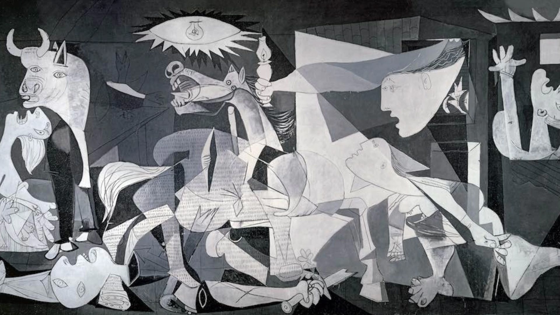
I launched a zine! Get Proof of Concept: The 000 Series today. Pablo Picasso’s Guernica is one of the most famous works of art in the world. A tapestry of it hangs at the United Nations as a reminder of piece. Picasso painted Guernica at his home in Paris in response to the 26 April 1937 bombing of Guernica, a Basque Country town in northern Spain which was bombed by Nazi Germany and Fascist Italy at the request of the Spanish Nationalists.
In addition to the powerful commentary of Picasso’s work, the piece of artwork is legendary in its development. Picasso documented the process along the way and conducted many studies of core aspects of the painting. As chaotic as the final composition looks, everything is intentional.
Whether it's an art masterpiece or a personal art project, making art studies is a common workflow to develop understanding of the subject matter the artist conveying. As an art student, I would create a lot of studies for complex paintings I wanted to work on. Before creating an oil painting, I'd create sketches of the compositions for the final piece. In some cases, creating a smaller version of the painting was a way to prototype what the final production would look like. An art study is any action done with the intention of learning about the subject you want to draw. You can study by drawing, sculpting, reading, or even just looking at something. It's important to distinguish that studies are a bit different than practicing. The act of practicing is a repeated task to build mastery in technique whereas The software you create contains multiple subjects in the form of features, core interactions, and other functionality. Your product interface is the art canvas. Yes, software as a form of art with practical function. Similar to in making art, there is a cost in what you build and you don't want to just release a bunch of things willy nilly—at least I hope you would not! You can create interface studies with the same inspiration. Whether physical, digital, or a blend of the two, products are dynamic and have kinetic movement to it. There is an anatomy, structure, and form to the experience. Conducting studies allows you to focus on specific areas to refine or invent core elements. The purpose of interface studiesStudies are important to isolate the core problem you're trying to solve. When you're in the thick of the day-to-day, decisions will get additive to what exists. This isn't necessarily a bad thing as shipping on existing constraints is a good practice. However, there are times when you need to re-invent or re-imagine something drastically to come to a longer-term solution. When the iPhone interface was first explored, the UI engineer who started working on it didn't disclose the final form factor. All they told her was, "design an interface for multi-touch." This type of focus allows you to go deep into the core aspect of the interaction. By removing the other mechanics of your product, you can focus on the problem. Making a studyOne of my beloved mentors is a brilliant designer and engineer—his most recognizable work was his early days at Apple and product experimentation at Facebook. When he was launching a new product in 2015 I had the opportunity to work with him on the designs. To this day, working with him was one of the most intensive, yet fulfilling, design work in my career. I remember we'd spend days, sometimes weeks, on creating interface studies to explore core functionality. For him, it was the crux of what would make the software great so wanted to make sure we got it right.
1. Identify a subject to exploreExplore a concept or problem space that merits a more abstract problem space. Avoid getting too specific at a feature level. For example, it's too specific if you say "Page navigator" and it's too high level if you try to explore "A blog builder app." The sweet spot to go for is something that is conceptual where you can explore an interaction for a concept, such as, "Exploring spatial viewing of pages". 2. Sketch the concept quicklyA quick and simple napkin sketch can provide a lot of clarity in the study and what you want to create. If I were to create a ceramic sculpture, I wouldn't start mashing clay together. I'd ensure I have a thumbnail to guide my rapid study. 3. Build it quicklyWithout hesitation, build something that conveys the functionality. Don't make high fidelity mocks, put the pieces together and refine as you go. Remember to keep the primary subject the focus of your study. If you're creating an interface study on how a theme picker can be invoked, don't focus on the outer decorations. Though my design skills are not as modern as the people on my team, my go-to simple tool is Principle—essentially a clone of Apple's internal tool Mica. Though Figma has much of the functionality in smart animations, Principle feels familiar to me and using gray boxes is a nice constraint to focus on the interaction itself. The software you use to create studies will vary based on what you're studying. 4. RepeatMake. Show. Learn. Criqitue the study yourself and pick it a part—see how you can improve. Bring other people in to get feedback on your ideas. Like prototypes, the best interface studies are "just enough" fidelity to convey the idea. Example of a studyThis is a VERY old interface study I did about eight years ago. Of course it was created with Quartz Composer. I wanted to share a tangible example of how you can put a quick study together to test different interactions. This study took about 20m to throw together and the idea was to explore how cell expansion in a contact app can be more playful in how you send a message to them. 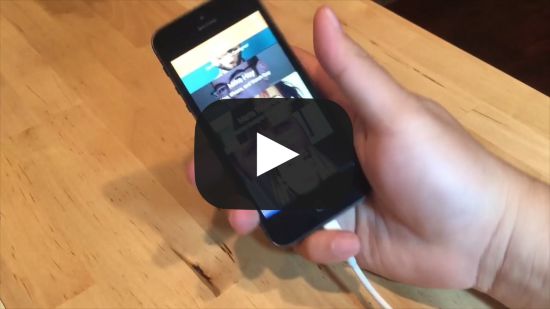 Find a project you can whip up a quick interface study! You need to step away from the intricacies of what exists and take a step back. In many ways, this is a form of first principles interface design where you can focus on the essence of it. Weekly recapThe biggest topic in tech news is new Twitter ownership, which is making many people question their future use of the platform. I don’t think many alternatives will make a lot of traction, unfortunately. Scale and adoption is hard, and it’s probably the reason we haven’t seen any Instagram alternative. Some may remember app.net (RIP), and while Mastodon is still around, it’s not going to have the same network effect as Twitter. At that point, might as well go indie blog and share RSS feeds, which I would absolutely love! Tweet of the weekHype links
Enjoy this newsletter? Please consider sharing it with friends, or subscribing if you haven’t already. I appreciate it! Sincerely, DH © 2022 David Hoang
|


Older messages
Peer mentorship with contemporaries
Sunday, October 23, 2022
Issue 115: Maximizing an under-utilized form of mentorship
Creating value with artifacts
Sunday, October 16, 2022
Issue 114: Making memorable documents
Books I'm reading and topics explored
Sunday, October 9, 2022
Issue 113: My current interests that'll shape into future projects
Drawing is the most enduring skill
Sunday, October 2, 2022
I love drawing. Though I'm not great at it, it's an activity I've enjoyed since my early childhood. My fondest memories growing up was taking paper from my dad's dot matrix printer and
Individual point of view and collaboration
Sunday, September 25, 2022
Issue 110: Understanding the two modes of work and how they complement
You Might Also Like
Business as a platform
Sunday, March 9, 2025
Issue 236: Applying business to your craft ͏ ͏ ͏ ͏ ͏ ͏ ͏ ͏ ͏ ͏ ͏ ͏ ͏ ͏ ͏ ͏ ͏ ͏ ͏ ͏ ͏ ͏ ͏ ͏ ͏ ͏ ͏ ͏ ͏ ͏ ͏ ͏ ͏ ͏ ͏ ͏ ͏ ͏ ͏ ͏ ͏ ͏ ͏ ͏ ͏ ͏ ͏ ͏ ͏ ͏ ͏ ͏ ͏ ͏ ͏ ͏ ͏ ͏ ͏ ͏ ͏ ͏ ͏ ͏ ͏ ͏ ͏ ͏ ͏ ͏ ͏ ͏ ͏ ͏ ͏ ͏ ͏ ͏ ͏
A Guide to Timetravels
Sunday, March 9, 2025
Our past and present selves have never been separate entities but rather interwoven narrators. ͏ ͏ ͏ ͏ ͏ ͏ ͏ ͏ ͏ ͏ ͏ ͏ ͏ ͏ ͏ ͏ ͏ ͏ ͏ ͏ ͏ ͏ ͏ ͏ ͏ ͏ ͏ ͏ ͏ ͏ ͏ ͏ ͏ ͏ ͏ ͏ ͏ ͏ ͏ ͏ ͏ ͏ ͏ ͏ ͏ ͏ ͏ ͏ ͏ ͏ ͏ ͏ ͏
The New Kitchen Trends on Our Radar
Thursday, March 6, 2025
View in your browser | Update your preferences ADPro Kitchen Confidential We at AD PRO see the kitchen as a bellwether for the rest of the home—a place where technology stays a couple of steps ahead,
🐺 How to kick start your PR efforts.
Wednesday, March 5, 2025
Lessons from a veteran publicist. ͏ ͏ ͏ ͏ ͏ ͏ ͏ ͏ ͏ ͏ ͏ ͏ ͏ ͏ ͏ ͏ ͏ ͏ ͏ ͏ ͏ ͏ ͏ ͏ ͏ ͏ ͏ ͏ ͏ ͏ ͏ ͏ ͏ ͏ ͏ ͏ ͏ ͏ ͏ ͏ ͏ ͏
How Rita Konig Gets Clients to Take Risks
Tuesday, March 4, 2025
View in your browser | Update your preferences ADPro It has been a career-defining few years for Rita Konig. First there was the British interior designer and author's Create Academy course, which
#497: Color Palettes and Generators
Tuesday, March 4, 2025
How to fix a broken color palette, accessible color combinations, color names and palette generators. Issue #497 • Feb 28, 2025 • View in the browser Smashing Newsletter Pryvit! Smashing Friends, How
180 / Make your everyday browsing ridiculously beautiful
Monday, March 3, 2025
Product Disrupt Logo Product Disrupt Half-Monthly Feb 2025 • Part 2 View in browser Welcome to Issue 180 Last year I teamed up with two of my close friends on a side project we're all obsessed with
Accessibility Weekly #438: When to Use Lists
Monday, March 3, 2025
March 3, 2025 • Issue #438 View this issue online or browse the full issue archive. Featured: When to use lists for better accessibility "When creating HTML content, using lists appropriately is
High touch recruiting
Sunday, March 2, 2025
Issue 235: Long-lasting candidate experiences ͏ ͏ ͏ ͏ ͏ ͏ ͏ ͏ ͏ ͏ ͏ ͏ ͏ ͏ ͏ ͏ ͏ ͏ ͏ ͏ ͏ ͏ ͏ ͏ ͏ ͏ ͏ ͏ ͏ ͏ ͏ ͏ ͏ ͏ ͏ ͏ ͏ ͏ ͏ ͏ ͏ ͏ ͏ ͏ ͏ ͏ ͏ ͏ ͏ ͏ ͏ ͏ ͏ ͏ ͏ ͏ ͏ ͏ ͏ ͏ ͏ ͏ ͏ ͏ ͏ ͏ ͏ ͏ ͏ ͏ ͏ ͏ ͏ ͏ ͏ ͏ ͏ ͏
All Compute Must Flow
Sunday, March 2, 2025
“If I don't have that kind of compute on Day 1, I can't breathe." ͏ ͏ ͏ ͏ ͏ ͏ ͏ ͏ ͏ ͏ ͏ ͏ ͏ ͏ ͏ ͏ ͏ ͏ ͏ ͏ ͏ ͏ ͏ ͏ ͏ ͏ ͏ ͏ ͏ ͏ ͏ ͏ ͏ ͏ ͏ ͏ ͏ ͏ ͏ ͏ ͏ ͏ ͏ ͏ ͏ ͏ ͏ ͏ ͏ ͏ ͏ ͏ ͏ ͏ ͏ ͏ ͏ ͏ ͏ ͏ ͏