First 1000 - 🎨 Canva
🎨 CanvaJaryd shares learnings about go-to-market motions, product-led growth, icebergs, and content from studying the $26b consumer design platform.Hi frens, 👋 I picked up on How They Grow, late last year & it quickly rose up to the top of my newsletter feeds. In a way, it is the sequel to many of my issues. I spend a lot of my time researching, talking to founders and thinking about the early-day growth and Jaryd does the same but for the later stages of a company’s life. Now, depending on how long you’ve been reading my stuff, you may have noticed this newsletter allows me to do something else I really love… Design! When there’s a visual I want to include in a post (e.g a timeline, market map, biz model, or flywheel) I get all giddy inside because design is just one of those things that I enjoy doing probably a lot more than I should. But, I’m no designer. And I think I’d be deeply lost in tools made for designers (i.e the Adobe stuff) — and if that’s all that was available, you’d have a lot less/worse graphics in these deep dives. So, today, we’re going to look at the company that makes design easy and accessible to over 100M people. The startup that kicked the latest evolutionary stage of design from complex desktop publishing tools to simple web publishing tools in motion — finding an extremely value gap in the $128b design services market. The startup from down under that makes me, mom-and-pops’, and people from Fortune 500 companies happy every week. Today, we’re going deep on Canva.
Let’s get right to it. 🎨 NB: If you’re reading this in your email right now, click to read the full thing 👇 How They StartedCanva is in the business of making the world a better looking place. And they’re doing it by breaking down the walled gardens of design and making it possible for everyday folks to create things that look good and get the job done. Design is all around us…but before Canva came along the status quo was either hire a designer, or bushwhack your way to a graphic yourself…usually hurting many eyes along the way. And then Melanie Perkins, Cliff Obrecht, and Cameron Adams came along in 2013 with their free-to-use, do-it-yourself design platform with everything “lowercase d” designers could ever need. Like an intuitive UI that doesn’t scare people away, simple and powerful tools that don’t require any training, and beautiful templates to get the ball rolling. Plus, it was brought online into the browser…no more downloads/licenses/updates. We now live in a world where there isn’t really an excuse for poor design. But 17 years ago, it wasn’t so obvious to most people that we’d get here. In 2006, Melanie Perkins had a big vision for the future of design: “to take the entire design ecosystem, integrate it into one page, and then make it accessible to the whole world”. That’s a big vision for a big market, but 100s of VC’s turned it down. So let’s take a look at how Canva broke into the world of Adobe and Microsoft and got to work on Melanie’s huge goal for the future of design. Big dreams (mostly) start smallIt all started in Perth, at the University of Western Australia. It was 2006, and Melanie Perkins was working her side hustle of teaching other students basic design on programs like InDesign and Photoshop. Being hands-on with students regularly, she soon identified a pattern. People who had no interest in being designers by trade found the platforms available hard and unnecessarily infuriating to learn. And like most founding stories go… she felt there must be a better way.
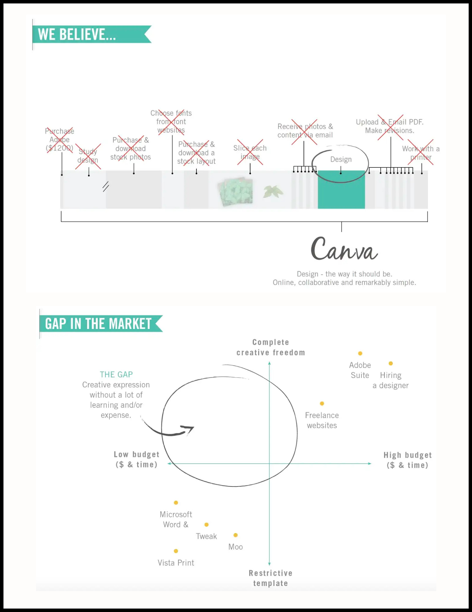
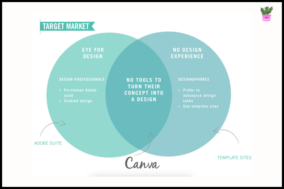
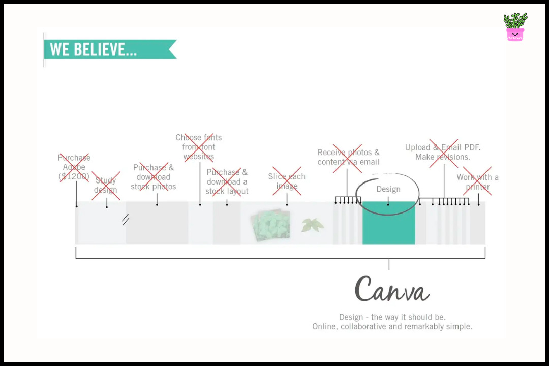
She recalls the process of designing and printing a poster — composing it in Photoshop or Word, converting to the right size and saving as a PDF, then going to a store to print. It all seemed cumbersome and unnecessary in the age of the internet. 💡Wouldn’t it be much better to do it all in one place with one online tool?💡 The idea of making design really simple was born. And although this pitch deck would not come for another few years, these two slides sum up how Melanie was thinking about where design was going, and how her big idea would fit in. The problem felt so obvious, and she feared if she didn’t move fast someone else would beat her to it. So, Melanie and her boyfriend, Cliff Obrecht, decided the best way to move quickly on this ambitious idea and test the concept was to break it down and start small. Being at university and close to the lives of students, she knew there was one niche that was right there, and underserved — school yearbooks. Typically the responsibility of student volunteers, and typically a tedious process because of the learning curve of the design tools and all the steps to get from A to Z, they knew this was how to get their foot in the door. So, they hired freelancers to help them build the site, dubbed in Fusion Books, and spun up their operation (including printing) in Melanie’s mom’s lounge. This initial pre-Canva product allowed students and schools to create their own yearbooks with simple drag and drop tools, and offered a library of customizable templates. While tightly focused on a very specific niche and use case — this concept became the core of Canva. And from here, Melanie and Cliff got their first customers for Fusion Books with boots-on-the-ground tactics — tapping into their student network and good-ol’ direct mail and phone calls.
But Melanie knew this wasn’t going to be the industry changing business she envisioned. How could it be when yearbooks happen only once a year and your total market demand is basically capped. Still, this very early concept got to the core problem they wanted to solve — easy online design — and they were very close to their customers. So they leaned into it to learn as much as they could. And Fusion Books grew into a nice lifestyle business. Surprisingly, it wasn’t until 4 years later that they starting getting closer to democratizing design for all. It was 2011 when Melanie spotted the narrowest of opportunities. Bill Tai, a Silicon Valley VC, was in Perth to judge a startup competition and get some kitesurfing in. They approached him after the event for a quick chat. Bill liked what they were putting down and invited them to San Francisco to pitch the idea.
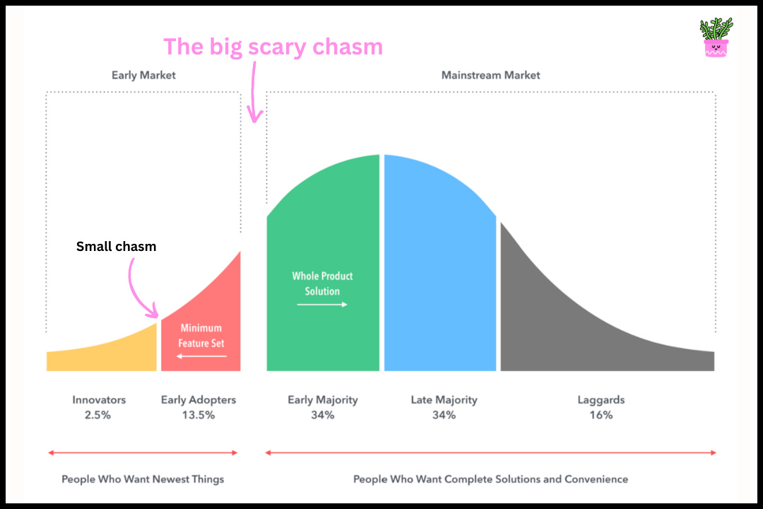
A few months later, after anxiously figuring things out in Perth and preparing for the world of venture capital — she flew to SF to meet Bill. In short, there was a very messy middle between flying to the states and eventually raising money and launching Canva. She was met with a lot of rejection, and it wasn’t before she recruited their technical co-founder, Cameron Adams, that they managed to raise a seed round of $3M. And on the 28th June 2012, Melanie, Cliff, and Cameron founded Canva. With a fresh new entity, cash in the bank, and a founding team — they were ready to get to work on changing how the world would design things. Let’s see how they did it. Subscribe Canva’s early growth and GTM strategyWe’ll start off by looking at Canva’s go-to-market strategy, covering an important concept in GTM motions that comes from WW2— the beachhead. 🪖 The tactics we’ll look at here got them some pretty incredible growth, and give us some great lessons for builders. We’ll then look beyond their GTM and unpack Canva’s current drivers of growth, the stuff that brings them +100% annual growth across a variety of their key metrics. Canva’s path to 150K usersTo make sense of Canva’s approach to breaking into the market, let’s first look at a concept I came across while reading Geoffrey Moore’s iconic business book, “Crossing The Chasm: Marketing and Selling High-Tech Products to Mainstream Customers”. We’ll kick it off with this visual… On the far left, you’ll notice the smaller chasm. This first market hurdle is where a new product has to translate its idea into something beneficial and usable to people beyond a small group of die hard tech enthusiast — known as innovators. These are the people that will just try just about anything as long as it has something novel to it and they like what it stands for. They don’t care for bugs and will tolerate all sorts of product issues that the rest of the market won’t.
Then there is the big scary chasm. This is the main chasm the book focuses on, and it’s where startups often die in their journey to going mainstream. And as the graphic above shows, it represents the big gap between two distinct markets:
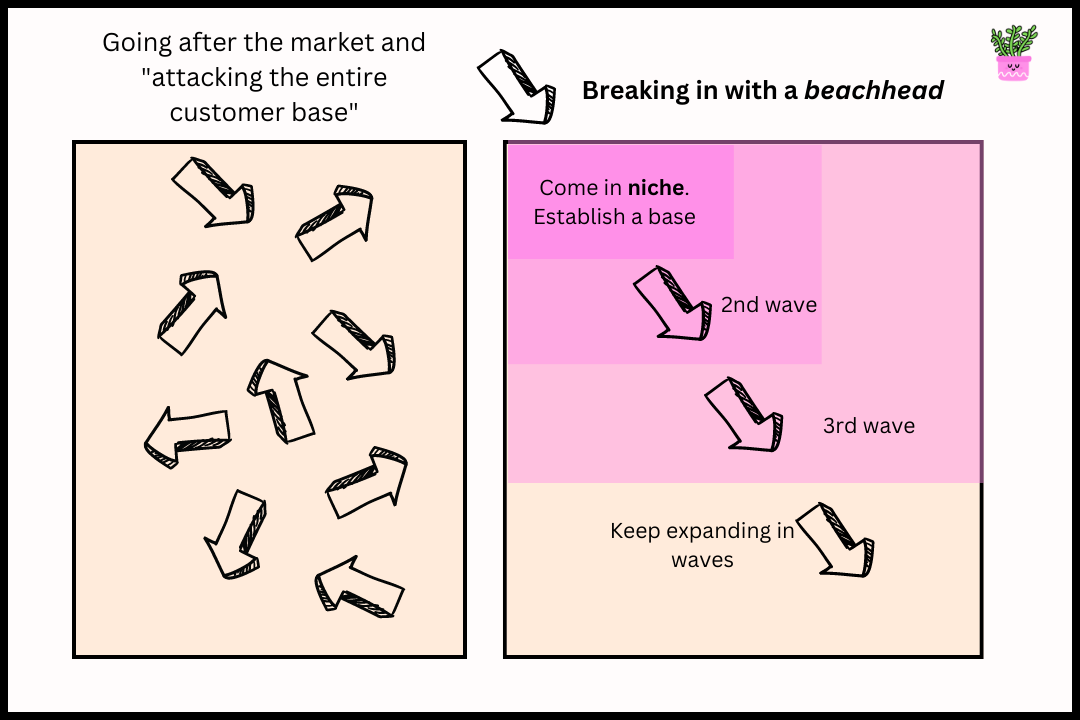
Finding a beachheadIn other words, the key to crossing the chasm is positioning and securing a “beachhead” in a mainstream market. Okay, what’s a beachhead though? Simply put, your beachhead is the smallest customer segment you can target that serves as a point of attack into the main market you want to break into. This niche has a set of characteristics that make it an ideal place to focus your initial effort. While I learned about it in Geoffrey’s book — the idea actually goes back to WW2.
To illustrate… And the strategy can be summarized like this:
And while Crossing the Chasm came out in 1991, that same year…another person was centering their strategy around the same principle. Only the mind behind what’s now the most valuable company on the planet. Taking a page from Steve Jobs’ → finding their nicheIf there’s one suggestion I ever make that you take seriously, I hope it’s this one. Watch this video by Steve Jobs talking about his strategy for NeXT computers — he articulates this idea of a beachhead so perfectly, plus it’s an 18 minute masterclass on clarity and strategic communication. To me, this sits at the heart of not just go-to-markets, but marketing.  And as we bring this quick theory session back to Canva-specifics — we’ll see they did exactly this. At the most zoomed out level — Melanie and Cliff knew there was this massive, growing, and underserved market of amateur/consumer designs. And as we covered earlier, they picked designers of school year books as their beachhead. Fusion Books (a super niche product) then transformed into Canva (a much more widely applicable tool). This approach helped them form a much deeper understanding of their target audience and their Job-To-Be-Done — helping them craft a better product. And with the earliest version of Canva, equipped with a more finessed whole product, we can see they pushed a bit further into the mainstream market they were after. But that middle segment (consumer designers) isn’t exactly niche. In fact, it’s massive. So, they narrowed it down to a specific use case — people needing to make content for Facebook. And more specifically, social media marketers and bloggers who needed to create lots of beautiful visual content but didn’t necessarily have any design experience. In 2013, small businesses were flocking to FB, and they needed professional-looking graphics like cover photos, flyers, social posts, event banners, etc. Canva identified this trend/problem and saw how they could position their product to easily appeal to this slice of the market and solve this huge pain point. So, going back to our theory from above — #1, “Select your beachhead” — we know who they targeted and why. But, how did they actually acquire their first customers? Let’s investigate. Leveraging communities for feedback and distribution.Canva started out in a private beta and used waitlists to control onboarding and build up demand. And before releasing publicly, they had over 50K people waiting to get access. How? The main thing they did was generate buzz within the design community and adjacent groups needing design help. Melanie and Cliff chased press, and reached out to blogs, podcasts, and conferences to offer “early access” to their audiences. And anyone on the waitlist who tweeted about Canva usually onboarded immediately. This pushed Canva’s name further and drummed up more hype. Taking a more gradual ramp up with waitlists is a highly effective strategy (tactics outlined here in our Superhuman deep dive) — and this closed beta allowed the team to run a tight feedback cycle and iterate on the product before the next bigger wave of customers were given access.
Watching users, removing friction, and showing people how to use the productTowards their goal of launching a whole product that people loved using, Canva spent a lot of time user testing during the pre-release period (via usertesting.com). This turned out to be key to unlocking their early growth— because they found a pretty significant issue. Their target customers who had never used any design software before “were scared to touch buttons”.
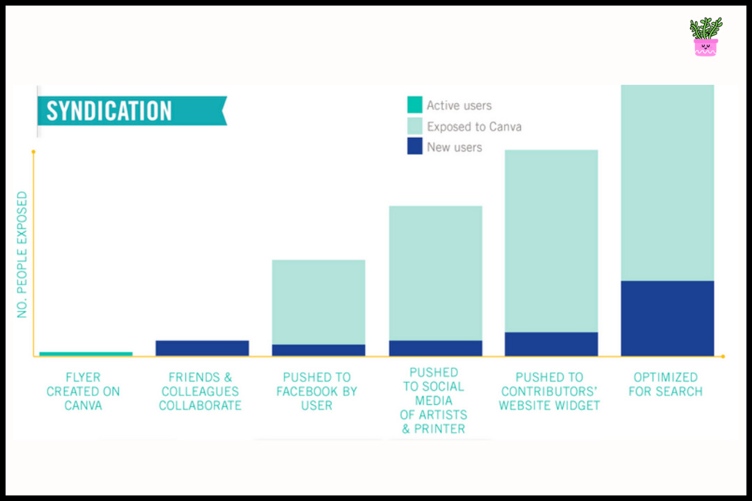
So, to boost confidence, new users went through a “how-to” guide before entering the product. Canva also built very basic starter challenges, like changing the color of a circle or adding a hat to a monkey - which helped users get familiar with the platform. “We continuously refined the experience until we got it to a point that people could jump in, and within five minutes had designed something,” says Perkins. This is a great example of how focusing on the customer and their experience is key to kickstarting growth. Get rid of the friction! Ok, so following our beachhead framework here, that’s how Canva did #2, “Get your product offer right for them” ✅. And below, we can also see how Canva ticked off #3 “Nail your distribution”. Focusing on a use case that was inherently viralThe niche use case that Canva picked for their GTM was designs for Facebook — this was tactically brilliant because at the time, FB was a great distribution channel to get Canva designs in front of as many people as possible. The Facebook templates drove referrals as users invited their colleagues to collaborate. It also drove word of mouth because when people posted a Canva graphic on Facebook, others would ask how they made it. Plus, Canva made it super easy for users to share the design (with one click) on Pinterest, Facebook, and Twitter. By doing this, a small number of users opened up a much larger audience. This graphic from Canva’s seed deck illustrates this strategy perfectly. Another example of this was how Canva leaned into a seasonal trend — holiday cards. For their first holiday season, they collaborated with artists to create 30+ templates for digital cards. Most were distributed via Facebook and email, which again funneled users back to Canva. And the most important fuel to Canva’s early growth was much simpler than all of this. People are inherently proud of their creations. Canva allowed people to create, and word of mouth organically drove a ton of growth. Leveraging social proof vs paid advertisingThese early adopters became Canva’s growth engine by sharing their designs with their friends.
Lots of startups looking to kickstart growth go straight to paid advertising, but besides hurting the bank, there’s diminishing returns when it comes to growth via ad dollars. As Reid DeRamus explains:
Ditto. I’m a strong believer that in most cases, you want to get a sustainable engine of growth working before leaning into paid advertising. Not only because it’s “free” growth that compounds on itself, but because it’s a signal that you have PMF. People don’t expend their valuable social credibility telling people about stuff they don’t like. That being said, while word of mouth is great (and often conflated with viral growth), Ben Thompson raises an interesting point:
Okay, we’re at the point in Canva’s growth story where what they did next, I would have typically dubbed viral growth. Except, if I called it that, I think I’d be wrong… 😬 Lenny Rachitsky wrote a piece recently that changed my view on what is “viral” — or rather, what isn’t. Let’s take a quick look, and then see how it applies to Canva. One-to-many broadcasts, AKA Canva’s turbo boostsOver the holiday break I was reading Hit Makers by Derek Thompson and one of the chapters forever changed the way I think about growth. […] One of his most surprising findings (at least for me) was that going “viral” is mostly a myth. We think that products often grow through friends telling friends, who tell more friends, and this cascades to so-called viral growth. It turns out this is almost never how products grow. Instead, products explode in popularity when someone (or a few someones) with a large platform shares the product with their audience. Here’s Derek Thompson describing this phenomenon:
In his post, Lenny goes on to argue that what we usually think is “viral” hardly ever is. Most things aren’t actually driven by “many people telling many other people”. Rather, it’s the result of someone with a large audience broadcasting it (i.e. one-to-many). Derek Thompson gives this example in his book:
That being said, Lenny notes that optimizing for viral engines like word of mouth is still important, and to kickstart (and restart) things like word of mouth you need to invest in large one-to-many broadcasts (i.e press, influencers, big ads). Now, bringing this quick theory interlude back Canva.
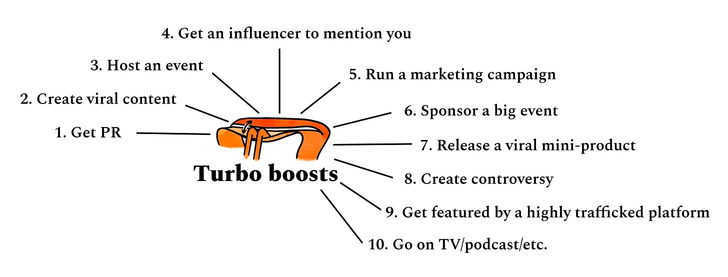
According to Lenny and Dan Hockeinmeir who created the Racecar Growth Framework —there are 10 different kinds of turbo boosts. Let’s look a bit closer at the turbo boosts they used to keep throwing logs on their WoM fire. 🔥
And that’s how Canva kickstarted their early growth and built up and impressive 150K in less than 24 months. 8 years later, they’ve almost 1000X that. How? 👇 Subscribe How Canva grows todayAs far as I can tell — there are 4 main forces behind this:
Today we will only go deep on PLG, since (1) it’s the core driver of Canva’s growth, (2) it’s one of the most important for a B2C SaaS company, and (3) there are a lot of brass tacks building lessons to learn here. We’ll lightly touch on the rest. Canva’s deep PLG iceberg
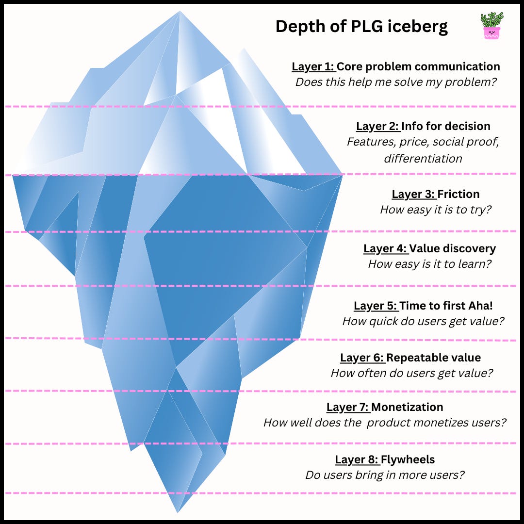
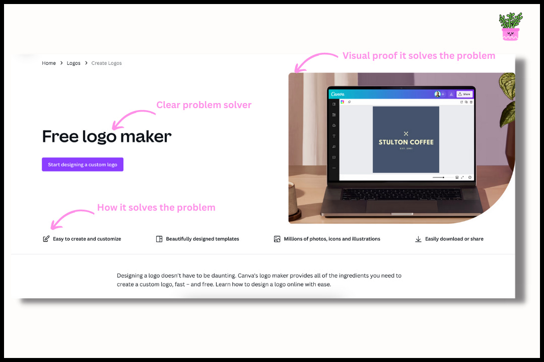
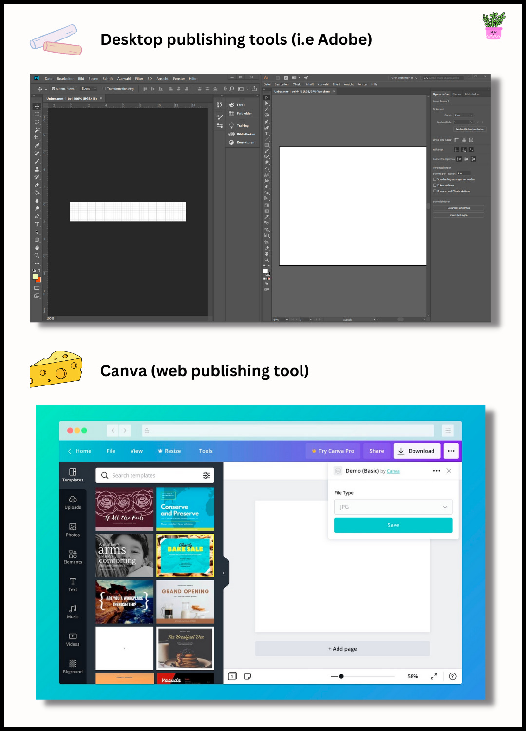
In other words — PLG is a growth model where product usage drives customer acquisition, retention, and expansion. It’s a strategy where the product takes center stage and converts users into paying customers (vs sales or marketing). And for consumers businesses, where each individual person is a decision maker, PLG is really the most effective way to onboard and convert them. A normal sales process just isn’t feasible. Canva is a brilliant example of a company that understands how to turn users into product-qualified leads (PQLs), which is great for growth since PQLs convert to paid customers on average 25% of the time. Now, before you get users whipping out their cards…first things first. When somebody is considering a new product, the very first thing they think about, whether they know it or not, is “how does this product help me solve this problem I have?”. The problem could be an aspirational one (i.e the desire to feel fancy), or a practical one (i.e I need to drill this hole). If that answer is hard to find or poorly communicated, everything else inside the product doesn’t really matter, because nobody will care to get there. Analogy time. Think of it like an iceberg. [Let me run over to Canva to illustrate 🧑🎨] Layer 1 and layer 2 are the easy-to-see showstoppers. It’s what will visibly causes a PLG company to fail, and it’s essential to have right if this is how a company is choosing to grow. That’s why most PLG companies end up getting this right. Every single iceberg (even a baby one) has a tip. But layer 3 and onwards are not technically essential and are harder to perfect. But the companies that do nail each layer become bigger and more formidable icebergs — meaning they will stick around for a lot longer. And this depth is what will sink competitors passing through. 🚢 Running with our iceberg analogy (which as far as I can tell we just invented here 🤘), upon closer investigation we can see Canva is doing every single layer extremely well. The tip → Communicating their value (L1 and L2)If I Googled something like “how to make a logo”, I’d quickly find myself on this page. Dead simple, and super clear that Canva solves this problem for me. And Canva has tons of search optimized landing pages for the breadth of problems they solve for consumer designers. Each page is personalized for the specific use case, and touches on specific value points that somebody considering designing, say, a resume will be thinking. And given Canva is free to use — this makes the decision easy to move along. Going deeper along the PLG iceberg…. Removing friction during onboarding (L3)Canva’s onboarding is seamless. They use single-sign on (i.e Google, FB) to make creating an account simple, and based on the landing page you’re coming from they bake in a lot of context around why you’re joining Canva. Then, with just a few easy questions — they suggest templates that will help you get the job done as quickly as possible (moving you closer to that Aha! moment). All in, getting from a landing page into the product, and having a working canvas to start your design, takes less than a minute This makes Canva extremely easy to try, with literally no risk. But onboarding goes beyond just the browser. For example, if you haven’t taken an action within an hour of signing up, you get an email with the subject “Design? You can do that.” After a user gets the first welcome email, if they haven’t clicked on the ‘get started’ button, they get some helpful and concise content to encourage that first action. And once the user has activated (started their first design) — Canva sends out weekly newsletters that cover things like: new templates, how to create on-trend designs, new features, and the beginning of their upsell with the benefits of Canva Pro. Canva keeps their marketing material practical — focusing on educating vs selling. Simply, because education brings users close to value, and repeat value. Value discovery and Aha! moments (L4 and L5)Canva’s whole shtick is that it’s the easiest design tool, period. And it has to be if they’re on a mission to make design available to anyone. The benefit of this is that they bring their learning curve way down. Education during onboarding can be friendly and more of a nudge, vs “documentation” and intense product tours that can be overwhelming. If you’re downloading Adobe Illustrator, it’ll be far longer before you find yourself staring at a canvas you’re proud of. Take a look: Chalk and cheese. Where the cheese here is clearly much less intimidating than traditional design software. Meaning the time to an end-product that makes people feel proud of themselves is orders of magnitude quicker. As their CPO says, a key philosophy of theirs is “have great defaults”, and defaults along with a huge template library make learning much easier. This makes the early discovery of the tool quick, but still allows users to go deeper with functionality as they get more comfortable. And when it takes just 20 minutes to make a logo vs 20 hours…people are likely to talk about it. That’s the shareable Aha! moment Aha! → again and again (L6)But providing just one key value experience isn’t enough to build an enduring business against. You to deliver value over and over again — and ideally, you’re not making that impossible by hiding your core product value behind a paywall. Canva gives us a masterclass on how to do this. Again, they’re free-to-use. But their freemium product isn’t time based, and it’s not usage based (i.e you can only design 3 things). This gives people open road to keep coming into Canva and making unlimited designs, forming a habit around the tool. For a consumer business, this habit forming is really important. But, how do they get people to keep coming back? First, they cover a huge range of use cases. If you came for a logo, you may well stay for presentations and social media posts. And there’s a lot of sideways product marketing and education to get you trying new things in Canva. This makes them much more sticky because all your designs now live in one place. Second, and this one is a biggie — Canva is vertically integrating the value chain of design. Way back in 2006 when Melanie had the idea to make design easy, she wanted “to take the entire design ecosystem, integrate it into one page, and then make it accessible to the whole world”. This was framed well in their first investor deck. They’ve executed on that vision. No more working across multiple tools and piecemealing your workflow together. Canva has made one place for everything, where they get to craft a perfect user experience. For instance:
And third, Canva is obsessed with listening to their users and evolving their product in response to their changing behaviors. Here’s their Chief Product Officer and co-founder, Cameron Adams, to show you how.
So by (1) covering a ton of design use cases, (2) vertically integrating across all value stages, and (3) always evolving their product to meet users needs, they’ve created one very sticky ecosystem. Now, what good is a sticky ecosystem if you’re not making money with it? Monetization: Canva’s free → paid conversion strategy (L7)Canva’s monetization strategy simple. Offer extensive free plans, help people see value upfront, and back the product to engage and retain people for long enough so they convert themselves into paid customers that are less likely to churn. When going after a large total addressable market of consumers — free plans are a key acquisition strategy. Once Canva has their engaged base of users set up, it’s then about segmenting them and finding the people that have a higher willingness to pay. From here, they can focus on delivering extra value to those segments. For example, they realized that SMB marketing teams were their sweet spot, turning their main Product-Led Sales playbook into a domino effect strategy (i.e converting individual users into teams). They lean into this by dropping well-placed paywalls on features like premium templates, brand guides, and advanced collaboration to nudge people using Canva on single-player mode to shift into multi-player mode. Now, while they have paywalled features and obviously want as many people as possible subscribing —they do this very unobtrusively. In an interview with Canva’s Product Growth Lead, he says that the main way they actually drive this segment of people to their premium offering is to “generally just let it happen”, because they’ve found that the people who use the product more frequently organically land on the paywalls sooner, have the highest conversion rate, and lowest churn rate. He goes on to say:
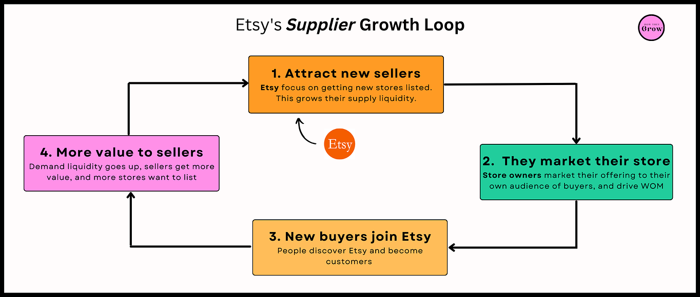
A great example of another consumer app that nails this balance is Spotify, who has a 46% conversion rate. I remember when I switched over from Apple Music back in 2018. I was broke and was more than happy to stick to the free plan. At first, I was okay with only 6 skips an hour, or whatever it was. At first, the ads were peppered in occasionally. But as the weeks passed and Spotify became part of my everyday, the ads became more frequent and more annoying. Eventually I paid. But if they’d made the free experience too gated (and therefore less enjoyable), I may well have churned. Canva strikes this balance well. Most people who’ve never “designed” before would be very hesitant to pay too early. So Canva lets them build habits and backs the downstream conversion. As an side: Canva has gradually also moved upstream, trying to get more enterprise customers. And with enterprises come sales people. This addition of a sales-led motion onto of a product-led one is very common. If you’re a PLG founder wondering what this might look like, there’s a podcast interview with John Eitel from Canva who gets into everything you need to know about adding a top-down motion to a bottom-up, product-led foundation. And now we get to the deepest level of the iceberg — getting your users to bring you more users. Creating a growth loop (L8)We’ve spoken about word of mouth already and how Canva facilitates this with one-click publishing, etc. We’ve also just touched on teams…where there’s obviously an invite mechanism here. Both of those have a flywheel effect. But let’s look at something else in the works that Canva has setup. 🧐 At face value, you wouldn’t think Canva is a marketplace. But under the hood, they’ve actually created a content marketplace that introduces a very neat flywheel unique to a marketplace business — supply driving demand. We covered this in our deep dive on Etsy. Here’s an excerpt:
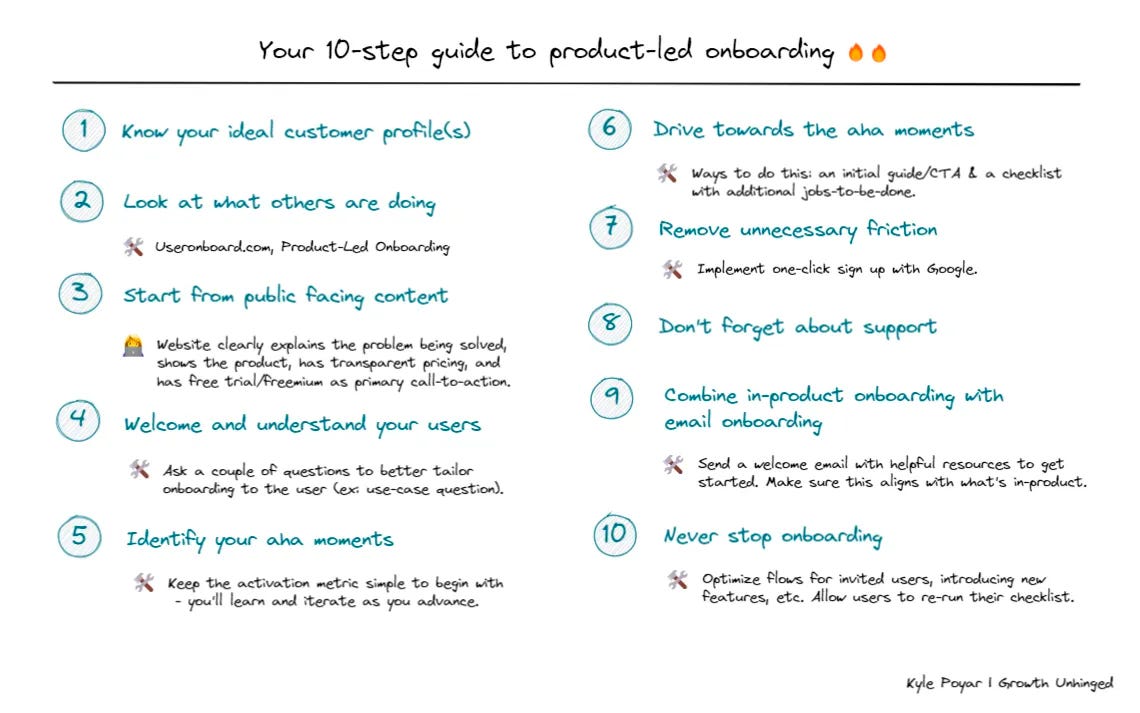
While that visual is Etsy-specific, you can imagine it works them same way when pro designers can come in and list their templates/designs to make passive income. And that’s the Canva PLG iceberg. Subscribe To summarize some action items to help you get your own iceberg in motion, here is a great visual by Kyle Poyar, Partner an Open View and author of Growth Unhinged. The next driving force behind Canva’s growth is content, which has helped them build “a backlink empire”. Content and winning at SEO
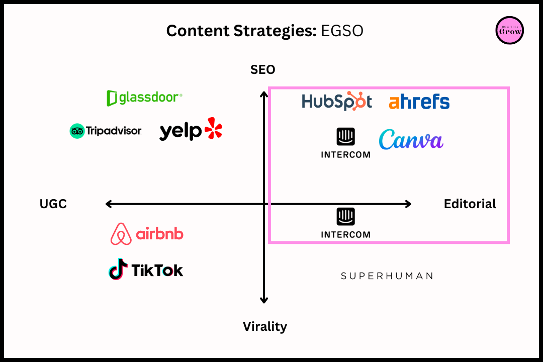
Canva is an excellent example of a company that’s used content marketing to build brand and drive real results using an inbound marketing funnel. At the heart of their strategy sits this quote by Silicon Valley marketer, Regis McKenna: “The best marketing is education.”All of Canva’s content is around helping users create better designs on Canva. But content is a massive term. In our deep dive on Intercom where we looked closely at content-driven growth, I wrote this:
Looking at where Canva sits in that quadrant, we can see that their content is created by employees and optimized for SEO. This strategy, dubbed by Lenny Rachitsky, is called Editorially-Generated SEO-Optimized (EGSO). People on the Canva team create content with the goal of ranking higher for certain keywords. Besides Canva, this helps drives the growth of companies like Ahrefs, Intercom, and HubSpot. And in short, Canva succeeds here by:
Strategy 1: Value-adding ContentAll of Canva’s content — from their blog, articles, and design school — is focused on education, and either making people feel either more confident to create their first design, or inspiring them to develop their skills and push how they use the tool. This helps reduce friction in their market of “amateur/consumer designers) and build Canva’s brand. The takeaway? Get your content to:
Strategy 2: Content that matches user intentSimply, search intent is the purpose of a user’s search. When you type something into search, Google makes assumptions about what you’re trying to find (your goal), and serves you what they think are the most relevant results. And how well you understand search intent as part of your content strategy impacts your ability to rank and whether the people that come to your pages are satisfied with your content. Canva uses a goal-related and solution focused keyword strategy for SEO. They focus on what their users are trying to achieve (i.e make a logo), and then connect them to a specific solution they're looking for on a dedicated landing page (i.e a free logo maker). The keywords they use are all based on jobs you can accomplish with the product — paving the way for high conversion rates because they do an excellent job at bringing users to content that is super relevant. Strategy 3: Building a backlink programBacklinks are all the inbound links to your content. The more people that drop in URLs to your stuff, the higher you rank on search. But…
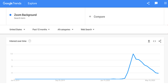
☝️FYI, that’s a backlink I just gave — making that article more visible in search. By being very intentional about getting more backlinks, Canva has come to dominate SEO. Strategy 4: Staying on top of consumer trendsCanva creates content in response to new demand, keeping them relevant and always in the conversation, and creating new lead magnets around the zeitgeist.
When demand spiked, Canva reacted by developing a new vertical dedicated to Zoom backgrounds. They spun up new landing pages to match search intent, and they even went to Product Hunt to drum up some interest. How startup-like. And that’s the high-level view of how Canva is using content and SEO to grow. The last driver of growth we’ll look at (very briefly) is how Canva is expanding internationally. Going global → localization & partnershipsIn the 5th edition of 5-Bit Friday’s, I wrote this while looking at the growth machine that is MrBeast (the worlds biggest content creator): Cast the widest net, catch the most fish.
With Canva, it’s very clear that international expansion is a key part of their growth. They’ve invested heavily in localization, as well as building in-country growth teams. Today, they’re in 190 countries and the platform is available in 100 languages. And with each new country/language Canva focused on supporting, their total addressable market got bigger. Here’s Cameron Adams talking about localization at Canva:
Curious on how to start your own localization strategy? Check this out. 🌎 Thank you Jaryd for an amazing breakdown of Canva. |
Older messages
$Cash App
Tuesday, January 31, 2023
How to innovate within a large company
🙊How to save money with startup deals
Friday, January 20, 2023
Unconventional ways to save money and extend your runway
📧 Welcome Emails
Tuesday, November 22, 2022
Good, Great & Amazing examples
⚠️ BeReal ⚠️
Tuesday, October 18, 2022
A detailed history of BeReal's rise from 0 to 15000000 customers
🟡 How to grab attention (for your company)
Tuesday, September 20, 2022
5 dead simple strategies for a brand to stand out.
You Might Also Like
🚀 Ready to scale? Apply now for the TinySeed SaaS Accelerator
Friday, February 14, 2025
What could $120K+ in funding do for your business?
📂 How to find a technical cofounder
Friday, February 14, 2025
If you're a marketer looking to become a founder, this newsletter is for you. Starting a startup alone is hard. Very hard. Even as someone who learned to code, I still believe that the
AI Impact Curves
Friday, February 14, 2025
Tomasz Tunguz Venture Capitalist If you were forwarded this newsletter, and you'd like to receive it in the future, subscribe here. AI Impact Curves What is the impact of AI across different
15 Silicon Valley Startups Raised $302 Million - Week of February 10, 2025
Friday, February 14, 2025
💕 AI's Power Couple 💰 How Stablecoins Could Drive the Dollar 🚚 USPS Halts China Inbound Packages for 12 Hours 💲 No One Knows How to Price AI Tools 💰 Blackrock & G42 on Financing AI
The Rewrite and Hybrid Favoritism 🤫
Friday, February 14, 2025
Dogs, Yay. Humans, Nay͏ ͏ ͏ ͏ ͏ ͏ ͏ ͏ ͏ ͏ ͏ ͏ ͏ ͏ ͏ ͏ ͏ ͏ ͏ ͏ ͏ ͏ ͏ ͏ ͏ ͏ ͏ ͏ ͏ ͏ ͏ ͏ ͏ ͏ ͏ ͏ ͏ ͏ ͏ ͏ ͏ ͏ ͏ ͏ ͏ ͏ ͏ ͏ ͏ ͏ ͏ ͏ ͏ ͏ ͏ ͏ ͏ ͏ ͏ ͏
🦄 AI product creation marketplace
Friday, February 14, 2025
Arcade is an AI-powered platform and marketplace that lets you design and create custom products, like jewelry.
Crazy week
Friday, February 14, 2025
Crazy week. ͏ ͏ ͏ ͏ ͏ ͏ ͏ ͏ ͏ ͏ ͏ ͏ ͏ ͏ ͏ ͏ ͏ ͏ ͏ ͏ ͏ ͏ ͏ ͏ ͏ ͏ ͏ ͏ ͏ ͏ ͏ ͏ ͏ ͏ ͏ ͏ ͏ ͏ ͏ ͏ ͏ ͏ ͏ ͏ ͏ ͏ ͏ ͏ ͏ ͏ ͏ ͏ ͏ ͏ ͏ ͏ ͏ ͏ ͏ ͏ ͏ ͏ ͏ ͏ ͏ ͏ ͏ ͏ ͏ ͏ ͏ ͏ ͏ ͏ ͏ ͏ ͏ ͏ ͏ ͏ ͏ ͏ ͏ ͏ ͏ ͏ ͏ ͏ ͏ ͏ ͏ ͏ ͏ ͏ ͏
join me: 6 trends shaping the AI landscape in 2025
Friday, February 14, 2025
this is tomorrow Hi there, Isabelle here, Senior Editor & Analyst at CB Insights. Tomorrow, I'll be breaking down the biggest shifts in AI – from the M&A surge to the deals fueling the
Six Startups to Watch
Friday, February 14, 2025
AI wrappers, DNA sequencing, fintech super-apps, and more. ͏ ͏ ͏ ͏ ͏ ͏ ͏ ͏ ͏ ͏ ͏ ͏ ͏ ͏ ͏ ͏ ͏ ͏ ͏ ͏ ͏ ͏ ͏ ͏ ͏ ͏ ͏ ͏ ͏ ͏ ͏ ͏ ͏ ͏ ͏ ͏ ͏ ͏ ͏ ͏ ͏ ͏ ͏ ͏ ͏ ͏ ͏ ͏ ͏ ͏ ͏ ͏ ͏ ͏ ͏ ͏ ͏ ͏ ͏ ͏ ͏ ͏ ͏ ͏ ͏ ͏ ͏ ͏ ͏ ͏ ͏
How Will AI-Native Games Work? Well, Now We Know.
Friday, February 14, 2025
A Deep Dive Into Simcluster ͏ ͏ ͏ ͏ ͏ ͏ ͏ ͏ ͏ ͏ ͏ ͏ ͏ ͏ ͏ ͏ ͏ ͏ ͏ ͏ ͏ ͏ ͏ ͏ ͏ ͏ ͏ ͏ ͏ ͏ ͏ ͏ ͏ ͏ ͏ ͏ ͏ ͏ ͏ ͏ ͏ ͏ ͏ ͏ ͏ ͏ ͏ ͏ ͏ ͏ ͏ ͏ ͏ ͏ ͏ ͏ ͏ ͏ ͏ ͏ ͏ ͏ ͏ ͏ ͏ ͏ ͏ ͏ ͏ ͏ ͏ ͏ ͏ ͏ ͏ ͏ ͏ ͏ ͏ ͏ ͏ ͏ ͏ ͏ ͏ ͏ ͏
