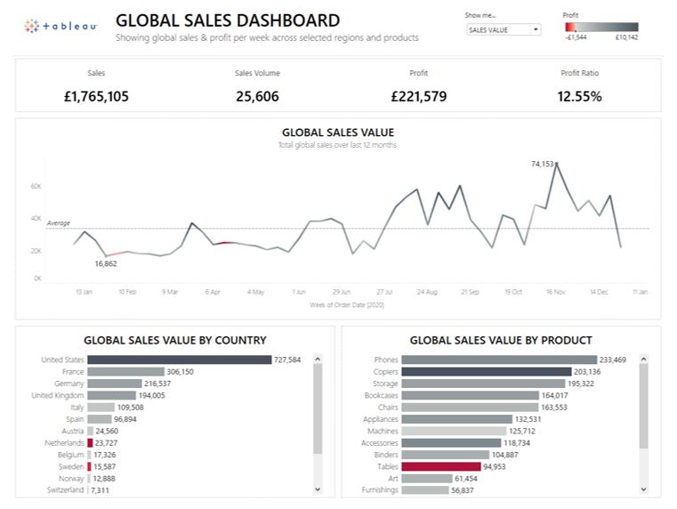
Course: Creating an interactive sales dashboard in Tableau
Course: Creating an interactive sales dashboard in TableauIn this Tableau Academy course you take up the role of a sales operations analyst who has been tasked with creating an interactive global sales dashboard for the retail chain they work for.For information on how Tableau Academy works please refer to our Welcome To Tableau Academy Guide. The ProjectThis section sets out the information about the project you’ll be undertaking in this lesson. Your Role:You’re working as a Sales Operations Analyst for a global retail chain that sells a range of office equipment. Part of your role is to produce reports and dashboards for the global sales leadership team to help them manage the business and identify reasons why sales are growing or falling in particular areas or categories. The Brief:The sales leadership team currently receive a variety of sales reports from different regions in different formats, they’ve asked for a global report to be created which allows them to see and compare sales across regions and products for the entire company. Required Data:The global Business Intelligence team have set up a daily export of the combined sales data from all regions in .csv file for you. This contains line by line sales items and is the trusted and signed off source of sales data for the entire company. The file is refreshed each day at 2.30am GMT with the previous days sales data added, the file location and name is always the same. All currencies have been converted to GBP and all date formats to DD-MM-YYYY as the globally agreed formats within your company. Project Requirements:The following requirements have been agreed and must be met: 1. A single page report containing a global view of total sales, profit and orders (sales volumes) per week for the past 12 months. 2. Ability to view each of the above by individual Geographies (Country), and Products (Sub Category). 3. Ability to see the breakdown of sales, profit and orders each week by Geography (Country), and Product (Sub Category). Course Files:You can download the files required for this project from here: Tableau Academy Course Files In particular you will need to download and save the data file here: Global Sales Data.csv SolutionThe rest of this course now walks you through building out an interactive dashboard in Tableau Desktop which meets the requirements above, once you’ve completed the course you’ll have built a fully interactive sales dashboard and been introduce to many of the key functions and capabilities of Tableau.
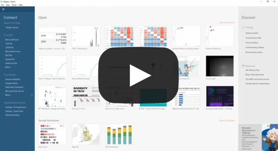
Step 1: Connect to the data and create the main global sales chart1.1 - Our first task is to connect to the provided data source in Tableau, make sure you’ve downloaded a copy of the global sales data.csv from above to your PC and that you have a copy of Tableau Desktop or Public installed. If you’re new to Tableau the first thing you’ll need to understand is how to get data into Tableau. If you’re coming from mainly using spreadsheets or similar software it’s worth knowing that Tableau connects to data stored in other files, databases or systems rather than providing a way for you to input data as you may be used to. The great news is that Tableau makes it really easy to connect to almost any data source, you generally just need to point Tableau at the data you want and it does most of the work for you. In this course we’re going to connect to a file that contains the data we want, specifically the ‘csv’ file you should have already saved from the course files folder.
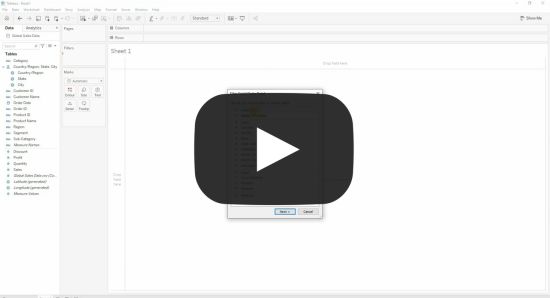
 1.2 - This has now opened up a new Sheet in Tableau for us to start creating our charts. To start with we’re going to add a filter to just show the last 12 months data as per the project requirements. The data file that we’ve loaded contains a lot of data but we’re only interested in the data for 2020 for this project. If we wanted we could remove the data we don’t want from the data file, or create a copy with just the data we want however Tableau can take care of this for us using data filters which we’ll take a look at now. On the screen that’s appeared you should be able to see your data pane at the far left of the screen, this is a list of data fields that exist within your data and we’ll see how to use these shortly. Next to those you should see a number of ‘cards’, namely Pages, Filters and Marks, we’re going to focus on the Filters one for this part of the lesson. As you might have expected the Filters card allows you to filter your data, Tableau provides many options for filtering your data but we’ll just use a simple date filter to introduce you to this. If we want to add a filter for a particular field in our data we simply drag it from the data pane and drop it onto the Filters card, a menu then pops up allowing us to set what we want to filter within that field as well as some additional options. In this project we want to filter on our ‘Order Date’ field and only include data with an order date that is in 2020, let’s have a look at how to do this:
You should now see that a blue pill has been added to the Filters card, other than that it won’t look like anything has changed. To see what has happened double click on the Order Date field in the data pane (note: in the data pane, not the filters card). A table should appear showing the years in the data, with the filter applied it should only show 2020. Click the blue pill in the Filters card to bring up the menu and then click Remove (a quicker way is to just drag the pill off the filter card to remove it as seen in the video below). You should now see that 2019 also appears in the table on the main panel so you can see that your data had indeed been filtered. To get your filter back follow the steps again, or click the undo button (or press ctrl + z) three times to get back to where you were.
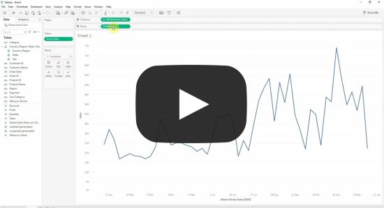
 1.3 - Now we’re going to create our main chart to show the total sales per week for the last 12 months. We’ve got our data and filtered it so we can now go ahead and start building some charts which is exactly what Tableau is for! In this part of the project we show you how easy it is to explore and visualise your data using drag and drop functionality. In Tableau we use Sheets to create individual charts, this can be confusing if you’re new to Tableau but once you know that each Sheet contains a single chart it makes it much easier (it would have been simpler if Tableau called their tabs Charts rather than Sheets though!). Later in the project we’ll show you how you combine multiple sheets and create multiple charts that can interact with each other. To create a chart we simply drag the relevant fields we want onto the relevant part of the main pane in Tableau. For our first chart we want to show sales for each week so we’ll want the Order Date field on our X axis (which Tableau calls Columns) and our Sales field on our Y axis (which Tableau calls Rows), you’ll also see that Tableau automatically picks the best chart type based on the data we add.
You should see that Tableau has automatically added up the sales for each week in our data and plotted this as a line chart for us, this is how easy it is to create charts to analyse and visualise your data in Tableau! Tableau makes a pretty good job of determining what to show based on the type of data we select, however you can also change this if you wish. We’re happy with what Tableau has selected but we could change the cart to a bar chart if we preferred and could also change it to show the average sales each week rather than the total but we’ll explore those in later projects.
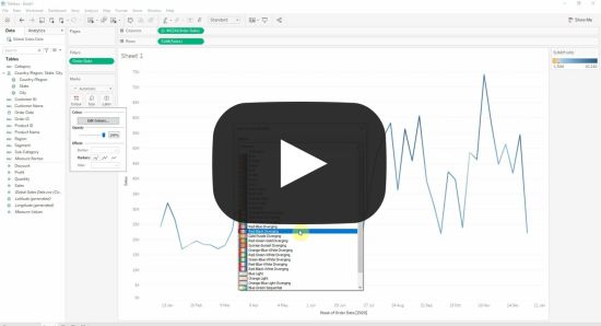
 1.4 - Next we’re going to add profit onto the colour dimension of the chart, this will allow users to see how both sales and profit have been performing at the same time. Something else Tableau does really well is enable us to create charts that show additional information and context without making our charts too busy and complicated. Take a look at the chart we just created, we can see when sales have increased and decreased pretty easily but what if we want to know whether our profitability has also gone up or down at the same time. We’d normally expect sales and profit to move in the same direction and have similar trends but what if our sales have increased as we’re offering huge discounts so selling a lot but not making as much profit on those sales? We could just add profit to the chart as another line which would work ok but a much more effective method would be to colour code the line in our chart to show when profit was increasing or decreasing and by how much which would then give us much more information. With Tableau we can do this in just a few seconds and with just a few clicks! This is how:
 1.5 - We’ve got what we need for our first chart, we’ll now clean up the formatting by adding labels and removing any clutter that we don’t need. Tableau does a pretty good job of creating clean and uncluttered charts by default. However, we’re big fans of only keeping things on our charts that add value. For example, rather than having our axis listing values on the left and taking up valuable screen space we prefer to remove these and add labels to the biggest and smallest values on the chart. This still allows users to see the range of values on the chart without taking up much space, if they need to see the specific numbers for a data point they can hover over or click on it to get these:
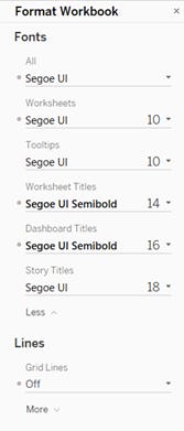
Rather than deciding on formatting for each individual chart, report or dashboard we’ve developed an internal style guide that we work to in order to keep our reports consistent. This style guide lays out the formatting we should apply to each element of our charts, below we go through making each of the changes our style guide depicts and in a later course we’ll show you how to create your own style guide and apply these by default to your Tableau workbooks. First up our style guide tells us what fonts, font sizes and weights to use for each area of our chart. To format the fonts used in your workbook:
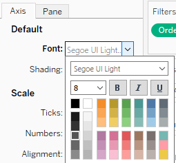
For some areas we can’t set the formatting via the format workbook menu so have to set it manually, for example we want to format the font used on our axis and remove the axis labels which we can do as follows:
We also want to change the title at the top of the chart, this defaults to the sheet title but we want something that looks better and is more informative, edit the title as follows:
GLOBAL SALES
The sheet title should now have updated to what you’ve just set.
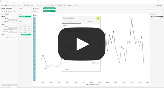 1.6 - Finally, we want to add a weekly average line so users can easily see if the sales each week is above or below what we might expect.
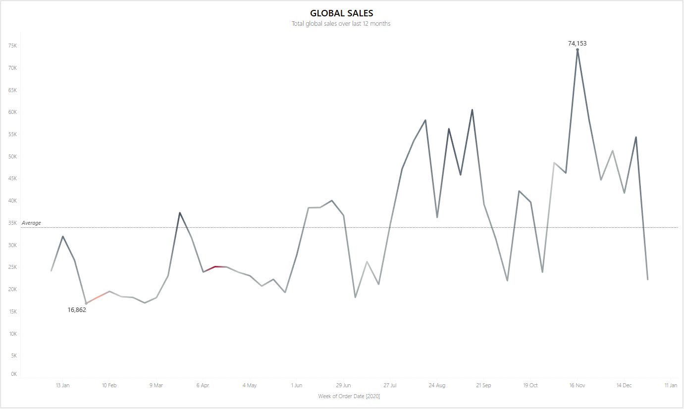
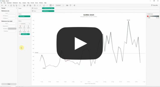 That’s the first step complete! You should now have a chart showing the global sales and profit each week which looks like this: Step 2: Enable users to see sales volumes as well as sales valuesOne of our requirements is to be able to see the sales volume as well as the sales value, we could add this as a second line on the chart but I find it tends to be misleading and confusing, instead we’re going to let users select which they want to see using a parameter and a calculated field... Subscribe to Tableau Academy to read the rest.Become a paying subscriber of Tableau Academy to get access to this post and other subscriber-only content. A subscription gets you:
|
Older messages
Tableau Tea Break, Tableau Jobs & Tableau Academy are now one!
Wednesday, April 26, 2023
Back for 2023! We're pleased to announce Tableau Tea Break, Tableau Jobs and Tableau Academy are all back and now under one banner, read on to find out more!
Your Complete Tableau Learning Pathway
Friday, February 17, 2023
Go from complete Tableau newbie to Tableau master in no time by following our tried and tested Tableau Learning Pathway. Simply follow each of the courses below in your own time and you'll cover
Introducing Tableau Jobs!
Monday, November 21, 2022
If you're looking for a new role, or just interested in what's out there check out our Tableau Jobs project below.
Creating a simple business KPI dashboard in Tableau
Tuesday, November 15, 2022
In this Tableau Academy course we introduce you to reporting on and visualising key performance indicators (KPIs) by taking you through a project to create a simple to use and understand business KPI
Recommended Course: Build your first interactive Tableau Dashboard
Monday, November 7, 2022
The very first step on our Tableau Learning Pathway takes you step by step through building your very first interactive dashboard, read on to find out more...
You Might Also Like
Instagram Book Promotion for Authors and Publishers
Friday, February 28, 2025
Your book on Instagram! Instagram promo image Instagram ~ a great place to advertise books
🤯 This is what calling your shot looks like…
Thursday, February 27, 2025
This year, we're playing to win. Read our annual company update right here, right now. Learn about our biggest moves yet... Playing to Win Contrarians, First, thank you. Trust is a rare currency in
3-2-1: On the secret to self-control, how to live longer, and what holds people back
Thursday, February 27, 2025
“The most wisdom per word of any newsletter on the web.” 3-2-1: On the secret to self-control, how to live longer, and what holds people back read on JAMESCLEAR.COM | FEBRUARY 27, 2025 Happy 3-2-1
10 Predictions for the 2020s: Midterm report card
Thursday, February 27, 2025
In December of 2019, which feels like quite a lifetime ago, I posted ten predictions about themes I thought would be important in the 2020s. In the immediate weeks after I wrote this post, it started
Ahrefs’ Digest #220: Hidden dangers of programmatic SEO, Anthropic’s SEO strategy, and more
Thursday, February 27, 2025
Welcome to a new edition of the Ahrefs' Digest. Here's our meme of the week: — Quick search marketing news Google Business Profile now explains why your verification fails. Google launches a
58% of B2B Buyers Won't Consider You.
Thursday, February 27, 2025
Here's why, and how to fix it. ͏ ͏ ͏ ͏ ͏ ͏ ͏ ͏ ͏ ͏ ͏ ͏ ͏ ͏ ͏ ͏ ͏ ͏ ͏ ͏ ͏ ͏ ͏ ͏ ͏ ͏ ͏ ͏ ͏ ͏ ͏ ͏ ͏ ͏ ͏ ͏ ͏ ͏ ͏ ͏ ͏ ͏ ͏ ͏ ͏ ͏ ͏ ͏ ͏ ͏ ͏ ͏ ͏ ͏ ͏ ͏ ͏ ͏ ͏ ͏ ͏ ͏ ͏ ͏ ͏ ͏ ͏ ͏ ͏ ͏ ͏ ͏ ͏ ͏ ͏ ͏ ͏ ͏ ͏ ͏ ͏ ͏ ͏
Teleportation, AI Innovation, and Outgrowing 'Good Enough'
Thursday, February 27, 2025
Oxford scientists have achieved quantum teleportation of logic gates, AI advances include France's €109B investment, Unitree's eerily smooth robotic movements, and DeepMind's Veo2 video
🧙♂️ Quick question
Thursday, February 27, 2025
Virtual dry-run of my event ͏ ͏ ͏ ͏ ͏ ͏ ͏ ͏ ͏ ͏ ͏ ͏ ͏ ͏ ͏ ͏ ͏ ͏ ͏ ͏ ͏ ͏ ͏ ͏ ͏ ͏ ͏ ͏ ͏ ͏ ͏ ͏ ͏ ͏ ͏ ͏ ͏ ͏ ͏ ͏ ͏ ͏ ͏ ͏ ͏ ͏ ͏ ͏ ͏ ͏ ͏ ͏ ͏ ͏ ͏ ͏ ͏ ͏ ͏ ͏ ͏ ͏ ͏ ͏ ͏ ͏ ͏ ͏ ͏ ͏ ͏ ͏ ͏ ͏ ͏ ͏ ͏ ͏ ͏ ͏ ͏ ͏ ͏ ͏ ͏ ͏ ͏
A Classical Way to Save the Whales
Thursday, February 27, 2025
But what song, we don't know.
I'm investing in early stage AI startups
Thursday, February 27, 2025
Hi all, I'm investing in early stage AI startups. If you know someone who's looking for easy-to-fit-in checks from helpful founders (happy to provide references) I'd love to chat. Trevor
