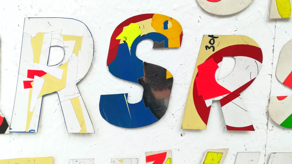
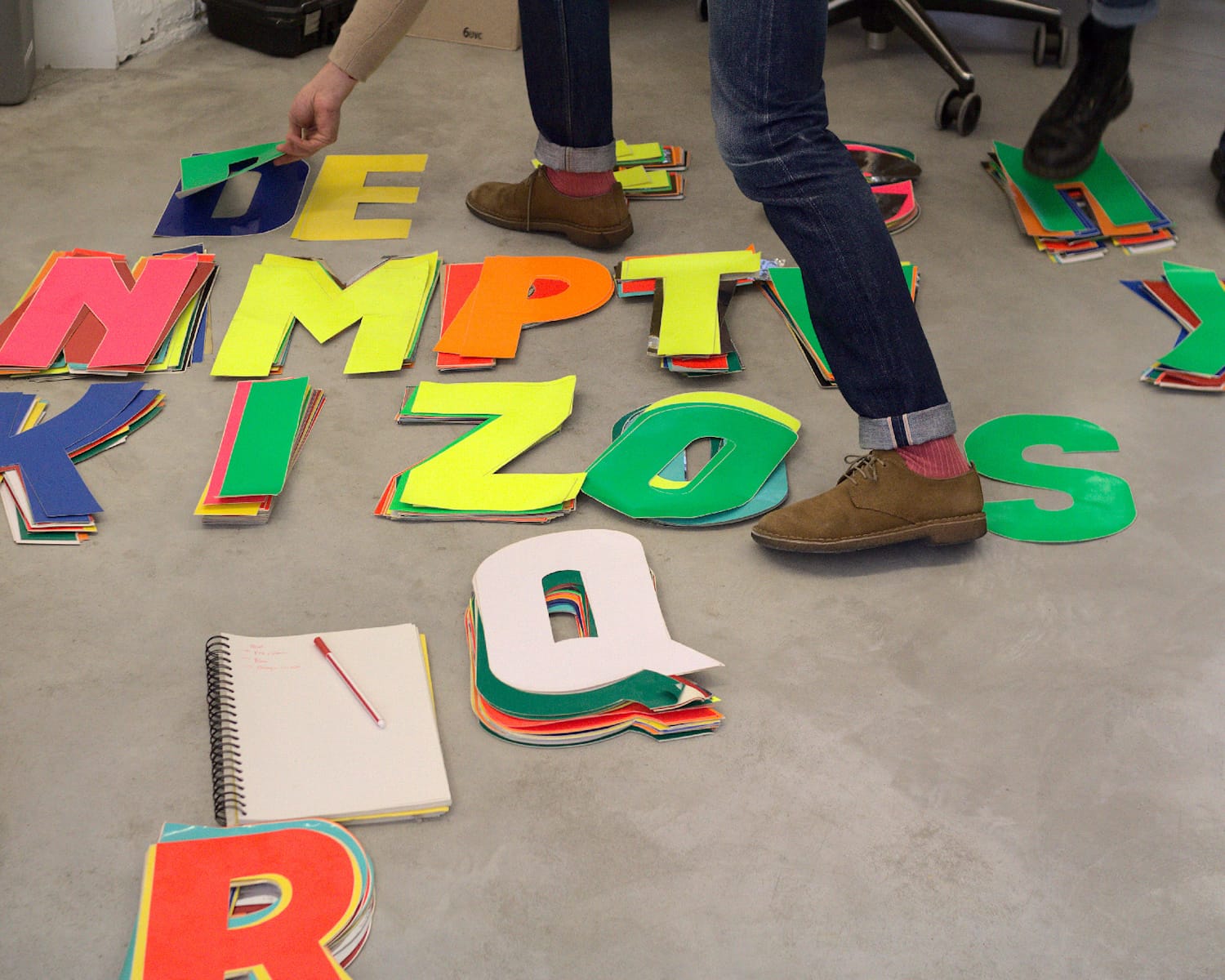
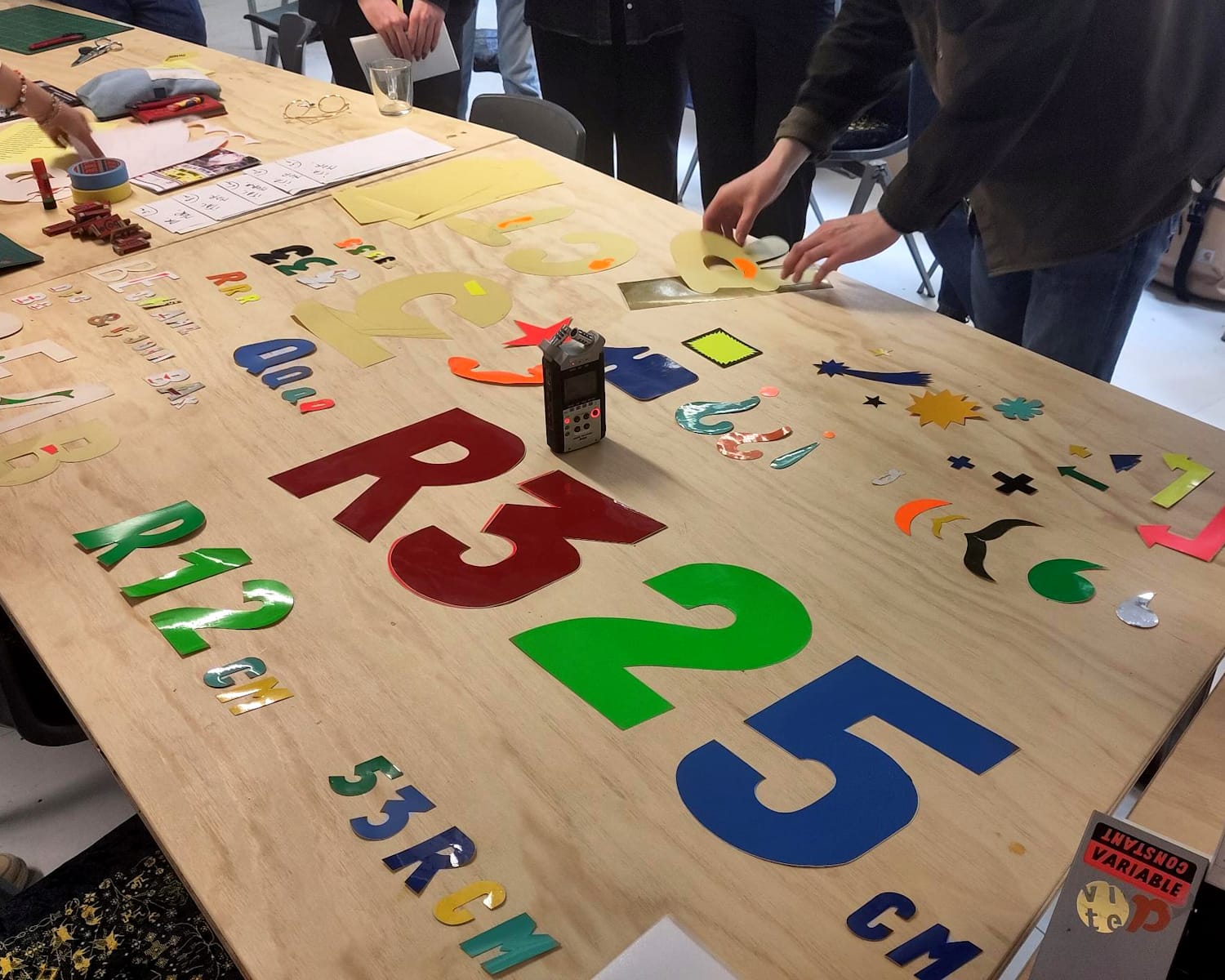
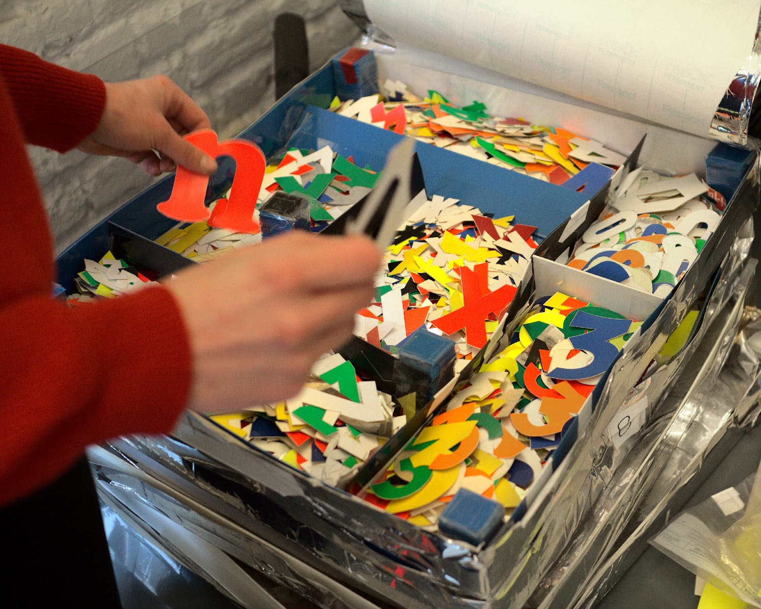
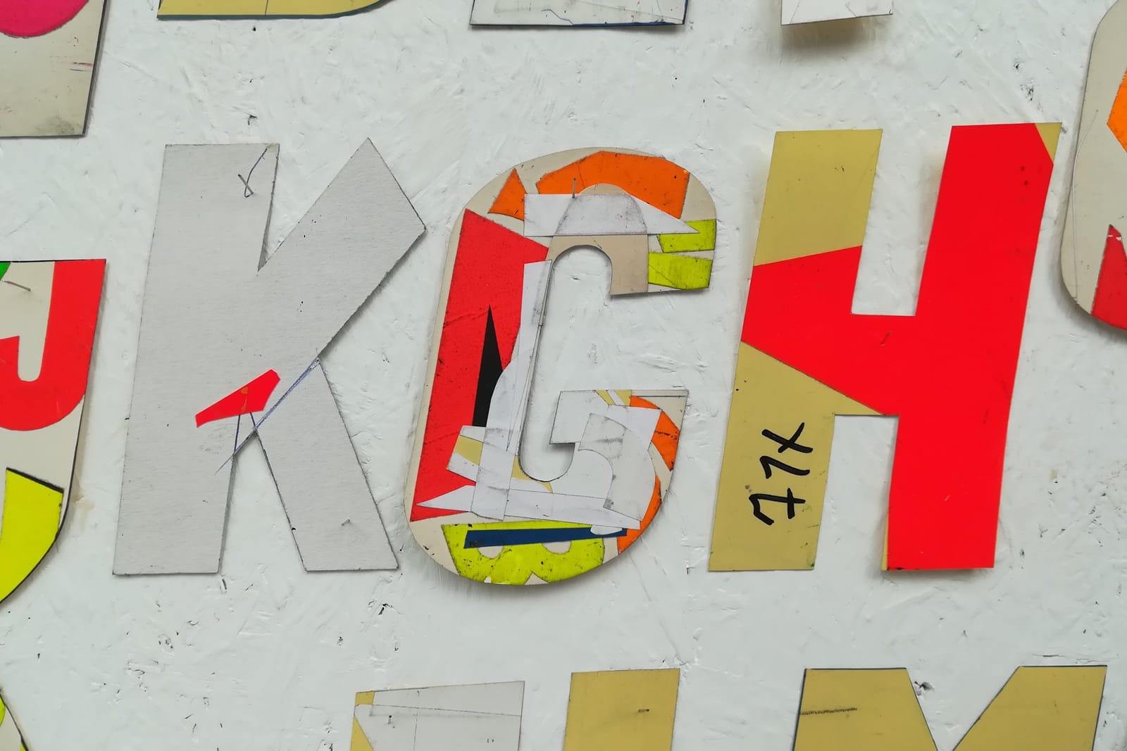
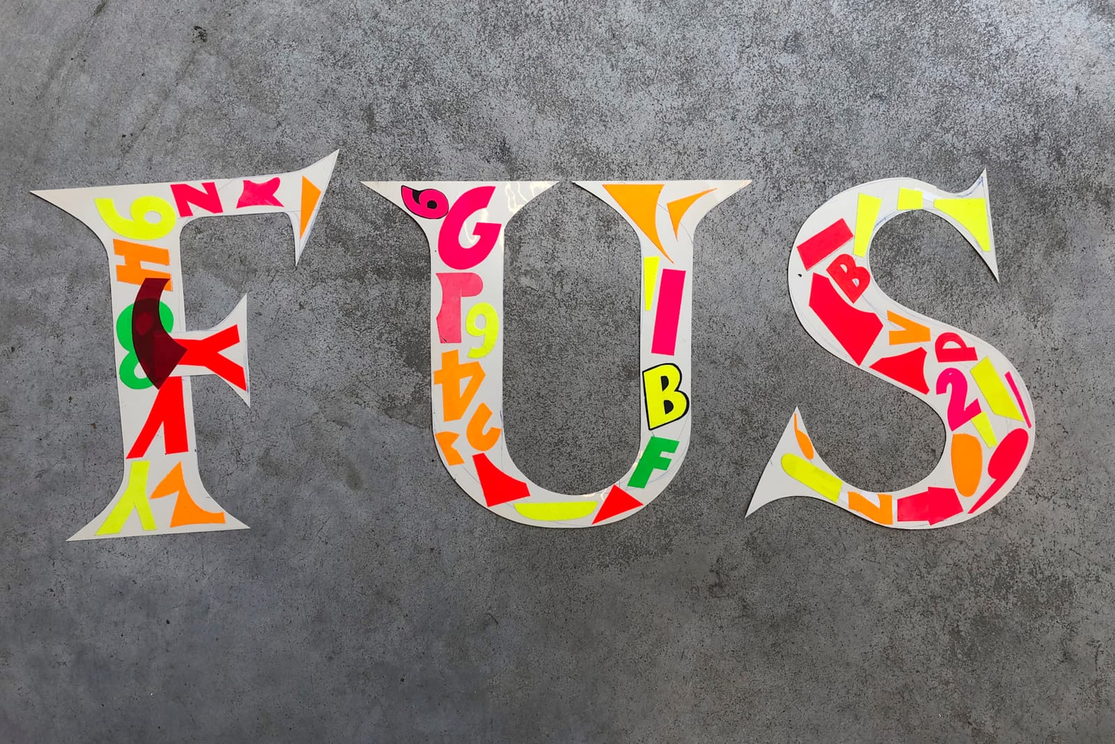
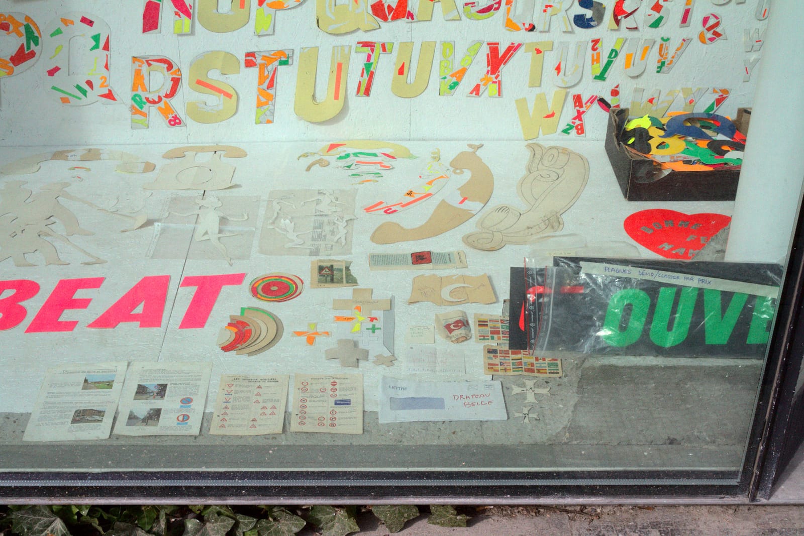
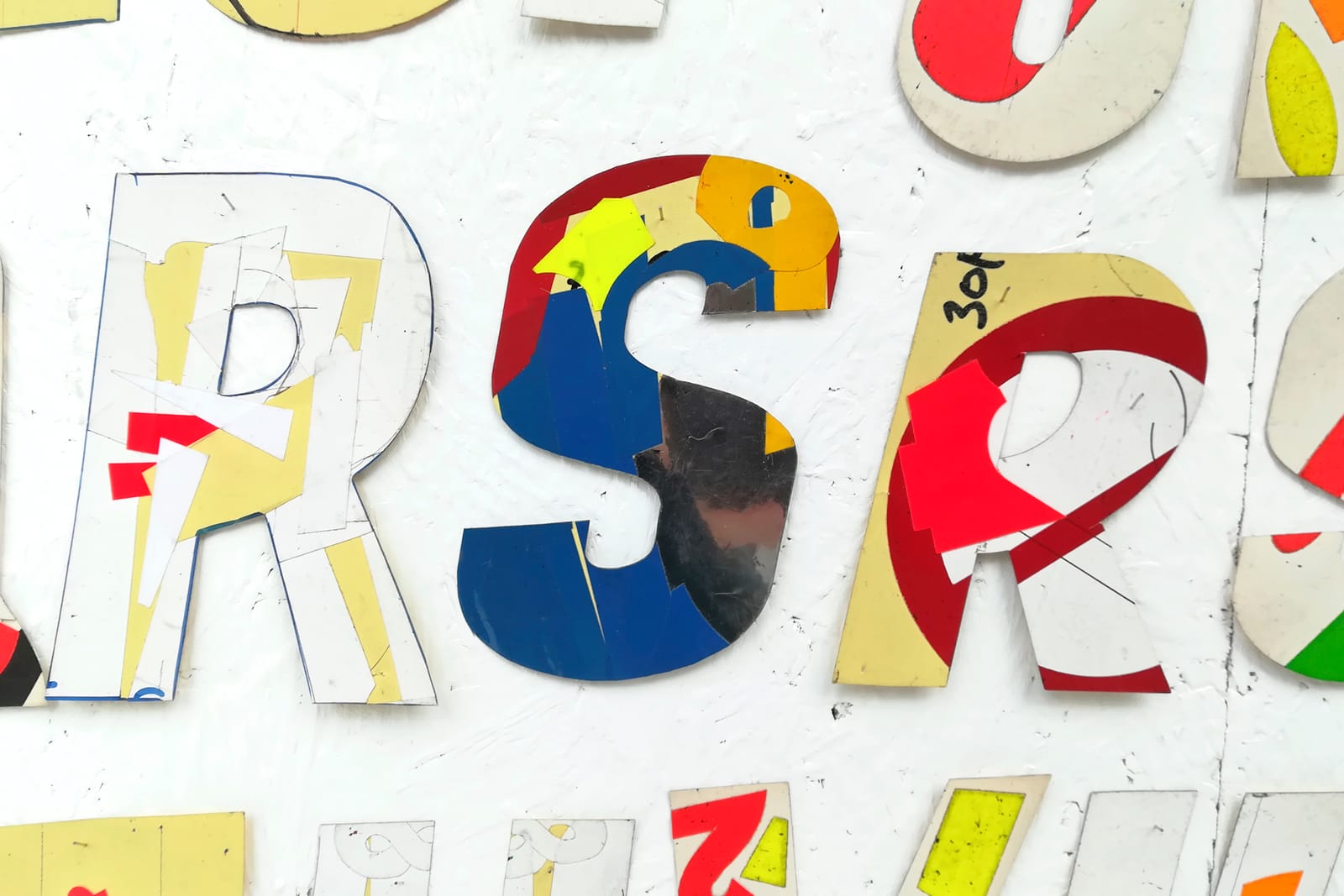
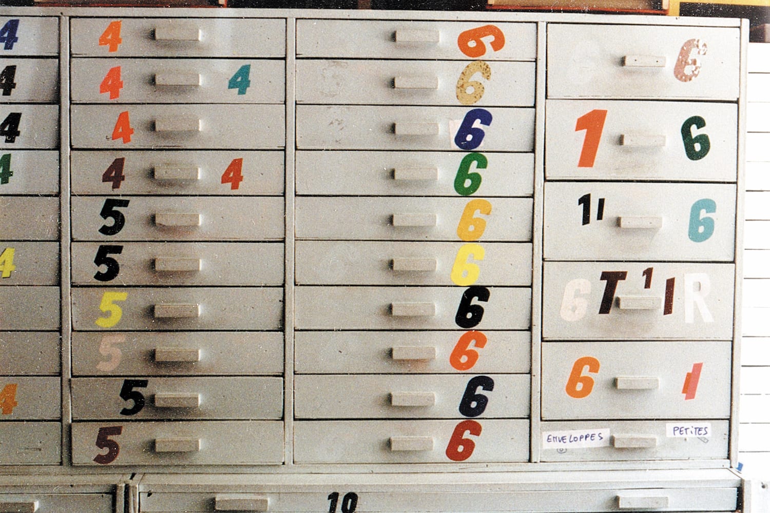
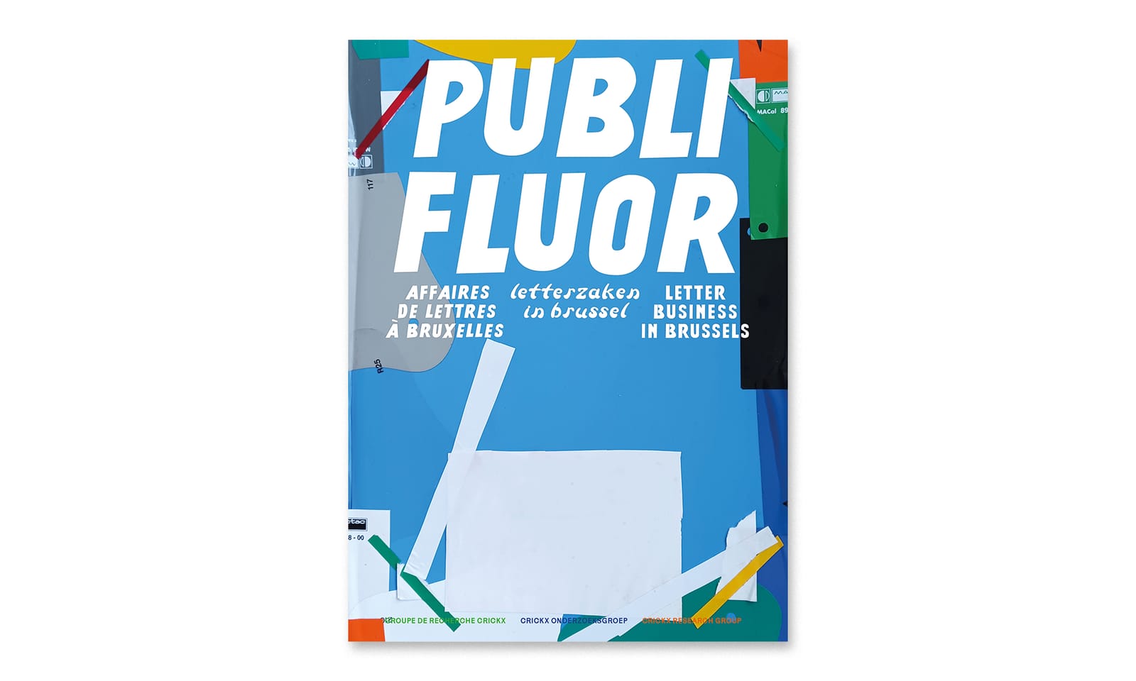
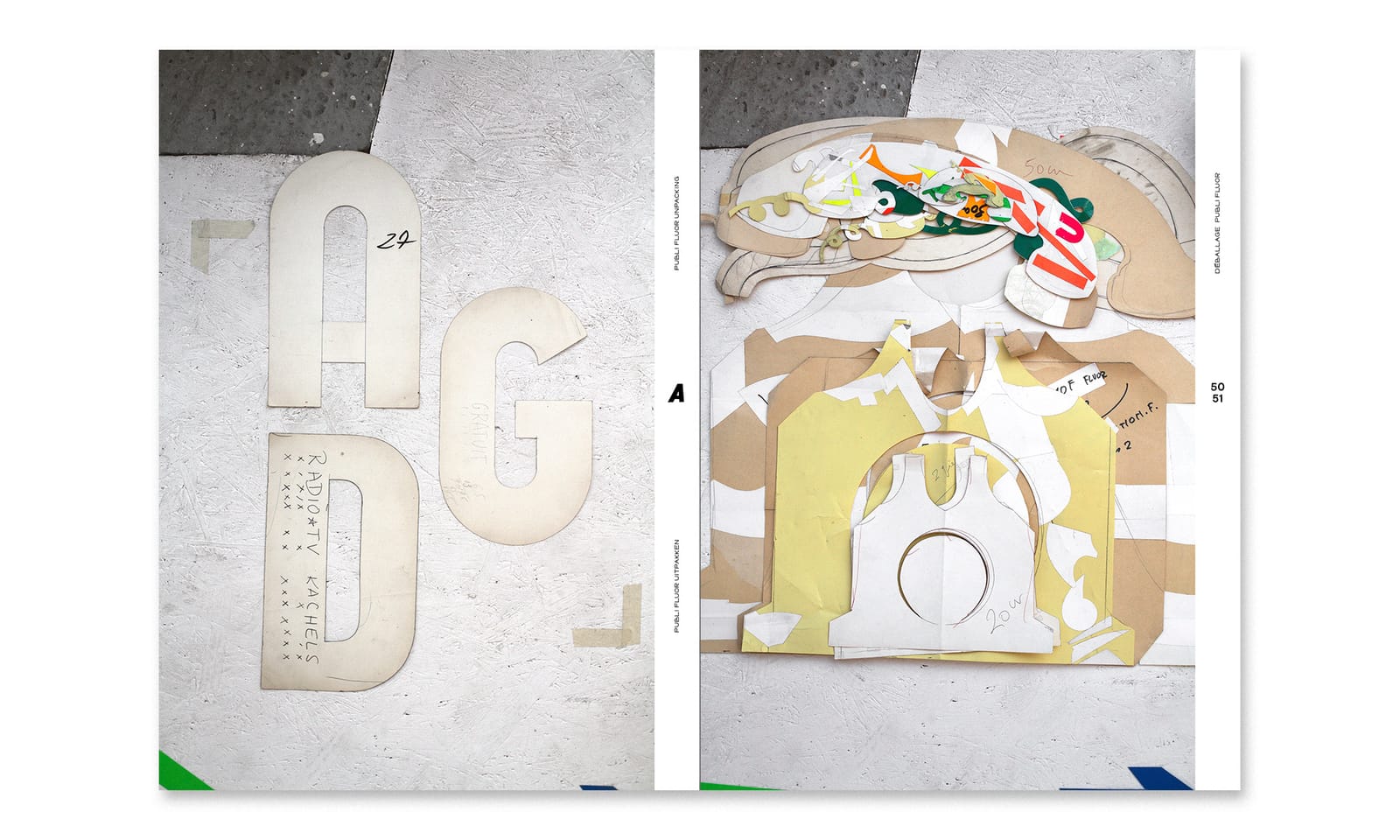
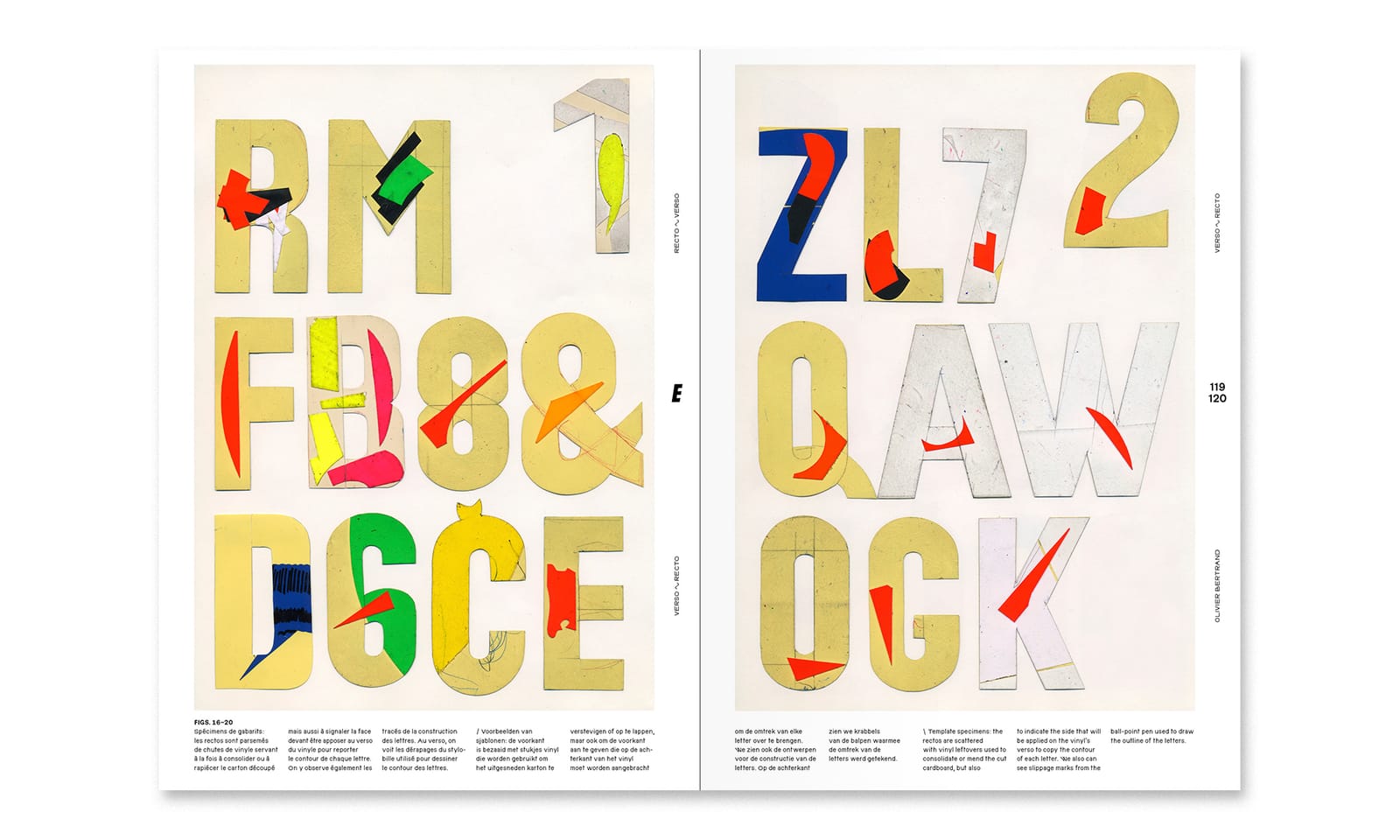
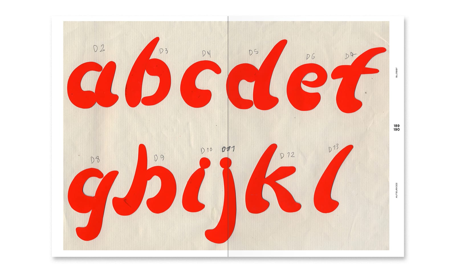
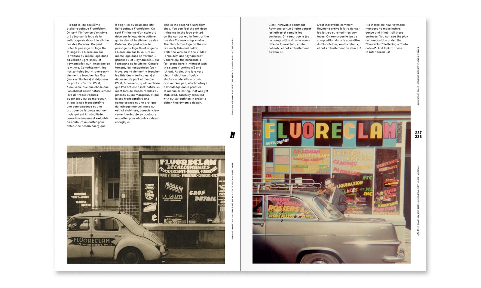
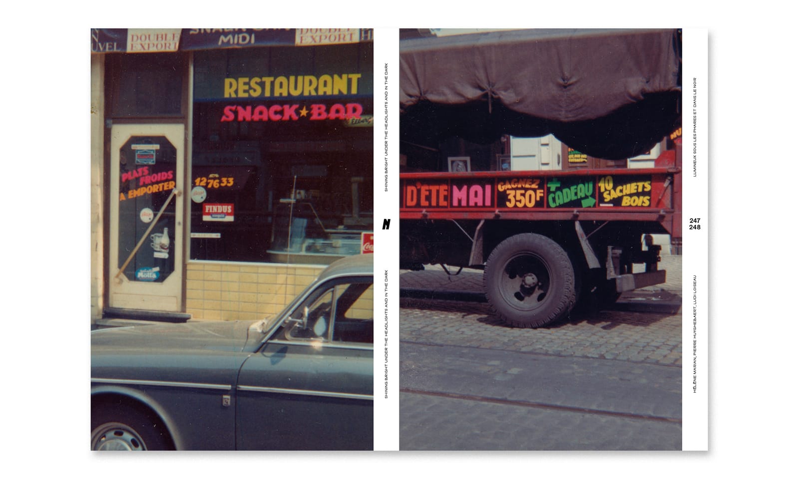
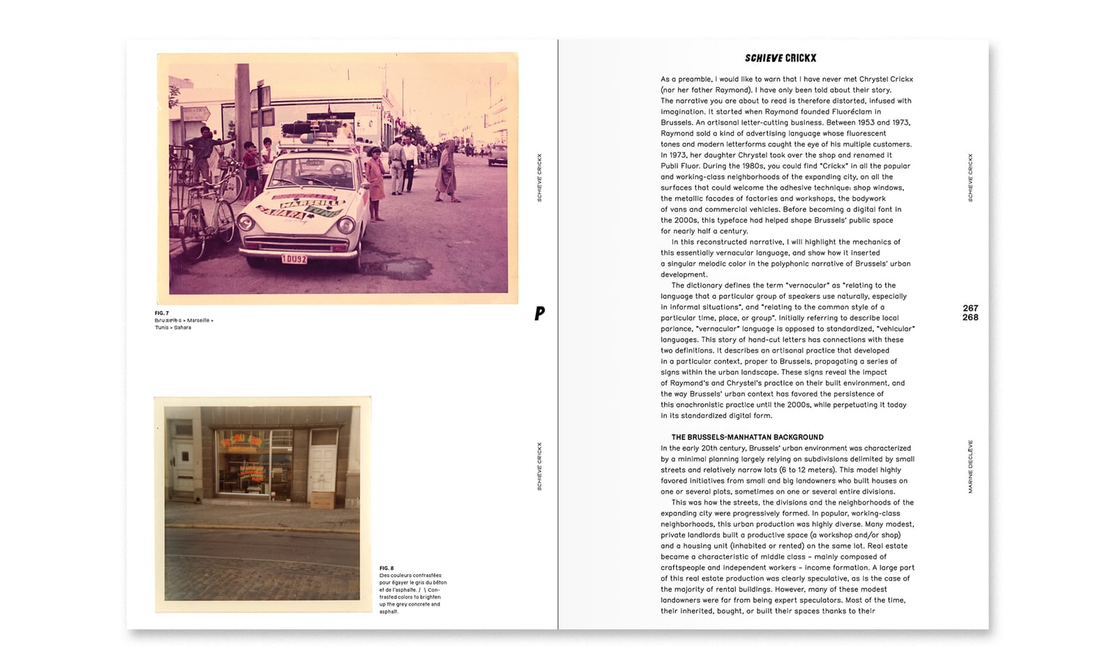
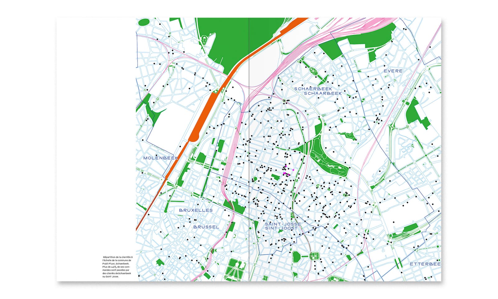
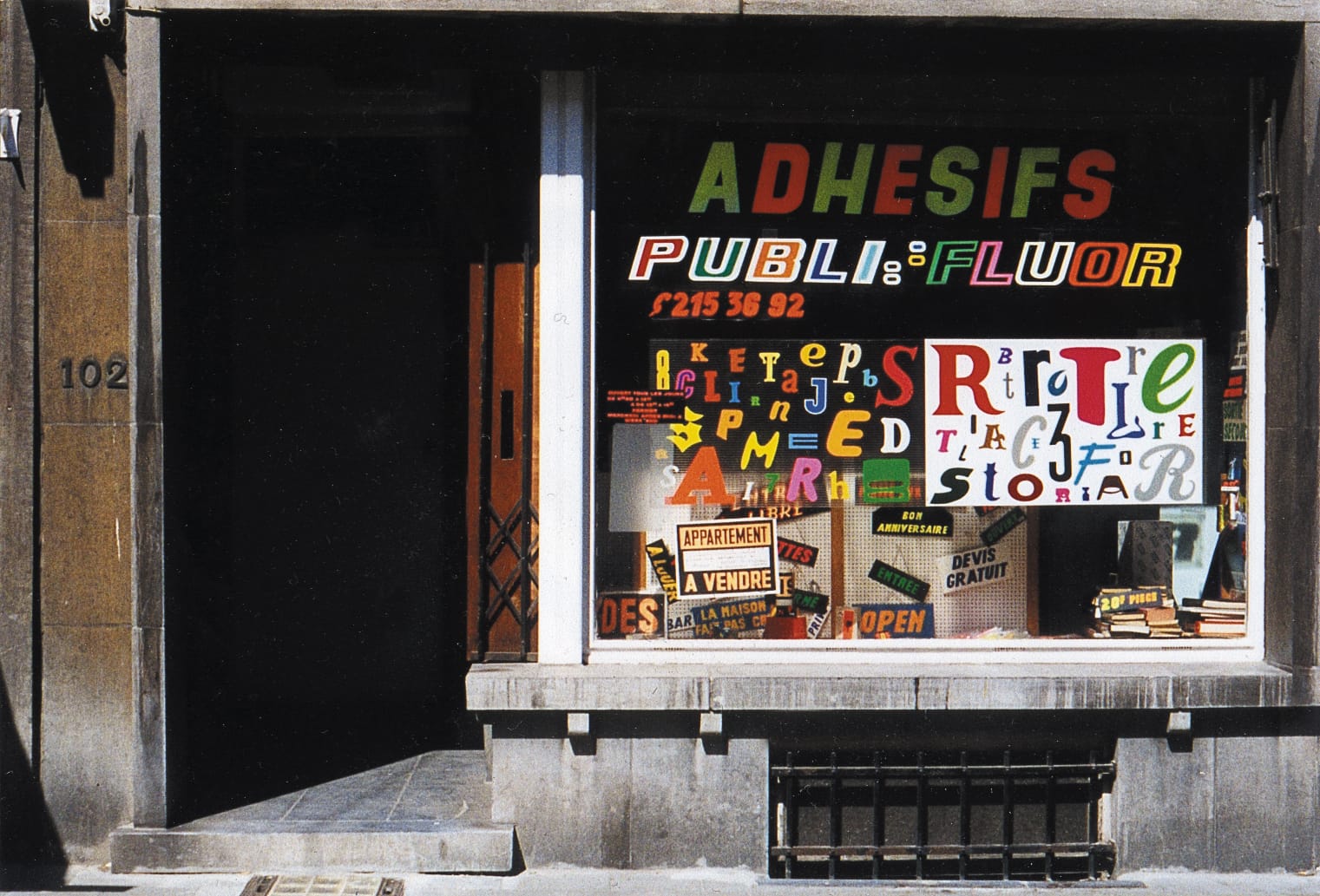
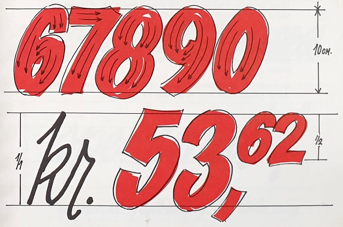
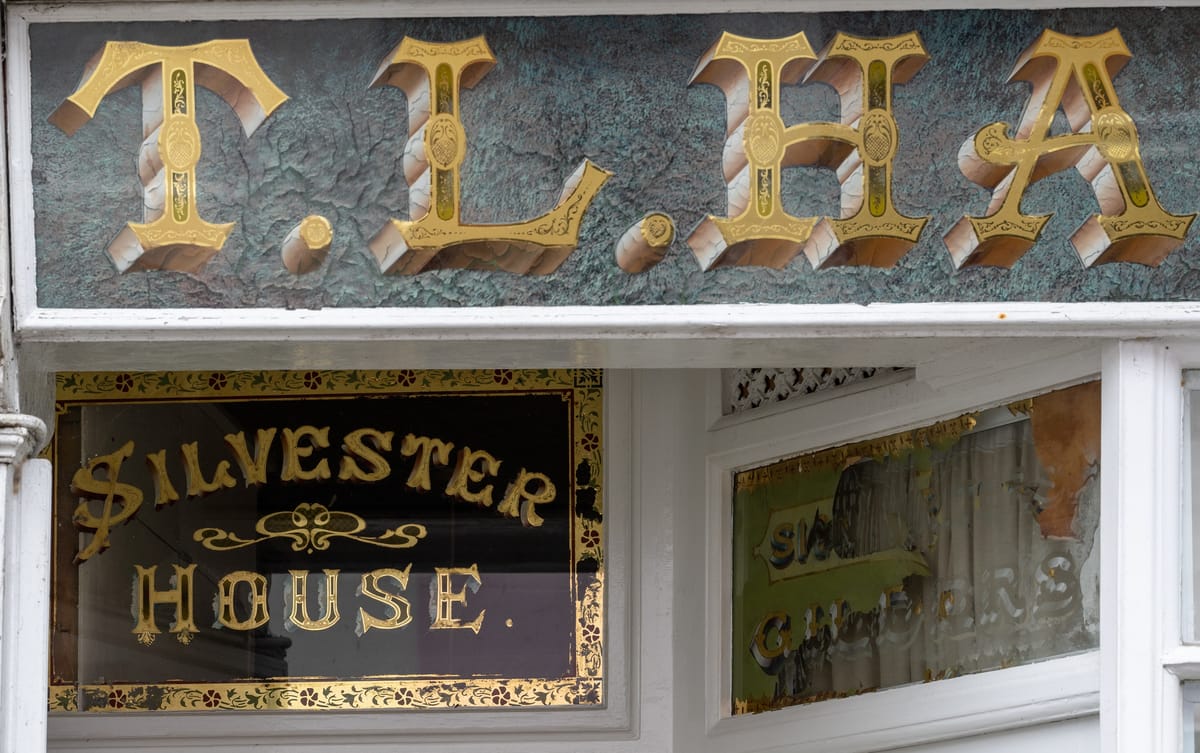
Peeling Back the Layers of Chrystel Crickx's Typographic Legacy
|
Older messages
Why Lead Paint Makes Signs Last: A Toxic Legacy
Thursday, January 25, 2024
An account of the enduring (and highly toxic) legacy of lead paint on signs, and sign painters. BLAG Magazine: Adventures in Sign Painting Craft, Community & Culture BLAG Magazine: Adventures in
Free Access to Even More bl.ag online Content
Wednesday, January 24, 2024
There's just one more week left to take advantage of the best ever BLAG offer, and also to check out some member-only content that I've made available to you at bl.ag online... Offer Expires 31
Bonus Material from BLAG 04
Thursday, January 18, 2024
Bonus content from the adventures in sign painting in Issue 04 of BLAG (Better Letters Magazine). BLAG Magazine: Adventures in Sign Painting Craft, Community & Culture BLAG Magazine: Adventures in
What's Inside Issue 04 of BLAG (Better Letters Magazine)?
Friday, January 12, 2024
Between the covers of the adventures in sign painting in Issue 03 of BLAG (Better Letters Magazine). BLAG Magazine: Adventures in Sign Painting Craft, Community & Culture BLAG Magazine: Adventures
Getting Into It: Sign Painters' Stories Around the World
Thursday, January 4, 2024
Six sign painters tell the stories of their paths into the trade, and offer their advice to others. BLAG Magazine: Adventures in Sign Painting Craft, Community & Culture BLAG Magazine: Adventures
You Might Also Like
“Fog” by Emma Lazarus
Saturday, March 1, 2025
Light silken curtain, colorless and soft, / Dreamlike before me floating! ͏ ͏ ͏ ͏ ͏ ͏ ͏ ͏ ͏ ͏ ͏ ͏ ͏ ͏ ͏ ͏ ͏ ͏ ͏ ͏ ͏ ͏ ͏ ͏ ͏ ͏ ͏ ͏ ͏ ͏ ͏ ͏
savourites 96
Saturday, March 1, 2025
escaping the city | abandoning my phone | olive oil ice cream ͏ ͏ ͏ ͏ ͏ ͏ ͏ ͏ ͏ ͏ ͏ ͏ ͏ ͏ ͏ ͏ ͏ ͏ ͏ ͏ ͏ ͏ ͏ ͏ ͏ ͏ ͏ ͏ ͏ ͏ ͏ ͏ ͏ ͏ ͏ ͏ ͏ ͏ ͏ ͏ ͏ ͏ ͏ ͏ ͏ ͏ ͏ ͏ ͏ ͏ ͏ ͏ ͏ ͏ ͏ ͏ ͏ ͏ ͏ ͏ ͏ ͏ ͏ ͏ ͏ ͏ ͏ ͏ ͏ ͏
5-Bullet Friday — How to Choose Peace of Mind Over Productivity, Guinean Beats for Winding Down, Lessons from Legendary Coach Raveling, and a New Chapter from THE NO BOOK
Saturday, March 1, 2025
"Easy, relaxed, breathing always leads to surprise: at how centred we already are, how unhurried we are underneath it all." — David Whyte ͏ ͏ ͏ ͏ ͏ ͏ ͏ ͏ ͏ ͏ ͏ ͏ ͏ ͏ ͏ ͏ ͏ ͏ ͏ ͏ ͏ ͏ ͏ ͏ ͏ ͏ ͏
Nicole Kidman's “Butter Biscuit” Hair Transformation Is A Perfect Color Refresh
Saturday, March 1, 2025
Just in time for spring. The Zoe Report Daily The Zoe Report 2.28.2025 Nicole Kidman's “Butter Biscuit” Hair Transformation Is A Perfect Color Refresh (Celebrity) Nicole Kidman's “Butter
David Beckham's Lifestyle Keeps Him Shredded at 50
Friday, February 28, 2025
View in Browser Men's Health SHOP MVP EXCLUSIVES SUBSCRIBE David Beckham's Lifestyle Keeps Him Shredded at 50 David Beckham's Lifestyle Keeps Him Shredded at 50 The soccer legend opens up
7 Home Upgrades That Require Zero Tools
Friday, February 28, 2025
Skype Is Dead. There are plenty of ways to make quick improvements to your house without a single hammer or screwdriver. Not displaying correctly? View this newsletter online. TODAY'S FEATURED
Heidi Klum Matched Her Red Thong To Her Shoes Like A Total Pro
Friday, February 28, 2025
Plus, the benefits of "brain flossing," your daily horoscope, and more. Feb. 28, 2025 Bustle Daily Here's every zodiac sign's horoscope for March 2025. ASTROLOGY Here's Your March
How Trans Teens Are Dealing With Trump 2.0, in Their Words
Friday, February 28, 2025
Today in style, self, culture, and power. The Cut February 28, 2025 POWER How Trans Teens Are Dealing With Trump 2.0, in Their Words “Being called your correct name and pronouns can be the difference
The Eater Oscars for best bites in film this year
Friday, February 28, 2025
An NYC cafe garners celebrity support after rent hike
The Must-See Movies The Oscars Overlooked
Friday, February 28, 2025
Plus: Celebrities pay tribute to Michelle Trachtenberg. • Feb. 28, 2025 Up Next Your complete guide to industry-shaping entertainment news, exclusive interviews with A-list celebs, and what you should
