👋 Hey Insiders,
I hope you are off to a good start this week!
This week I’ve been obsessed with studying the highest performing paid mobile apps and how they design for engagement and sharing.
Below are 12 tactical examples. Sorry, I couldn’t fit enough images for each point.
Some images credits to Mobbin.design
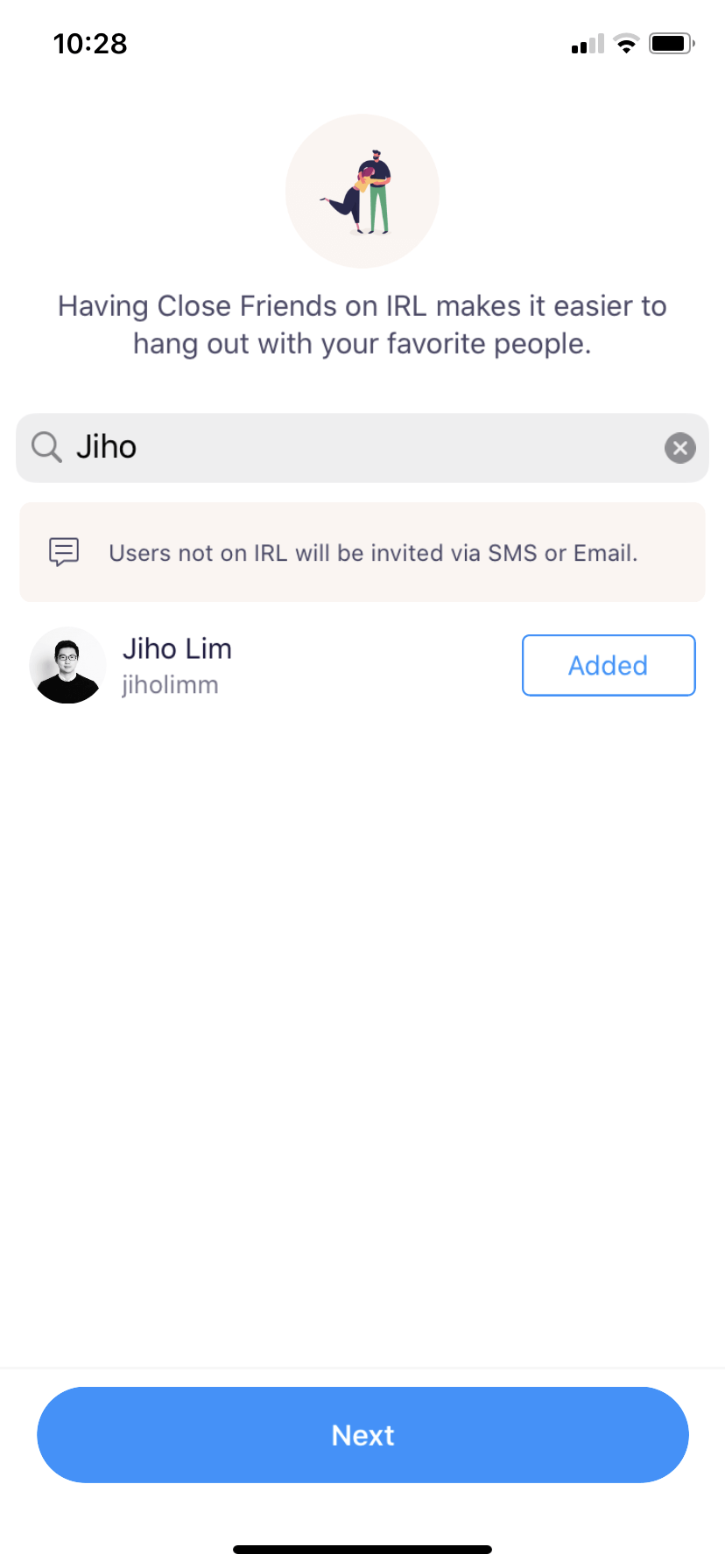
1. Encourage people to invite friends
If your app or tasks benefit from social interactions, add invitations into the onboarding flow.
 |
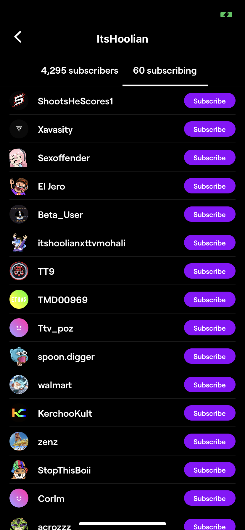
2. Allow people to follow each other
This enables them to engage one another and keep using your product.
 |
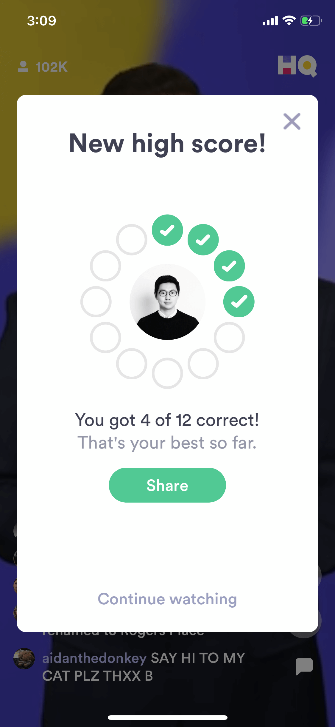
3. Take advantage of user’s peak motivation to share their achievements.
For example, if you have an app where users accomplish something (learn new things, complete a repetitive task etc…) prompt them to share their accomplishments.
 |
4. Let people share special rewards with friends. Gamify them to be random.
Example: Instead of sending 1 deal to one friend, you could send a “packet” of deals, all randomized. Talk about suspense!
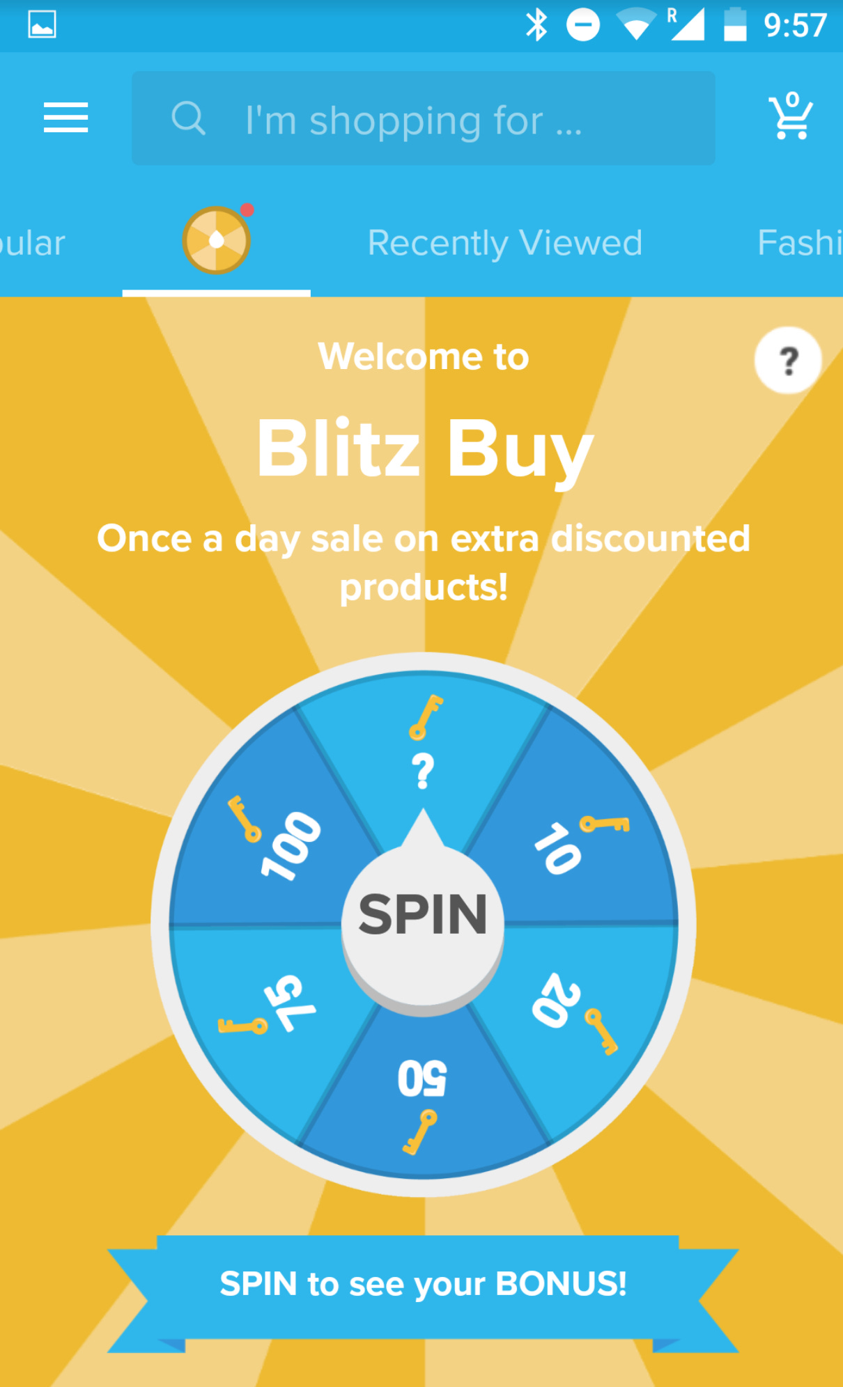
5. Add variable rewards (as part of daily interactions, or for achievements).
 |
6. Create future-dated unlockable deals to encourage users to return to your app.
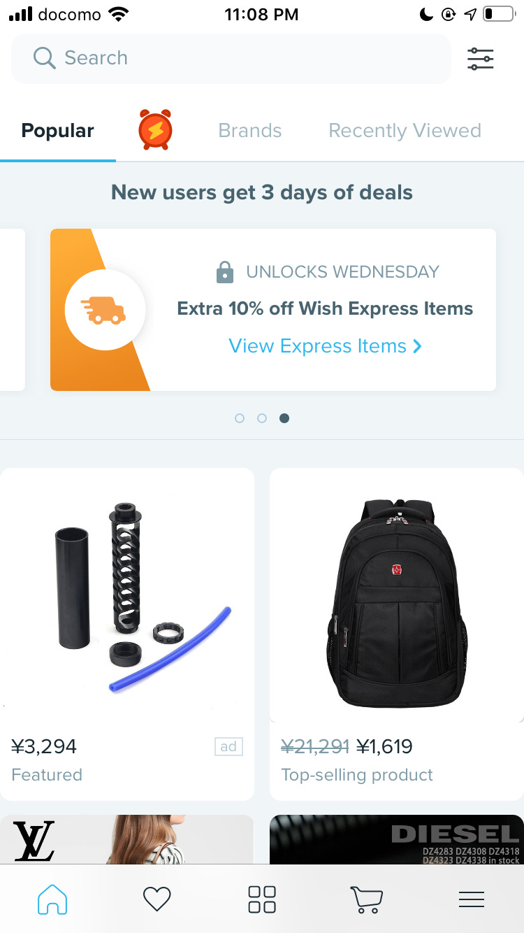 |
7. Start users off with a credit to their account
This encourages them to come back and “use up the free cash”. In reality, cash credit is just a reverse discount.
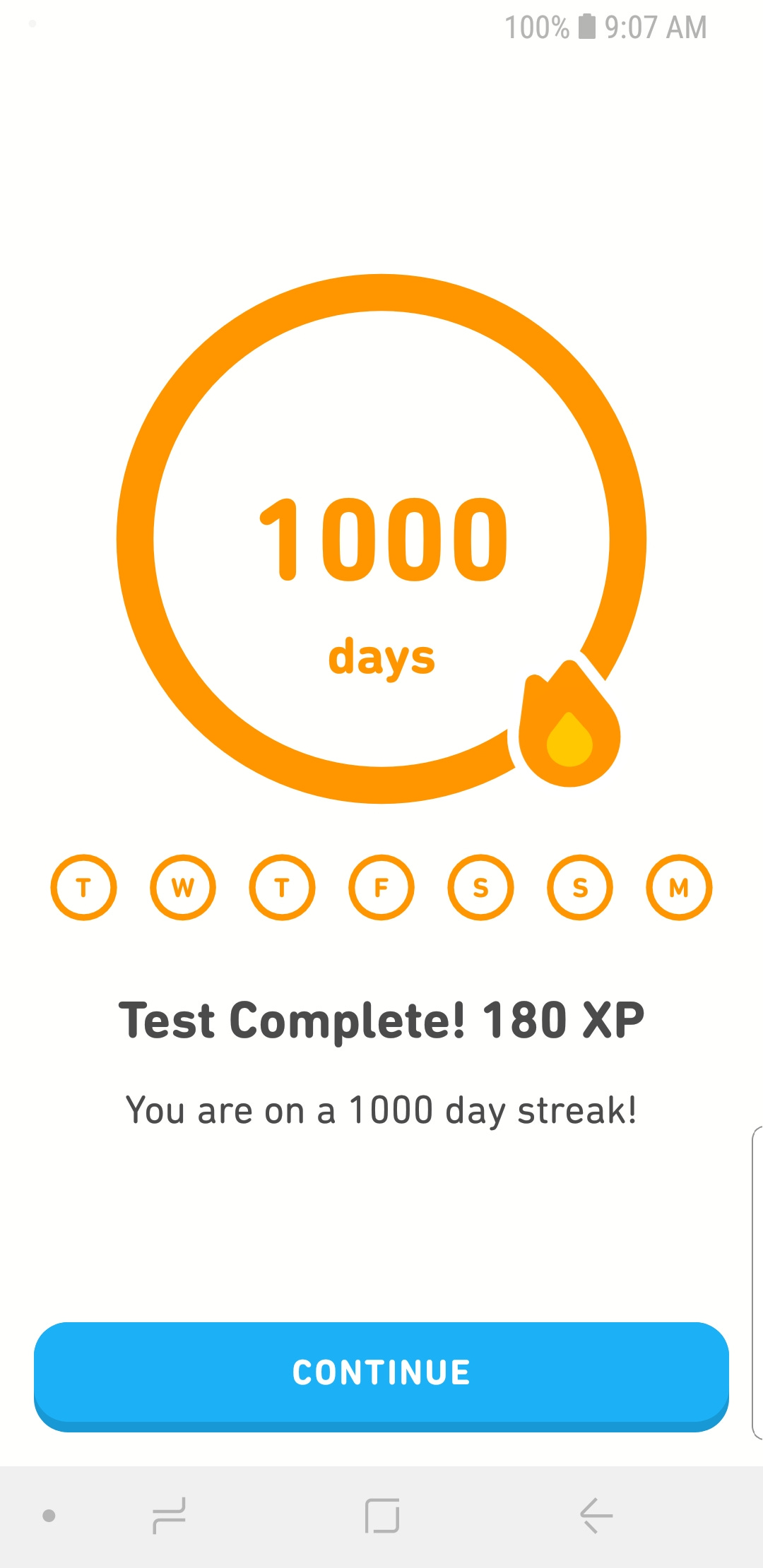
8. Use streaks to keep people coming back (personal and with friends)
 |
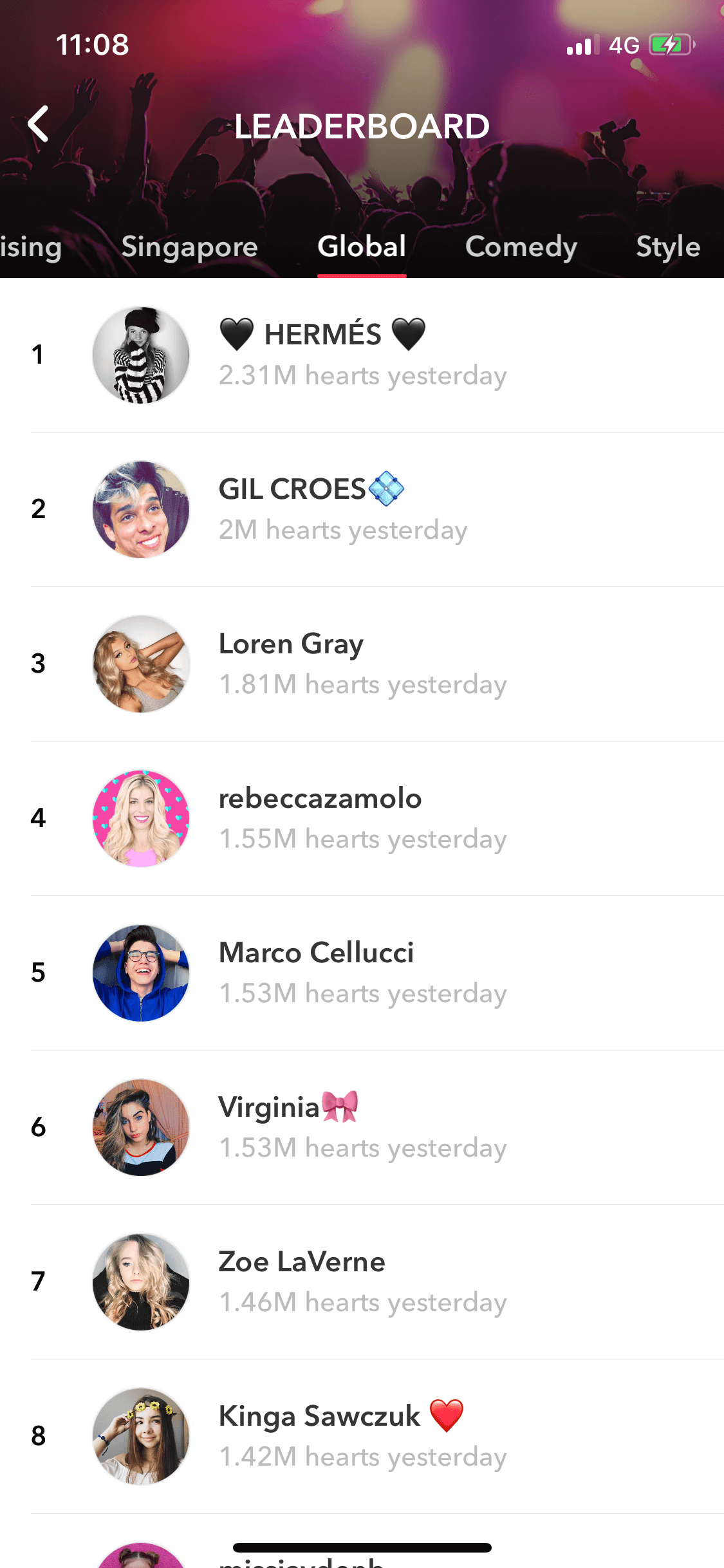
9. Gamify with a leaderboard to let people compete
 |
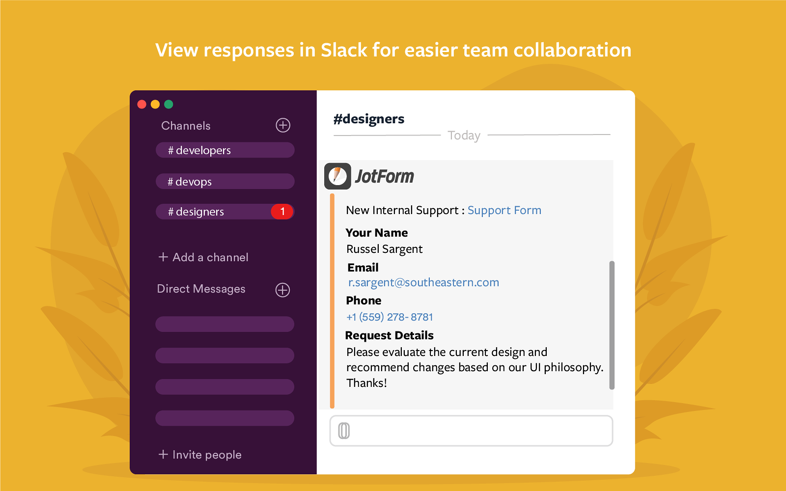
10. Integrate with platforms that already have a large audience
Upload to Youtube. Send file to Slack. Integrating with other popular tools exposes the entire organization or group to your product.
 |
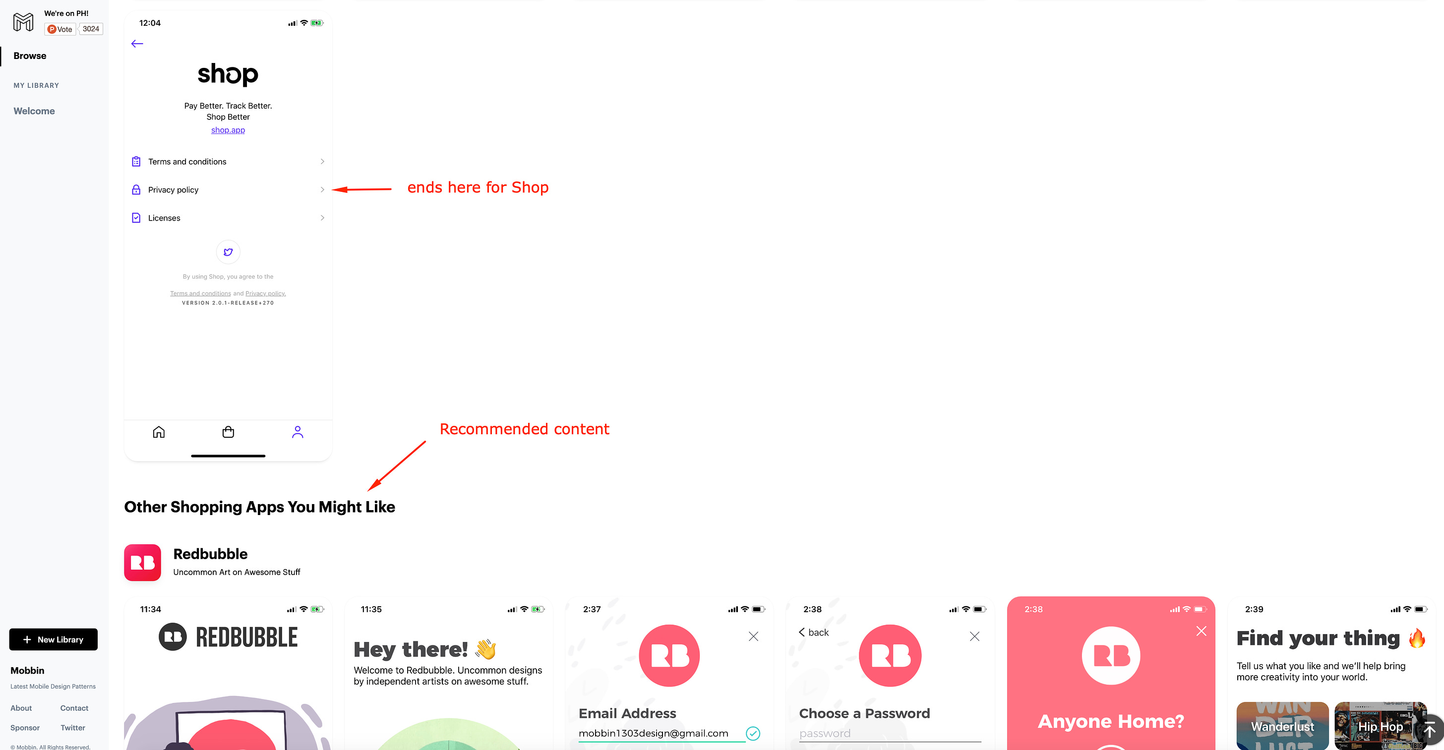
11. Show recommended content to increase time on site / app.
 |
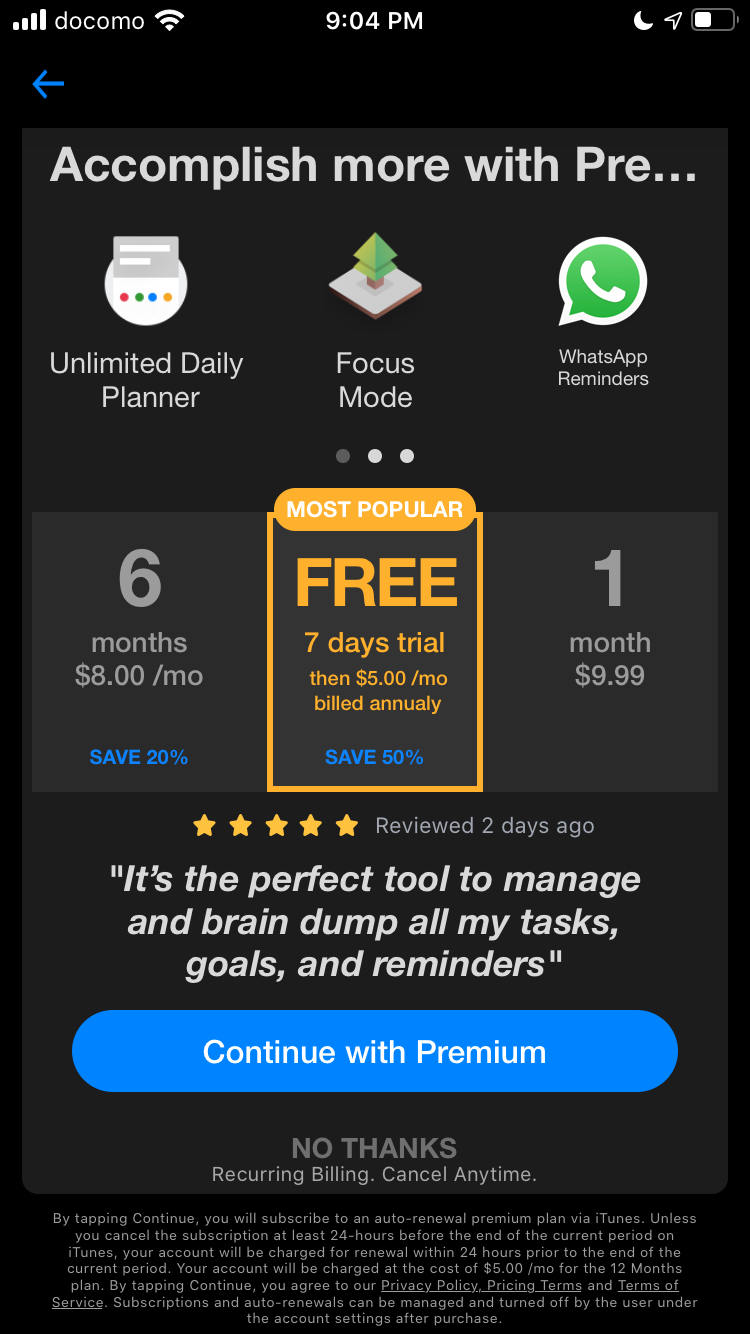
12. Try the premium upsell as the first screen
I noticed that this tactical design decision is prevalent among many of the most downloaded apps in the app store. Could it be that it makes a huge difference in conversions to paid plans? I hope to find out soon!
 |
Odds & Ends
Terry Xu swapped his iOS app (Goals) images and saw an increase in conversions by almost 32%! Here is what the images looked like before.
Jack Butcher is selling his course like crazy on Twitter. $73k this month alone? Took a while to get to this point. Stay consistent, keep doing, good things will come.
5k subs and 100k visitors in 6 weeks - signed up for 12 bank accounts and wrote abou their UX. High effort = high reward. Millions of impressions on LinkedIn!
Previous issues
Psssst! From now on I will include my email open rates below (no matter how embarrassing), so you can tell for yourself which headlines perform best!
👨💼 GI #008: The audience is the boss (50% of you opened this email)
🤦♀️ GI #007: 70 websites, biggest mistakes (56% opened)
🔔 GI #006: Triggers (49% opened)
🤑 GI #005: Steal this content strategy for 10x conversions (48% opened)
🧲 GI #004 - First Users. Newsletters. Content Repurposing. (54% opened)
⏲ GI #003 - Strangely Effective (59% opened)
🛹 GI #002 - 14 ways to reduce friction for higher conversions (59% opened)
✈ GI #001 - Growth Design Takeaways from Scott's Cheap Flights (100% open - sample only 3 people though!)
