Today in Tedium: Internet culture has evolved in numerous ways over the years, from its chaotic roots on Usenet and bulletin boards into the modern social networks that have become key to our digital interactions. But one thing that’s been lost along the way is design—not the design of the platforms, themselves, but the freedom to take a piece of internet land and make it your own. Sites like Geocities and MySpace get mocked today because of their often ugly looks, but these sites were some of the most important and fundamental for digital creativity, that encouraged people to experiment and try things. And our modern social networks have moved away from this. To me, that’s sad. I want that back. Today’s Tedium ponders social media, customization, and design (or lack thereof). — Ernie @ Tedium

Be sure to check out today’s sponsor below—it’s a cool podcast worth checking out.

Sunday in the Heights with Dolly!

Why is Cats a musical? Didn't anyone think it was a weird idea? In each episode of the podcast Sunday in the Heights with Dolly! we take a deep dive into the stories behind Broadway's biggest shows. Learn how Evita beat bad reviews, how Annie beat socialists and then became one, and how the cast of Hair became a true close-knit tribe (spoiler: constant sex).

Today’s Tedium is sponsored by Sunday in the Heights with Dolly!

“When something is such a creative medium as the web, the limits to it are our imagination.”

— Tim Berners-Lee, the creator of the World Wide Web, discussing the role that creativity plays in the medium, which is one of the most fundamentally important we have. Lee, as you might be aware, has long raised concerns about the web’s future due to concerns about privacy and a tendency to close things off into walled gardens.

Substack Screenshot

Substack has been great for the internet, but its lack of design customizability means that its potential is held back.

Is design and customization a second-class citizen on the modern web?

Because I write an email newsletter and I’ve been doing it for quite a long time, I’ve been asked on many occasions about different platforms, including one in particular, Substack.

Substack is an essential platform for many budding writers and journalists, and it comes with a built-in business model that respects writers and allows them to make money from their work. I respect what they do for my field.

But would I ever bring Tedium there? No, at least not as currently structured. And the reason for that comes down to one thing: design flexibility, or lack thereof. You can’t customize your templates or your design. That stuff matters to me.

It’s a similar situation with other platforms online. Medium is great, for example, but it decides designs for you and you just have to live with those visuals. Sure, the defaults are elegant, but they are constant reminders that you’re ultimately building castles in someone else’s sandbox, which is sad and unfortunate when you’re trying to build the coolest castle you can.

To me, as someone who looks through a lot of technology issues through the vector of design, I see it like this: People are trying to build businesses on Substack and similar platforms, yet end users have no control over the coat of paint on the primary product. To me, that’s such a missed opportunity, and a red line that I will not personally cross.

It’s like telling someone who is putting together their own retail boutique that they can stock the shelves, but they cannot move any of the furniture. These companies have business plans, revenue … but no way to really put their own mark on the product.

Crayons

Think of building a custom design as the adult version of being able to draw with crayons when you were five, and you start to understand the problem to some degree. (Kristin Brown/Unsplash)

Is it ever truly theirs if they’re just renting?

Look, I get that email design is a dark art, and that not everyone is naturally talented as a designer, but the result is that the creator’s identity is put to the side in favor of the organization’s.

To be clear, I think that the lack of design flexibility in platforms like Medium and Substack has deep roots based on a well-accepted truism of modern platforms: the idea that modularity and platform consistency is a basic tenet of walled gardens.

Walled gardens are kept up very carefully from a design perspective. They don’t have weeds. Instead, you get a plot—a spot where your entire presence online lives. This is great if you want some modest lines to paint within, but as soon as you have any sort of ambition, you find yourself stifled by the platform pulling the strings.

It’s a model that Facebook perfected and lots of other social media-minded startups have followed since. Why change? In some ways, the problem’s roots might have something to do with MySpace.

“It was rough around the edges, but so was the web. No one knew what it was going to be, and in this hazy, undefined territory, many felt free to surface their passions, no matter how minute or narrow. GeoCities gave them a chance to do it, and connected them to users that felt the same way.”

— Jay Hoffmann, the founder of History of the Web, a newsletter and site you should be reading, discussing the fate of GeoCities, a platform that was, like MySpace, a gateway drug to web design for many early users of the web. As Hoffmann notes, when Yahoo shut down GeoCities in 2009, it killed a lot of culture that had built up on the platform over the years. “The site was taken offline on October 26, 2009. We lost a lot that day,” Hoffman writes. “And not just the amateurish, barely visited trash pages some of us made in middle school. Families lost entire photo albums. Those fan fiction communities crumpled. And if a widow or widower couldn’t access their spouses GeoCities account, there goes a historical record.” Like MySpace, GeoCities allowed users to create their own designs unabated.

My Space logo

(Bruthanick/Flickr)

Why MySpace’s defining feature is really an extremely lucky accident

When people talk about MySpace, the definition of “space” that people often think back to isn’t the one that the developers of MySpace intended. Had things gone a little bit differently, it would have been just as cookie cutter as every other social medium platform on the internet.

But a combination of a quick departure and an unforced technical error created an unexpected opportunity for a new social network. In the 2009 book ‌Stealing MySpace, the story of the platform that made Tom everyone’s friend, author Julia Angwin (now of The Markup) notes that the pivotal move that made MySpace relevant was twofold. One, the network essentially didn’t care about using real names, something its early competitor Friendster controversially did; and second, the company made a mistake in programming its website that opened up an entire world to its users.

Duc Chau, the original lead developer of MySpace, ended up leaving because he found the work boring—essentially his technical skill, honed with an early advertising startup, wasn’t being taxed by the site’s platform. Chau’s departure was a problem for MySpace’s owners, as they weren’t aware of the language he used, Perl.

So the creators of MySpace used ColdFusion, a web-development platform that was owned by Macromedia at the time under a proprietary commercial license, not going open-source until years later. (By contrast, competitors like Facebook were built using open-source languages like PHP.) On the fly, developers Gabe Harriman and Toan Nguyen, building the site on the cheap, quickly rebuilt the platform in a language they knew. And in haste, Nguyen forgot to turn on a feature that prevented end users from adding HTML into forms.

“His mistake allowed users to build colorful backgrounds and wallpaper and load them onto their MySpace pages,” Angwin wrote. “Suddenly teenage girls could decorate their MySpace page with hearts and glitter and smiley faces the same way that they were decorating their lockers and book bags.”

And this mistake was not immediately apparent to MySpace’s staff, and once they caught it, they considered fixing the error, but ultimately decided to keep it, believing that the users knew best.

This decision was a pure hack all the way around, a stumble into a defining feature that helped give it an unintentional connection to Geocities sites from half a decade prior.

It also caused massive problems down the line—as WireDelta notes, the site was not built to scale up for the hundreds of millions of users it would eventually have, leading to the site being reprogrammed onto another proprietary platform, Microsoft’s ASP.NET, in 2005. The happy accident that allowed MySpace to grow—the ability to modify pages—remained.
Samy Worm

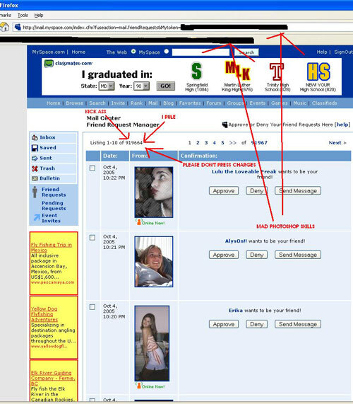
The Samy worm broke MySpace and won Samy a million friend requests. (Samy Kamkar)

This would prove a problem over time, though. That year, the weaknesses in MySpace’s infrastructure were exploited by a 19-year-old hacker who used a cross-site scripting (XSS) attack to gain a million friends through an aggressive worm. The weaknesses in the security code, the same ones that allowed for all those background images and weird fonts, let the Samy worm do a lot of damage, quick, and forced MySpace to boost its security in the process.

(Side note: An early Facebook employee, Chris Putnam, used a similar worm to make Facebook profiles look like MySpace profiles … which earned him a job with the company.)

As MySpace matured, professional marketers tried to make an imprint on the platform by raising the bar for the site’s design by using it to promote things—often giving popular bands a glossy sheen on their MySpace profiles.

Oneupweb, a Michigan digital marketing firm, bet big on MySpace back in the day, but came away from it with a bit of a sour feeling, as reflected in a 2010 blog post about MySpace, right around the time most had moved to Facebook and Twitter for good. Author Tony Owen noted that he was fairly talented with the platform, but he felt that many others weren’t, and that degraded the platform as a whole:

However, aside from web developers, there were few to ever master the art of designing MySpace profiles. Consequently creating a digital landscape of Geocities-like pages stoutly serving as eyesores and annoyances, rather than functional personal pages and profiles.

Poorly constructed MySpace profiles could undoubtedly freeze-up web browsers due to deformed coding, or as a result of users placing high-bandwidth rudiments in their profiles—such as video, graphics, and flash. These could be set to auto play on load. And when you have multiple items set to play on load, you have sounds playing over other sounds—creating audio chaos known as the train wreck effect.

So, let’s be clear—MySpace was often a shitshow of profiles that broke apart because its killer feature was a product of bad coding rather than a well-thought-out concept, but it was still an important one because of what it represented.

The problem with MySpace and design is that it should have been built with customization in mind, but because it wasn’t, its structural weaknesses (later compounded by its business weaknesses) ensured that it would eventually falter once and for all.

“The first purpose of Tumblr was really two things: We wanted you to post any kind of media and customize everything about your blog. If you are an average user, you pick a theme that looks nice, set the colors, check and uncheck boxes. If you are designer, you tear out the code and you can create something entirely original. At the time it was more interesting to us than it was important. Once we saw the original stuff the creative community was doing with it, then we realized how important and special it was.”

— David Karp, the founder and former leader of Tumblr, explaining in a 2011 interview with Richmond BizSense why the platform has such a strong focus on customization and design—something that makes it an exception in today’s world of social media, even today. While Tumblr has taken its share of arrows over the years, it is to this day perhaps the only major social network where you can basically design every element and make it your own, generally using your own HTML and design. Even on mobile.

Bad My Space Design

An example of what we’re talking about here.

The MySpace vs. Facebook battle may have offered an unfair death blow to customization

More than 15 years ago, Facebook made a call to emphasize standardization in its design. Rather than letting people just do whatever on their pages like MySpace did, it emphasized a more prescriptive approach. Other networks followed suit—particularly after Facebook made a key change that likely restructured the relationship between social networks and creativity forever.

While you could upload photos, or add commentary, all of the customization features that originally attracted users to MySpace were nowhere to be found on Facebook, which relied on a simple, understated design.

It’s worth considering the reputation that MySpace had at the time among the public. While the site was customizable, it was terribly designed and years of bad decisions had scared off users, according to the company’s former vice president of online marketing, Sean Percival.

“The baggage was too much. Users had too many bad experiences,” Percival recalled. “They would go on there and they’d get hit with spam. There’d be all this weird stuff. The baggage was really intense.”

Sean Parker, an early Facebook employee and Napster cofounder, noted that MySpace was not built around iteration, and the lack of improvement finally caught up with it eventually. In comments to Jimmy Fallon at a 2011 conference, he had this to say:

They weren’t successful in iterating and evolving the product enough, it was basically this junk heap of bad design that persisted for many, many years. There was a period of time where if they had just copied Facebook rapidly, I think they would have been Facebook. The network effects, the scale effects were enormous. There was so much power there.

And then there’s the whole factor of the news feed. This concept, which Facebook introduced in 2006 to much controversy, slowly changed the dynamic of what social media looked like throughout the ecosystem—rather than being centered on the individual user, suddenly, social media users became focused on the network as a whole. Wildly successful and addictive, it eventually moved past the boycotts to change the way we interacted with our friends. Rather than going directly to them to see updates, the feed directed us to them.

Facebook News Feed

An early iteration of the Facebook News Feed. (via World Economic Forum)

While other changes were added to the site to offer new ways of sharing identity and creativity over the years, such as photos, timelines, and profile banners, Facebook’s original’s sin in many ways is that it pushed away from the individual in favor of the network, creating messy problems that emerged more subtly.

What it gained in exchange for that shift was an early foothold on something that matters a lot to modern advertisers: brand safety. Facebook, which is in the midst of an advertiser boycott, won over users by being seen as the “safe alternative” to MySpace, a site its own executives called “a massive spaghetti-ball mess” of code.

Facebook, for all its problems and punch-drunk illustrations in Wired over the years, gained a reputation among users as a “safe space” compared to MySpace, which eventually followed through to advertisers and has been hard to shake since.

In many ways, the happy-accident design solution MySpace uncovered by sheer chance might have cost us some true tinkering abilities in our modern platforms.

Look, I get that MySpace sucked from a broader design standpoint—it was a terribly complex site to use, one that somehow succeeded due to timing rather than any sort of masterful plan.

But I worry that, culturally, we took the wrong lessons from Facebook’s trouncing of MySpace more than a decade ago. Developers and product managers saw the “safe space” vibes that Facebook’s not-truly-customizable design offered and mistook that for being a key element of what a social network needed to look like.

This conflict, at least at the time, provided a pretty compelling reason that customization doesn’t work at scale. It convinced advertisers that having a prescriptive overarching design to the network was better than having something more chaotic like MySpace had.

Crayons 2

Let us change the CSS! Let us use crayons! (Benigno Hoyuela/Unsplash)

But I think in many ways we’re paying for that decision all these years later. While not saying that MySpace was a drama-free zone—far from it; remember ordering your top eight?—I think the fact that most social networks not based around video don’t truly value creativity in the spirit of the original web has taken away from some of the internet’s original power.

What we’re left with, because we can’t screw with the HTML or tweak settings in the design, are social networks in which engagement, rather than individuality, are valued above all else. If you want to do truly creative, additive things, you may feel like you have to do them on other networks and simply mention them on Facebook or Twitter, rather than letting that creativity happen on the platform itself.

So what do we focus on instead, without that ability to tweak or iterate? Well, some of the messier network effects of social media, I’d argue. Sure, leaving a comment may be more “engaging” than picking a color and setting a design, but those things give us a feeling of ownership that we never really feel like we have when they’re all decided for us.

And more broadly, Facebook’s success with a prescriptive design has in many ways encouraged the wrong lessons to take over on other social networks and platforms. Substack and Medium are just two examples of this dynamic playing out.

Look, I’m not saying that we should go full MySpace with our social networks, but can we bring back customization a little more, so we can make these walled gardens feel a little more like our own?

And can we stop taking the wrong lessons from tech history in building our platforms?

--

Find this one an interesting read? Share it with a pal! And thanks to Sunday in the Heights With Dolly! for sponsoring today’s issue. Be sure to give them a listen.