Speckyboy RSS: My Client Made Me Do It: True Tales from the Grumpy Designer

Your latest Speckyboy content is here!.

Speckyboy Design Magazine

Design News, Resources & Inspiration

My Client Made Me Do It: True Tales from the Grumpy Designer


By Eric Karkovack on Feb 11, 2021 07:16 pm


Designers often like to critique other designers. It’s just a natural side effect of being creative. We see a website or app and immediately start looking at how it all fits together. What challenges might have our brethren faced along the way? Would we have done anything differently?

Of course, no designer is perfect. We all have those projects in our portfolio that we’d like to forget. But let’s not dismiss the role clients play in this chaos.

More often, a questionable decision comes down to an opinionated client. No matter how much we try to sway them, they’re going full speed ahead towards a design disaster. I’ve experienced this more times than I can count. Eventually, it becomes pointless to continue pleading your case.

Today, we’re going to celebrate (or roast) the features that we implement in order to keep clients happy. No, they don’t meet our highest ideals. In fact, we’d probably rather hide under a blanket than have them tarnish our street cred. But we go along in the spirit of compromise (and wanting to get paid).

Home Page Sliders

Sliders and carousels have been used as a key component of home pages for years. Yet they are often lamented as ineffective and difficult to use. This doesn’t mean that they aren’t of some value – just not the perfect solution they’re made out to be.

Yes, you can place a lot of information into a limited amount of space. But it can get to the point where you’re expecting users to navigate through irrelevant options or (even worse) wait for the information they need. Not to mention the sometimes-overdone special effects and their impact on performance.

Still, it can be a challenge to steer clients in a different direction. I’ve had several experiences where a client overruled a static hero area in favor of a big old slideshow.

Why? It might be because you see sliders pretty much everywhere. And if the competition is using one, you may as well jump on the bandwagon. In these situations, all you can do is try to make the feature as unobtrusive as possible.

A <a target=laptop computer displaying a website." width="900" border="0" style="max-width: 100%;width: 100%;padding-bottom: 0;display: inline;vertical-align: bottom;border: 0;height: auto;outline: none;text-decoration: none;-ms-interpolation-mode: bicubic;" class="mcRssImage">

Multicolumn Text Passages

There are a number of print design staples that work nicely on the web. But some are geared towards dealing with the limited space on a printed page – a challenge that doesn’t impact websites so much.

Multicolumn text would fit into this latter category. You see it all the time in newspapers and magazines. Articles span across multiple narrow columns in a smallish font. It’s a great way to squeeze a lot of content onto a page.

But when you see this technique on the web, it generally makes content more difficult to digest. This particularly true on large desktop devices, where content widths could be well in excess of 1,000 pixels. Attempting to read anything of significant length is frustrating – particularly if scrolling is involved.

I recently encountered a long press release utilizing this format. The only thing I could do was mutter an exasperated “Why?” under my breath.

A person holding a newspaper.

Inaccessible Color Schemes

Clients can be very insistent when it comes to their website’s color scheme. It’s easy to see why. After all, colors are a vital part of branding and public image.

Color also plays a huge role in website accessibility. We designers have had this concept drilled into our heads over and over. If you don’t implement acceptable color contrast ratios, your website won’t be accessible. Simple as that.

But you still see some really funky color combinations that give even those with 20/20 vision a hard time. Strangely, it’s not just outdated mom and pop websites that have their colors mixed up. You’ll also find the occasional big brand that has lousy contrast ratios.

However, there may be some hope in this area. With designers pushing accessibility harder than ever, and with so much at stake, clients will hopefully come to their senses. Besides, there are plenty of creative ways to use a brand’s color scheme while keeping accessibility at the forefront.

Paint jars on a table.

Modal Windows

Remember those old pop-up ads from the early 2000s? You’d visit a website and be inundated with little windows scattered across your screen. Common decency (or, more likely, browser technology) knocked them out of existence years ago – only to be replaced by modal windows.

Modals are certainly sleeker and can be effective under the right circumstances. But, like their popup ancestors, they can be easily abused. What users are left with is a barrier to entering (or leaving) a website and doing something useful.

Clients tend to think that modals are great attention-getters. Maybe so, but they are just as likely to annoy a potential customer. Therefore, you’d better have some killer content inside that little box.

The worst abuse? When you dismiss a window, only to have it show up the next time you’re on the site. That’s just plain cruelty.

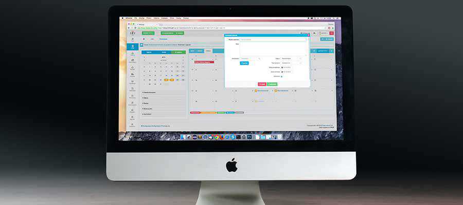
A desktop computer screen.

Chatbots

I’m probably going against the grain on this one. But I can’t think of a single instance when a chatbot was actually helpful to me. Sure, they can be rather polite. At the same time, they tend to run users around in circles.

It has become the web equivalent of telephoning a large company. Only instead of feverishly dialing “0” to speak to a human, you now have to type in multiple phrases, hoping to elicit signs of intelligent life.

Beyond that, these contraptions can’t provide you with anything that you couldn’t already get by using a search feature. Only the trusty search bar is more likely to direct me to the right place – and without asking me how I am. Like they really care?

Clients tend to see this as a way to personalize their website. It’s like having a customer service representative on hand 24 hours a day. They only think this way because, well, they don’t have to actually communicate with the chatbot.

A robot holding a tablet computer.

The Price of Keeping Clients Happy

Many of us in the web design industry like to think of ourselves as purists. We heed the instruction of knowledgeable peers and try to build projects that follow best practices. But the reality is not so simple.

Whether we realize it or not, web design is a service industry as well as a creative one. We serve our clients and work with them to produce a satisfactory result.

And no matter how much good advice we give, the final decisions still rest with the client. Sometimes, despite our efforts, they make a choice that goes against our wishes. So be it.

With the exception of accessibility, the items above may not be our taste – but they won’t lead to the end of civilization (there are plenty of other people working on that). In the end, it’s about making the most out of a project – no matter what obstacles we face.

The good news is that we still get to make those fun critiques. Doesn’t that make you feel better?

The post My Client Made Me Do It: True Tales from the Grumpy Designer appeared first on Speckyboy Design Magazine.


Read in browser »

Recent Articles:

Appreciating the Unsung Heroes of WordPress
10 Things Designers Can Learn From Pastry Chefs
8 Unique Ways to Implement Social Media Icons with CSS & JavaScript
8 Essential Free Plugins for WordPress Multisite
Weekly News for Designers № 578
Share
Tweet
+1
Share
Forward
Copyright © 2021 Speckyboy Design Magazine, All rights reserved.
You signed up for daily Speckyboy Design Magazine email alerts either via Feedburner or directly through our site.

Our mailing address is:
Speckyboy Design Magazine
27 Braeside Park
Inverness, Scotland IV2 7HL
United Kingdom

Add us to your address book


Want to change how you receive these emails?
You can update your preferences or unsubscribe from this list.

Older messages

Speckyboy RSS: 10 Things Designers Can Learn From Pastry Chefs

Tuesday, February 9, 2021

Your latest Speckyboy content is here!. Speckyboy Design Magazine Design News, Resources & Inspiration 10 Things Designers Can Learn From Pastry Chefs By Addison Duvall on Feb 09, 2021 07:35 am I

Speckyboy RSS: 8 Unique Ways to Implement Social Media Icons with CSS & JavaScript

Monday, February 8, 2021

Your latest Speckyboy content is here!. Speckyboy Design Magazine Design News, Resources & Inspiration 8 Unique Ways to Implement Social Media Icons with CSS & JavaScript By Eric Karkovack on

Speckyboy RSS: Weekly News for Designers № 578

Friday, February 5, 2021

Your latest Speckyboy content is here!. Speckyboy Design Magazine Design News, Resources & Inspiration Weekly News for Designers № 578 By Speckyboy on Feb 05, 2021 12:18 pm Envato Elements Pika –

Speckyboy RSS: As a Designer, Is Failure a Necessary Part of Success?

Wednesday, February 3, 2021

Your latest Speckyboy content is here!. Speckyboy Design Magazine Design News, Resources & Inspiration As a Designer, Is Failure a Necessary Part of Success? By Addison Duvall on Feb 03, 2021 07:08

Speckyboy RSS: Why Is Focusing on Long-Term Goals So Difficult?

Tuesday, February 2, 2021

Your latest Speckyboy content is here!. Speckyboy Design Magazine Design News, Resources & Inspiration Why Is Focusing on Long-Term Goals So Difficult? By Eric Karkovack on Feb 02, 2021 09:21 am

You Might Also Like

The Books AD Editors Can’t Put Down Right Now

Friday, November 15, 2024

View in your browser | Update your preferences ADPro Good Reads Here at AD PRO, we're all about celebrating a good coffee table book. With crisp project imagery and behind-the-scenes stories tucked

What astrology has to do with PR?

Wednesday, November 13, 2024

and, no we won't tell you to read your chart! ͏ ͏ ͏ ͏ ͏ ͏ ͏ ͏ ͏ ͏ ͏ ͏ ͏ ͏ ͏ ͏ ͏ ͏ ͏ ͏ ͏ ͏ ͏ ͏ ͏ ͏ ͏ ͏ ͏ ͏ ͏ ͏ ͏ ͏ ͏ ͏ ͏ ͏ ͏ ͏ ͏ ͏ ͏ ͏ ͏ ͏ ͏ ͏ ͏ ͏ ͏ ͏ ͏ ͏ ͏ ͏ ͏ ͏ ͏ ͏ ͏ ͏ ͏ ͏ ͏ ͏ ͏ ͏ ͏ ͏ ͏ ͏ ͏ ͏ ͏ ͏

#482: New Front-End Techniques

Tuesday, November 12, 2024

With high-definition colors, virtual keyboard on mobile, CSS and reliable dialog in HTML. Issue #482 • Nov 12, 2024 • View in the browser Smashing Newsletter Hej Smashing Friends, I remember the good

Mayer Rus on a Malibu Scouting Mission Gone Right

Tuesday, November 12, 2024

View in your browser | Update your preferences ADPro California Dreamin' I should bring my passport, I always think whenever work demands that I leave my cozy nest in Silver Lake to scout a house

Accessibility Weekly #422: Designing Against the Deaf Tax

Monday, November 11, 2024

November 11, 2024 • Issue #422 View this issue online or browse the full issue archive. Featured: Designing against the deaf tax "'Your baby has failed' isn't a phrase any parent wants

Slow Productivity

Sunday, November 10, 2024

Issue 220: Reflections on the new Cal Newport book ͏ ͏ ͏ ͏ ͏ ͏ ͏ ͏ ͏ ͏ ͏ ͏ ͏ ͏ ͏ ͏ ͏ ͏ ͏ ͏ ͏ ͏ ͏ ͏ ͏ ͏ ͏ ͏ ͏ ͏ ͏ ͏ ͏ ͏ ͏ ͏ ͏ ͏ ͏ ͏ ͏ ͏ ͏ ͏ ͏ ͏ ͏ ͏ ͏ ͏ ͏ ͏ ͏ ͏ ͏ ͏ ͏ ͏ ͏ ͏ ͏ ͏ ͏ ͏ ͏ ͏ ͏ ͏ ͏ ͏ ͏ ͏ ͏ ͏ ͏

Introducing Brand Presets for Email Templates – Available on All Plans

Saturday, November 9, 2024

Postcards email builder update: mantain your Brand Style across all templates.͏‌ ͏‌ ͏‌ ͏‌ ͏‌ ͏‌ ͏‌ ͏‌ ͏‌ ͏‌ ͏‌ ͏‌ ͏‌ ͏‌ ͏‌ ͏‌ ͏‌ ͏‌ ͏‌ ͏‌ ͏‌ ͏‌ ͏‌ ͏‌ ͏‌ ͏‌ ͏‌ ͏‌ ͏‌ ͏‌ ͏‌ ͏‌ ͏‌ ͏‌ ͏‌ ͏‌ ͏‌ ͏‌ ͏‌ ͏‌ ͏‌

Here’s Every 2025 Color of the Year (So Far)

Thursday, November 7, 2024

View in your browser | Update your preferences ADPro Mood of the Moment Color experts are to autumn what Michael Bublé is to the holidays—re-emerging annually in full force to spread seasonal cheer.

Martha Stewart, the Queen of Reinvention

Tuesday, November 5, 2024

View in your browser | Update your preferences ADPro At the book signings for her debut tome, the now-iconic Entertaining published by Clarkson Potter in 1982, Martha Stewart would autograph the inside

#481: Front-End Techniques

Tuesday, November 5, 2024

With text balancing, exclusive accordions, CSS-only validation, responsive video and audio. Issue #481 • Nov 5, 2024 • View in the browser Smashing Newsletter Hej Smashing Friends, As we keep searching