Speckyboy RSS: A Focus on the Basics: Must-Have Features for Your eCommerce Website

Your latest Speckyboy content is here!.

Speckyboy Design Magazine

Design News, Resources & Inspiration

A Focus on the Basics: Must-Have Features for Your eCommerce Website


By Eric Karkovack on May 11, 2021 07:57 am


Building a website sometimes becomes a race to cram the most features into the final product. This rings especially true when it comes to eCommerce, where massive amounts of bells and whistles have become the standard.

This methodology can produce mixed results. In some cases, all of the fancy functionality and effects can be distracting. They take users away from the core functions of browsing and buying online. Indeed, sometimes you really can go a little too big.

What’s missing is a focus on the bare essentials. These are the features that shoppers need to easily get around your site and find what they’re looking for. If and when they do place an order, checking out and reviewing order status need to be dead simple.

So, let’s eschew all of the bloated features for a moment and turn our attention to the basics. Here are a few must-have features for your eCommerce website.

Product Filtering

Online stores come in all shapes and sizes. But it stands to reason that, the more products you sell, the harder it can be for visitors to sift through your offerings. The risk is that they’ll either expend a lot of effort to find what they need or, even worse, they won’t find it at all.

That’s why product filtering functionality is so crucial. It provides a logical path to narrow down products to those that fit a customer’s specific requirements.

Filtering can be implemented in a number of different ways. The most basic being the ability to view products by their assigned categories and tags. For shops that have a low-to-moderate number of products, this may be all you need – so long as you provide navigation for them.

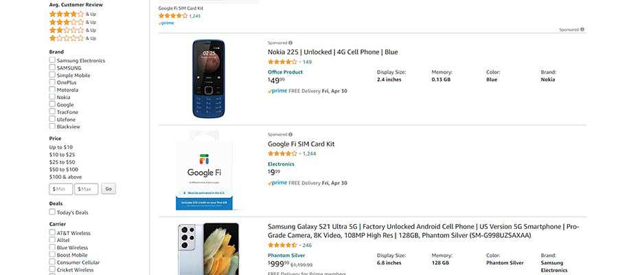
Of course, it can be scaled all the way up to dedicated UIs where users select from a range of options. Details such as pricing, brand, color, size, etc. make finding the right match that much easier.

Product filtering options on Amazon.com

Related and Recently Viewed Products

Once a customer finds what they’re looking for, it doesn’t necessarily mean they’re ready to buy. They may want to do a little more research or simply come back another time.

Therefore, you’ll want to provide them with alternative options and a way to get back to where they were. Offering lists of related and recently viewed products will do the trick.

Related Products

Related products can be a great way for customers to learn about other items within the same category. For example, someone may want to compare several televisions before making a decision. It could even compel them to go for the more expensive option (everybody wants that big screen, right?).

It could also be utilized as an invitation to purchase accessories. With the aforementioned TV shopper, they might see the perfect stand or soundbar. There are any number of possibilities here.

A related product listing from Crutchfield

Recently Viewed Products

When it comes to recently viewed products, this feature makes it easy for a shopper to pick up where they left off. At the very least, it saves them the trouble of having to search through your store again.

While this doesn’t have to be prominently displayed, it should be added to an area where shoppers will see it. That could be at the bottom of the page or maybe even within a sidebar. Either way, it’s a nice little convenience.

Recently viewed products list from LL Bean

The Ability to Create an Account or Shop as a Guest

Every shopper that comes to your website has their own preferences regarding user accounts. Some want the convenience of having their own login, while others would rather keep things a bit more casual.

It’s important to meet customers where they’re most comfortable. Forcing a particular action – even with good intentions – will likely be a turnoff. With that, allowing them to easily create an account or shop as a guest provides them with choice.

User Accounts

User accounts are an attractive feature for both shoppers and store owners. Shoppers get the convenience of having a single place to manage orders, billing information and shipping addresses. Those that are frequent buyers will appreciate not having to re-enter this data every time they place an order.

For store owners, the account dashboard is a great place to offer customers extra perks or get in touch with them regarding an order. Package tracking numbers, for instance, can be added here – allowing customers to reference them anytime.

Account creation can be made available through various avenues. Placing a link in the navigation and via call-to-actions are advisable. Enabling registration during checkout is also an effective means of encouraging customers to sign up.

Guest Shopping

Unless your eCommerce store is members-only, it makes sense to allow customers to check out as guests. This enables them to shop without having to make a commitment.

Besides, this doesn’t mean you have to give up all hope. There’s still an opportunity to tout the advantages of registering for an account. Who knows? Some people may eventually take you up on the offer.

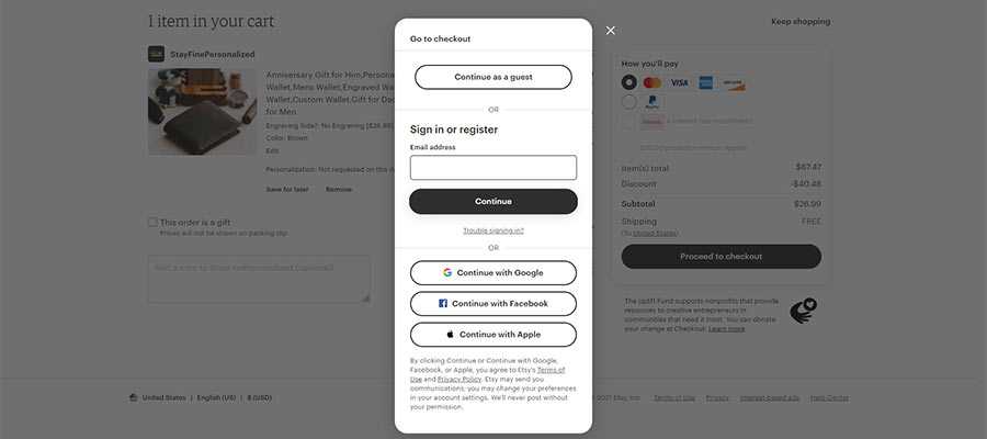
Etsy offers the option to create an account or checkout as a guest

Master the Basic Features of eCommerce, Then Add On

In the design process, it’s easy to overlook the tried-and-true features of an eCommerce website. They tend to get lost in the pursuit of more flashy bells and whistles. Yet, it’s those basics that lay the foundation for a great user experience.

Much as designers tend to focus on a mobile-first philosophy, perhaps eCommerce should be approached with an eye towards basics-first. Once those are established, it’s time to think about adding a little bling to the mix.

This will ensure that a website is user-friendly and reinforces the primary goal of making conversions.

The post A Focus on the Basics: Must-Have Features for Your eCommerce Website appeared first on Speckyboy Design Magazine.


Read in browser »

Recent Articles:

Dealing With an Absentee Web Design Client
Weekly News for Designers № 591
Presenting Design Ideas is All About Presentation
4 Ways Clients Can Hurt Project Outcomes (and How You Can Save the Day)
8 Stunning Examples of CSS & JavaScript 3D Text Effects
Share
Tweet
+1
Share
Forward
Copyright © 2021 Speckyboy Design Magazine, All rights reserved.
You signed up for daily Speckyboy Design Magazine email alerts either via Feedburner or directly through our site.

Our mailing address is:
Speckyboy Design Magazine
27 Braeside Park
Inverness, Scotland IV2 7HL
United Kingdom

Add us to your address book


Want to change how you receive these emails?
You can update your preferences or unsubscribe from this list.

Older messages

Speckyboy RSS: Dealing With an Absentee Web Design Client

Monday, May 10, 2021

Your latest Speckyboy content is here!. Speckyboy Design Magazine Design News, Resources & Inspiration Dealing With an Absentee Web Design Client By Eric Karkovack on May 09, 2021 09:16 pm Building

Speckyboy RSS: Weekly News for Designers № 591

Friday, May 7, 2021

Your latest Speckyboy content is here!. Speckyboy Design Magazine Design News, Resources & Inspiration Weekly News for Designers № 591 By Speckyboy on May 07, 2021 07:55 am Envato Elements The

Speckyboy RSS: Presenting Design Ideas is All About Presentation

Wednesday, May 5, 2021

Your latest Speckyboy content is here!. Speckyboy Design Magazine Design News, Resources & Inspiration Presenting Design Ideas is All About Presentation By Addison Duvall on May 05, 2021 07:09 am

Speckyboy RSS: 4 Ways Clients Can Hurt Project Outcomes (and How You Can Save the Day)

Tuesday, May 4, 2021

Your latest Speckyboy content is here!. Speckyboy Design Magazine Design News, Resources & Inspiration 4 Ways Clients Can Hurt Project Outcomes (and How You Can Save the Day) By Eric Karkovack on

Speckyboy RSS: 8 Stunning Examples of CSS & JavaScript 3D Text Effects

Monday, May 3, 2021

Your latest Speckyboy content is here!. Speckyboy Design Magazine Design News, Resources & Inspiration 8 Stunning Examples of CSS & JavaScript 3D Text Effects By Eric Karkovack on May 02, 2021

You Might Also Like

What astrology has to do with PR?

Wednesday, November 13, 2024

and, no we won't tell you to read your chart! ͏ ͏ ͏ ͏ ͏ ͏ ͏ ͏ ͏ ͏ ͏ ͏ ͏ ͏ ͏ ͏ ͏ ͏ ͏ ͏ ͏ ͏ ͏ ͏ ͏ ͏ ͏ ͏ ͏ ͏ ͏ ͏ ͏ ͏ ͏ ͏ ͏ ͏ ͏ ͏ ͏ ͏ ͏ ͏ ͏ ͏ ͏ ͏ ͏ ͏ ͏ ͏ ͏ ͏ ͏ ͏ ͏ ͏ ͏ ͏ ͏ ͏ ͏ ͏ ͏ ͏ ͏ ͏ ͏ ͏ ͏ ͏ ͏ ͏ ͏ ͏

#482: New Front-End Techniques

Tuesday, November 12, 2024

With high-definition colors, virtual keyboard on mobile, CSS and reliable dialog in HTML. Issue #482 • Nov 12, 2024 • View in the browser Smashing Newsletter Hej Smashing Friends, I remember the good

Mayer Rus on a Malibu Scouting Mission Gone Right

Tuesday, November 12, 2024

View in your browser | Update your preferences ADPro California Dreamin' I should bring my passport, I always think whenever work demands that I leave my cozy nest in Silver Lake to scout a house

Accessibility Weekly #422: Designing Against the Deaf Tax

Monday, November 11, 2024

November 11, 2024 • Issue #422 View this issue online or browse the full issue archive. Featured: Designing against the deaf tax "'Your baby has failed' isn't a phrase any parent wants

Slow Productivity

Sunday, November 10, 2024

Issue 220: Reflections on the new Cal Newport book ͏ ͏ ͏ ͏ ͏ ͏ ͏ ͏ ͏ ͏ ͏ ͏ ͏ ͏ ͏ ͏ ͏ ͏ ͏ ͏ ͏ ͏ ͏ ͏ ͏ ͏ ͏ ͏ ͏ ͏ ͏ ͏ ͏ ͏ ͏ ͏ ͏ ͏ ͏ ͏ ͏ ͏ ͏ ͏ ͏ ͏ ͏ ͏ ͏ ͏ ͏ ͏ ͏ ͏ ͏ ͏ ͏ ͏ ͏ ͏ ͏ ͏ ͏ ͏ ͏ ͏ ͏ ͏ ͏ ͏ ͏ ͏ ͏ ͏ ͏

Introducing Brand Presets for Email Templates – Available on All Plans

Saturday, November 9, 2024

Postcards email builder update: mantain your Brand Style across all templates.͏‌ ͏‌ ͏‌ ͏‌ ͏‌ ͏‌ ͏‌ ͏‌ ͏‌ ͏‌ ͏‌ ͏‌ ͏‌ ͏‌ ͏‌ ͏‌ ͏‌ ͏‌ ͏‌ ͏‌ ͏‌ ͏‌ ͏‌ ͏‌ ͏‌ ͏‌ ͏‌ ͏‌ ͏‌ ͏‌ ͏‌ ͏‌ ͏‌ ͏‌ ͏‌ ͏‌ ͏‌ ͏‌ ͏‌ ͏‌ ͏‌

Here’s Every 2025 Color of the Year (So Far)

Thursday, November 7, 2024

View in your browser | Update your preferences ADPro Mood of the Moment Color experts are to autumn what Michael Bublé is to the holidays—re-emerging annually in full force to spread seasonal cheer.

Martha Stewart, the Queen of Reinvention

Tuesday, November 5, 2024

View in your browser | Update your preferences ADPro At the book signings for her debut tome, the now-iconic Entertaining published by Clarkson Potter in 1982, Martha Stewart would autograph the inside

#481: Front-End Techniques

Tuesday, November 5, 2024

With text balancing, exclusive accordions, CSS-only validation, responsive video and audio. Issue #481 • Nov 5, 2024 • View in the browser Smashing Newsletter Hej Smashing Friends, As we keep searching

174 / Sketch notes with autumn colors

Tuesday, November 5, 2024

Product Disrupt Logo Product Disrupt Half-Monthly Oct 2024 • Part 2 View in browser Welcome to Issue 174 I'm back from a vacation in Alicante. It's a beautiful coastal city in Spain. We