Course: Creating a business Key Performance Indicator (KPI) dashboard
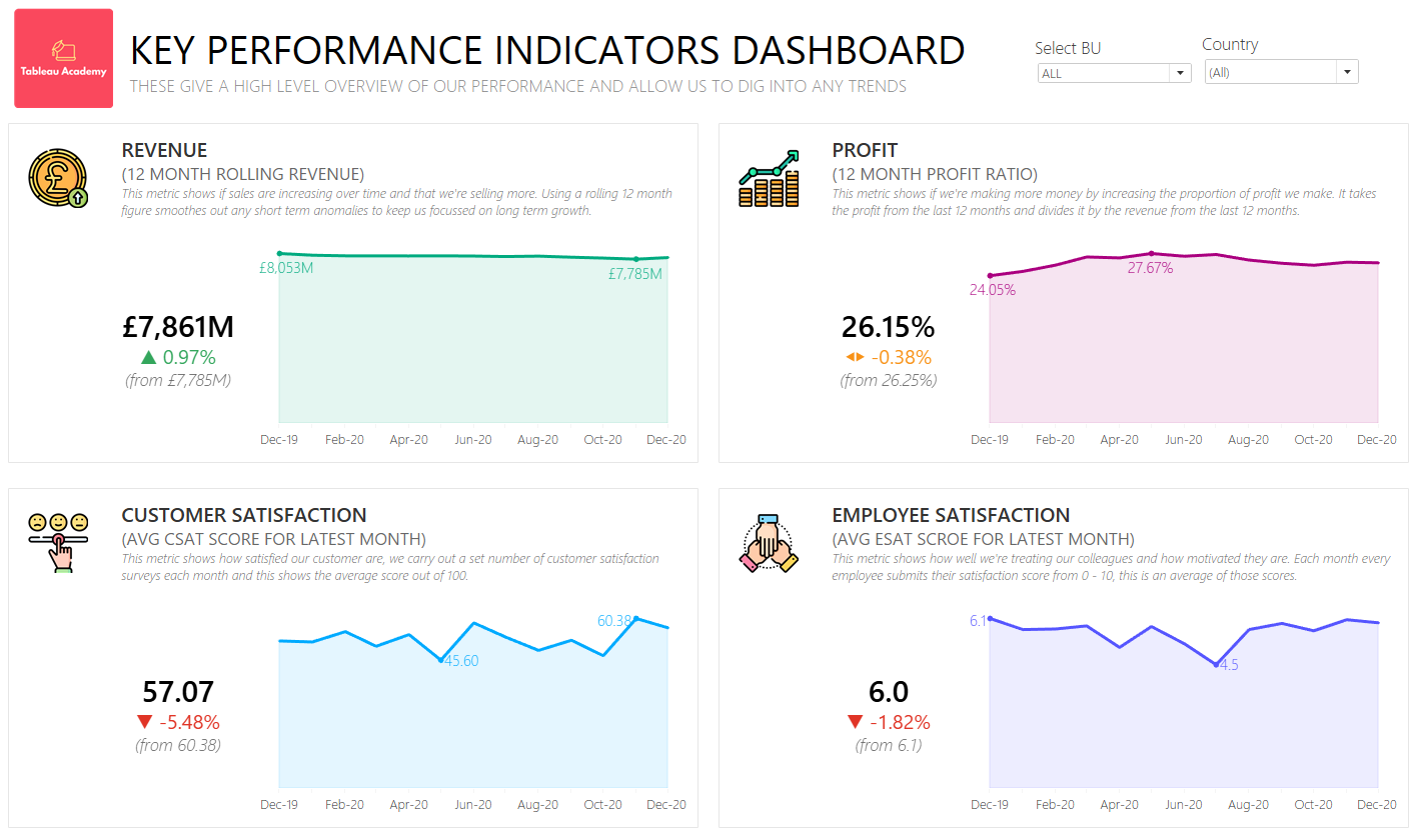
Course: Creating a business Key Performance Indicator (KPI) dashboardIn the third Tableau Academy course you've been tasked with creating a KPI dashboard to align the strategic goals and aims within your organisation and reduce the number of reports and KPIs.Creating A KPI DashboardFor information on how Tableau Academy works please refer to our Welcome To Tableau Academy Guide. The ProjectIn this lesson you’ll be creating a KPI dashboard which enables your organisation to track four key metrics that have been selected and identify trends for further investigation, the KPI dashboard will be displayed around the organisation’s head quarters and be available to the entire organisation. Your Role:You’ve been seconded to the Corporate Strategy team within an organisation that sells products to businesses around the globe. The Corporate Strategy team is currently focussed on aligning the strategy and goals across the company and has been tasked with ensuring this is clearly defined and putting a programme in place to ensure each part of the organisation is working towards this. Your role within the team is to streamline the number of reports that are produced and distributed throughout the organisation, a key part of this is also to reduce the number of Key Performance Indicators (KPIs) that are used and tracked across the organisation and to produce a dashboard that makes the selected KPIs visible to everyone within the organisation. The Brief:A recent analysis by the Corporate Strategy team identified that the number of reports and KPIs in use across the organisation is creating confusion and is resulting in different parts of the organisation focussing on different areas. Four KPIs have been agreed as part of the wider project and you’ve been tasked with building a dashboard that shows theses KPIs along with the trends which will eventually form the basis of a streamlined reporting output for the entire organisation. The dashboard will be used to monitor the KPIs and identify any trends for further investigation, it is anticipated that a later phase of the project will build out the ability to investigate the reason for any underlying trends and put in place actions to address any areas of concern. Required Data:The data you need for this project comes from a number of sources which have been combined together into a single view within your organisations reporting data warehouse. This is automatically distributed to you each month in a .csv file called KPI_Data.csv and can be downloaded from the lesson files section below.
Additional Information:The four KPIs that have been selected are as follows (more details are included in the relevant sections when you come to build these):
The reporting date is the last calendar day of each month, the latest reporting date is always the last calendar day of the last completed month. This project also uses a number of icons for the dashboard these are available to download below, as well as a Tableau template file that you can use for this project. Project Requirements:The following requirements have been agreed and signed off by the project stakeholders and must be met:
Lesson Files:You can download the files required for this project from here: Tableau Academy Google Drive - Lesson 3 In particular you will need to download and save the csv data file here: KPI_Data.csv Solution
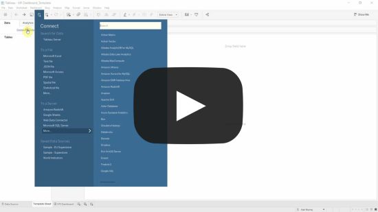
Step 1: Download the template and connect to the dataStep 1.1 - For this project we’ve created a template that you can use to save you setting the formatting and layout of the dashboard yourself, in this first step we’ll download this and connect to the required data source. Make sure you’ve downloaded and saved both the KPI_Data.csv file and KPI Dashboard_Template.twbx files from above. Open the KPI Dashboard_Template.twbx file in either Tableau Desktop or Tableau Public. Click Connect to Data in the Data pane (Tip: Use the Ctrl+d shortcut key to open this quickly), on the left hand side click Text File, then navigate to where you saved the KPI_Data.csv file and click Open. The data should appear in the preview panel, there’s nothing you need to do with the data as it’s already been prepared so simply click the Template Sheet tab at the bottom of the screen to get started! Once you start to create your charts in the next step you’ll notice our standard design has already been applied for you. If you click into the KPI Dashboard tab you should also see that we’ve created a template for the dashboard that contains the sections, text and icons that you’ll need to save you doing this manually.
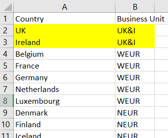
Video 1.1:  Step 1.2 - The data we receive is split by countries, each of these countries is assigned to a Business Unit but this isn’t present in our data. In this step we’ll group our countries into their Business Units so that we can easily filter by them later. Click the New Sheet button at the bottom of the screen. Drag Country from the Data pane and drop it on the Rows shelf or area. Open up the Country to Business Unit Mapping.xlsx file from the data folder in the Tableau Academy Google Drive - Lesson 3 In here you should see a list of Countries in the first column and the Business Unit in the second. For example you should see that both UK and Ireland belong to the UK&I business unit: Back in Tableau click Ireland on the new sheet you created with the list of country names, the scroll down until you see UK. Hold the ctrl key and click UK so that both UK and Ireland are selected. Right click either and select Group. They should both now be grouped together under Ireland & UK and notice that a new Country (group) field has appeared. This is preserving your original list of countries but creating a new field where they are grouped into their respective Business Units - Right click the new Ireland & UK ‘country’ that’s appeared, click Edit Alias and change it to UK&I as per the file. Do the same for the remaining countries so that they’re all grouped correctly and then rename Country (group) field as Business Unit.
Once done we want to combine the Country field with the new Business Unit field to create a hierarchy between the two. If you drag the Country field and drop it on top of the Business Unit field a Create Hierarchy box appears, change the Name to Organisational Hierarchy and press OK. This will now appear in your Data pane with the Business Unit and Country below it, this has created a link between those two fields as a hierarchy so when you add them to a view you can drill up/down between them. Video 1.2:  Step 2: Create the Revenue KPI and trend chartsStep 2.1 - Create the revenue KPI, in this step we’ll create the calculations and charts needed for the revenue KPI as defined in the project information above. If you’re not already on it click the Template Sheet tab at the bottom of the screen and rename it as Revenue KPI. We first need to figure out the latest reporting date, this is simply the latest date in our data and we can use a Fixed Level of Detail calculation to find this. Click Analysis from the top menu and Create Calculated Field (Tip: Use Alt, then a, then c to access this quickly). Name the calculation Latest Date and add the following calculation:
We also need to know whether each row in our data was within the last 12 months or not to know whether to include it. To do this we’ll use a calculation that works out the difference, in months, between the latest date above and the Date for each row in our data. Create a new calculated field and name it Months Before Latest and add the following: We can now use this to calculate the total revenue across the previous 12 months. Create a new calculated field and name it Revenue KPI_Current Month (we’re going to prefix all of our KPI calculation in the same way so it’s easier to keep track of them) and add the following calculation: The DATEDIFF calculation is getting the difference, in months, between the Latest Date and Date for every row in our data. If the difference is less than or equal to 11 (as our current month would be 0) then it’s getting the revenue for that month. We also want to see what the Revenue KPI was in the previous month, we can use the same method as above to do this. Right click the Revenue KPI_Current Month field in the Data pane and click Duplicate. Right click the duplicated field that’s appeared and click Edit. Change the name of the calculated field to Revenue KPI_Previous Month and add the following calculation: This is doing the same as our first calculation except it’s increasing the number of months it’s looking back to 13 (a difference of 12 months from our latest month) and then excluding the current month so that we’re still looking at a 12 month period (as the difference for that would be 0, so >= 1 makes sure we don’t include the latest month). Drag both of the Revenue KPI fields and drop them onto the Text card (note: Hold the ctrl key to select multiple fields at once and then you can drag and drop them at the same time). Click the Text card and then the ‘…’ next to the text to edit it. Format the <SUM(Revenue KPI_Current Month)> line as Font: Segoe UI Semibold, Size: 18, Colour: Black. Add a blank line below it then add the text “(from “ in front of the <SUM Revenue KPI_Previous Month)> and a “)” after it, then format the line as Italics and change the colour to #666666 (this is the 2nd last grey in the first column). Centre align the entire text and then click OK. We now just need to set the default number format for each of the new fields. Right click each of the Revenue KPI fields in turn then go to Default Properties > Default Number Format. Select Currency (Custom), set the Decimal places to 0 and under Suffix add an M to show that it’s £ Million that’s being shown... Subscribe to Tableau Academy to read the rest.Become a paying subscriber of Tableau Academy to get access to this post and other subscriber-only content. A subscription gets you:
|
Older messages
Course: Creating an interactive sales dashboard in Tableau
Friday, May 12, 2023
In this Tableau Academy course you take up the role of a sales operations analyst who has been tasked with creating an interactive global sales dashboard for the retail chain they work for.
Tableau Tea Break, Tableau Jobs & Tableau Academy are now one!
Wednesday, April 26, 2023
Back for 2023! We're pleased to announce Tableau Tea Break, Tableau Jobs and Tableau Academy are all back and now under one banner, read on to find out more!
Your Complete Tableau Learning Pathway
Friday, February 17, 2023
Go from complete Tableau newbie to Tableau master in no time by following our tried and tested Tableau Learning Pathway. Simply follow each of the courses below in your own time and you'll cover
Introducing Tableau Jobs!
Monday, November 21, 2022
If you're looking for a new role, or just interested in what's out there check out our Tableau Jobs project below.
Creating a simple business KPI dashboard in Tableau
Tuesday, November 15, 2022
In this Tableau Academy course we introduce you to reporting on and visualising key performance indicators (KPIs) by taking you through a project to create a simple to use and understand business KPI
You Might Also Like
Instagram Book Promotion for Authors and Publishers
Friday, February 28, 2025
Your book on Instagram! Instagram promo image Instagram ~ a great place to advertise books
🤯 This is what calling your shot looks like…
Thursday, February 27, 2025
This year, we're playing to win. Read our annual company update right here, right now. Learn about our biggest moves yet... Playing to Win Contrarians, First, thank you. Trust is a rare currency in
3-2-1: On the secret to self-control, how to live longer, and what holds people back
Thursday, February 27, 2025
“The most wisdom per word of any newsletter on the web.” 3-2-1: On the secret to self-control, how to live longer, and what holds people back read on JAMESCLEAR.COM | FEBRUARY 27, 2025 Happy 3-2-1
10 Predictions for the 2020s: Midterm report card
Thursday, February 27, 2025
In December of 2019, which feels like quite a lifetime ago, I posted ten predictions about themes I thought would be important in the 2020s. In the immediate weeks after I wrote this post, it started
Ahrefs’ Digest #220: Hidden dangers of programmatic SEO, Anthropic’s SEO strategy, and more
Thursday, February 27, 2025
Welcome to a new edition of the Ahrefs' Digest. Here's our meme of the week: — Quick search marketing news Google Business Profile now explains why your verification fails. Google launches a
58% of B2B Buyers Won't Consider You.
Thursday, February 27, 2025
Here's why, and how to fix it. ͏ ͏ ͏ ͏ ͏ ͏ ͏ ͏ ͏ ͏ ͏ ͏ ͏ ͏ ͏ ͏ ͏ ͏ ͏ ͏ ͏ ͏ ͏ ͏ ͏ ͏ ͏ ͏ ͏ ͏ ͏ ͏ ͏ ͏ ͏ ͏ ͏ ͏ ͏ ͏ ͏ ͏ ͏ ͏ ͏ ͏ ͏ ͏ ͏ ͏ ͏ ͏ ͏ ͏ ͏ ͏ ͏ ͏ ͏ ͏ ͏ ͏ ͏ ͏ ͏ ͏ ͏ ͏ ͏ ͏ ͏ ͏ ͏ ͏ ͏ ͏ ͏ ͏ ͏ ͏ ͏ ͏ ͏
Teleportation, AI Innovation, and Outgrowing 'Good Enough'
Thursday, February 27, 2025
Oxford scientists have achieved quantum teleportation of logic gates, AI advances include France's €109B investment, Unitree's eerily smooth robotic movements, and DeepMind's Veo2 video
🧙♂️ Quick question
Thursday, February 27, 2025
Virtual dry-run of my event ͏ ͏ ͏ ͏ ͏ ͏ ͏ ͏ ͏ ͏ ͏ ͏ ͏ ͏ ͏ ͏ ͏ ͏ ͏ ͏ ͏ ͏ ͏ ͏ ͏ ͏ ͏ ͏ ͏ ͏ ͏ ͏ ͏ ͏ ͏ ͏ ͏ ͏ ͏ ͏ ͏ ͏ ͏ ͏ ͏ ͏ ͏ ͏ ͏ ͏ ͏ ͏ ͏ ͏ ͏ ͏ ͏ ͏ ͏ ͏ ͏ ͏ ͏ ͏ ͏ ͏ ͏ ͏ ͏ ͏ ͏ ͏ ͏ ͏ ͏ ͏ ͏ ͏ ͏ ͏ ͏ ͏ ͏ ͏ ͏ ͏ ͏
A Classical Way to Save the Whales
Thursday, February 27, 2025
But what song, we don't know.
I'm investing in early stage AI startups
Thursday, February 27, 2025
Hi all, I'm investing in early stage AI startups. If you know someone who's looking for easy-to-fit-in checks from helpful founders (happy to provide references) I'd love to chat. Trevor

