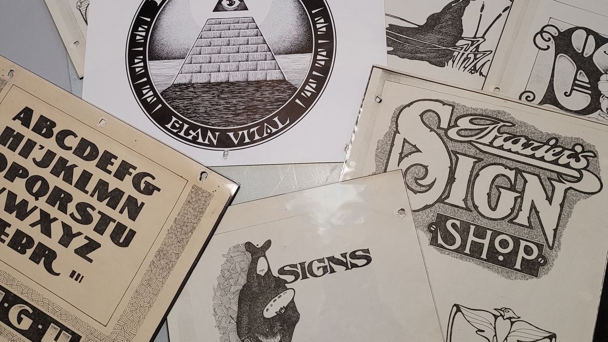
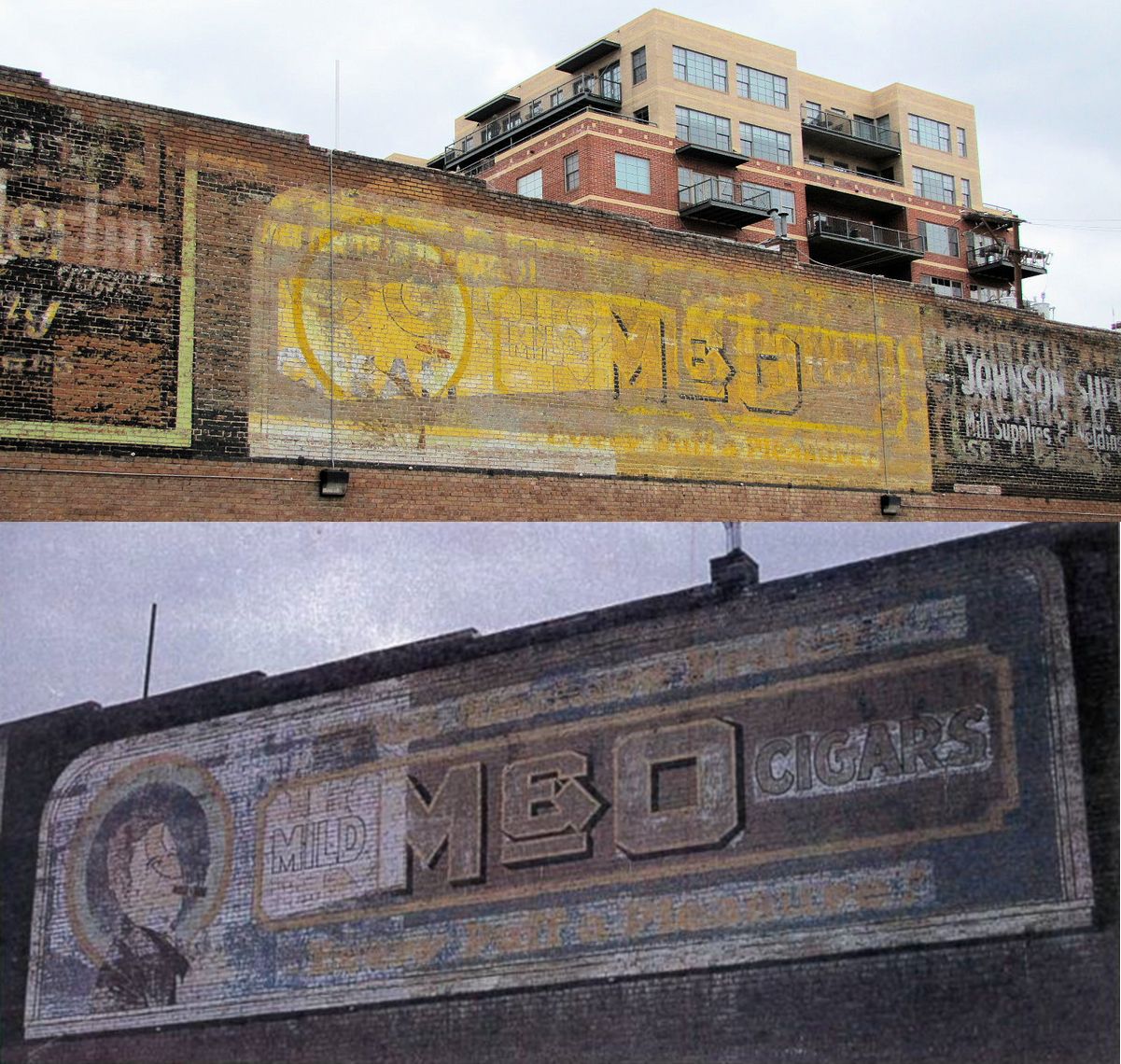
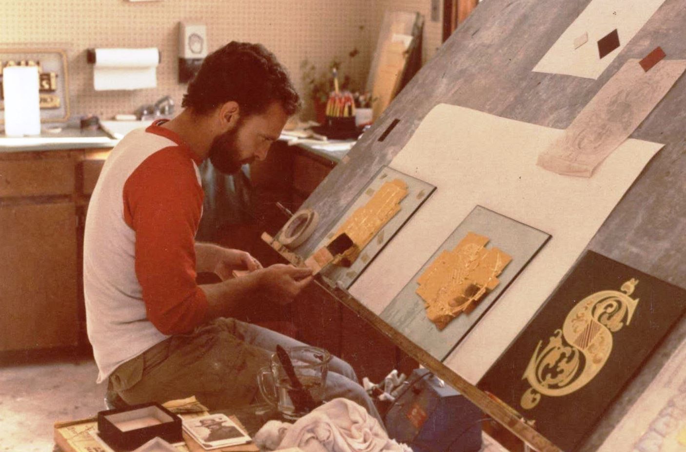
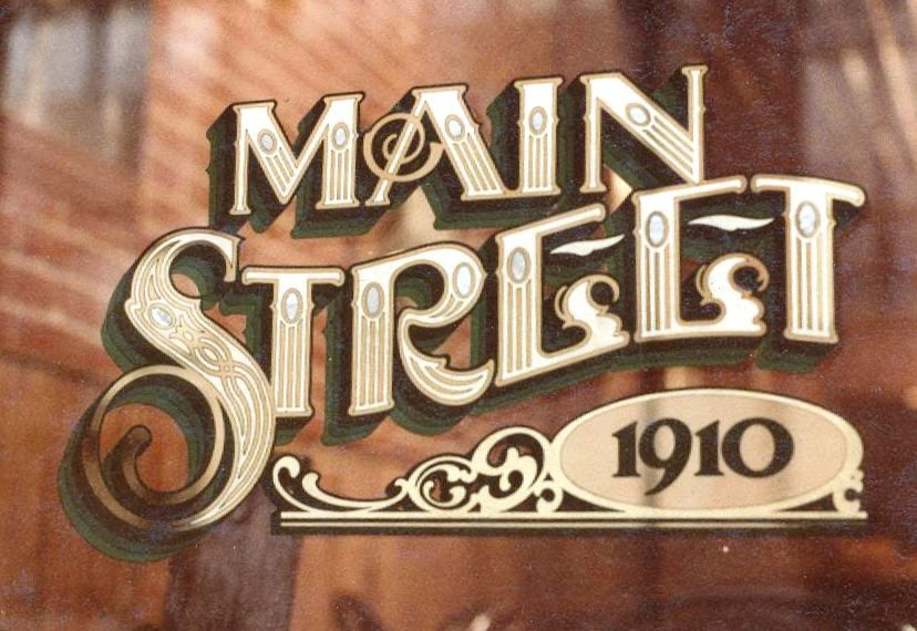
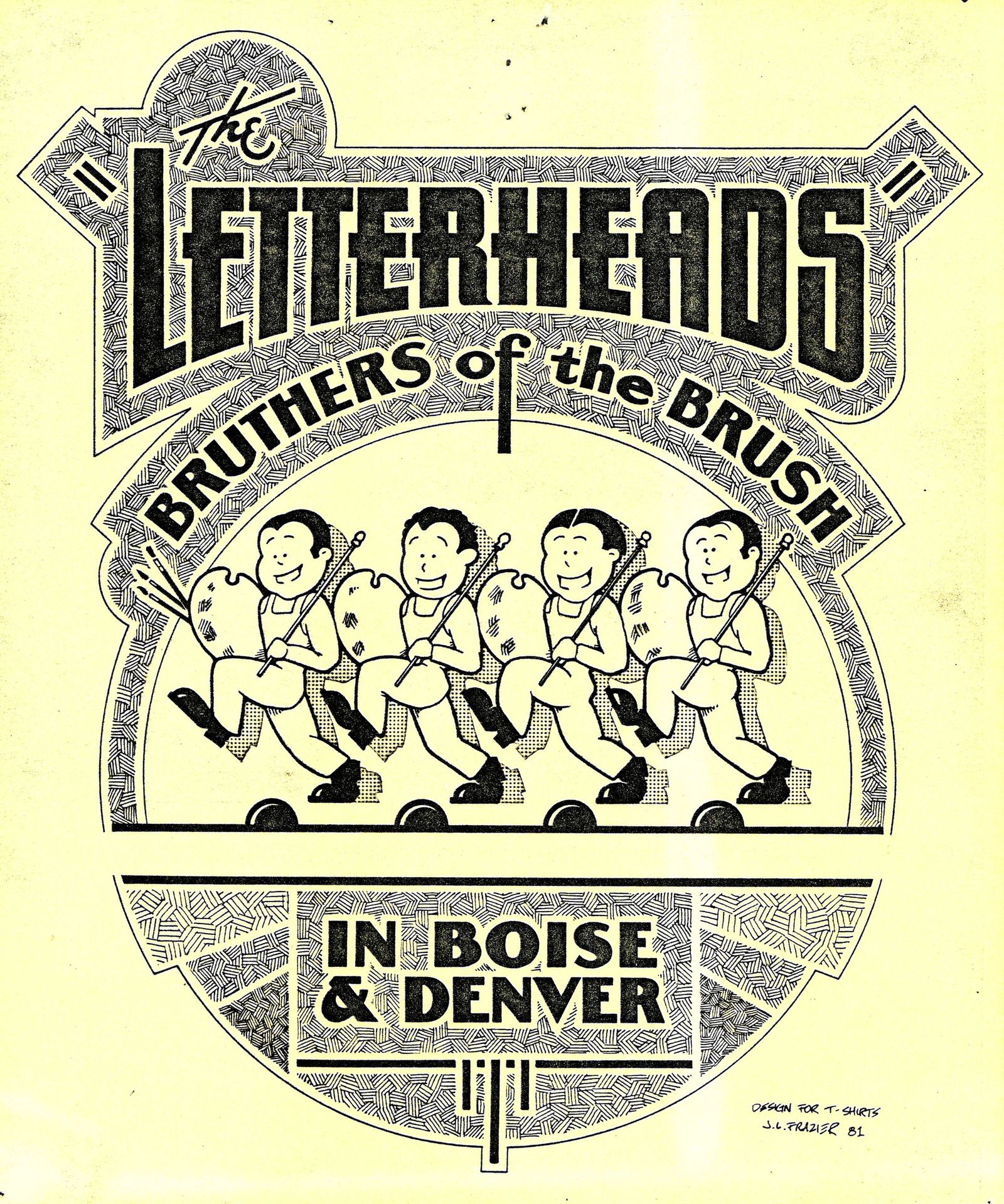
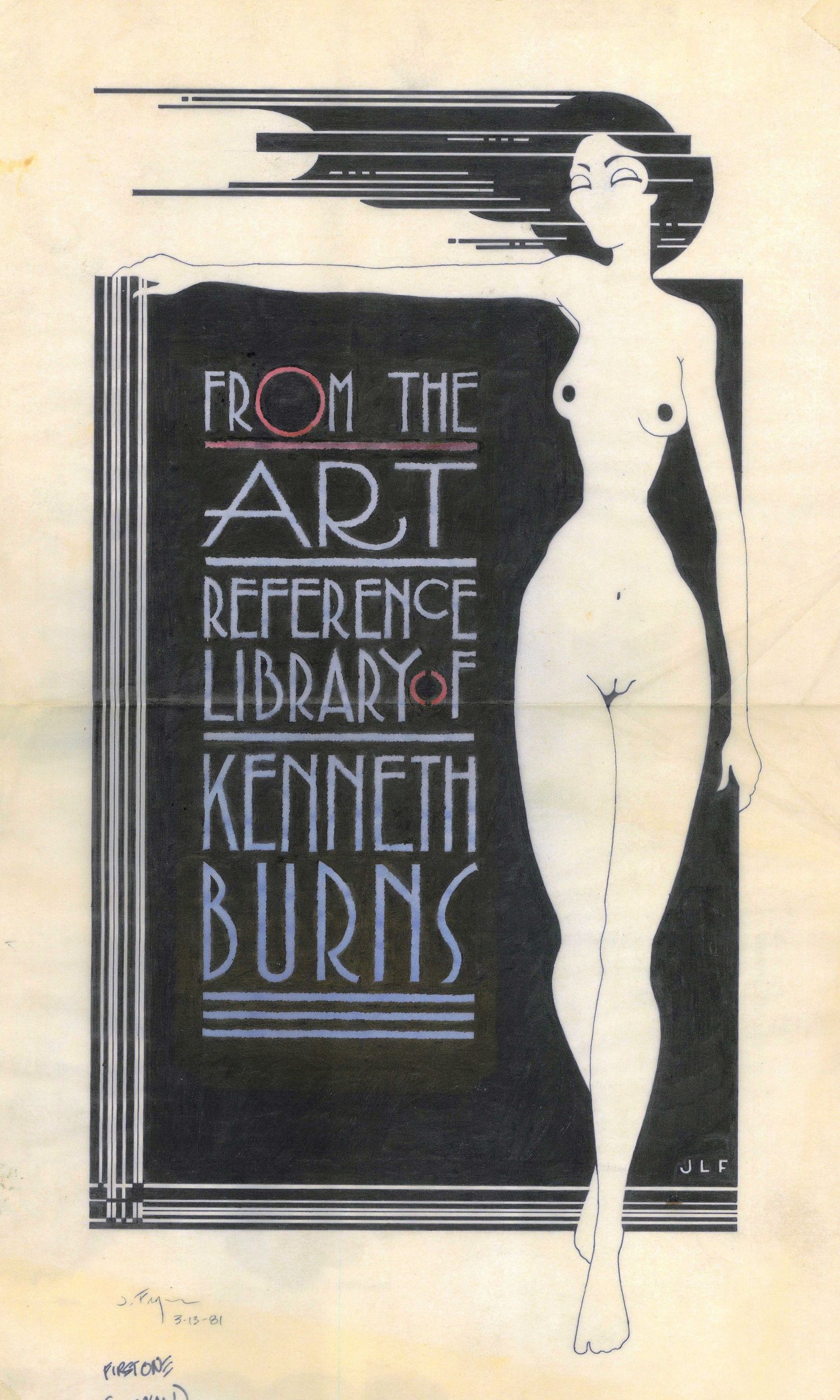
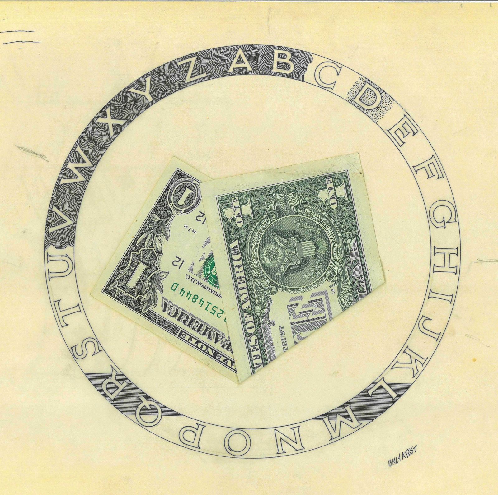
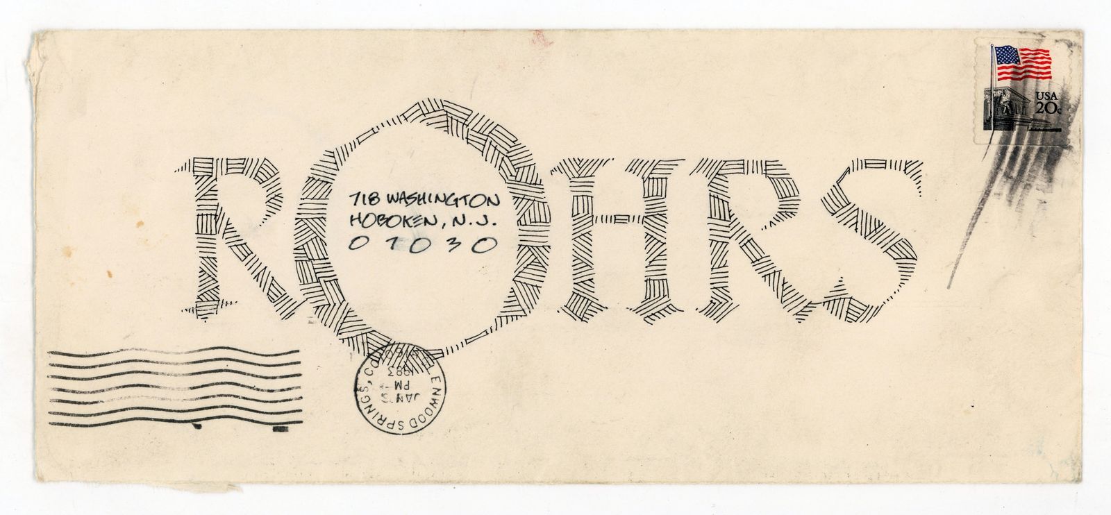
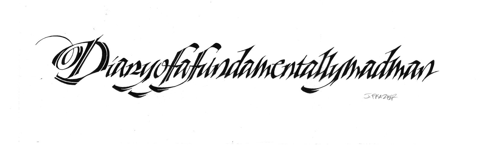
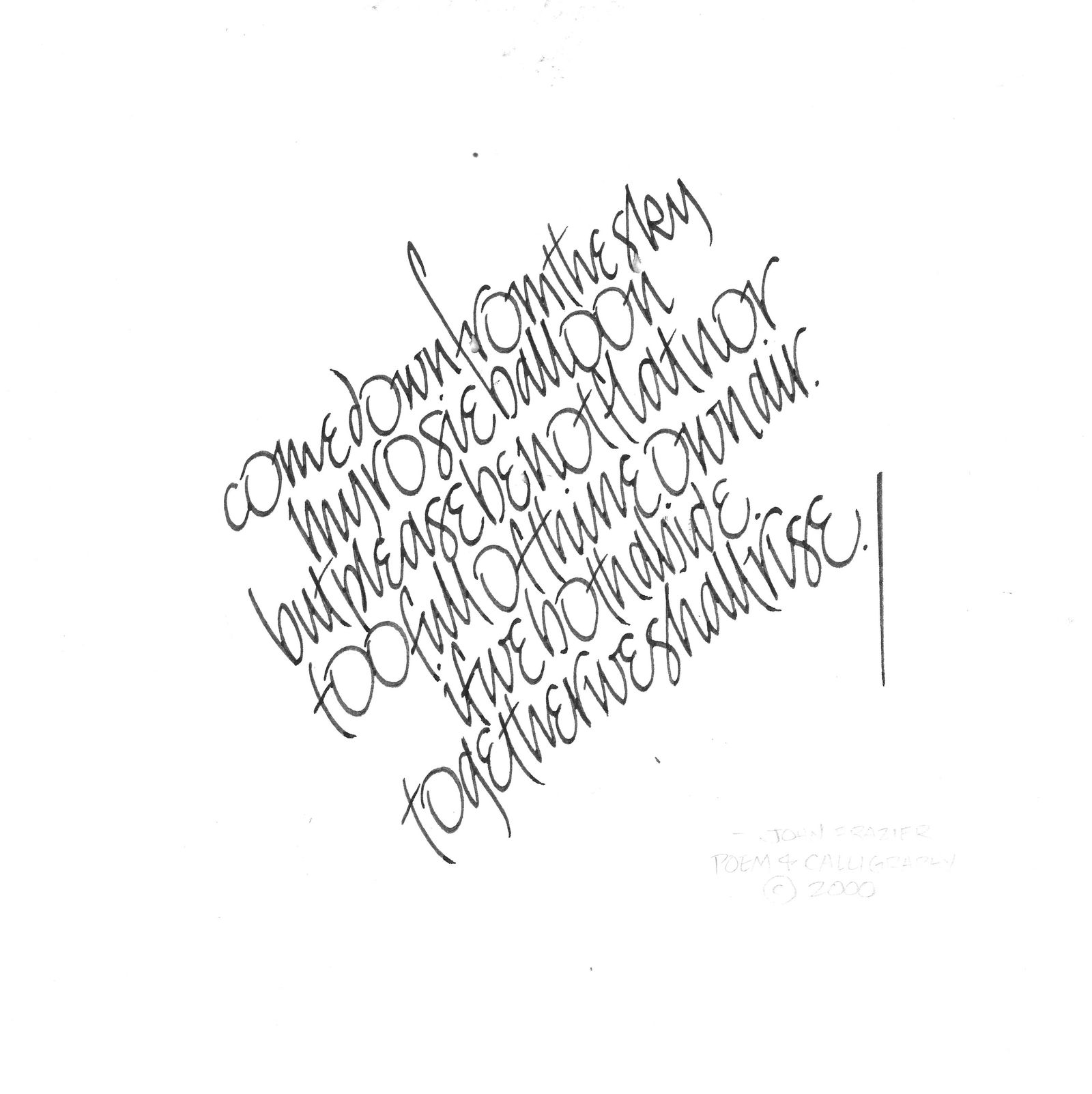
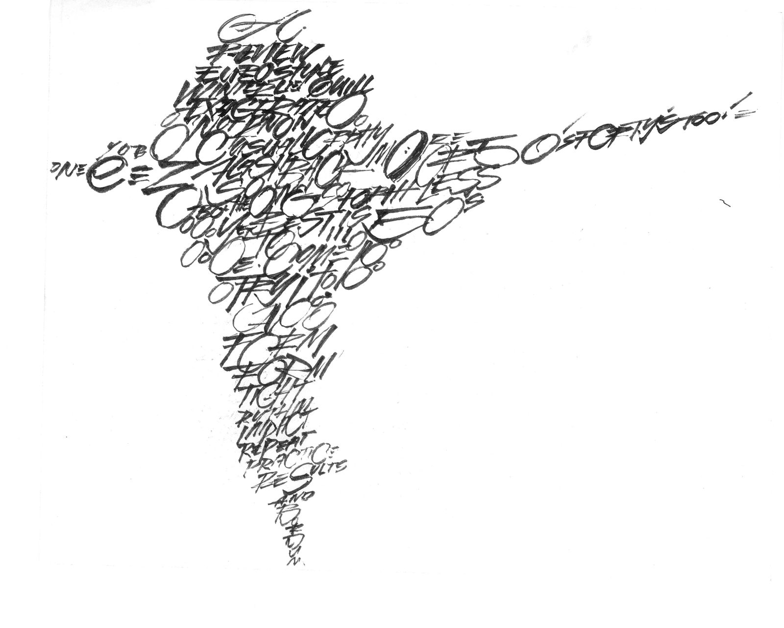
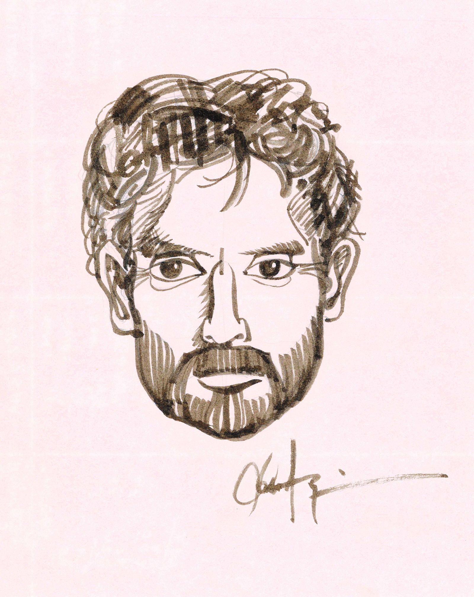
That Saturday Afternoon Jaunt with John Frazier, Original Letterhead
|


Older messages
Raffle for Dapper Signs
Friday, May 12, 2023
Raffles and other ways to support Cooper at Dapper Signs during a medical emergency. BLAG (Better Letters Magazine) BLAG (Better Letters Magazine) Support Dapper Signs by entering the raffle to win
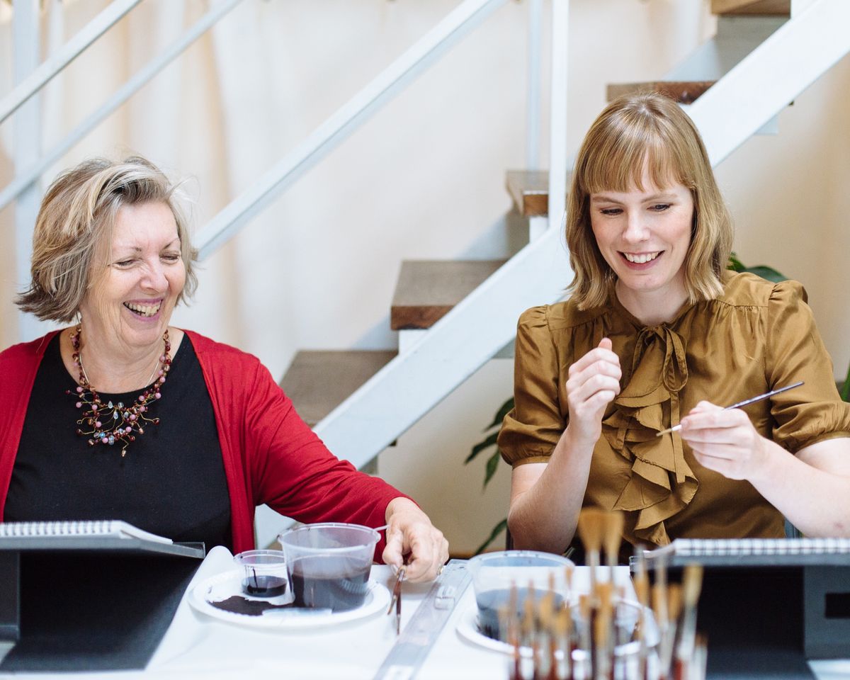
On the Brush with Barbara Enright and Carla Hackett
Friday, May 12, 2023
Recording of Barbara Enright and Carla Hackett's BLAG Chat and brush lettering demonstration. BLAG (Better Letters Magazine) BLAG (Better Letters Magazine) Brush lettering duo Barbara Enright and
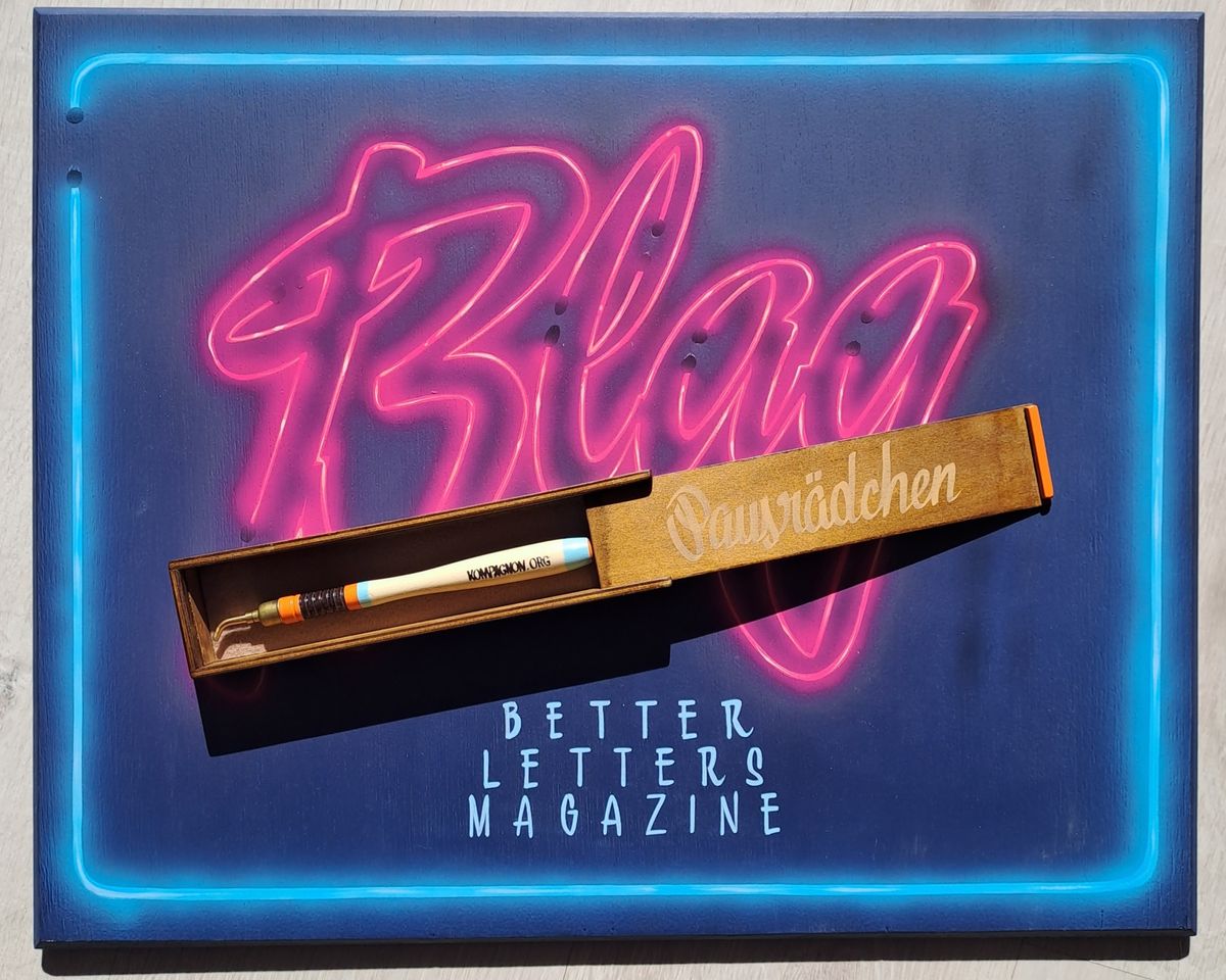
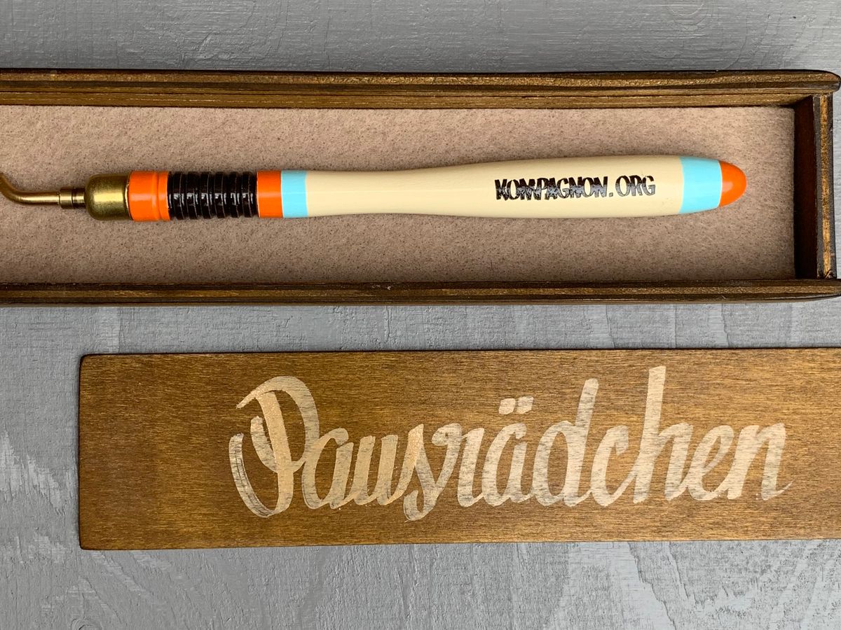
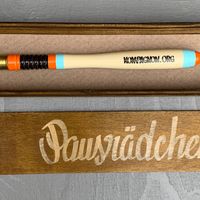
Paying Respect to the Vintage Pausrädchen (Pounce Wheel)
Thursday, May 4, 2023
A batch of high-quality vintage pounce wheels are customised for sale as an art edition in Germany. BLAG (Better Letters Magazine) BLAG (Better Letters Magazine) The limited edition Kompagnon.org
Behind the Scenic Painting of Pinocchio's Animation Oscar
Thursday, April 27, 2023
Polly Robbins, a scenic artist on Pinocchio, shares what goes into an Oscar-winning animation. BLAG (Better Letters Magazine) BLAG (Better Letters Magazine) Scenic painting for Guillermo del Toro's
Your BLAG Emails Are Changing
Tuesday, April 25, 2023
This week, the format and frequency of emails from BLAG are changing. This is in response to feedback from the reader survey, and to give paid members greater control of what they receive. What does
You Might Also Like
What to Watch For in Trump's Abnormal, Authoritarian Address to Congress
Tuesday, March 4, 2025
Trump gives the speech amidst mounting political challenges and sinking poll numbers ͏ ͏ ͏ ͏ ͏ ͏ ͏ ͏ ͏ ͏ ͏ ͏ ͏ ͏ ͏ ͏ ͏ ͏ ͏ ͏ ͏ ͏ ͏ ͏ ͏ ͏ ͏ ͏ ͏ ͏ ͏ ͏ ͏ ͏ ͏ ͏ ͏ ͏ ͏ ͏ ͏ ͏ ͏ ͏ ͏ ͏ ͏ ͏ ͏ ͏ ͏ ͏ ͏ ͏ ͏ ͏ ͏ ͏
“Becoming a Poet,” by Susan Browne
Tuesday, March 4, 2025
I was five, / lying facedown on my bed ͏ ͏ ͏ ͏ ͏ ͏ ͏ ͏ ͏ ͏ ͏ ͏ ͏ ͏ ͏ ͏ ͏ ͏ ͏ ͏ ͏ ͏ ͏ ͏ ͏ ͏ ͏ ͏ ͏ ͏ ͏ ͏ ͏ ͏ ͏ ͏ ͏ ͏ ͏ ͏ ͏
Pass the fries
Tuesday, March 4, 2025
— Check out what we Skimm'd for you today March 4, 2025 Subscribe Read in browser But first: what our editors were obsessed with in February Update location or View forecast Quote of the Day "
Kendall Jenner's Sheer Oscars After-Party Gown Stole The Night
Tuesday, March 4, 2025
A perfect risqué fashion moment. The Zoe Report Daily The Zoe Report 3.3.2025 Now that award show season has come to an end, it's time to look back at the red carpet trends, especially from last
The FDA Just Issued a Recall on a Supplement — Because it Contains an ED Drug
Monday, March 3, 2025
View in Browser Men's Health SHOP MVP EXCLUSIVES SUBSCRIBE The FDA Just Issued a Recall on a Supplement — Because It Contains an ED Drug The FDA Just Issued a Recall on a Supplement — Because It
10 Ways You're Damaging Your House Without Realizing It
Monday, March 3, 2025
Lenovo Is Showing off Quirky Laptop Prototypes. Don't cause trouble for yourself. Not displaying correctly? View this newsletter online. TODAY'S FEATURED STORY 10 Ways You're Damaging Your
There Is Only One Aimee Lou Wood
Monday, March 3, 2025
Today in style, self, culture, and power. The Cut March 3, 2025 ENCOUNTER There Is Only One Aimee Lou Wood A Sex Education fan favorite, she's now breaking into Hollywood on The White Lotus. Get
Kylie's Bedazzled Bra, Doja Cat's Diamond Naked Dress, & Other Oscars Looks
Monday, March 3, 2025
Plus, meet the women choosing petty revenge, your daily horoscope, and more. Mar. 3, 2025 Bustle Daily Rise Above? These Proudly Petty Women Would Rather Fight Back PAYBACK Rise Above? These Proudly
The World’s 50 Best Restaurants is launching a new list
Monday, March 3, 2025
A gunman opened fire into an NYC bar
Solidarity Or Generational Theft?
Monday, March 3, 2025
How should housing folks think about helping seniors stay in their communities? ͏ ͏ ͏ ͏ ͏ ͏ ͏ ͏ ͏ ͏ ͏ ͏ ͏ ͏ ͏ ͏ ͏ ͏ ͏ ͏ ͏ ͏ ͏ ͏ ͏ ͏ ͏ ͏ ͏ ͏ ͏ ͏ ͏ ͏ ͏ ͏ ͏ ͏ ͏ ͏ ͏ ͏ ͏ ͏ ͏ ͏ ͏ ͏ ͏ ͏ ͏ ͏ ͏ ͏ ͏ ͏ ͏ ͏ ͏ ͏ ͏