Time is one of the biggest resource constraints for marketing teams, especially at high-growth companies chasing ambitious targets on tight budgets .
When you decide to use your time to learn and upskill, having a seamless e-learning experience is crucial, so you can make the most of it.
In recent editions of our newsletter, we started to share how we collect user feedback and how we categorize that into weighted opportunities.
In this issue we want to continue down this path. Let's explore some main issues on the UX side and how we tried to address them. |
|
|
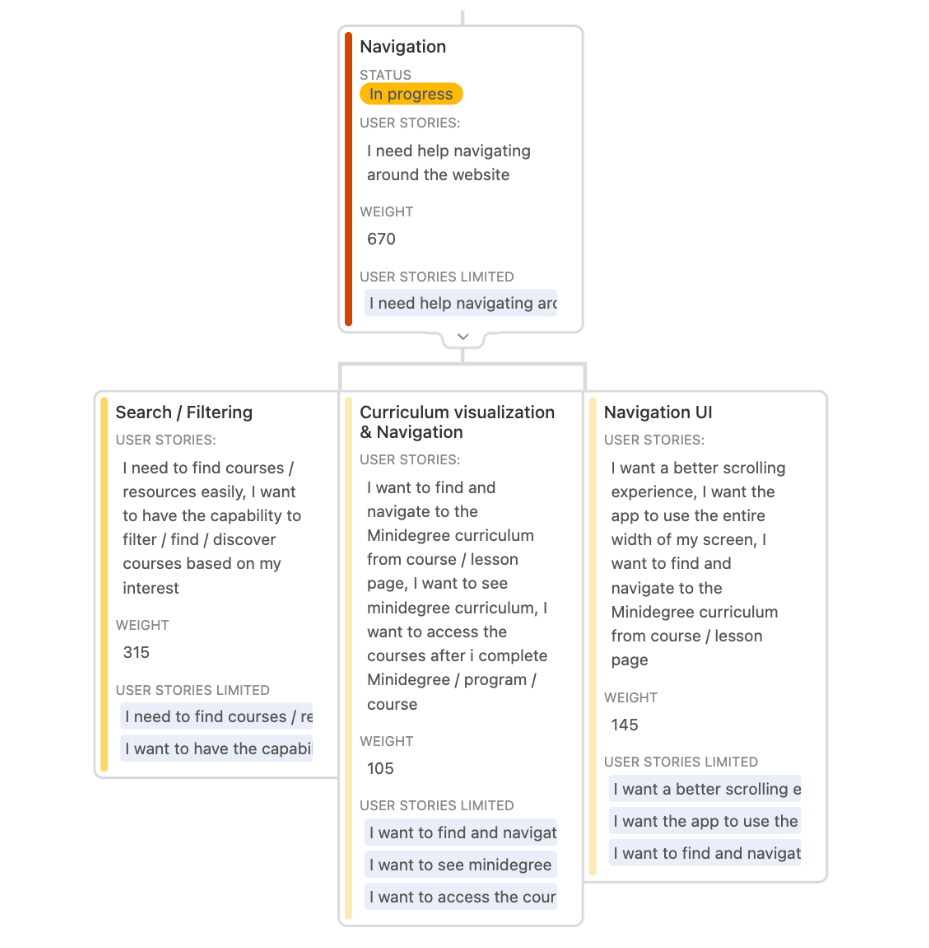
This is a screengrab from our weighted opportunity map.
The weighting is based on a rubric of meta data. - Who gave the feedback?
- At which point of the journey?
- What study plan they had?
- Etc.
For our UI/UX feedback, we mostly broke it down into two categories: Enhancing navigation and providing a better onboarding experience for our users.
Today we want to zoom in on our Navigation issues and how we tried to address them.
|
Restart motion: Picking up where you left off
Learners often want to resume their courses from exactly where they left off. A seamless transition is crucial for maintaining engagement and encouraging progress.
Our hypothesis:
If we include a section with the last visited/viewed courses as the first content block on the dashboard, it would reduce the number of clicks a user needs to make to resume learning.
What we found:
- The first iteration did the job, but feedback immediately came up that we should have clear indicators of where the learner stopped in the course on the previous visit.
- Simply looking at a course will add it to the active course section. Perhaps we need some sort of engagement criteria as filter to prevent overpopulation or showing courses that was simply explored but never started.
-
Some older courses had a slightly different approach in how they were produced and the progress indicators could have some small accuracy issues, leading to an inconsistent experience.
|
Forward motion:
Making it easier to find and pick your next course
One of the biggest hurdles users face on our platform is finding the right course to take next.
There are multiple pathways here. Some people take courses in topic bundles (like SEO and Content), some take courses based on a specific need (like learning how to set up GA4 effectively) , and some go by interest or some other method.
Our hypothesis:
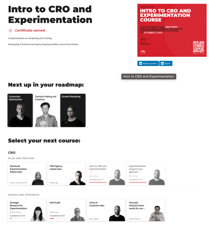
If we improve categorization and include a Course completion page that shows recommendations for courses that might be good to go for next, users are more likely to find their next course with fewer clicks.
What we found: -
We improved categorization and it helped, but the categorization layers negatively impacted our navigation component. We realized we need a less complex menu navigation.
- The desired choice isn’t always listed, so we need to get an effective global search up and running - currently, it only exists in the catalog, but making it more accessible would be a huge help for users to find their next course.
|
Backwards motion:
Going back to the Minidegree page
Sounds simple right? But, it wasn’t quite so. Grouping together courses that have multiple parents became a UX and design challenge for us and a frustration to our users.
Fortunately, some of the categorization work mentioned earlier made it easier to tackle this problem.
Our hypothesis:
If we include options for the users to easily navigate back to all available Minidegree options associated with the specific course at hand, they can return to the curriculum page with fewer clicks and without the need to open new tabs.
What we found: - The amount of complaints and feedback on this issue decreased. Hinting at a partial solution to the initial problem. A more visible, clearer pathway could potentially solve this problem entirely.
-
Some course are popular and relevant to various categories. This created some additional complexity by introducing too many options. Whilst functionally it does what it should, it created some confusion when there is no association to the other content modules. Again, a filter on engagement criteria could potentially help solve this.
|
Cost of click: Speed Matters
You have seen us mention “clicks” a few times now, but what's the significance here?
Underpinning all of these issues is performance. The slower your site, the higher the cost of a click is. If you click on the wrong page and you want to go back, everything just takes a little longer than it should, and the user experience suffers because of it.
So, we always want users to be able to reach their desired destination with as little clicks as possible, while making sure pages load as fast as possible.
Our hypothesis:
If we improve page load times and introduce a loading spinner on CTAs between key pages, it would reduce the number of clicks on a single button and rage-click incidents.
What we found:
The loading spinner was an easy and low-lift solution that mitigated complaints. It sets expectations immediately and confirms that the click was successful while indicating that something is happening.
The bigger issue, however, is performance, or page load speed.
The most important learning here is, no matter how far and fast you want to travel between pages, always keep load speed in check, it's a big deal. |
Fun fact:
More than 10 years ago, Amazon found that every 100ms of latency cost them 1% in sales. |
As a lean growing company, we need to focus.
We made this much progress with the resources at hand:
|
We made a significant dent in one piece of the puzzle. But, by no means, have we reached the finish line or achieved a perfect state. Even with hiring external help and putting the required attention to the development of our platform. |
As a small business building an e-learning platform and producing industry-defining content to go with it, we have had to make some compromises along the way.
To remain competitive, we have to channel our focus to deliver the most value to our students. For us, here at CXL, this is our content, and we should put our selves in a position to focus on that.
|
We are planning a re-platforming and giving our learning environment a serious upgrade in the process.
This will not only upgrade the user experience, but would allow us to spend less time fixing up the platform and focus even more of our attention on producing industry-leading content. Helping marketing teams overcome growth challenges and punch above their weight.
We want to bring some of you in on the action early.
This way you can help shape the next version of CXL and help us decide what is best for you.
We will give you access to the beta platform where we have built a small amount of content and features. We want to work with you to make sure we get this right.
Join the beta group
We made it this far, and want thank you for your support and participation along the way.
|
New Blog:
From Brand Strategy to Brand Fame: Your ticket to sustained growth and customer loyalty. |
"Everyone in the category competes with famous brands and industry leaders. Famous brands need to put in less effort to convince people to buy from them. While smaller, lesser-known brands have to spend money just to be an open Chrome tab on someone’s browser when researching a new product, service, or software."
As Prof. Mark Ritson puts it, “You’re very fucked if you are a small brand.” Small brands will always compete with the biggest fish in the pond and, more often than not, draw the short straw.
Stefan Maritz, our new Marketing Lead, shares an extensive look into how to build a brand that can stand out in the market and dominate your niche.
Read the full blog.
|
New Course:
On-Page, On-Site & Programmatic SEO |
You will learn how to:
- Use content as SEO’s #1 growth lever
- Increase content performance with internal linking and site architecture
- Safely and effectively approach AI content strategies
-
Use programmatic SEO to scale your content generation and reach
- Leverage SEO strategies to reach a global audience
Learn from B2B SEO consultant Logan Bryant, bringing over a decade of SEO knowledge. Logan built a 15X SEO program with Tipalti, a billion-dollar FinTech unicorn, and will share his secrets in this course.
Check it out |
Unlimited Team Plan:
Start a 15-Day Free Trial |
✔ Unlimited team seats – big team, big savings. ✔ 120+ highly practical and detailed marketing courses. ✔ 10 deep skill-building programs. ✔ Learn from vetted top 1% marketing practitioners.
If you have a team of 10, that’d be only $672/yr per team member. $336/yr per member for a team of 20.
Start a 15-day free trial.
|
|
|
CXL, 901 S Mo Pac Expy, Suite 150, Barton Oaks Plaza One, Austin TX 78746. Follow us on LinkedIn.
Unsubscribe from future emails like these. |
|
|
|


_01J32DSX6NM7APHHS3EJ0MVYJB.png)
_01J32EFPSG0GN2SKK1YGRAZ6RR.png)
_01J32ES4MGB9N2YTEZXY61Y9HD.png)