Tedium - From Segments To Pixels 🧮

The calculator’s role in the rise of the LCD.

Hunting for the end of the long tail • August 18, 2024

Today in Tedium: Odds are, if you’re a sophisticated person, you’ve flipped a pocket calculator upside down to see what words you could make with the calculator symbols. (I’m, of course, talking about “hello.”) Those characters were interesting, in part because they appeared on devices similar to the modern liquid crystal displays we have now. But those LCDs were simple—and the ones you use now to read issues of Tedium are far more complex. (Unless you figured out a way to read Tedium on a one-line calculator, in which case, please reach out.) How did we close the gap between the LCDs that shaped pocket calculators and the ones that gave us modern-day gadgets to write home about? (Hint: Look at the shape of the numbers.) Today’s Tedium talks about display technology, calculators, segmented LCDs, and the seven black bars that have come to define it. — Ernie @ Tedium

TLDR

Want a byte-sized version of Hacker News? Try TLDR’s free daily newsletter.

TLDR covers the most interesting tech, science, and coding news in just 5 minutes.

No sports, politics, or weather.

Subscribe for free!

You’ve seen these symbols everywhere. There’s a chance you didn’t even know they had a name. Turns out they do. (Ben Green/Unsplash)

The symbols on the average calculator are actually way older than the LCD itself

We’ve written a bit about liquid crystal displays over the years, in their many forms, including a piece about how employees at Westinghouse had developed a working active-matrix LCD panel. (Despite that, the technology completely fell through the company’s hands out of absolute disinterest.)

But active matrix LCDs, developed in the late 1970s, weren’t the first LCD to draw interest. Back in the 1960s, work at RCA’s David Sarnoff Research Center led to the first liquid crystal displays. Perhaps overshadowed today by other famed research labs like Xerox PARC and Bell Labs, the center was responsible for many key electronic innovations, including the CMOS circuit, solar cells, and color television. (The lab also developed the first disc-based video medium, the Selectavision VideoDisc, which was in the works years before LaserDisc.)

Those are obviously hugely important, but more important than all of these, arguably, is the LCD panel, which ultimately reshaped our relationship with information.

(If you’re curious about the history of the research center, Alexander B. Magoun of the IEEE History Center, who was previously the curator of the David Sarnoff Library, wrote a book on the topic way back in 2003. I know he’s a Tedium reader, so let me just say: Hi Alex!)

As you’ll see in the video above, around the 24-minute mark, the first thing publicly displayed on one of these panels was the number 5, in that distinctive blocky shape-based setup you’re likely familiar with.

Interesting—so it’s the same symbol design that we used on calculators and blinking microwaves? Did these researchers invent this very blocky, line-minimizing typographical design?

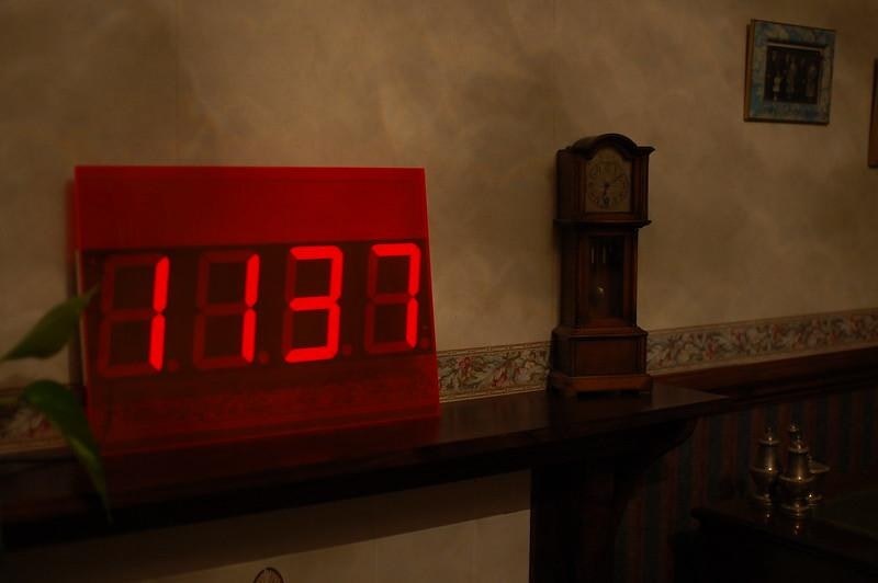
The answer to that question, it turns out, is no. The official name of this symbolic font is the seven-segment display, which refers to the number of lines in the layout—two on either side, one at the top and bottom, and one in the middle. That is the perfect number of shapes to display each of the 10 base numbers, meaning its first use was in contexts like clocks and timers.

In an electronics context, what makes them great is that they minimize the number of components necessary for conveying information. To turn an 8 into a 3, turn off two of the seven lights; to turn a 3 into a 6, turn off one light and turn on two others. At a time when computing was relatively primitive, seven-segment displays limited complexity.

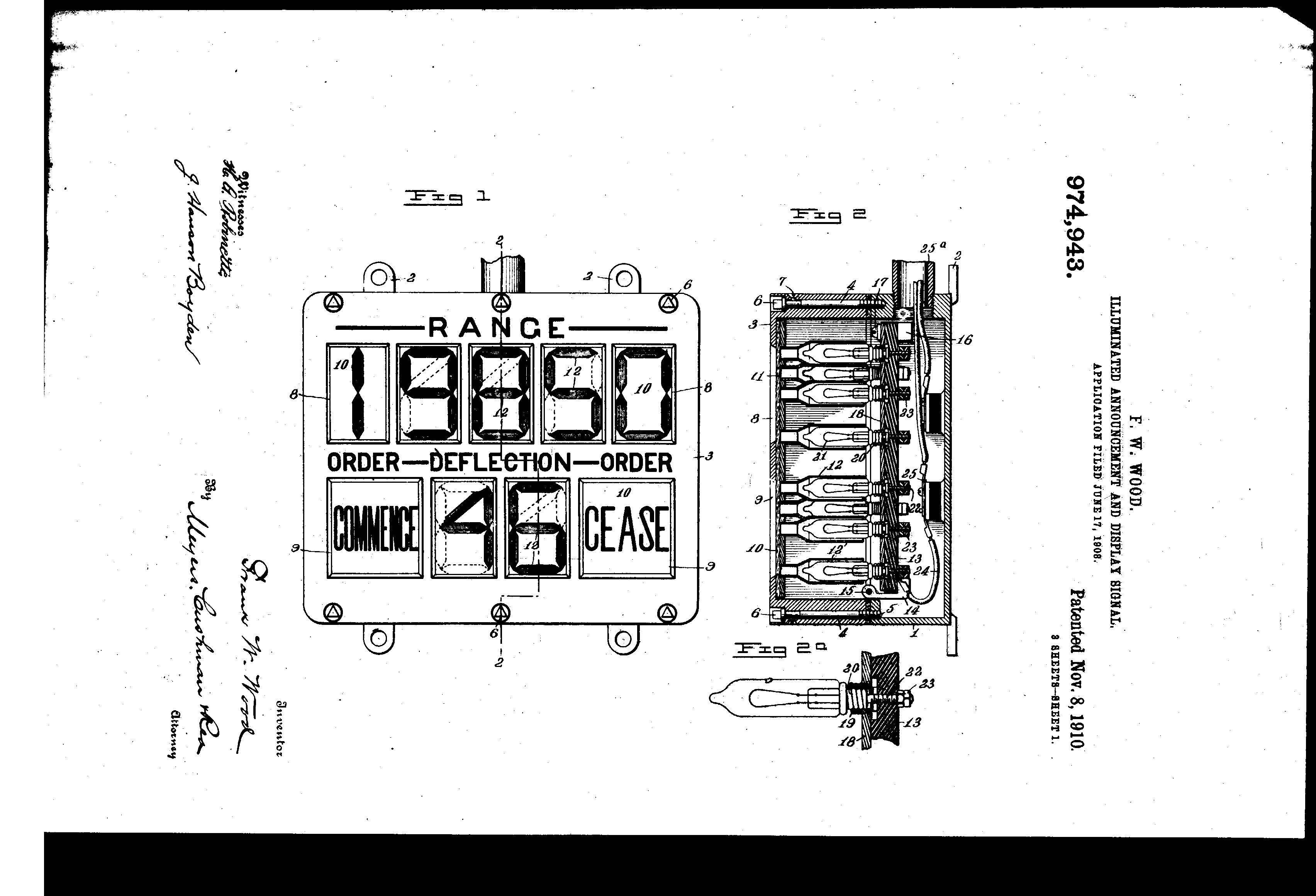
The first attempt at a seven-segment-style design, dating to 1908. (Google Patents)

The history of these bars goes back way further than you’d guess. One 1908 patent filing, utilizing cathode ray tubes, explicitly displays a clear predecessor of the modern seven-segment. But initially, the lighting and logic technologies had not caught up with the typographical cleverness of this design. (They weren’t widely used, either—Nixie tubes, at one point the gold standard for displaying numerical information, essentially had individual neon-filled cathodes for each number located in a single tube, raising complexity significantly.)

Things started to pick up by the 1960s, when contexts for displaying constantly changing numbers started to appear. Many of these early digital appliances used seven-segment displays with the help of vacuum-fluorescent displays, a common type of lighting that used a similar technology to cathode ray tubes. They were not perfect, often quite complex for their size, but they worked and were generally quite bright, making them useful in the dark.

(The similar magnetic ink character recognition technology, used in check processing, emerged around the same time. They look similar, but have opposite purposes: MICR helped make numeric data created by humans machine-readable, while seven-segment characters helped make numeric data made by machines human-readable.)

Simultaneously, light emitting diodes first gained momentum, appearing in devices like alarm clocks. (We only had red LEDs at first, so if you wanted an LED, hope you like red.) Each of these technologies had their pluses and minuses, but leveraged seven-segment numbers as the most cost-effective way of displaying numerical information.

RCA in particular became known for making these devices, releasing the Numitron, a set of filaments in vacuum tubes that created seven-segment numbers, around 1970. Friend of Tedium Alec Watson of Technology Connections recently did a video about these things, and it’s great. The reason for that? Well, he was extremely critical of these devices because of how lazy and half-baked he felt they were. Remember our recent take on Cassingles? That’s pretty much how he feels about Numitron tubes. (Much-watch video if you have not seen.)

Improving technology put the seven-segment display in additional contexts, including the Hamilton Pulsar digital wristwatch, which appeared around 1970 and appeared on The Tonight Show at the time. (The lines are so thin that YouTube compression ate them!)

“The watch will tell you the exact moment you went bankrupt,” Carson deadpanned after revealing the $1,500 cost.

The segmented LCD, on the other hand, had an easier time breaking through. The reason? There was an obvious consumer-friendly use case: the pocket calculator, a gadget innovating by leaps and bounds.

14

The number of segments needed to allow a segmented device to display traditional alphabetical characters along with numerical ones. While seven-segment displays can make some alphabetical symbols work, there are certain characters that cannot be made using this method, such as the letters M, X, Q, and V. (Essentially, anything that requires an angled line to display.) Therefore, segments in this layout require significantly more LEDs to correctly display. Want to learn more about 14-segment displays? Check this guide from Analog devices, complete with font map.

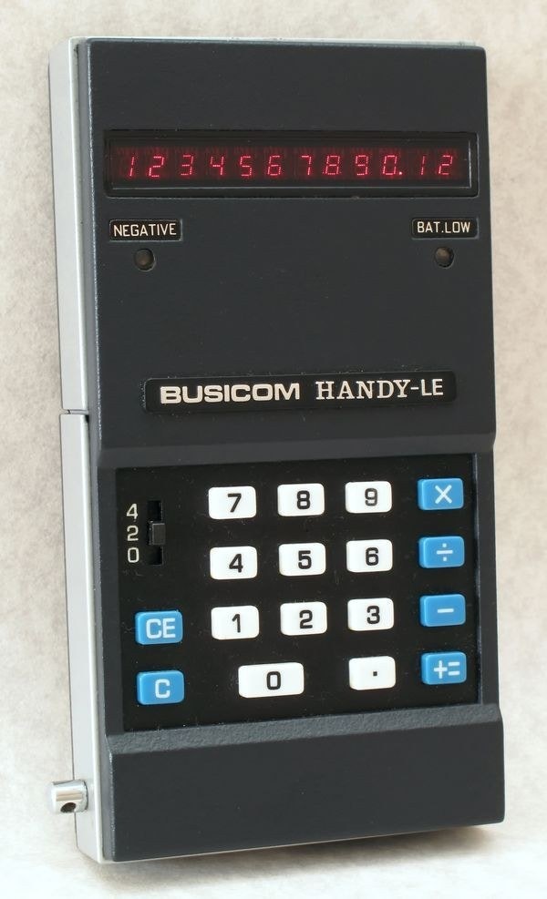
The Busicom Handy LE-120A, the first calculator to use an LED display. LCD displays appeared on pocket calculators less than two years later. (via Computer History Museum)

With LCD screens and segmented characters, calculator technology evolved fast

Here’s how fast the pocket calculator innovated. The first handheld battery-powered calculator, developed by Texas Instruments between 1965 and 1967, and introduced in 1970 as the Canon Pocketronic, used physical, wasteful paper.

The first pocket calculator to use LED lighting, the Busicom LE-120A, came out in 1971. And by 1973, Sharp had introduced the first pocket calculator to use an LCD, a mere five years after RCA introduced the technology to the world.

Why wasn’t it RCA? Well, as with many innovations from the David Sarnoff Research Center, RCA let the LCD fall out of its hands, failing to see that it would eventually replace the color television, the feather in its cap. The issue was a lack of funding and internal support—with a 2012 IEEE Spectrum piece noting how one manager seemed dead-set on minimizing the LCD’s commercial prospects.

RCA would gradually become a footnote, and its consumer electronics arm was decimated in the late 1980s under an ownership reign by General Electric. Other companies would nurse the LCD to commercial viability.

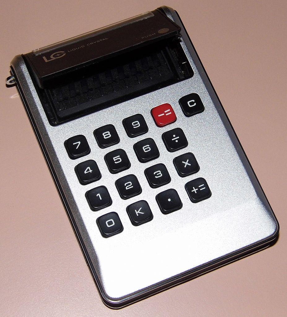
The Sharp EL-805, which helped define the direction calculators were about to go in. (Wikimedia Commons)

One of the biggest early beneficiaries of RCA failing to commercialize the LCD would be Sharp, in the form of the EL-805, a brick of a device that supported up to eight numbers. It was actually the second calculator to use an LCD—the Accumatic 100, developed by Rockwell under the Lloyd’s brand, beat them to it, but it was not pocket-sized. The EL-805 was a head-turner when it first came out, and it remains one to this day, for one simple reason: Unlike nearly all simple calculators, it used white characters on a black display—a design closer to the LED-based calculators of the period, but one eventually eschewed by calculator makers in favor of a black-on-gray aesthetic.

To be clear, LCDs had plenty of weaknesses. For one thing, unlike Nixie lights or even Numitrons, they were not visible in the dark without additional lighting. And the screens used in calculators had just two modes—off and on—for each object. But the strengths of the LCD in the case of the calculator were massive. Suddenly, a device that required frequent battery replacement now sipped power—per a 1973 Popular Electronics mention, the $109.95 calculator lasted 100 hours on a single penlight battery, meaning you could put it in your bag and not even think about it. And as economies of scale built around these calculators, they also became extremely inexpensive to make, to the point where, by the early 1980s, LED-based calculators were essentially nonentities.

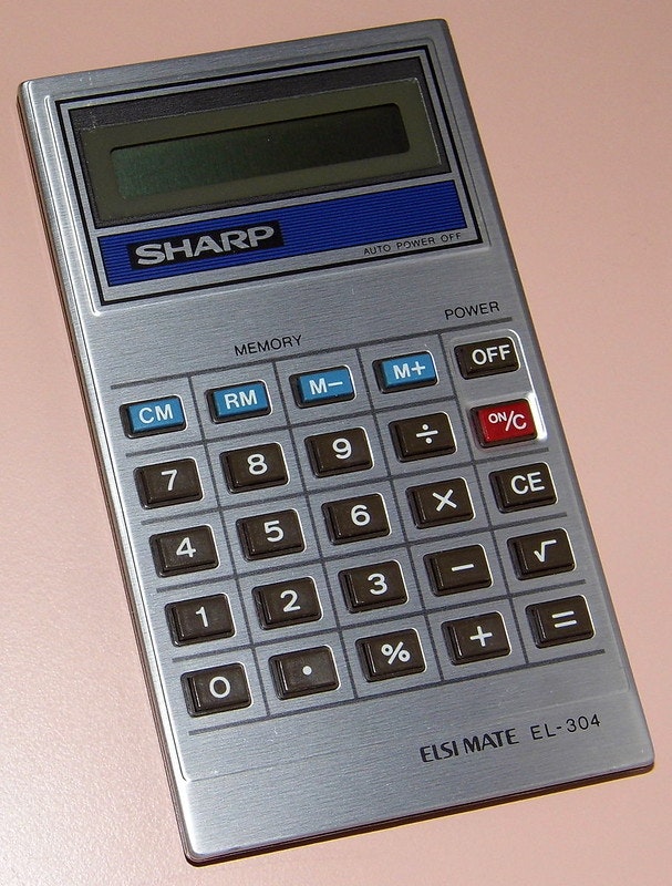
The Sharp EL-304, dating to 1980, shrank the design of the EL-805 considerably while maintaining nearly all of its function. (Joe Haupt/Flickr)

If you were a fan of innovation, there was a lot to enjoy about being a calculator fan in the 1970s, as one look at the Vintage Calculators Web Museum will tell you.

Still, there were other places to take LCD technology. It would take later technologies to get beyond the plain simplicity of this state of affairs, to put everything on a standardized dot grid that allowed the visuals to become more complex and nuanced over time. Sure, you could display anything in an LCD block. But a pixel grid would be the road to sophistication and every display innovation since.

But it took an observant toy designer to build a bridge between those two ideas.

“At that time, I don’t think Sharp had thought much about uses for LCD screens outside of calculators. Nor do I think they had considered using them for personal computer applications as we do today.”

— Gunpei Yokoi, the legendary Nintendo engineer who came up with the Game & Watch, the handheld gaming device that gave Sharp’s LCD displays a context outside of calculators, in a translated portion of his book, Gunpei Yokoi’s Game Museum. Per Yokoi, Sharp had struggled with its LCD business before Nintendo created an additional context for those screens.

Gunpei Yokoi wasn’t happy about being a pinch-hitting chauffeur, but it worked out. (via Nintendo Life)

The fateful chauffeur assignment that turned calculator displays into handheld games

If you know what’s going to appear in a given spot, you can literally put anything in that spot. It doesn’t have to be a set of lines that turns into a number.

That was the great innovation that led early LCDs to expand beyond numbers and into more interactive fare. It also took a bit of observation on the part of one Gunpei Yokoi. The Nintendo toy maker, initially known for his work in making clever gadgets like the Ultra Hand, had built a reputation as one of Nintendo’s brightest minds. Nintendo wasn’t a video game company at the time, though it was starting to dabble in the arcades. Yokoi assisted with many of the company’s mechanical arcade products, such as Wild Gunman, which came out in 1976.

Which is to say his background was not in video games. But he realized there was something important about them, and that helped set the stage for Nintendo’s future as a video game giant.

As the story goes, one day, Yokoi was on the train, and he saw some white-collar workers messing around with their pocket calculators, trying to kill time. Per a translated essay from his book Gunpei Yokoi’s Game Museum helpfully shared by Shmuplations, Yokoi realized this was an opportunity to reach a new audience with games.

It was just a passing idea until a day when he was asked to drive around Nintendo’s president, Hiroshi Yamauchi, after his chauffeur had gotten sick. Because the car was a Cadillac, he needed a driver who knew how to drive a vehicle with a left-side steering wheel. Yokoi, a car enthusiast, was one of the few people at the company who could take on the task.

During his moonlighting as a chauffeur, Yokoi—who felt compelled to talk shop with Yamauchi, given Yokoi’s high-ranking role in R&D—explained the idea he had about handheld gaming devices using calculator technology.

“I think it could be really interesting if we made a little calculator-sized game console,” Yokoi recalled telling Yamauchi. “Up to now, our philosophy with toys has been ‘the bigger they are, the better they sell’, but I think a slim, small game device like this would allow even salarymen like us to play games discreetly.”

It was a loose idea, but Yamauchi took Yokoi seriously—as he always had. Yamauchi approved the manufacturing of the Ultra Hand, then gave Yokoi a promotion after it became a hit. And Yamauchi just happened to be going to a meeting where he was seated next to the president of Sharp, where he brought up the idea he was just pitched.

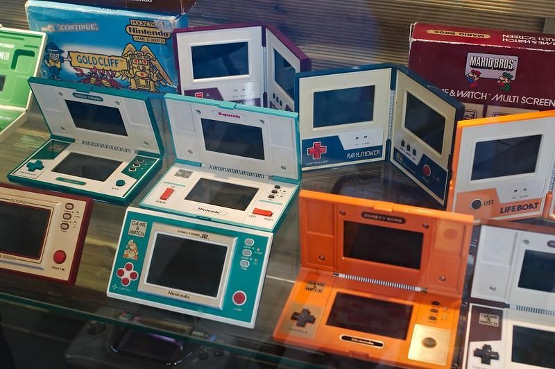
(Frédéric BISSON/Flickr)

Suddenly, a spare observation had buy-in from a major technology supplier. And that observation turned into a gradual change in Nintendo’s fortunes. Yokoi’s development of the Game & Watch leveraged extremely low-end hardware, stuff no more powerful than a calculator, to play actual games. And the LCD, once relegated to showing variations of nine numbers built from seven lines, had now been expanded to graphical illustrations. (Yokoi had an artist on his team who specialized in drawing manga work on the art.) Sure, the more detailed illustrations couldn’t do much—they were black and white, and functionally no more interactive than the digits of a calculator—but by presenting them in an alternate context, they became far more exciting.

If you look at Nintendo’s history, the moment where it stopped following trends and started creating its own ideas was when it truly started to break through. Nintendo’s early arcade games were space-themed or variations on existing games like Pong or Breakout. The Game & Watch, whose first games were fully original ideas by necessity of the platform, succeeded in large part because they represented an attempt to lean into the company’s own creativity. The creativity extended to the device, too, because it was an excellent example of what Yokoi called Kareta Gijutsu no Suihei Shikō, or “lateral thinking with withered technology.”

Tiger Electronics, which carried the torch of the Game & Watch into the ’90s with its own handhelds, largely followed the same strategy. Tiger improved on Nintendo’s design by tying the games to popular cartoons, video games, and movies, while giving the designs more visual flair. Games like Aladdin, for example, eschewed the flat gray backgrounds of calculators (and the early Game & Watch devices) for illustrated backing designs.

Nintendo, by the time Tiger had taken hold of the calculator-style handheld market, had moved on to portable consoles with pixel-driven LCD screens that were still low-end for their time, but allowed for actual animation and interactivity. Like many of Nintendo’s designs, the Game Boy—both screen and processor—were developed by Sharp, a company that still works closely with Nintendo today, as a manufacturer of the Switch.

Turns out it was a fortunate thing that Gunpei Yokoi knew how to drive with a left-side steering wheel.

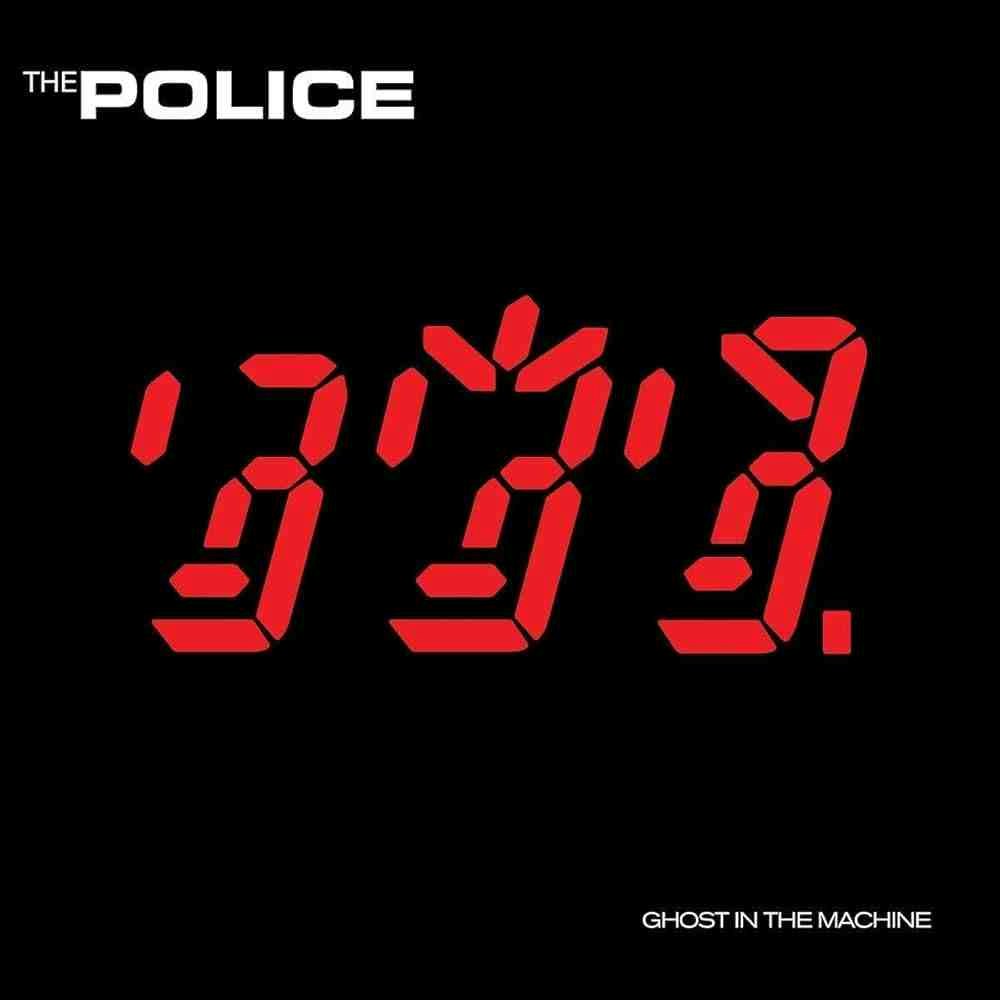
In the fall of 1981, when I was five months old, one of the biggest rock bands in the world, The Police, decided to make an album cover inspired by the seven-segment display. By that point, the display format was used in all sorts of settings, such as automobiles and alarm clocks.

I feel like whatever The Police was going for with this wasn’t really captured. Sorry, Sting.

The cover for Ghost in the Machine was clever, and the right time for such a design to appear. But in my view, the design didn’t really work.

The problem is that it was intended to look like the band, which is why the symbols spike up in the middle—it’s a very low-resolution take on the famously spiky-haired Sting. But the only way you’d know this is if you had seen a picture of the band recently. Otherwise, it looks like a bunch of random symbols, which is how I saw it until someone explained to me that I was actually looking at primitive representations of Andy Summers, Sting, and Stewart Copeland.

(They should have gone with a Game & Watch-style design—it would have been easier to follow. Someone should redo the cover in that style.)

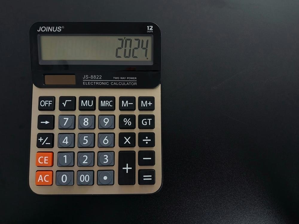
A classic of the form. Does not need to try so hard. (Doston Nabotov/Unsplash)

Its failure as a design actually points out the real benefit of the segmented display. When the character design was simple, it was one of the most efficient ways to electronically display basic, human-readable information. If it was cluttered in the way that The Police tried to display it, it would have never taken off.

But the fact that the band even tried that idea at the time they did, no matter how broken it looks and how confusing it is to modern eyes, shows just how pervasive the design of segmented displays had become. In both LED and LCD forms, these designs became part of the global visual landscape.

And while they aren’t so prominent today, in part because once-expensive display technology is now trivial, they were some of the earliest shapes we built a relationship with. Whether on a CD player, a camera, a calculator, a Game & Watch, or even the dashboard of a vehicle, an LED or LCD screen with these seven segments sets us on the path where electronics share information back with us.

They tell us what time it was, or how fast we were going. They handle the math for us. And they made the computer age slightly more approachable.

--

Find this one an interesting read? Share it with a pal! And if you want to support our little slice of Tedium, throw us a little nudge on Ko-Fi.

Share this post:

follow on Twitter | privacy policy | advertise with us

Copyright © 2015-2024 Tedium, all rights reserved.

Disclosure: From time to time, we may use affiliate links in our content—but only when it makes sense. Promise.

unsubscribe from this list | view email in browser | sent with Email Octopus

Older messages

Dead On A Friday 📺

Sunday, August 11, 2024

Where you don't want your favorite programs to air. Here's a version for your browser. Hunting for the end of the long tail • August 11, 2024 Today in Tedium: I have this memory of the one

Mac As Appliance 🖥️

Friday, August 9, 2024

Apple tries bending users to its will through annoyance. Here's a version for your browser. Hunting for the end of the long tail • August 09, 2024 Mac As Appliance Apple ticks off its non-casual

Writearound ✏️

Monday, August 5, 2024

Thoughts on using VS Code as a writing medium. Here's a version for your browser. Hunting for the end of the long tail • August 05, 2024 Writearound How I gradually fell out of love with the idea

Shape-Shifting Companies 💼

Sunday, August 4, 2024

Shell companies, holding companies, and the stuff left behind. Here's a version for your browser. Hunting for the end of the long tail • August 04, 2024 Today in Tedium: Every MBA knows the tale.

The Rich Data Wonk 📊

Friday, August 2, 2024

Steve Ballmer, federal budget expert. Here's a version for your browser. Hunting for the end of the long tail • August 02, 2024 The Rich Data Wonk There's something weirdly comforting about

You Might Also Like

Weekend Reading — More time to write

Sunday, November 24, 2024

More Time to Write A fully functional clock that ticks backwards, giving you more time to write. Tech Stuff Martijn Faassen (FWIW I don't know how to use any debugger other than console.log) People

🕹️ Retro Consoles Worth Collecting While You Still Can — Is Last Year's Flagship Phone Worth Your Money?

Saturday, November 23, 2024

Also: Best Outdoor Smart Plugs, and More! How-To Geek Logo November 23, 2024 Did You Know After the "flair" that servers wore—buttons and other adornments—was made the butt of a joke in the

JSK Daily for Nov 23, 2024

Saturday, November 23, 2024

JSK Daily for Nov 23, 2024 View this email in your browser A community curated daily e-mail of JavaScript news React E-Commerce App for Digital Products: Part 4 (Creating the Home Page) This component

Not Ready For The Camera 📸

Saturday, November 23, 2024

What (and who) video-based social media leaves out. Here's a version for your browser. Hunting for the end of the long tail • November 23, 2024 Not Ready For The Camera Why hasn't video

Daily Coding Problem: Problem #1617 [Easy]

Saturday, November 23, 2024

Daily Coding Problem Good morning! Here's your coding interview problem for today. This problem was asked by Microsoft. You are given an string representing the initial conditions of some dominoes.

Ranked | The Tallest and Shortest Countries, by Average Height 📏

Saturday, November 23, 2024

These two maps compare the world's tallest countries, and the world's shortest countries, by average height. View Online | Subscribe | Download Our App TIME IS RUNNING OUT There's just 3

⚙️ Your own Personal AI Agent, for Everything

Saturday, November 23, 2024

November 23, 2024 | Read Online Subscribe | Advertise Good Morning. Welcome to this special edition of The Deep View, brought to you in collaboration with Convergence. Imagine if you had a digital

Educational Byte: Are Privacy Coins Like Monero and Zcash Legal?

Saturday, November 23, 2024

Top Tech Content sent at Noon! How the world collects web data Read this email in your browser How are you, @newsletterest1? 🪐 What's happening in tech today, November 23, 2024? The HackerNoon

🐍 New Python tutorials on Real Python

Saturday, November 23, 2024

Hey there, There's always something going on over at Real Python as far as Python tutorials go. Here's what you may have missed this past week: Black Friday Giveaway @ Real Python This Black

Re: Hackers may have stolen everyone's SSN!

Saturday, November 23, 2024

I wanted to make sure you saw Incogni's Black Friday deal, which is exclusively available for iPhone Life readers. Use coupon code IPHONELIFE to save 58%. Here's why we recommend Incogni for