Happy New Year, and welcome back!
May 2025 be a great year for all of you.
I hope you managed to take a well-earned break before diving into the madness again. This year promises to be a wild ride—AI will keep rewriting the rules, someone will declare SEO officially dead (again), and those steep targets aren’t going anywhere.
No matter what comes your way, we promise to be here to help you connect the dots and crush your goals.
Today, we’re kicking things off with some tips from the one and only Andy Crestodina. He shares 5 ways to instantly improve any webpage with more specificity.
Enjoy the read.
Stefan |
|
|
5 Ways to Improve Any Webpage by Adding Specificity
by Andy Crestodina, from Orbit Media |
“I can’t tell what this company does”
“Some kind of marketing website”
“Unsure”
“No idea”
These are all common responses to the 5-second test, in which we use an online tool to show a homepage to a group of users, and then ask “What does this company do?”
When we show the results of these tests to clients, everyone feels urgency to fix the problem. And the ideas always focus on making the site more descriptive. Add clarity.
The key is simple: specificity.
The more specific something is (headers, navigation, images, CTAs) the more likely it is to connect with the visitor. Bonus: it also makes the page more likely to rank in search engines.
We all want our websites to communicate quickly and clearly, helping our visitors know if they’re in the right place. Qualified visitors dig deeper. Here are 5 places you can be more specific and make a better page.
|
1. Write descriptive <h1> headers
We’ll start with the header because it’s often at the top of the visual hierarchy.
Yes, every page (in fact, every scroll depth on every page) has a visual hierarchy. One element is the most prominent, attracting the visitor’s attention first. A second element comes next in the hierarchy, so their eyes move there next, and so on down the page.
Creating and managing the visual hierarchy is the key to web design and usability.
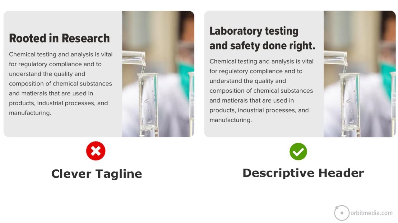
The <h1> header is often at the top of that hierarchy, so we’ll start there. If it’s generic, vague and boring, that’s bad. If it’s specific and descriptive, that’s good. You’ll pass the 5-second test.
|
💡Clear is better than clever for headers. Descriptive headers are better for visitors and search rankings!
The difference is huge. And it’s an easy opportunity to capture. Updating your homepage header more descriptive may take less than 5 minutes. If internal stakeholders push back, tell them it’s just a test (all changes are, really) and that you’ll change it back if it doesn’t perform well.
Clear is more important than clever in headers. The most visually prominent thing should also be the helpful and compelling thing. Otherwise, the visitor has to dig.
|
2. Use a relevant hero image
Also near or at the top of the visual hierarchy is the featured area image. If the header is specific, then the image doesn’t have to work as hard. The visitor may already know they’re in the right place. But it’s still an opportunity to be specific.
A relevant and specific image tells them that they’re in the right place. A stock photo typically does nothing for your user’s experience. It tastes like water. |
💡Authenticity is better than production quality. Your own legit photo beats a stock photo any day.
Take a look at that image at the top of your homepage. Ask yourself if it’s specific to your business, or generic to millions of businesses.
The hero image doesn’t need to be a picture at all. Sometimes a texture or looping background video. These are fine options that reduce the prominence of that element. The visitor gets clarity from other elements.
Other times, the hero area is the perfect place to show the product in context, show the team or indicate the process and the results.
|
3. Rewrite (or remove) generic subheads
The subhead is often the most visually prominent element at that scroll depth. The visitor is very likely to see it as they scan down the page. So it should be compelling, specific and descriptive.
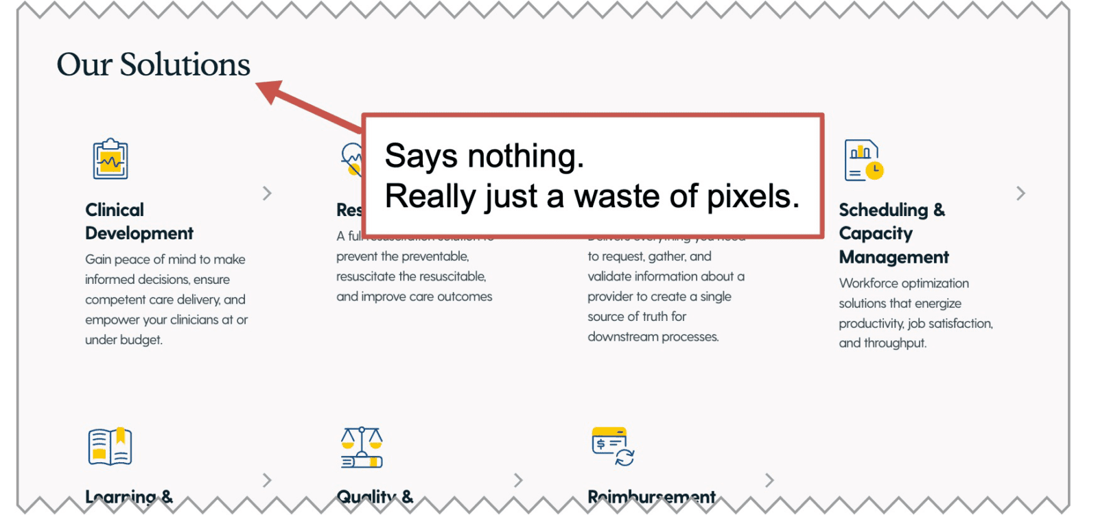
Subheads that are generic often take up space without adding any value at all. They simply push down the rest of the page. When looking at any of your subheads, ask yourself if the page wouldn’t be just as good if you removed it completely.
“What we do” doesn’t actually say what you do. It’s not helpful. “Our solutions” is just as bad. |
💡The only people who use the word "solutions" are salespeople. I've done hundreds of hours of keyword research and never seen the word "solutions" appear. Buyers don't use that word.
Subheads are an opportunity to put something relevant and helpful into view for the visitor. The best subheads are specific to your business. They communicate quickly, adding value to the experience of the visitor.
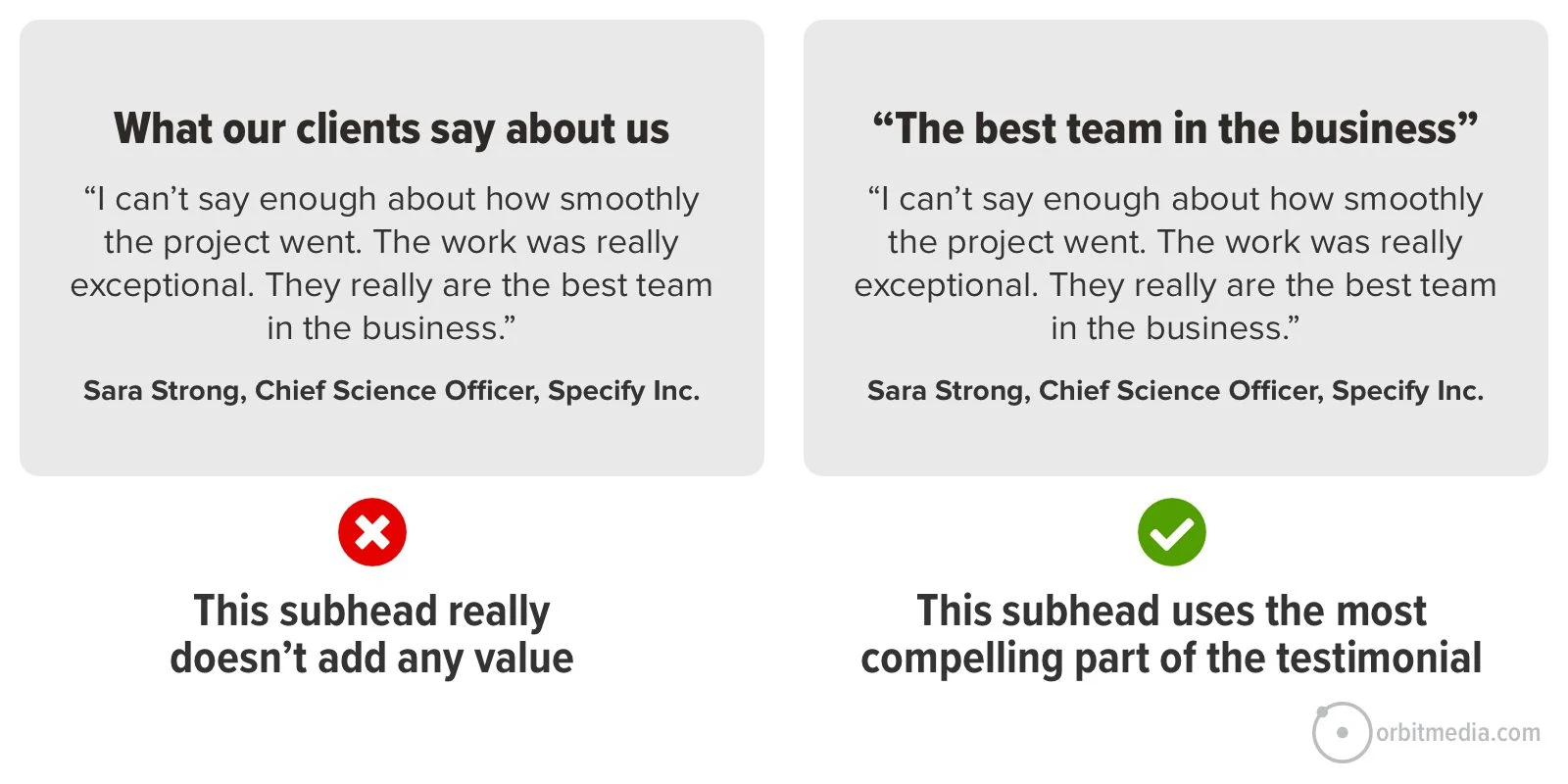
Testimonial subheads are a good example. The subhead “What clients say about us” doesn’t actually show what clients say. Far better to use the subhead to showcase a compelling part of a testimonial. |
💡Why not just make the juiciest part of the testimonial into the subhead?
In the first example above, the visitor isn’t likely to read those super compelling words in the testimonial. The most compelling thing is the least visually prominent thing. In the second example, the visitor is very likely to read that part of the testimonial, because the visual hierarchy aligns with the messaging priorities.
Make sense?
|
4. Use descriptive navigation labels
Another opportunity to be specific (or super generic and vague) is in the main menu. The navigation bar is always near the top of the visual hierarchy. Most visitors scan the main menu first, even before scrolling at all.
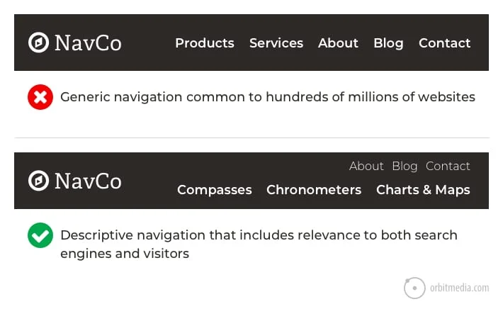
So the navigation labels are very important. Specific, descriptive nav labels are part of website navigation best practices. They tell the visitor that they’re in the right place. They also help the visitor segment themselves into deeper pages with more specific content.
|
💡Push the secondary navigation up above the primary nav, into the so-called "eyebrow"
Labels such as solutions, services, products and industries are generic, vague and unhelpful. Literally, any business could use these.
Scan through your website navigation and ask yourself: Are these labels specific to our business? Or are they common to millions of businesses?
Of course, big businesses with many offers may have a good reason to use generic labels at the top level of the navigation. It makes sense. But even huge companies can be very specific in the sub-navigation labels within their mega menus.
|
5. Write calls to action that give them a reason to click
Finally, we get down to the CTA. These days, it’s often given its own page block near the bottom of the page. That’s good. It deserves its own real estate.
But how specific is your CTA? Is it relevant to your business, or generic to all businesses?
Compare the difference between these two examples. The first is generic and common to every website on the internet. The second is specific to the visitor. It gives them a reason to click. |
💡So what if the button is big? Is that a problem for visitors?
Look closely at the verbs on your page. Verbs are part of the key to high clickthrough rate buttons. Some calls to action have common verbs like contact, read, learn and click. Great CTAs have specific verbs like schedule, chat, check, download and watch.
Remember, no one clicks anything until they’ve done a split-second cost/benefit analysis. You can increase the clickthrough rate of anything by making the perceived cost smaller or the benefit bigger.
|
So why do marketers use vague language?
Specificity correlates with engagement and conversion. Specificity also correlates with search rankings.
So if using specific, descriptive language is good for both the cheese (traffic) and the mousetrap (conversion), why is vague language so common on websites?
The main reason is fear.
Marketers are often afraid of excluding one of their audiences. They want to address many different markets. To do so, they water down their language. Ironically, they end up excluding everyone because the page doesn’t connect with anyone.
Let’s ask Doug. If you don’t know Doug, here’s my standard introduction: Doug Kessler is your favorite writer’s favorite writer. He’s that good. And he has an explanation for vague copy: |
“The urge to try to be all things to all people is so strong it’s almost the default setting for marketing teams. Excluding a potential buyer (no matter how unlikely it is that they actually do buy) just feels wrong to marketers.
And it can be hard to convince stakeholders (especially voracious sales carnivores) that laser-focusing only on ideal prospects is actually a better strategy. The all things to all people mindset leads to fuzzy, flabby, lowest common denominator copy that just doesn’t resonate with anyone.”
Doug also shares an example. Suppose you have two audiences with excellent messages for each. For example, if you work with insurance brokers and investment bankers, you can write strong value propositions for each. But try writing one that works for both. It’s doomed to be vague.
Yes, homepages are hard because they need to speak to every audience, but work hard on those interior pages. And for some brands, the issue is positioning, not copywriting. If the brand is really trying to be everything to everyone, it will connect with no one.
No amount of talented writing can save the “solutions provider” who is unwilling to niche down. |
Get an annual, all-access subscription for $1199.
You get:
✅ 120+ practical marketing courses
✅ 9 extensive minidegree programs
✅ Delivered by the top 1% of marketing practitioners
✅ New courses and updates monthly
Learn more >
|
|
|
CXL, 901 S Mo Pac Expy, Suite 150, Barton Oaks Plaza One, Austin TX 78746.
Follow us on LinkedIn.
Unsubscribe from future emails like these. |
|
|
|




_01JGXFD8ZTK0X07F4P710PGXW3.png)