Today’s a big day.
You get another episode of Sheet Improvement! This time we make a job application tracker better. Provided by the newsletter: LandOfRandom
And you can tune in late tonight for a live sheet build that I’ll be doing with Doc Williams.

But, You came for the sheets…
Let’s go on and improve a sheet!
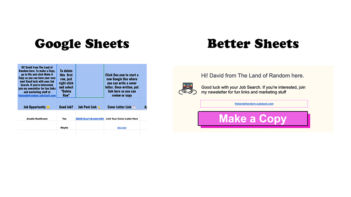
David of LandofRandom sent us a sheet in a tweet.


What I Did
 |
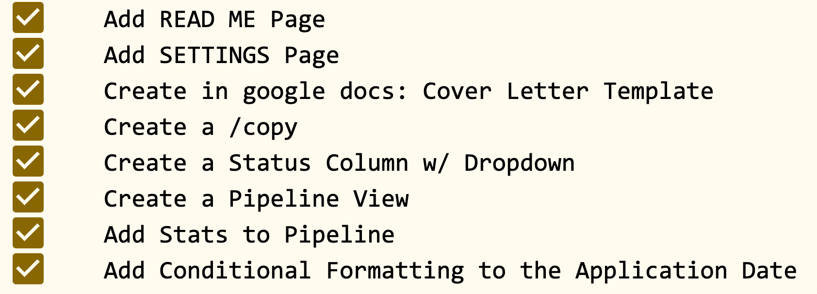
All The Improvements
 |
HIGHLIGHTS
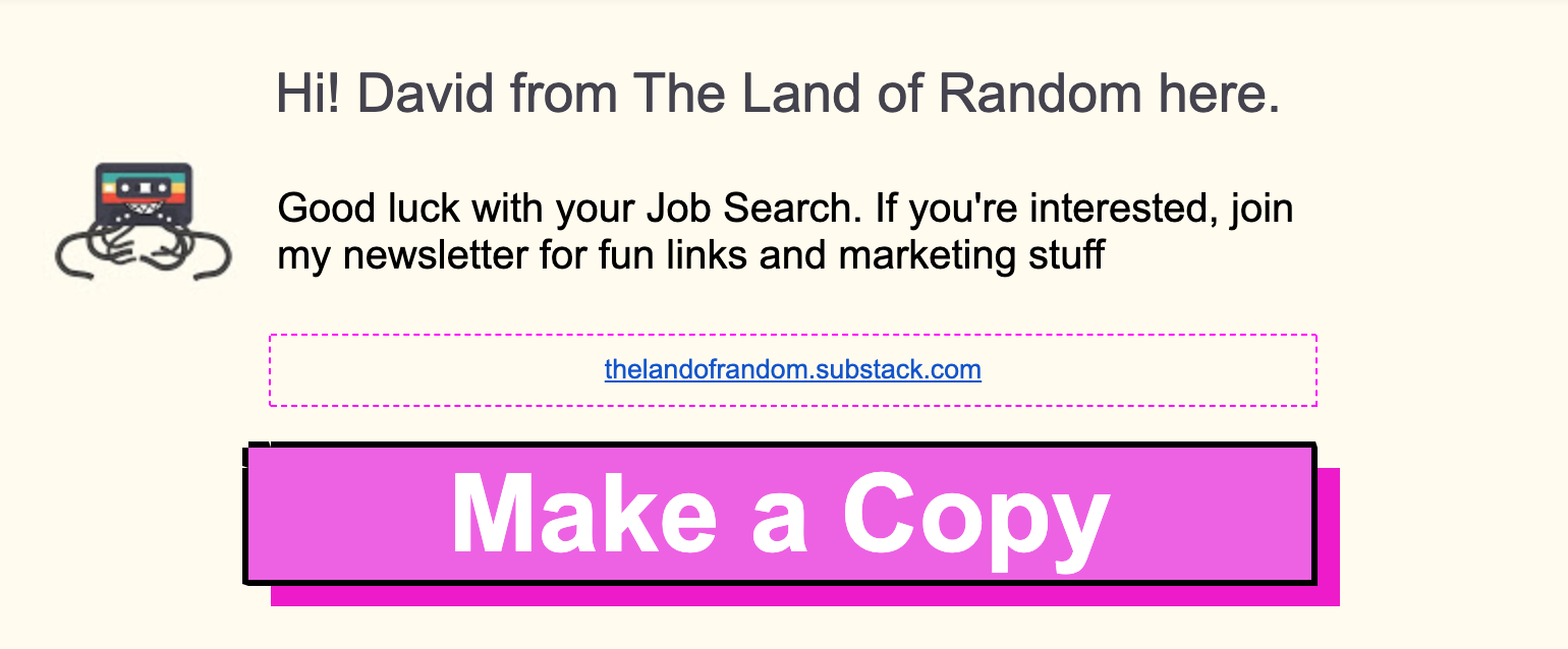
I made a Read Me page. or also a starting page. This page should be the first thing people see and how they interact with the sheet. I made a big button to show where someone should click to make a copy. Because this is a template.
Again I made the button with a dropdown. Fun, right?
Also notice the beige background. I took that color from the image of the newsletter. And so the tape image looks like it has no border, no edge. Cool, right?
Brings a different shape to the sheet when you can introduce none square or non-straight images.
Make headshots in circles also accomplishes the same effect.
 |
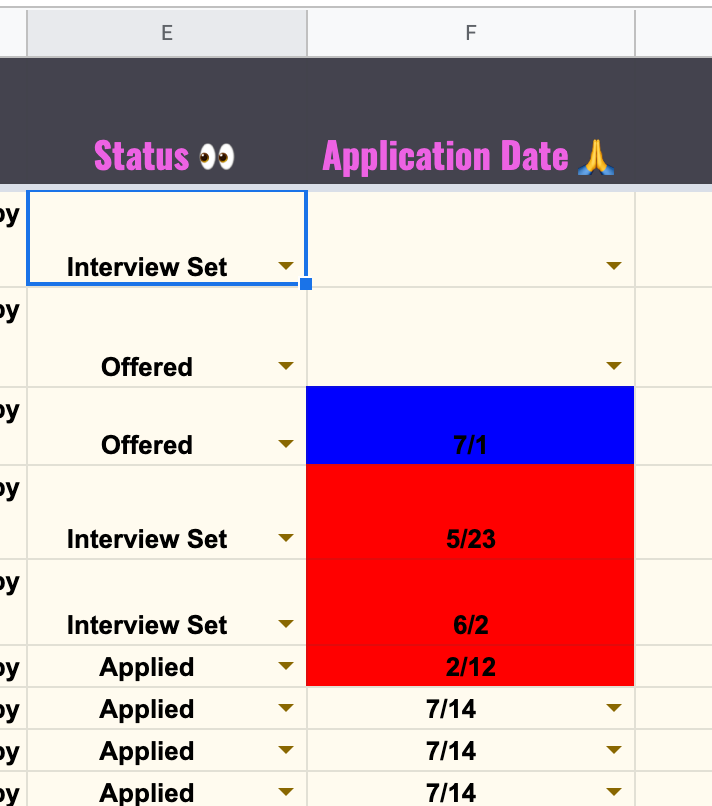
I also wanted to point out that I smashed a bunch of columns together into one status column. Saving a lot of room. Also this leads to the next thing I did, a pipeline.
 |
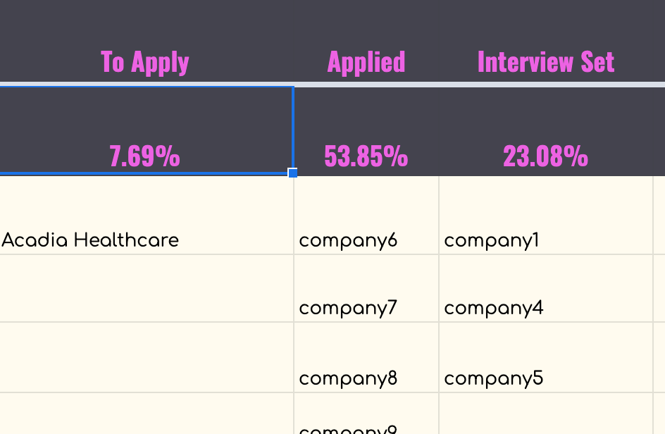
Using Transpose and a few Filters I made a pipeline view in the style of a Kanban. You can see which companies are in which status without having to sort the list. Provides your sheet and data an additional perspective.
 |
58 More Members
Yes, 50 more members joined in the past two days.
You are more than welcome to pick up a membership from Appsumo.


