
Today in Tedium: Bulletin boards, love them or hate them, quickly became relics of their time for a few reasons. One of the most visible, for obvious reasons, was the graphics. Say what you will about the gracefulness of a text interface with colorful ANSI graphics, but for many consumers, it could simply not compete with the literal photos and graphical user interfaces of the World Wide Web. Bulletin board operators, some of whom had built out sizable businesses around their onetime hobbies, were aware of this problem, though, and were trying to help build a second life for their systems that modernized them for the next generation. And that meant getting graphical. Problem was, the digital climate was moving too fast even for nice graphics. Today’s Tedium talks about efforts to give BBSes graphics and why RIPscrip, as the most popular effort was called, might have been secretly ahead of its time. — Ernie @ Tedium

Today’s GIF is an example of a RIP graphic being drawn, via YouTube. To prioritize speed, the graphic is drawn on the screen using a layering effect.

Sunday in the Heights with Dolly!

Why is Cats a musical? Didn't anyone think it was a weird idea? In each episode of the podcast Sunday in the Heights with Dolly! we take a deep dive into the stories behind Broadway's biggest shows. Learn how Evita beat bad reviews, how Annie beat socialists and then became one, and how the cast of Hair became a true close-knit tribe (spoiler: constant sex).

Today’s Tedium is sponsored by Sunday in the Heights with Dolly!

Legend of the Red Dragon

An example of ANSI art in action. If you played Legend of the Red Dragon in 1995, we can be friends. (via Archaic Binary)

Why (and how) bulletin boards started to get graphical in the 1980s and 1990s

People who missed the BBS craze of the mid-1980s through the early 1990s may remember the bulletin board system as mostly a text affair, with a touch of color thanks to the use of ANSI art, a form of illustration that relied on a series of escape codes that expanded the capabilities of many terminal text layouts.

If you remember BBS “door games” like Trade Wars or Legend of the Red Dragon, these games, and others, used ANSI art to add visual appeal to what would otherwise be a drab text-based experience.

For early users of BBS systems, you might remember that these ANSI characters would flow through your screen slowly, adding character after character as more ANSI codes came through your phone line.

For many people reliant on pokey modems whose speeds were measured in baud, this was enough to get by. But as far back as the mid-1980s, some early developers saw room for improvement.

Examples of efforts to expand the ubiquitous ANSI standard for terminal text dated as far back as the mid-1980s, when a developer named Michael Cox started working on a program called SkyTerm for the Amiga, which took advantage of the Amiga’s obvious graphics capabilities to allow for more visually impressive imagery, using a superset of ANSI called SkyPix. Above is a video of the Amiga’s famous bouncing Boing Ball, rendered in SkyPix … slowly, but completely.

Another similar innovation in graphics-based extensions included AVATAR (the Advanced Video Attribute Terminal Assembler and Recreator), which existed to compress ANSI escape codes to something that would load a bit quicker on your standard BBS.

Perhaps you didn’t use a BBS. Maybe you used Prodigy to get online in the late 1980s, and remember its graphical interfaces. This was actually based on a third type of graphical rendering technology called NAPLPS (North American Presentation Level Protocol Syntax), which was used for videotex services and television platforms such as the “lost” Genesis StoryTime cable channel. But it did get some uptake in the world of BBSes, with noted BBS impresario Dave Hughes (mentioned in this piece on Free-Nets) calling a transition to NAPLPS-based bulletin boards “the only solution to interoperability at a certain level.”

Well, perhaps not the only one.

“If you’ve ever used CompuServe’s WinCIM or America Online, you’ll feel right at home with Worldgroup. In fact, the graphical nature of Worldgroup makes even the most basic BBS look like a polished, professional online service.”

An August 1995 PC Magazine review of Galacticomm’s Worldgroup software, which effectively reinvented the widely used MajorBBS bulletin board platform as a Windows-compatible graphical offering. The review noted that the software “breaks the typical BBS-caller-as-dumb terminal stereotype” that came to define bulletin boards of the era. It looked like AOL, not a command line.

Garfield RI Pscrip Example

An example of a RIP-drawn graphic, featuring Garfield the cat, who hates dot-matrix printers but loves lasagna. (via Archive Team)

How RIP graphics became the de facto standard for nice graphics over a BBS

The above solutions were but for those of you that remember BBSes getting graphical in ways that looked slightly better than ANSI art, you most likely remember RIPscrip, which became the de facto standard for BBS-based graphics during the mid-1990s.

RIPscrip, developed by TeleGrafix, a company launched by a group of alumni from the computer manufacturer AST Research, eschewed both standardization and extending ANSI escape codes to come up with something that could be programmed by hand but could also be used to develop colorful GUI-style interfaces. As noted in a protocol specification gathered by the Internet Archive’s Jason Scott for his BBS: The Documentary, the language necessarily prized compression over source-code readability:

Earlier graphical script languages (Avatar and Skypix among others) utilize special command characters to indicate which graphics command is to be executed. This precludes their use on systems that are limited to ASCII printable text. Traditional script languages use English words to accomplish things (eg, “BOX 0,0 100,50”). This kind of thing is incredibly bulky, especially when you consider that pictures are usually not simple things, but [composed] of hundreds or thousands of individual graphical operations (eg, line, circles, fills, text, etc.). With this in mind, a human-readable script language was completely inappropriate for the relatively limited bandwidth of conventional modems.

So, one of our main strategies for this language was to make it as efficient as possible without going completely binary. This allows the immediate installation of the protocol onto any ASCII text-based host system—because the language consists entirely of ASCII-printable characters. We justify the unreadability of the language by pointing out the limitations of today’s modems and phone lines—the language must be compact.

RIPscrip, which probably saw its most prominent use in the early 1990s, was intended as an alternative to proprietary graphical solutions to online access such as CompuServe, America Online, and the aforementioned Prodigy, noted Jim Bergman, the vice president of TeleGrafix.

“We started the design of RIPscrip because we saw the many companies were doing on-line graphics, but they were requiring that you used their host and their terminal; in other words, a dedicated proprietary solution,” Bergman told The Computer Paper in 1993. “Also, as sysops, we’d often wished for some sort of graphical user interface for our boards. We’d come across many solutions, but they all fell short in one way or another. In short, we became frustrated.”

RIPscrip, like prior graphical scripting languages such as NAPLPS, serves a role very similar to what the SVG vector graphics format does today, but its major difference is that it could be used to build graphical user interfaces. (TeleGrafix was quick to note, though, that RIPscrip wasn’t, on its own, a GUI: “RIPscrip’s fundamental design and philosophy is geared toward allowing you, the service provider, the ability to display information in any manner that you want. This is simply not possible in most traditional GUI environments.”)
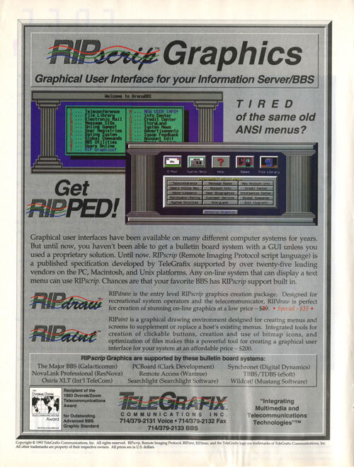
RI Pscrip Graphics Ad 1994

An early ad for RIPscrip that ran in an issue of Boardwatch Magazine in 1994. (Internet Archive)

This was an incredibly novel concept for its time—TeleGrafix, without labeling it as such, was selling BBSes AOL in a box, complete with the flexibility that AOL had at the time. That said, its definition of “open” differed in some important ways from what NAPLPS, for example, represented. While NAPLPS was a documented standard that had been used previously for television, RIPscrip was largely developed by a single company that sold the software both to BBS operators and the public. While RIP graphics could be developed without TeleGrafix’s help, they still ran the show.

Nonetheless, it didn’t scare off BBS operators, who saw the better graphics as an optional value-add for users. In a 1993 PC Magazine column, John C. Dvorak called RIPscrip’s ability to replicate GUI interfaces “phenomenal.”

“If you’ve been using a bulletin board over the past year, you’re already familiar with RIPscrip—the most quickly adopted standard I’ve ever seen in this industry,” he wrote.

Part of what might have impressed him: RIPscrip works with a mouse, a huge advantage compared to many BBS platforms of the time, which were straight keyboard affairs. But there were knocks against it: For example, RIP had a somewhat outdated look by the time it came to market around 1993 or so. Initially, it mostly adhered to the 16-color EGA specification; at the time, most PCs could support VGA or even Super VGA, which could display more colors at a time.

Eventually, RIPscrip would gain more capabilities. But, like so many other tools of the era, its best features simply did not translate very well to the modern internet.

1995

The year that the University of Florida helped its local newspaper, The Gainesville Sun, launch a local BBS that used RIPscrip. The service, which also simultaneously launched with a primitive web presence, allowed callers to use the platform for 30 minutes per day for free, or to pay $5.95 per month for up to three hours of access per day. In an alternate reality, this may have been what online access became—a series of locally owned networks that distributed news and information to the public.

Syncro Net BBS

An example of a RIP graphic used by the BBS Synchronet in the early 1990s. (via the Synchronet wiki)

The makers of RIPscrip tried, but ultimately failed, to keep up with the internet

As I was researching this story, I came across a line about TeleGrafix, the makers of RIPscrip, that really says it all.

Buried in a brief in a 1997 issue of InfoWorld, the line says this: “Will Telnet become as big as the World Wide Web? TeleGrafix Communications thinks so.”

That line, in retrospect, sounds like the starting point of a hilariously bad business decision in action. The web was a given at this point in history … right?

Perhaps, but evidence seems to show that to some degree, TeleGrafix saw the web browser as something of a competitor, or at the very least, something whose dominance on the internet wasn’t a given.

In a 1994 NetworkWorld piece, for example, TeleGrafix President and CEO Patrick Clawson is quoted as showing anger over the University of Illinois selling licensing rights to NCSA Mosaic to the tech company Spyglass, implying that the federal government—which funded the National Center for Supercomputing Applications where the groundbreaking browser was developed—was playing favorites.

“The government has no business being involved in subsidizing highly profitable commercial ventures,” Clawson said.

Whatever the case, by 1997, the company was selling the world on its RIPtel Visual Telnet software, which brought its RIPscrip graphics technology to another part of the internet experience.

“There’s more to the Internet than the Web. RIPtel Visual Telnet lights up the rest of the Net with graphics and multimedia for the first time. It gives the average computer user an easy-to-use and entertaining tool that harnesses the raw power of Telnet and gives it graphical gusto,” Clawson said in a 1996 news release. “RIPtel’s importance to the Internet parallels that of the original Mosaic Web browser, by making it simple and visual for the first time to use the Internet’s most powerful resources.”

RI Ptel Visual Telnet example

ACiD Underworld 2.0 is an example of a modern BBS that supports RIPtel.

Other parts of the release lamented that “little attention has been devoted” by Microsoft and Netscape to telnet-based experiences.

But the truth was, as noted by a Washington Post article from the era, that the company was simply looking for a way to hold on, having seen its business model die out overnight, and the business challenges that problem created.

“We’ve had, to date, over 100 companies slam the door in our face,” Clawson told the paper of his challenges to get investor support.

Part of the problem? Most internet users circa 1997 were newbies, not tech-savvy users trying to get on a BBS, even via telnet. In some ways, the heart of the approach was in the right place—a lot of bulletin-board enthusiasts were still out there and if BBS-style interfaces had continued as a mainstream tech phenomenon, RIP-style interfaces probably would have won over users.

However, the true opportunity area for RIPscrip graphics was on the web itself, where their small size which offered a potential solution to the internet’s speed problems at the time. Beyond the telnet application, the company also pitched displaying RIP graphics using a browser extension around 1995, something Sun’s Java was having much success with at the time and Macromedia’s Shockwave and Flash would come to dominate. While we didn’t end up using RIPscrip, lots of tools built in the same spirit took over instead.

The problem? Those technologies were supported by large Silicon Valley companies. TeleGrafix was a company of maybe half a dozen people being funded by Clawson’s credit cards, and despite the clear innovation of their idea, the market chose more familiar options.

You kinda wish this was a story where the little guy won big, but the world didn’t work out that way.

The bulletin board, in the present day, seems to get overshadowed by the modern web, and in RIPscrip is just one key example of that dynamic playing out.

These tools, often developed by engineers supporting budding communities of enthusiasts, often were exotic for many BBS users of the time because they were inconsistently placed. Logging into a new BBS was a journey, usually to find a machine with a version of LORD you hadn’t played just yet.

(As a kid, I once connected to a BBS in Toronto basically because I wanted to try a RIP bulletin board, and there were none near me. That phone bill was fun to explain.)

Most of the tools around bulletin boards did not make it through the pipeline into the modern day. The most notable and famous exception, of course, was the PKZIP format, which is a part of basically every computer you own.

Door Games Menu

An example of a menu for BBS door games, as rendered in RIPscrip. If you’d like to view or even create RIP graphics today in their original form, the best option is the file editor PabloDraw.

The RIPscrip format, which made bulletin boards around the world look just a little nicer, seemed like it had a shot, at least for a little while. But despite the fact that formats that ultimately did many of the same things, such as Flash and the SVG format, it didn’t have the market clout of many of its contemporaries.

And I wonder how much of that reflects on the technology’s roots as an enthusiast tool. The internet, all said and done, seemed to favor those with money and means in many ways. Competing with a far smaller staff and a limited number of resources, it feels like a given—a sad one—that many of the startups that built around the BBS scene in the ’80s and ’90s, despite their clear innovation in working around limitations, have largely been forgotten by mainstream computer users.

Companies like TeleGrafix and Galacticomm were the biggest fish in their respective ponds. The problem was, the internet highlighted how small that pond really was.

At least the graphics were pretty cool.

--

Find this one an interesting read? Share it with a pal! And thanks again to Sunday in the Heights with Dolly! for sponsoring.