Speckyboy RSS: Do All of the Projects in Your Portfolio Look the Same? That’s OK.

Your latest Speckyboy content is here!.

Speckyboy Design Magazine

Design News, Resources & Inspiration

Do All of the Projects in Your Portfolio Look the Same? That’s OK.


By Eric Karkovack on Jul 27, 2020 10:52 am


All creative professionals can benefit from having an online portfolio. They’re great for attracting new clients and can even provide a trip down memory lane – letting you reminisce about what you’ve learned over time.

Still, it’s possible to obsess over a portfolio a little too much. For example, adding certain features to a project just so you can list it could be a sign of mixed priorities. Are you designing to serve your current client or to impress the next one?

Maybe that’s not as big of a sin as we might think. There is also a legitimacy in wanting to show off your full range of skills. Many of us might cringe at the thought of being pegged as a proverbial one-trick-pony, only capable of recycling the same tired design.

But if all of the projects in our portfolio look similar, does that really mean we’re incapable of more? Of course not. There’s more to this than meets the eye. Let’s dig a little deeper.

Good Design Doesn’t Need to Be Groundbreaking

The point of a project – whether it be a website, mobile app or print piece – is for people to consume it. In the vast majority of cases, this does not require a designer to do something no one has ever done before.

Really, it boils down to: looking good, being easy to use and understand. If something we create does those three things, maybe it’s safe to call it “good design”.

Yet, we don’t always see things that way. We may see something that looks cutting-edge and feel like we’re just not in the same league as another designer. That’s why looking through collections like Awwwards can be both inspiring and a bit depressing.

Thus, even if you can’t call any of your work “groundbreaking”, that doesn’t speak to its overall quality.

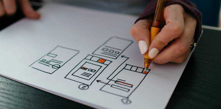
woman sketching web wireframe

How Project Variety Affects Your Portfolio

It stands to reason that the specific client and project type means a lot when it comes to design. They’ll go a long way towards determining the appropriate look and features.

After all, the point is in making your client look their best. That often means staying within the expected parameters of what a website in a particular industry must achieve.

If you’re building a site for a law firm, for example, it’s got to look clean and professional. There won’t be a lot of room for far-out special effects or typography. On the contrary, a site for a photographer or visual artist naturally lend themselves to experimentation.

Sometimes, the biggest impediment to showing off your creativity is having the opportunity to do so. The bigger the variety of project types you take on, the more varied your portfolio will be.

That being said, a designer who stays within a certain niche and budget range will likely have a lot of projects with a similar look. It’s not any sort of judgement on one’s abilities. Rather, it’s just the result of designing for the realities of a given project.

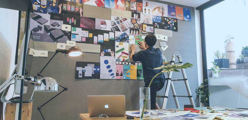
man designer office creativity

Making a Difference Where Possible

Perhaps your typical clientele doesn’t provide you with a lot of opportunity to take chances with design. So be it. This doesn’t mean that you have to keep things completely unimaginative.

There are still plenty of ways to add your own signature style to the mix. Areas such as layouts and microinteractions can have a big impact, even if they aren’t groundbreaking.

The goal should be to make the most of what a project affords us. Even if we don’t necessarily have the mandate and time to create something Awwwards-worthy, there is still room for creativity. And that will shine through in your portfolio.

When a potential client takes the time to click through your work, they’ll see the difference. The attention to detail will be apparent (if not, point it out!) – and it may be what sets you apart from the competition.

Beyond that, it is often said that your portfolio needs to reflect the types of projects you want to attract. If you really want to change your narrative, then going all out on side projects or even the design of your portfolio itself can help you show more depth.

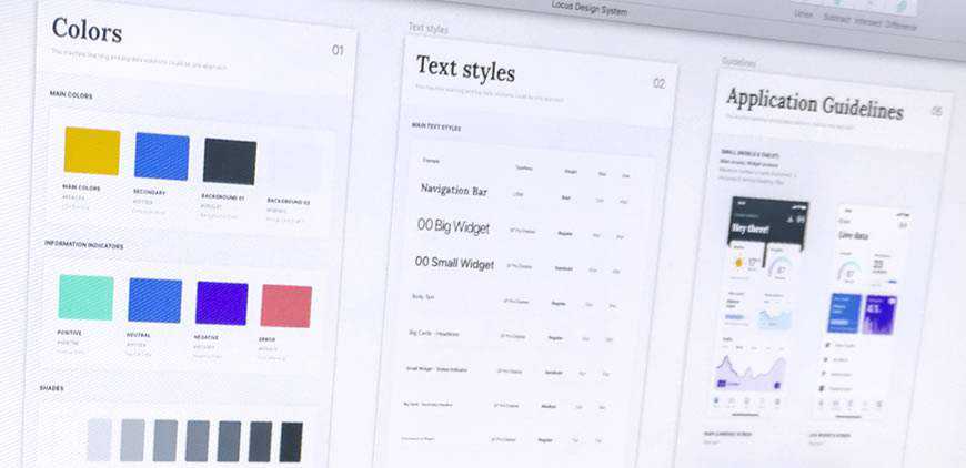
web design styleguide colors typography portfolio

Rethinking the Purpose of a Portfolio

When you think about it, a portfolio can mean different things to different people. It all depends on what you do and who your target audience is.

In that way, a freelance web designer’s portfolio may well serve a different purpose than that of a 3D animator. For the freelancer, it could be about showing consistent quality over a number of projects. If they all happen to sport a similar look and feel, that’s not such a bad thing. Having that “wow” factor may indeed be more important for the animator in our scenario.

So, if you look at your past projects and see a certain sameness to them, try not to take it as a negative. Instead, consider how each of those projects turned out – were they successful? If so, that might be good enough reason to shift your perception.

The post Do All of the Projects in Your Portfolio Look the Same? That’s OK. appeared first on Speckyboy Design Magazine.


Read in browser »

Recent Articles:

Weekly News for Designers № 550
What Web Designers and Their Clients Need to Know About SEO
Stop Worrying About People Stealing Your Ideas
8 Caffeine-Powered CSS and JavaScript Snippets
The Case for Building Resiliency into Every Website
Share
Tweet
+1
Share
Forward
Copyright © 2020 Speckyboy Design Magazine, All rights reserved.
You signed up for daily Speckyboy Design Magazine email alerts either via Feedburner or directly through our site.

Our mailing address is:
Speckyboy Design Magazine
27 Braeside Park
Inverness, Scotland IV2 7HL
United Kingdom

Add us to your address book


Want to change how you receive these emails?
You can update your preferences or unsubscribe from this list.

Older messages

Speckyboy RSS: What Web Designers and Their Clients Need to Know About SEO

Thursday, July 23, 2020

Your latest Speckyboy content is here!. Speckyboy Design Magazine Design News, Resources & Inspiration What Web Designers and Their Clients Need to Know About SEO By Eric Karkovack on Jul 23, 2020

Speckyboy RSS: Weekly News for Designers № 549

Saturday, July 18, 2020

Your latest Speckyboy content is here!. Speckyboy Design Magazine Design News, Resources & Inspiration Weekly News for Designers № 549 By Speckyboy on Jul 17, 2020 06:03 pm Envato Elements 15 Free

Speckyboy RSS: WordPress Theme Showdown: Custom Built vs. Readymade

Wednesday, July 15, 2020

Your latest Speckyboy content is here!. Speckyboy Design Magazine Design News, Resources & Inspiration WordPress Theme Showdown: Custom Built vs. Readymade By Eric Karkovack on Jul 13, 2020 04:40

Speckyboy RSS: The Web Design Hack Hall of Fame

Monday, July 13, 2020

Your latest Speckyboy content is here!. Speckyboy Design Magazine Design News, Resources & Inspiration The Web Design Hack Hall of Fame By Eric Karkovack on Jul 12, 2020 05:59 pm We web designers

Speckyboy RSS: Get Real-Time Global Market Data with the marketstack Stock API Sponsored

Wednesday, July 8, 2020

Your latest Speckyboy content is here!. Speckyboy Design Magazine Design News, Resources & Inspiration Get Real-Time Global Market Data with the marketstack Stock API Sponsored By Eric Karkovack on

You Might Also Like

What astrology has to do with PR?

Wednesday, November 13, 2024

and, no we won't tell you to read your chart! ͏ ͏ ͏ ͏ ͏ ͏ ͏ ͏ ͏ ͏ ͏ ͏ ͏ ͏ ͏ ͏ ͏ ͏ ͏ ͏ ͏ ͏ ͏ ͏ ͏ ͏ ͏ ͏ ͏ ͏ ͏ ͏ ͏ ͏ ͏ ͏ ͏ ͏ ͏ ͏ ͏ ͏ ͏ ͏ ͏ ͏ ͏ ͏ ͏ ͏ ͏ ͏ ͏ ͏ ͏ ͏ ͏ ͏ ͏ ͏ ͏ ͏ ͏ ͏ ͏ ͏ ͏ ͏ ͏ ͏ ͏ ͏ ͏ ͏ ͏ ͏

#482: New Front-End Techniques

Tuesday, November 12, 2024

With high-definition colors, virtual keyboard on mobile, CSS and reliable dialog in HTML. Issue #482 • Nov 12, 2024 • View in the browser Smashing Newsletter Hej Smashing Friends, I remember the good

Mayer Rus on a Malibu Scouting Mission Gone Right

Tuesday, November 12, 2024

View in your browser | Update your preferences ADPro California Dreamin' I should bring my passport, I always think whenever work demands that I leave my cozy nest in Silver Lake to scout a house

Accessibility Weekly #422: Designing Against the Deaf Tax

Monday, November 11, 2024

November 11, 2024 • Issue #422 View this issue online or browse the full issue archive. Featured: Designing against the deaf tax "'Your baby has failed' isn't a phrase any parent wants

Slow Productivity

Sunday, November 10, 2024

Issue 220: Reflections on the new Cal Newport book ͏ ͏ ͏ ͏ ͏ ͏ ͏ ͏ ͏ ͏ ͏ ͏ ͏ ͏ ͏ ͏ ͏ ͏ ͏ ͏ ͏ ͏ ͏ ͏ ͏ ͏ ͏ ͏ ͏ ͏ ͏ ͏ ͏ ͏ ͏ ͏ ͏ ͏ ͏ ͏ ͏ ͏ ͏ ͏ ͏ ͏ ͏ ͏ ͏ ͏ ͏ ͏ ͏ ͏ ͏ ͏ ͏ ͏ ͏ ͏ ͏ ͏ ͏ ͏ ͏ ͏ ͏ ͏ ͏ ͏ ͏ ͏ ͏ ͏ ͏

Introducing Brand Presets for Email Templates – Available on All Plans

Saturday, November 9, 2024

Postcards email builder update: mantain your Brand Style across all templates.͏‌ ͏‌ ͏‌ ͏‌ ͏‌ ͏‌ ͏‌ ͏‌ ͏‌ ͏‌ ͏‌ ͏‌ ͏‌ ͏‌ ͏‌ ͏‌ ͏‌ ͏‌ ͏‌ ͏‌ ͏‌ ͏‌ ͏‌ ͏‌ ͏‌ ͏‌ ͏‌ ͏‌ ͏‌ ͏‌ ͏‌ ͏‌ ͏‌ ͏‌ ͏‌ ͏‌ ͏‌ ͏‌ ͏‌ ͏‌ ͏‌

Here’s Every 2025 Color of the Year (So Far)

Thursday, November 7, 2024

View in your browser | Update your preferences ADPro Mood of the Moment Color experts are to autumn what Michael Bublé is to the holidays—re-emerging annually in full force to spread seasonal cheer.

Martha Stewart, the Queen of Reinvention

Tuesday, November 5, 2024

View in your browser | Update your preferences ADPro At the book signings for her debut tome, the now-iconic Entertaining published by Clarkson Potter in 1982, Martha Stewart would autograph the inside

#481: Front-End Techniques

Tuesday, November 5, 2024

With text balancing, exclusive accordions, CSS-only validation, responsive video and audio. Issue #481 • Nov 5, 2024 • View in the browser Smashing Newsletter Hej Smashing Friends, As we keep searching

174 / Sketch notes with autumn colors

Tuesday, November 5, 2024

Product Disrupt Logo Product Disrupt Half-Monthly Oct 2024 • Part 2 View in browser Welcome to Issue 174 I'm back from a vacation in Alicante. It's a beautiful coastal city in Spain. We