Speckyboy RSS: Looking at an Online School Through a Web Designer’s Eyes

Your latest Speckyboy content is here!.

Speckyboy Design Magazine

Design News, Resources & Inspiration

Looking at an Online School Through a Web Designer’s Eyes


By Eric Karkovack on Sep 28, 2020 07:51 am


Like so many families around the globe, ours has had to make some difficult decisions during the COVID-19 pandemic. One of the most agonizing was what to do about school. Should we send our daughter back to traditional school, or should we opt for an online school?

Out of both concerns for safety and consistency, we chose the online program offered by our local school district. It would require some adjustments from all of us, but we felt it was the right path to take – at least for now.

Still, there was a lot we didn’t know in terms of how this virtual school worked. How are parents kept in the loop? How easy would it be for our daughter to use? What would the classes be like?

We’ve now had some experience with this method of learning and are slowly getting the hang of it. With that, I thought it might be interesting to look at things from a web designer’s perspective – one who is also a parent.

Below are some observations based on the particular provider our school district uses. It’s by no means a complete review of online education – just a look at the design and functionality of this one system. And any critiques are just that, as I’m not privy to why certain decisions were made or the limitations involved.

So, how does the experience stack up? It’s a bit of a mixed bag so far.

Background Information

The virtual academy we’re utilizing doesn’t have live classes. Rather, it’s a mix of videos, testing and interactive features all run through a web browser.

While classes can theoretically be taken at any time, students are encouraged to do their work during normal school hours. That is in part due to the availability of live tutoring help via a chat application.

Both students and parents can keep track of progress, grades and access courses through a portal. A messaging system is included, along with detailed student activity reports.

A child looking at a computer screen.

A Dated, Unintuitive Portal

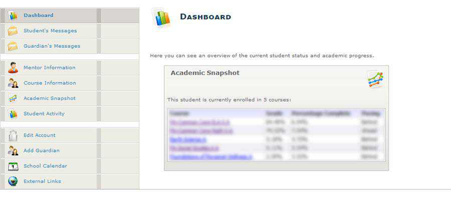
Upon entering the portal for the first time, I was reminded of the content management systems of yesteryear – as in pre-WordPress. The design is very early-to-mid-2000s, complete with a helping of 3D icons spread throughout.

Of course, compelling design isn’t really the point here. It’s a shared space for parents and students. Both groups can view activity logs, grades and exchange messages with teachers. Students also use it as a gateway to their individual courses as well.

For those tasks, the portal gets the job done. There are some usability issues, though – particularly when it comes to navigation. One can find themselves clicking around in circles due to an ambiguous series of links within the content area. It doesn’t always lead to the expected result.

This may be my biggest pet peeve with the experience. The design doesn’t have to look cutting-edge, but it should at least be intuitive. For something that looks this dated, you’d think that these sorts of bugs would have been ironed out long ago.

Online school dashboard screen.

Courses Look and Function Well

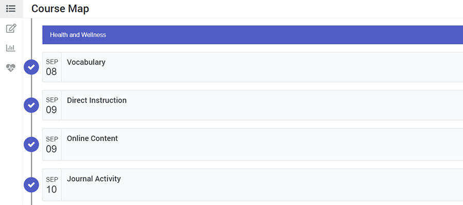
Easily the most impressive part from a design and functionality perspective, the online courses are first-rate. The look is much more modern and is infinitely more usable than the portal.

Students can view a course “map” that lists the activities they will have to complete that day (as well as those in the future). That includes quizzes and tests, as well as standard lesson material.

It’s easy to navigate. Importantly, students can also go back and review past lessons. There’s also a separate panel for notetaking and the ability to generate some highly-visual reports regarding grading and activity.

If extra help is needed during a lesson, students can click an icon to open up a chat window to speak with a tutor. It’s very similar to what you’d see in a technical support setting, providing students with their place in the queue.

Overall, the UX here is excellent. But if I had one issue, it’s…

An example course map.

Wait, They Still Use Flash?

When first considering the online school, we were provided with a technical requirements document. Among those requirements was the Adobe Flash Player – which is set to go away at the end of 2020. The document was from 2015, so I figured that things must have evolved a bit since then.

Not so fast. There are in fact some interactive games interspersed throughout the courses that still rely on Flash.

And, even though my daughter’s laptop had Flash installed, we still had to specifically enable it in Google Chrome. That’s because it’s deactivated by default as a security measure.

I admit: the games are fun and help reinforce the lessons. But the long-term viability of using Flash is concerning. They’ll need to be ported over to HTML5 or some other technology to still be usable after Flash dies off.

A child playing a video game.

The Lessons for Web Designers

One of my big takeaways from this experience is that web applications have to be revisited again and again. They should be tweaked based on user feedback in order to provide the best possible experience. We’re unlikely to get it right without their help.

Take the aforementioned portal, for example. The fact that it looks dated may be dismaying to a designer – fair enough. But that doesn’t hurt the user experience quite like the navigational shortcomings.

It’s OK, even if a bit unsavory, if a website doesn’t look like it was designed yesterday. What matters is that users can get what they need without confusion. A little bit of cleanup here would do wonders.

This is one of the big challenges of maintaining a legacy system. Various elements need to be periodically refreshed to keep up with the times. Plus, bugs and usability concerns can arise at any time. Designers and developers need to stay on top of them.

The use of Flash here is a prime example. It may have served this online school well for years, but is now likely to cause more problems than it solves. Less tech-savvy parents may not know that the software needs to be enabled or be aware of the security issues it poses. Not to mention what it all means as far as accessibility is concerned. This will make things harder for everyone – potentially impeding a student’s progress.

In addition, this also reinforces the need for simplicity. Sometimes, we can overthink an interface to the point where it’s not intuitive enough. Here, the courses offer that simplistic design while the portal does not. The difference is night and day.

No, it’s not perfect. But overall, we’ve found a lot to like about online schooling so far. Viewing it through a web designer’s eyes, I’ve also learned a thing or two myself.

The post Looking at an Online School Through a Web Designer’s Eyes appeared first on Speckyboy Design Magazine.


Read in browser »

Recent Articles:

Weekly News for Designers № 559
Does A Designer’s Opinion Mean More Than The User’s?
How to Pave Your Own Path as a Freelancer
Famous Architecture Recreated with CSS and JavaScript
Weekly News for Designers № 558
Share
Tweet
+1
Share
Forward
Copyright © 2020 Speckyboy Design Magazine, All rights reserved.
You signed up for daily Speckyboy Design Magazine email alerts either via Feedburner or directly through our site.

Our mailing address is:
Speckyboy Design Magazine
27 Braeside Park
Inverness, Scotland IV2 7HL
United Kingdom

Add us to your address book


Want to change how you receive these emails?
You can update your preferences or unsubscribe from this list.

Older messages

Speckyboy RSS: Famous Architecture Recreated with CSS and JavaScript

Monday, September 21, 2020

Your latest Speckyboy content is here!. Speckyboy Design Magazine Design News, Resources & Inspiration Famous Architecture Recreated with CSS and JavaScript By Eric Karkovack on Sep 20, 2020 04:20

Speckyboy RSS: The 50 Best Fonts for Creating Stunning Logos

Tuesday, September 15, 2020

Your latest Speckyboy content is here!. Speckyboy Design Magazine Design News, Resources & Inspiration The 50 Best Fonts for Creating Stunning Logos By Paul Andrew on Sep 14, 2020 03:43 pm Every

Speckyboy RSS: Why Some Outdated WordPress Plugins & Themes Are Facing Extinction

Monday, September 14, 2020

Your latest Speckyboy content is here!. Speckyboy Design Magazine Design News, Resources & Inspiration Why Some Outdated WordPress Plugins & Themes Are Facing Extinction By Eric Karkovack on

Speckyboy RSS: How to Create a Simple Gutenberg Block Pattern in WordPress

Tuesday, September 8, 2020

Your latest Speckyboy content is here!. Speckyboy Design Magazine Design News, Resources & Inspiration How to Create a Simple Gutenberg Block Pattern in WordPress By Eric Karkovack on Sep 07, 2020

Speckyboy RSS: Weekly News for Designers № 556

Friday, September 4, 2020

Your latest Speckyboy content is here!. Speckyboy Design Magazine Design News, Resources & Inspiration Weekly News for Designers № 556 By Speckyboy on Sep 04, 2020 07:52 am Envato Elements ztext.js

You Might Also Like

The Books AD Editors Can’t Put Down Right Now

Friday, November 15, 2024

View in your browser | Update your preferences ADPro Good Reads Here at AD PRO, we're all about celebrating a good coffee table book. With crisp project imagery and behind-the-scenes stories tucked

What astrology has to do with PR?

Wednesday, November 13, 2024

and, no we won't tell you to read your chart! ͏ ͏ ͏ ͏ ͏ ͏ ͏ ͏ ͏ ͏ ͏ ͏ ͏ ͏ ͏ ͏ ͏ ͏ ͏ ͏ ͏ ͏ ͏ ͏ ͏ ͏ ͏ ͏ ͏ ͏ ͏ ͏ ͏ ͏ ͏ ͏ ͏ ͏ ͏ ͏ ͏ ͏ ͏ ͏ ͏ ͏ ͏ ͏ ͏ ͏ ͏ ͏ ͏ ͏ ͏ ͏ ͏ ͏ ͏ ͏ ͏ ͏ ͏ ͏ ͏ ͏ ͏ ͏ ͏ ͏ ͏ ͏ ͏ ͏ ͏ ͏

#482: New Front-End Techniques

Tuesday, November 12, 2024

With high-definition colors, virtual keyboard on mobile, CSS and reliable dialog in HTML. Issue #482 • Nov 12, 2024 • View in the browser Smashing Newsletter Hej Smashing Friends, I remember the good

Mayer Rus on a Malibu Scouting Mission Gone Right

Tuesday, November 12, 2024

View in your browser | Update your preferences ADPro California Dreamin' I should bring my passport, I always think whenever work demands that I leave my cozy nest in Silver Lake to scout a house

Accessibility Weekly #422: Designing Against the Deaf Tax

Monday, November 11, 2024

November 11, 2024 • Issue #422 View this issue online or browse the full issue archive. Featured: Designing against the deaf tax "'Your baby has failed' isn't a phrase any parent wants

Slow Productivity

Sunday, November 10, 2024

Issue 220: Reflections on the new Cal Newport book ͏ ͏ ͏ ͏ ͏ ͏ ͏ ͏ ͏ ͏ ͏ ͏ ͏ ͏ ͏ ͏ ͏ ͏ ͏ ͏ ͏ ͏ ͏ ͏ ͏ ͏ ͏ ͏ ͏ ͏ ͏ ͏ ͏ ͏ ͏ ͏ ͏ ͏ ͏ ͏ ͏ ͏ ͏ ͏ ͏ ͏ ͏ ͏ ͏ ͏ ͏ ͏ ͏ ͏ ͏ ͏ ͏ ͏ ͏ ͏ ͏ ͏ ͏ ͏ ͏ ͏ ͏ ͏ ͏ ͏ ͏ ͏ ͏ ͏ ͏
Introducing Brand Presets for Email Templates – Available on All Plans

Saturday, November 9, 2024

Postcards email builder update: mantain your Brand Style across all templates.͏‌ ͏‌ ͏‌ ͏‌ ͏‌ ͏‌ ͏‌ ͏‌ ͏‌ ͏‌ ͏‌ ͏‌ ͏‌ ͏‌ ͏‌ ͏‌ ͏‌ ͏‌ ͏‌ ͏‌ ͏‌ ͏‌ ͏‌ ͏‌ ͏‌ ͏‌ ͏‌ ͏‌ ͏‌ ͏‌ ͏‌ ͏‌ ͏‌ ͏‌ ͏‌ ͏‌ ͏‌ ͏‌ ͏‌ ͏‌ ͏‌

Here’s Every 2025 Color of the Year (So Far)

Thursday, November 7, 2024

View in your browser | Update your preferences ADPro Mood of the Moment Color experts are to autumn what Michael Bublé is to the holidays—re-emerging annually in full force to spread seasonal cheer.

Martha Stewart, the Queen of Reinvention

Tuesday, November 5, 2024

View in your browser | Update your preferences ADPro At the book signings for her debut tome, the now-iconic Entertaining published by Clarkson Potter in 1982, Martha Stewart would autograph the inside

#481: Front-End Techniques

Tuesday, November 5, 2024

With text balancing, exclusive accordions, CSS-only validation, responsive video and audio. Issue #481 • Nov 5, 2024 • View in the browser Smashing Newsletter Hej Smashing Friends, As we keep searching