Tedium - You’re Being Misled 🤨

When packaging gets misleading.

Hunting for the end of the long tail • February 02, 2022

Today in Tedium: A few years ago, I wrote a tweet, which I imagine is shocking to many of you, but this tweet was quite the tweet. It was just five words, attached to an image that highlighted the risks of misleading packaging, and yet, somehow I apparently captured the zeitgeist of clickbait on the internet in 2018. It was, honestly, weird, and it pulled some crazy numbers (while making my phone totally useless for a while). But now that the dust has long settled on that tweet, I got to thinking about the central theme of it: Why do we put up with misleading packaging? And who decides that something is misleading, anyway? Today’s Tedium looks on the other side of the personal pan pizza that is product design. — Ernie @ Tedium

⬇️ Be sure to check out today’s sponsor, Revival, below. ⬇️

Ever try to buy a nice rug online? The process has traditonally been a bit of a pain, but in 2017, Revival stepped in to give floors the world over a makeover. With more than 4,000 rugs from 3 different countries—produced sustainably, with fair wages—you can tie the room together while keeping your ethical compass in check. Learn more, and check out a few cool-looking rugs, over this way.

Grocery Store

(Franki Chamaki/Unsplash)

Misleading labeling law has some teeth in the U.S., but the fact of the matter is, misleading packaging springs eternal

The administration of Lyndon B. Johnson managed to make a lot of headway on some important issues of the era, including civil rights. One of those areas involved the labeling of products.

The Fair Packaging and Labeling Act of 1966 created a set of basic standards for product makers to abide by when producing consumer goods, to ensure that they correctly listed what was in the product, where it was produced, and how it could be marketed. And these regulations were later amended to include things like ingredient lists as well.

Of course, it’s never been a perfect law. A 1969 piece in the New York Times noted (somewhat sarcastically) that there were questions over how effective the regulation could actually be in practice:

What’s to happen with the Barbie doll as of July 1, when the Fair Packaging and Labeling Act goes into effect? Will the package have to say, in compliance with the act’s rules, “One doll, net,” on quantity, and then, on size, “34-21-34”?

And on Mr. Clean, under the Act’s dual declarations provision, will the detergent container have to say “24 ounces avoirdupois” and then in parenthesis “(1 lb., 8 ounces)?”

And on refrigerators, now temporarily exempt, what will be the need for indications of “net quantity of content” after the kids get through with it? And what about the 10,000 other items sold by department stores that may now come under the extended “consumer commodities” ruling on the act by the Federal Trade Commission?

But push comes to shove, and the 1966 law and its later updates gave the FTC some teeth to deal with the mislabeling of products, which is obviously a common tension thanks.

Now, to be clear, even despite the regulation, there’s plenty of room for confusion, as the sarcastic NYT intro implies. After all, what are the odds you’ve logged into Facebook literally in the last day and saw someone attempting to sell a product that didn’t do what it promised? Or saw something similar on television? And ever open up a box for something and find that the object inside only took up a small amount of the space?

(And who’s going to sue the person who made that personal pan pizza, anyway?)

Ultimately, if misleading products hit the market, they often actually have to spend time on the market before the FTC can step in and slap them with a false packaging claim.

And ultimately, not everything will be the target of a complaint, leading to lots of gray area in packaging. For example, as Washington Post food columnist Ellie Krieger noted in 2019, there’s a tendency for packaging design to imply claims of healthiness that the product itself doesn’t back up, with some of the issues she points out including:

  • Thin, curvy containers that imply healthiness

  • Images that imply the product was made on a farm

  • Muted colors, which imply better-for-you tones (think how an organic variant of macaroni and cheese compares to the Kraft kind)

  • Brown paper packaging, used to emphasize the eco-friendliness of a product

One other example she brings up is transparency, which is generally seen as a way to highlight how nothing is getting between you and the product you’re buying.

(Mind you, Crystal Pepsi, perhaps the most infamous example of a transparent product, has 250 calories in a 20-ounce bottle, which is exactly the same amount as in the non-clear variant.)

On their own, these are not exactly egregious crimes in misleading marketing—and may not be enough to draw the scrutiny of the FTC. But they do highlight how you cannot judge a book by its cover.

“Taken together, these design techniques are not necessarily a bad thing—they will often lead you to products that are genuinely better for you and the planet,” Krieger writes. “But to be a smart consumer, don’t judge a food by its container.”

That seems like a useful rule for anything. After all, with the long tail as deep as it is, the odds of a product getting misleading increase the deeper you get.

“We overlooked the possibility that the naming could mislead people to think the whole packaging is made of paper. We apologize for failing to deliver information in a precise way.”

— A statement from the South Korean beauty company Innisfree, in reaction to the revelation that the company was selling a product that loudly stated “Hello I’m Paper Bottle” on the label, despite the “paper” element of the bottle simply covering up the bottle, which is (in fact) plastic. The bottle became something of a meme upon its discovery last year.

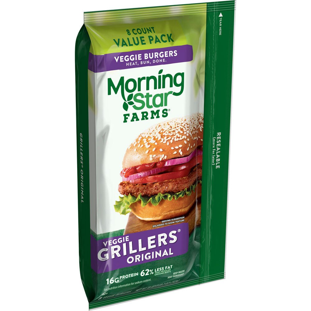
Veggie Burgers

Is it misleading to label a veggie burger a veggie burger if it’s primarily made of wheat? That was an argument in a class-action suit that was recently dismissed.

A couple of recent incidents in which companies were sued for misleading packaging … and the lawsuits failed

In a lot of ways, the definition of misleading can be in the eye of the beholder, especially if that beholder knows how to contact a lawyer.

Let me give you a fairly recent example. Last year, a woman filed a lawsuit, seeking class action status, over branding on a common product that had been sold for decades that she felt was inaccurate? The product? Morningstar Farms veggie burgers. What was her problem? Simply put, she felt that the term “veggie” implied more vegetables than the burgers actually contained. The patties were largely made of wheat and corn syrup.

Kellogg’s, the makers of these popular patties (which have a history that goes back more than a century), defended itself in court, and won a quick dismissal of the case just last week, after a judge agreed with the cereal-maker that “veggie” was a common way to refer to vegetarian products.

(Granted, the suit won’t exactly do wonders for the products’ image, though Kellogg’s has a point.)

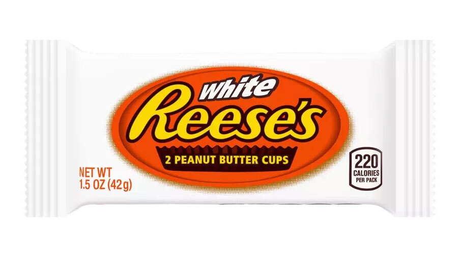
White Reeses

To be fair, it says nowhere on the packaging that it uses white chocolate.

Another somewhat recent incident revolved around the Reese’s Peanut Butter Cup, which received a white-colored variant of the popular candy a few years ago. Just one problem: Many consumers misconstrued the white-colored chocolate treat as white chocolate, when in reality, it was actually just white crème. That led to a class action lawsuit of its own just a few years ago.

Is it misleading to make a white version of a product that is usually made of chocolate, and not use white chocolate? While the suit was eventually dismissed, Reese’s and its parent company Hershey did update the packaging to make this distinction more obvious.

One might ask, really, how bothered were consumers by these things? And the answer might seem underwhelming. But at the same time, if you bit into a white peanut butter cup and weren’t impressed by the sugary quality of the product you just purchased, maybe you were in fact mad enough to call a lawyer.

10%

The amount of overprovisioning that takes place, on average, when it comes to solid state drives or flash memory. The SSD’s real storage amount has created a lot of confusion in the consumer market in part because of the way that data is measured (Windows measures drive size in the similar-but-not-the same TiB measurement, leading to end-user confusion), as well as the need for many SSDs to be overprovisioned to allow for proper data management. As How-to Geek notes, this is already a bit confusing when it comes to smaller-capacity SSDs, but it can feel a little like highway robbery when it comes to drives with 8 terabytes of capacity. The confusion about drive capacity has led to lawsuits against companies like Sandisk, but the drive manufacturers have usually won.

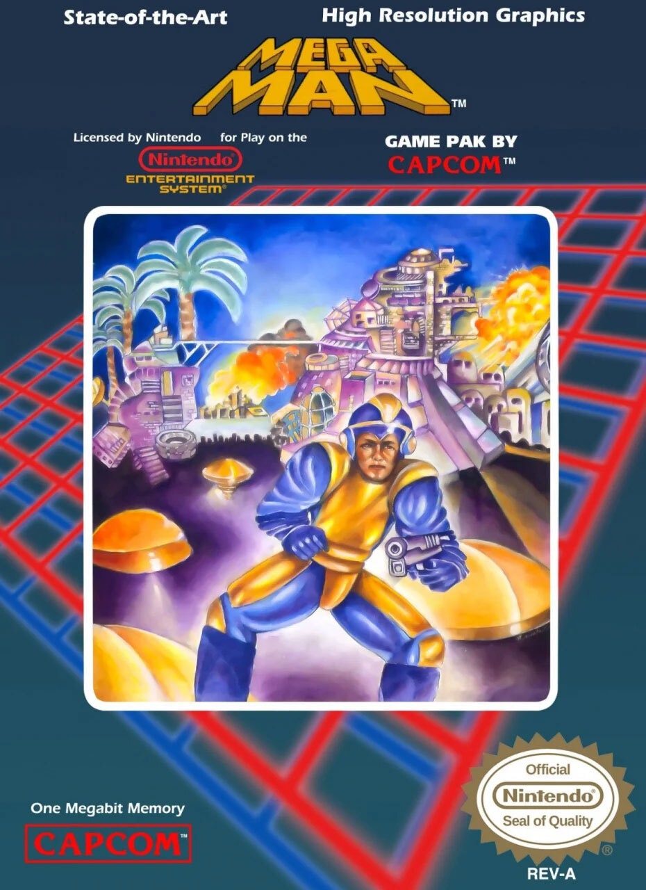
Mega Man

The original Mega Man box art had something to do with the game, but only on an extreme surface level.

The video game with the incongruent cover image that had nothing to do with the game

Video games, especially early ones, are infamous for art that doesn’t always capture the full scope of the game. You might remember, for example, that the cover for the original Mega Man game went in a grotesquely realistic direction, despite the fact that the characters in the actual game were in a much more cartoonish style.

If you picked the game up in a store based on the box, with zero experience with the series, you might be surprised at how little the art matches reality … in a good way.

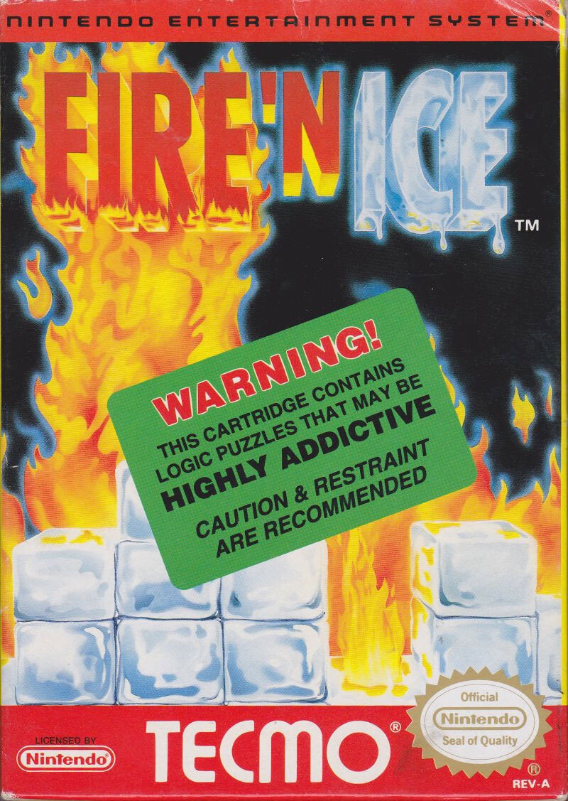
Fire N Ice

Oh, so we’re going to pretend that Solomon’s Key didn’t happen?!?! (via MobyGames)

This was a common problem with many early video games, in part because of a perception that the game’s art wasn’t always a good match for the box. Just to offer an example: Tecmo’s Fire ’N Ice, the direct sequel to the popular early NES game Solomon’s Key, was promoted using an unusual approach that seemed to play up the game’s Tetris-like qualities, despite largely being a strategy-driven puzzle platformer.

(Other games late in the life of the NES had similar problems: Taito’s Little Samson, retrospectively considered one of the best games for the console, basically died on the vine in part because of the questionable branding, which implied a Biblical affiliation that wasn’t in the game at all. But that was more a situation of confused branding, rather than misleading branding—had they gone with the Japanese name, Seirei Densetsu Lickle, it might not have gone over much better, but at least it doesn’t imply an affiliation that it doesn’t have.)

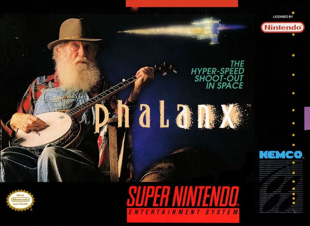
Phalanx

(via Destructoid)

But the worst example of poor video game branding might be Phalanx, a traditional shooter-style game for the Super NES. The game, released early in the console’s life, was effectively a take on a Gradius-style shooter at a time a lot of Gradius-style shooters were being released. And in an effort to help the game stand out to consumers, the advertising company tried for an edgier approach to get people’s attention: They put a random old guy with a banjo on the cover, despite the fact that there are literally zero old guys with banjos in the actual game.

But there was a method to the madness. As recalled in a 2001 Electronic Gaming Monthly article reshared by Hardcore Gaming 101, the tactic was an intentional attempt to try to win over consumers via confusion.

“The problem is that all the game art looked alike at the time—monsters or spaceships or something,” marketer Matt Guss told the magazine. “We wanted to create shock value so someone would have to pick the game up. We called it the ‘Heavy Huh?!’ factor.”

In a more recent interview with Destructoid, Guss noted that he and his collaborator, Keith Campbell, were not gamers, but they were advertisers who knew a thing about making a boring thing interesting, so as a result they went for marketing weirdness, bringing in an 80-year-old man who previously appeared in a Santa Claus ad to show up on the cover for the game, implying a storyline in which the alien fighters are somehow in the same canonical universe as this weird banjo guy. Guss again:

So Keith could have done some predictable spaceship shooting bullshit that would have been like every other game out there. Or he could create a story that would make people stop and think about it. And I guess it’s proof that was a good idea because people are still thinking about it. Phalanx was a very average game with an unexpected cover design. It needed a great/weird idea to stand out from the crowd.

In many ways, the banjo player represented an attempt to counter-advertise. In a world of same-y looking space games, putting something different on the cover could, at least briefly, fool you into thinking that you were getting something else. This puts the game into the fun lineage of something like OK Soda, where strange branding created a differentiating market factor.

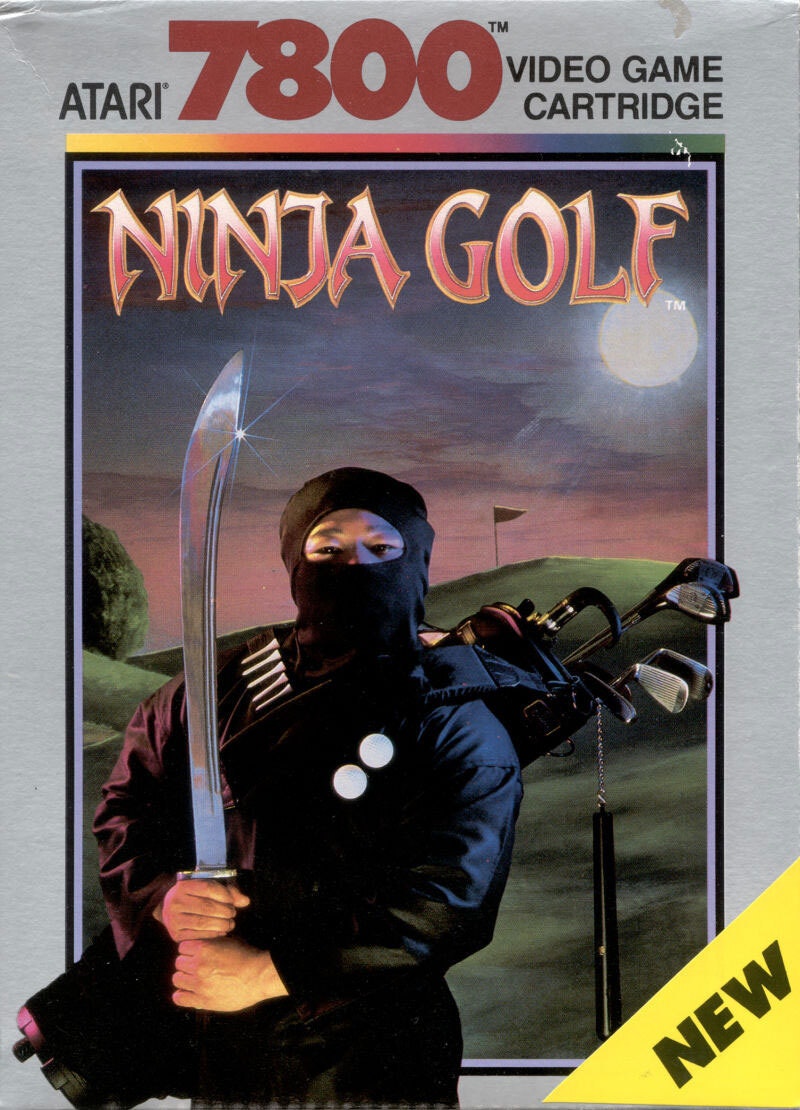
Ninja Golf

(via MobyGames)

Sometimes the game itself is just strange, and in an effort to sell it, you have to embellish it just a little bit. Such is the case of the Atari 7800 game Ninja Golf, which (as the name suggests) combines nine holes of golf with a kick-and-punch style of gameplay somewhat reminiscent of the classic Apple II game Karateka.

The box art, despite the already unusual expectations, is fairly misleading. One of the most misleading elements is the prominent use of a sword on the cover, despite the fact that the game uses a traditional golf club and the ninja doesn’t actually use a sword in the fighting scenes. The other is the fact that the background clearly implies a game that takes place at night, despite the fact that golf would generally be considered impossible to play at night, and there are no night scenes in the actual game.

Given that the concept already combines ninja fighting and golf, two very incongruent forms of gameplay, it seems unnecessary and hilarious that the makers of the box art felt they had to embellish it any further.

But I guess when you’re trying to convince someone to buy your product, sometimes you have to just bend the truth a little.

When it comes to product advertising, one of the most deceptive practices you might run into is there being too much slack. And I’m not referring to the chat client, either.

As the lawyer-run blog Misbranded, published by the law firm Patterson Belknap, notes, there being too much air inside of a box has long been a target of regulatory scrutiny, but despite that, lawsuits have often come up short in “slack-fill” cases, even in the era before the Fair Packaging and Labeling Act of 1966, when the FDA attempted to regulate around this issue to little success.

The FDA has guidance on slack fill, noting that it may be necessary, for example, to protect the contents of the package or to account for product settling during shipping. But the regulations have generally not stood up to legal scrutiny.

To be fair, they keep trying: The advertising watchdog Truth in Advertising has over the years tracked examples of suits around things like Pringles chips, Junior Mints, and liquid cosmetics. Largely, these slack suits have been full of hot air.

“The more that lawyers have inundated courts with these suits, the more aggressively courts have responded to shut the silliness down,” lawyers Jonah M. Knobler and Julie A. Simeone wrote on Misbranded.

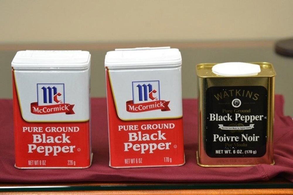
Pepper Lawsuit

Still though, there are cases where the slack led to some legal success stories; in 2020, the seasoning maker McCormick & Company settled a class-action lawsuit after it started reportedly underfilling seasoning containers—putting less pepper in the same-size container, very quietly—leading consumers in the class action to get a coupon as a result of the suit.

It could be worse; McCormick could be facing class-action accusations of selling people carcinogens. Oh wait.

--

Now to go play a game of Ninja Golf. Find this one an interesting read? Share it with a pal!

And thanks again to Revival for sponsoring.

Share this post:

follow on Twitter | privacy policy | advertise with us

Copyright © 2015-2022 Tedium, all rights reserved.

Disclosure: From time to time, we may use affiliate links in our content—but only when it makes sense. Promise.

unsubscribe from this list | view email in browser | sent with Email Octopus

Older messages

Sounding Board 🔊

Friday, January 21, 2022

Upsetting the internet by pointing out specialized file formats. Here's a version for your browser. Hunting for the end of the long tail • January 21, 2022 Today in Tedium: A couple months ago, on

Surfing Upstream 🏄‍♂️

Wednesday, January 19, 2022

Why a browser that costs money might protect your privacy. Here's a version for your browser. Hunting for the end of the long tail • January 19, 2022 Today in Tedium: It's often been suggested

Lessons in Pivoting 📚

Thursday, January 13, 2022

How an education company learned some new tricks of its own. Here's a version for your browser. Hunting for the end of the long tail • January 12, 2022 Today in Tedium: Say what you will about the

Prize Patrol Immortality 💰

Saturday, January 8, 2022

Why the Publisher's Clearing House wants to outlive you. Here's a version for your browser. Hunting for the end of the long tail • January 07, 2022 Hey all, Ernie here with an odd question:

The Leech Machine ☁️

Wednesday, January 5, 2022

Considering an unusual use for leeches. Here's a version for your browser. Hunting for the end of the long tail • January 05, 2022 Hey all, Ernie here with a piece from a new contributor, Nathan

You Might Also Like

🔒 The Vault Newsletter: November issue 🔑

Monday, November 25, 2024

Get the latest business security news, updates, and advice from 1Password. ͏ ͏ ͏ ͏ ͏ ͏ ͏ ͏ ͏ ͏ ͏ ͏ ͏ ͏ ͏ ͏ ͏ ͏ ͏ ͏ ͏ ͏ ͏ ͏ ͏ ͏ ͏ ͏ ͏ ͏ ͏ ͏ ͏ ͏ ͏ ͏ ͏ ͏ ͏ ͏ ͏ ͏ ͏ ͏ ͏ ͏ ͏ ͏ ͏ ͏ ͏ ͏ ͏ ͏ ͏ ͏ ͏ ͏ ͏ ͏ ͏ ͏ ͏

🧐 The Most Interesting Phones You Didn't See in 2024 — Making Reddit Faster on Older Devices

Monday, November 25, 2024

Also: Best Black Friday Deals So Far, and More! How-To Geek Logo November 25, 2024 Did You Know If you look closely over John Lennon's shoulder on the iconic cover of The Beatles Abbey Road album,

JSK Daily for Nov 25, 2024

Monday, November 25, 2024

JSK Daily for Nov 25, 2024 View this email in your browser A community curated daily e-mail of JavaScript news JavaScript Certification Black Friday Offer – Up to 54% Off! Certificates.dev, the trusted

Ranked | How Americans Rate Business Figures 📊

Monday, November 25, 2024

This graphic visualizes the results of a YouGov survey that asks Americans for their opinions on various business figures. View Online | Subscribe Presented by: Non-consensus strategies that go where

Spyglass Dispatch: Apple Throws Their Film to the Wolves • The AI Supercomputer Arms Race • Sony's Mobile Game • The EU Hunts Bluesky • Bluesky Hunts User Trust • 'Glicked' Pricked • One Massive iPad

Monday, November 25, 2024

Apple Throws Their Film to the Wolves • The AI Supercomputer Arms Race • Sony's Mobile Game • The EU Hunts Bluesky • Bluesky Hunts User Trust • 'Glicked' Pricked • One Massive iPad The

Daily Coding Problem: Problem #1619 [Hard]

Monday, November 25, 2024

Daily Coding Problem Good morning! Here's your coding interview problem for today. This problem was asked by Google. Given two non-empty binary trees s and t , check whether tree t has exactly the

Unpacking “Craft” in the Software Interface & The Five Pillars of Creative Flow

Monday, November 25, 2024

Systems Over Substance, Anytype's autumn updates, Ghost's progress with its ActivityPub integration, and a lot more in this week's issue of Creativerly. Creativerly Unpacking “Craft” in the

What Investors Want From AI Startups in 2025

Monday, November 25, 2024

Top Tech Content sent at Noon! How the world collects web data Read this email in your browser How are you, @newsletterest1? 🪐 What's happening in tech today, November 25, 2024? The HackerNoon

GCP Newsletter #426

Monday, November 25, 2024

Welcome to issue #426 November 25th, 2024 News LLM Official Blog Vertex AI Announcing Mistral AI's Large-Instruct-2411 on Vertex AI - Google Cloud has announced the availability of Mistral AI's

⏳ 36 Hours Left: Help Get "The Art of Data" Across the Finish Line 🏁

Monday, November 25, 2024

Visual Capitalist plans to unveal its secrets behind data storytelling, but only if the book hits its minimum funding goal. View Online | Subscribe | Download Our App We Need Your Help Only 36 Hours