Proof of Concept - Developing a sketching system
Readers have asked about the origin of my drawing style for Proof of Concept. The honest answer is it evolved over time based on what was the most effective way to communicate ideas. If you look at the early issues, the sketches were directionless. At some point, I decided to draw in the manner in which I create diagrams and low fidelity sketches to convey ideas. In Issue 59, I wrote about sketching as a strategy. For this one, I'll share a bit about the benefits of developing your sketching system and how having a visual language can increase your creativity. The goal of a sketch is to make a rough drawing—you're not painting the Mona Lisa. A sketch is a powerful communication tool to take ideas and make them tangible. Over the time working with people, I developed some shorthand techniques on how I approach drawing in hopes to convey those ideas more rapidly My sketch systemA lot of you have asked about my drawing style for this newsletter. It's very low fidelity and for the purpose of recognition and connection to a concept. One important thing to remember is people don't have to fully understand your system unless you're planning to create a presentation. It's helpful for you to generate your ideas. Annotations and references
I am a huge fan of creating quick annotations to help people comprehend my sketches. Annotations and references are great ways to make it visually clear on the intention. I use this system in my whiteboarding sessions and now applied it to my sketches. It’s dead simple. Plot numbers on your sketch and on the side write descriptions. You can create powerful documentation at the fidelity of a napkin sketch. Symbols
I use symbols as a way to remind myself of key elements; often borrowed from other systems. For example, I might borrow symbols found in the Unified Modeling Language (UML) but for quick sketches, I may not be building a literal diagram based on that language. Three circles stacked on one another helps remind me that this is regarding a database. Color coding
I use just about 50 shades of gray to create fills and depth to communicate the ideas. A lesson I've learned in art school that is engrained in my mind is to never work with a blank canvas—to fill all the white space. Though there are times and places for minimalism, having fills helps you refine and edit. I use black ink sparingly, only for line emphasis. For more detailed drawings, I may use it for cross-hatching and adding fine details. I always carry red and blue ink to add additional layers to my sketches. Effective visuals for me is when people can look at something flat and can see metadata of information in additional layers. In this case, red marks fixes and adjustments while blue are reserved for key indicators and documentation. Thickness and depth for emphasis
Storyboards and user flows are helpful artifacts but can be overwhelming to look at as they get more complex. One trick is to use different thicknesses to emphasize certain frames. In the drawing above, I use shadows to create elevation—can you see them? I use a lot of line hops to show a visual connection for frames that are far away without drawing lines that look like a game of Snake on a Nokia cell phone. Developing your own systemDoing exactly what I do might not work for you. The key is to create one that helps you recall and execute quicker. Questions to ask while devising your system:
I hope this gives you some ideas to develop your own sketch system. We'll miss you, WilsonOn Thursday, I said goodbye to my best friend of 19 years. Wilson passed pain-free and with dignity at the VCA hospital in Indio, California. The past few days have been incredibly difficult. I considered not writing anything this week. However, I think a big part of grieving and coping is to keep going. It doesn't mean hastily forgo mourning, but try to keep a routine.
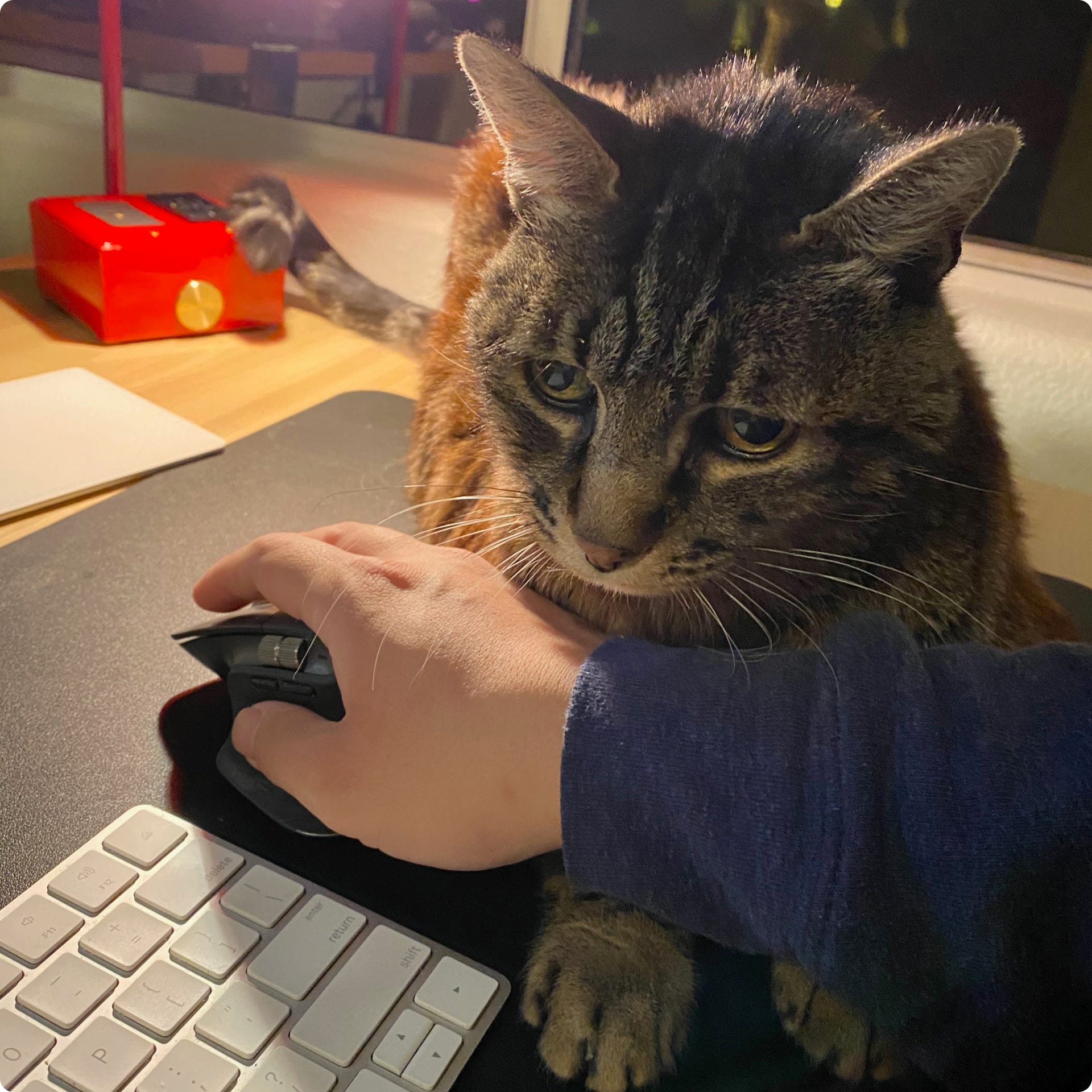
Wilson: September 8, 2003 - February 3, 2022. I made a page on my website and wrote a letter to him. I miss you so much, Wilson. If you have a pet, please give them a big hug. Tweet of the weekHave cats on my mind. Hype links
Enjoy this newsletter? Please consider sharing it with friends, or subscribing if you haven’t already. I appreciate it! Sincerely, DH © 2022 David Hoang Unsubscribe
|


Older messages
Turn method into magic—the alchemy of prototyping
Sunday, January 30, 2022
Issue 77: How to go from idea to reality
Practicing the dark arts
Sunday, January 23, 2022
Issue 76: Breaking dogma and adapting methods
The ridiculous power of list-making
Sunday, January 16, 2022
Issue 75: From Jira backlogs to the MySpace Top 8, how a simple method can help boost creativity
Combatting the Sunday Scaries
Sunday, January 2, 2022
Issue 73: Prepping for the hardest Monday of the year
Ready or not, here comes 2022
Sunday, December 26, 2021
Issue 72: A look back this year and focus moving forward
You Might Also Like
This Unusual Color Palette Is Making a Comeback
Tuesday, March 11, 2025
View in your browser | Update your preferences ADPro Having a Moment Over the last few years, Piero Portaluppi's 1930s Villa Necchi (you know it from Luca Guadagnino's I Am Love) has become the
#498: Usability & UX
Tuesday, March 11, 2025
New books for UX designers, practical guides and how to deal with placeholders and text labels. Issue #498 • Mar 11, 2025 • View in the browser Smashing Newsletter Aluu Smashing Friends, We've just
New Email Templates, Postcards & Slides Updates
Monday, March 10, 2025
Both our email builder and website builder have been updated.
🐺 How to write better newsletters
Monday, March 10, 2025
A free video walkthrough with examples. ͏ ͏ ͏ ͏ ͏ ͏ ͏ ͏ ͏ ͏ ͏ ͏ ͏ ͏ ͏ ͏ ͏ ͏ ͏ ͏ ͏ ͏ ͏ ͏ ͏ ͏ ͏ ͏ ͏ ͏ ͏ ͏ ͏ ͏ ͏ ͏ ͏ ͏ ͏ ͏ ͏
Accessibility Weekly #439: Values
Monday, March 10, 2025
March 10, 2025 • Issue #439 View this issue online or browse the full issue archive. Featured: Values "Let's talk about the disconnect within the accessibility scene/industry/community and
Business as a platform
Sunday, March 9, 2025
Issue 236: Applying business to your craft ͏ ͏ ͏ ͏ ͏ ͏ ͏ ͏ ͏ ͏ ͏ ͏ ͏ ͏ ͏ ͏ ͏ ͏ ͏ ͏ ͏ ͏ ͏ ͏ ͏ ͏ ͏ ͏ ͏ ͏ ͏ ͏ ͏ ͏ ͏ ͏ ͏ ͏ ͏ ͏ ͏ ͏ ͏ ͏ ͏ ͏ ͏ ͏ ͏ ͏ ͏ ͏ ͏ ͏ ͏ ͏ ͏ ͏ ͏ ͏ ͏ ͏ ͏ ͏ ͏ ͏ ͏ ͏ ͏ ͏ ͏ ͏ ͏ ͏ ͏ ͏ ͏ ͏ ͏
A Guide to Timetravels
Sunday, March 9, 2025
Our past and present selves have never been separate entities but rather interwoven narrators. ͏ ͏ ͏ ͏ ͏ ͏ ͏ ͏ ͏ ͏ ͏ ͏ ͏ ͏ ͏ ͏ ͏ ͏ ͏ ͏ ͏ ͏ ͏ ͏ ͏ ͏ ͏ ͏ ͏ ͏ ͏ ͏ ͏ ͏ ͏ ͏ ͏ ͏ ͏ ͏ ͏ ͏ ͏ ͏ ͏ ͏ ͏ ͏ ͏ ͏ ͏ ͏ ͏
The New Kitchen Trends on Our Radar
Thursday, March 6, 2025
View in your browser | Update your preferences ADPro Kitchen Confidential We at AD PRO see the kitchen as a bellwether for the rest of the home—a place where technology stays a couple of steps ahead,
🐺 How to kick start your PR efforts.
Wednesday, March 5, 2025
Lessons from a veteran publicist. ͏ ͏ ͏ ͏ ͏ ͏ ͏ ͏ ͏ ͏ ͏ ͏ ͏ ͏ ͏ ͏ ͏ ͏ ͏ ͏ ͏ ͏ ͏ ͏ ͏ ͏ ͏ ͏ ͏ ͏ ͏ ͏ ͏ ͏ ͏ ͏ ͏ ͏ ͏ ͏ ͏ ͏
How Rita Konig Gets Clients to Take Risks
Tuesday, March 4, 2025
View in your browser | Update your preferences ADPro It has been a career-defining few years for Rita Konig. First there was the British interior designer and author's Create Academy course, which