Numlock Sunday: Heather Jones talks the graphic design of You Are What You Watch
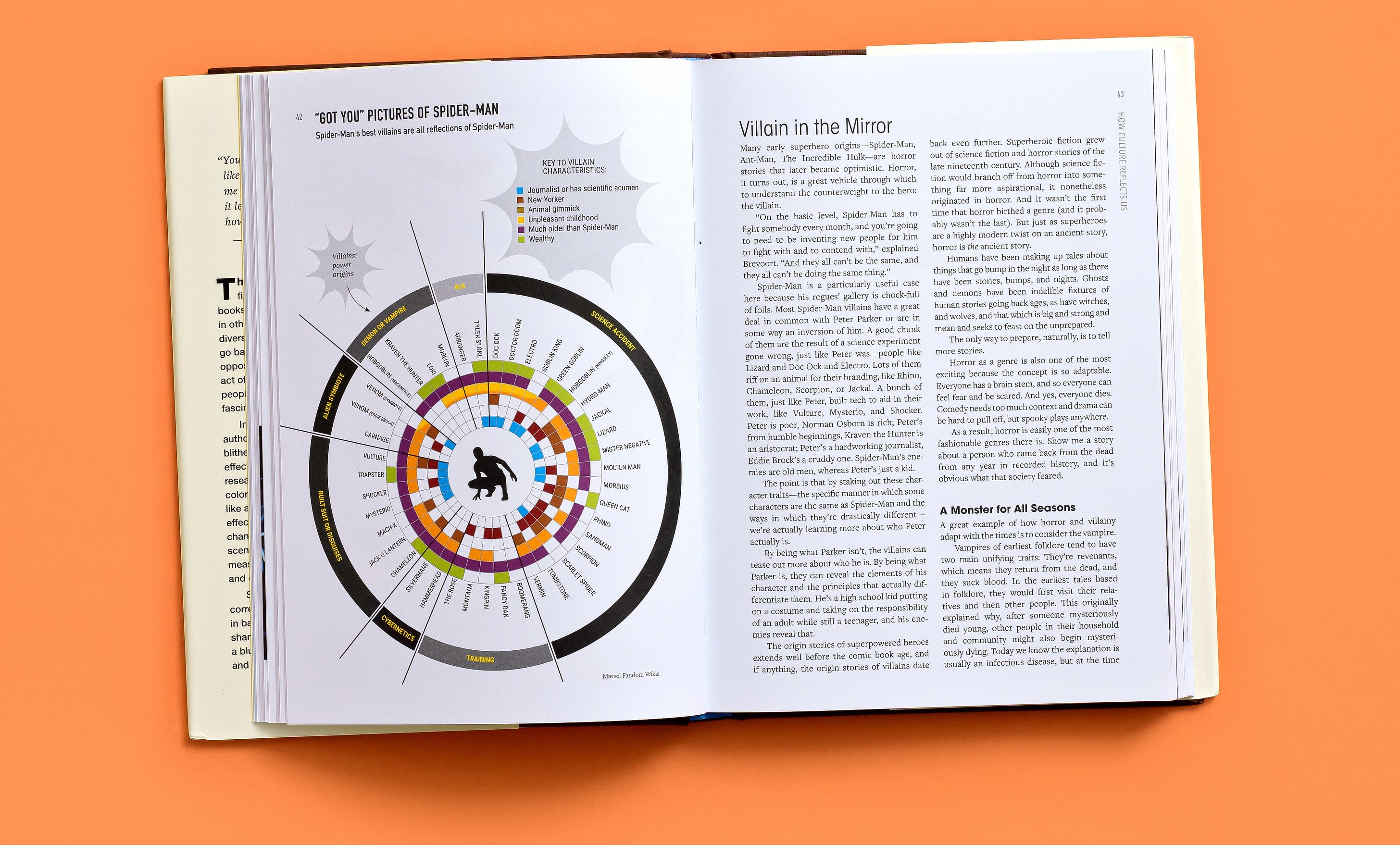
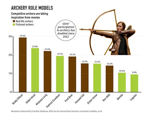
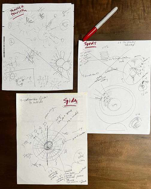
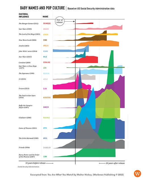
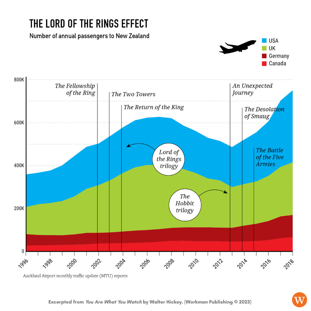
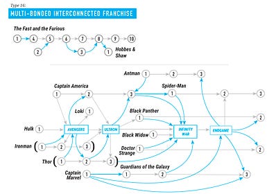
By Walt HickeyWelcome to the Numlock Sunday edition.One last Sunday edition for everyone about the book! This week, a deep dive into data visualization. I spoke to Heather Jones, who is the brilliant graphic designer for the book, and is the mind behind the eye-popping visuals you’ve seen. Heather can be found on Instagram, LinkedIn and Twitter. The book is available at your local bookstore and wherever books are sold. It’s been a really exciting launch so far, thanks to all the Numlock readers who have supported it! This interview has been condensed and edited. How does it feel to have this thing out? It feels really good. I think it was supposed to be four months on my part, and it was two years. Yeah, I'm used to working at dailies or weeklies, so I've never worked on anything this long. How did you come to the project to begin with? I know some of this, but I don't actually think I know all of it. What attracted you to it in the first place? I was actually going to work on another project at Workman that for some reason or another didn't happen, so I think I was on their radar. When the pop culture angle came along, John Meils, the editor, reached out to me, and it sounded like an even better fit than the other projects. I've done everything from culture to politics to health science, all kinds of stuff, so this was really kind of a treat to do something this fun. You do what you say you're going to do to back up your thesis, i.e., putting physical equipment on a person to gather the data, or wearing a Spider-Man outfit to hit the deadline. When I tried to get a graphics job a while back I sent in an infographic called “Why Heather is the Person for This Job,” because I wanted to not just say what I could do, but do what I was talking about. You will not see that graphic. The graphics are just such a fascinating and compelling part of the book. Do you have any ones where you particularly enjoyed how they came out? I do. They're all really fun, but the one that was really challenging for me was the Disney graphic, the full-page one about deaths in kids movies. I really liked the way it turned out. For some reason, I just sat with it for a long time, and I just came up with the graveyard idea. For some reason I found it really satisfying, even though it's a little bit dark. I really liked that one. Then some of the simpler ones I really liked, too. The Katniss Everdeen one with the archery interest in girls, that was one of the first ones, and I just really like it. It's just simple and clear, and she's shooting an arrow at her factoid, so how could you get better than that? Those were really fun. Some of them were definitely challenges. You alluded to the one about Disney characters and how Disney likes to start movies off with orphans, because it makes things nice and clean. I guess one thing I'll throw your way and ask about your general philosophy when it comes to viz, because a lot of the stuff in this book is categorical data rather than sometimes numerical data. What are some ways that pop culture data is more challenging to represent than perhaps economic or financial data? Well, I think it just has to be available, accessible to lots and lots of different kinds of people, to keep in mind your reader. I think people who experience pop culture are all different kinds of people, so I just wanted to make it super, super bright and colorful, like the ongoing superhero theme, but also pull out a factoid here and there of what we're supposed to look at. The bobbleheads, I thought, also just add an entry point. I just wanted to not only show a graphic but hold the hand of the reader a little bit, because it can be kind of dense; that's kind of how I went about this project. First of all, working with you is great because you know the information so well. Sometimes I get approached by people who say they want an infographic, and they don't really know what that is, or they don't have anything quantifiable or numbers, even, but they want it to look academic, or well-studied, or something like that. I think that that's just something going on right now. But you know this information backwards and forward, so I think for this project it was more about translating what could be really dense Excel sheets to like, talk to me like I don't know anything about Pokémon, or something like that. I just tried to get the gist of what we were talking about, make it really colorful, and know that the context around it in the book is going to help the reader as well, read on about more in each subject. I think more and more people have that TLDR thing or cultural ADD, in that instead of reading a novel or long-form stories, graphics can be a fast entry point to an idea, and inspire them to read on or delve deeper. Yeah, I sent you some really weird stuff at times. Some of the spreadsheets I sent you were downright Lovecraftian. No, no, it was great. It was great. I appreciate the fact that you run billions of simulations on something to get to the answer that you're looking for, and I think in the same way I try to design until I'm satisfied with it, sink my teeth into it, if I really care about it. I had quite a few sketches in this, and I can share those. But one thing about my approach is, often people come to me and ask me what program I use or what filter I use to do stuff. They kind of want a little bit of an easy answer, like, "Oh, I use this software. I plugged this in." But it's just years of experience and it's a lot, a lot of sketching, and then I take it into different tools. But I don't know, I think the brain work is the most important part, obviously. Yeah, I mean there's no filter that you can click and make that Spider-Man chart. Yeah, exactly. There are so many tools out there that do data viz, and I sort of started at magazines when there wasn't a lot of this stuff. I'm glad that there is, but I like to do my stuff much more in a bespoke way, to, again, have the reader in mind, have the purpose in mind and the client in mind. I hope that that doesn't get lost. All these tools out there, they tend to look a little bit the same to me, so I kind of want to keep that individual touch. There's a woman, an information designer named Giorgia Lupi, who you may or may not have heard of, and she advocates for data humanism and that's sort of what I'm driving at. Charts don't have to be just really sterile and straight-ahead and kind of boring; they have to be kind of beautiful and telling, and they can be really emotional, even if they're straight-ahead. So that's something I keep in the back of my mind all the time, is that they have to be accessible in a beautiful, designed kind of way. Some of these charts have already been getting some very good pickup online, and I'd love to go through one or two of them. I'd love to hear about that baby name chart. That was a really fun one. Yeah, that was really challenging because of the amount of data that you gave me and trying to get that in the 6-by-9 space that we had. I don't know if you remember, but I tried to flip it and make it a gatefold, which is when it goes across the gutter. It was just a little bit too tough. Although I am not opposed to doing that in a book of this caliber; asking your reader to turn something sideways isn't a lot for the payoff that you get. But yeah, I wanted it to look sort of like molehills, so I had to have some transparency involved so that you could see Arya going completely over Luna, and the smaller ones on the bottom and such like that. I really liked the way it turned out, and I think it gets the point across that, yeah, these names were nowhere before these movies came out. Yeah, I really dig it. I've got quite a few interesting Twitter followers now, thanks to you. Hell yeah. There are a couple charts in here that are basically just like, there's the Lord of the Rings chart that you made; there's the chart that shows basically the reverberations of Jurassic Park across the scientific community; there's the dog chart. They basically show an event occurring, and then after that event, a substantial change in the status quo. What was designing those charts that show those correlations like? Well, I mean, those were pretty straightforward. The Lord of the Rings was, the data there tells it all. That was kind of an easy one. The humps before and after The Lord of the Rings and The Hobbit, that was great. The dogs were a little more challenging, because the AKC has different breeds than the FCI, and then there were some that were in the ten thousands, some that were in the hundred thousands, so I just wanted to kind of show the humps at similar scale. So including the XY axes, obviously. But that one I liked, because I thought it was kind of fun. The dogs are kind of looking up at their names. The one also that you didn't mention was the movies and tourism. I definitely wanted to make that a map, because I don't think we had any maps in the book, or maybe we had one more. I feel like that could even be in a travel store somewhere. I want to go to Cheers in Boston or wherever, all these places in England. That was just really fun, and I haven't seen that data before, so I'm glad you included it. Amazing. What chart would you say that you're proudest of from the book? It would have to be franchise structure. It's all you, all day on that one. You basically laid the blueprints for that one, but I definitely wanted to make it sort of like chemical diagrams, like a formula, and I just love how intense they get. I was really, really intimidated when I saw what this was going to grow to. And also, again, you're putting it in 6 by 9, so I have this weird need to want to print this poster size because I just want to kind of spread out and give it the air that it deserves. But yeah, this could go on and on. King Kong and Godzilla, we could add LA, we could add Japan in there, all the different spin-offs. I think that was a really, really rigorous exercise, and it was really satisfying, I think, probably more than anything else in the book. Yeah, I loved how that came out a whole lot. It just came out so clean and so refreshing, and it was just such a great presentation on your part that I really liked. Where can folks find you? Oh, I'm msjonesnyc.com and @msjonesnyc on all platforms. Order You Are What You Watch today, and if you’ve already done so, thank you! Excerpted from “You Are What You Watch” (Workman) by Walt Hickey. Copyright © 2023. Data visuals copyright © by Heather Jones (art) and Walt Hickey (data). If you have anything you’d like to see in this Sunday special, shoot me an email. Comment below! Thanks for reading, and thanks so much for supporting Numlock. Thank you so much for becoming a paid subscriber! Invite your friends and earn rewardsIf you enjoy Numlock News, share it with your friends and earn rewards when they subscribe. |
Older messages
Numlock News: October 27, 2023 • Short Corn, Thai Food Near Me, Zoom Wave
Friday, October 27, 2023
By Walt Hickey Thanks to everyone who supported the book release this week! It's been so exciting to see people get their hands on it finally and I've been blown away by the response. If you
Numlock News: October 26, 2023 • Nightshade, Britney, Barbie
Thursday, October 26, 2023
By Walt Hickey A couple of really fun excerpts and interviews about You Are What You Watch have come out! Check out this excerpt in Insider about nostalgia and reboots, this excerpt in Polygon about
Numlock News: October 25, 2023 • Solar, Volcano, Voyager
Wednesday, October 25, 2023
By Walt Hickey Thanks to everyone who has been talking about the book on social media; it really does mean so much to me. The launch event in New York last night was absolutely amazing. Thank you to
Numlock News: October 24, 2023 • Moon, Scares, Deus Ex Machina
Tuesday, October 24, 2023
My book launches today!
Numlock News: October 23, 2023 • Q-Day, Trinity, Caterpillars
Monday, October 23, 2023
By Walt Hickey Welcome back! Hope you enjoyed the book excerpt yesterday. Tomorrow is the big day, thank you all so much for your support throughout this book launch process, it has meant the world to
You Might Also Like
☕ Say cheese
Wednesday, March 19, 2025
Why Cheez-It's parent company is embracing basketball. March 19, 2025 View Online | Sign Up Marketing Brew Presented By Tubi Welcome to Wednesday. Madison Avenue is one step closer to getting
☕ Manual transmission
Wednesday, March 19, 2025
Razor's kid-friendly assembly instructions. March 19, 2025 View Online | Sign Up Retail Brew Presented By IM Digital It's Wednesday. Don't miss out—join us tomorrow for a virtual event that
Trump, El Salvador, and the Alien Enemies Act.
Wednesday, March 19, 2025
Who got deported, where did they go, and why? Trump, El Salvador, and the Alien Enemies Act. Who got deported, where did they go, and why? By Isaac Saul • 19 Mar 2025 View in browser View in browser El
Managerial Heist
Wednesday, March 19, 2025
Writing of lasting value Managerial Heist By Sylvia Bishop • 19 Mar 2025 View in browser View in browser The Managerial Class Has No Future Peter Wei | Ecumene | 8th March 2025 Unlike traditional
📬 No. 71 | Newsletters every newsroom should launch
Wednesday, March 19, 2025
These 13 formats work great for publishers. Should you try them too? ͏ ͏ ͏ ͏ ͏ ͏ ͏ ͏ ͏ ͏ ͏ ͏ ͏ ͏ ͏ ͏ ͏ ͏ ͏ ͏ ͏ ͏ ͏ ͏ ͏ ͏ ͏ ͏ ͏ ͏ ͏ ͏ ͏
Animals have culture, too – but we do have something they don't
Wednesday, March 19, 2025
+ do you need measles vaccine? When you were born matters
⚔️ ‘Assassin’s Creed Shadows’ Falls Short Of Greatness
Wednesday, March 19, 2025
Plus: 'The Penguin's Colin Farrell might star in yet another DC project. Inverse Daily Assassin's Creed Shadows is a visually stunning game that trips over some of its more baffling design
A Less-Expensive Vitamin C Serum That Works
Wednesday, March 19, 2025
Rachael Griffiths tried out Clinique's reformulated dark-spot-correcting serum. The Strategist Beauty Brief March 19, 2025 Every product is independently selected by editors. If you buy something
☕ Open discourse
Wednesday, March 19, 2025
DeepSeek chatter at HumanX. March 19, 2025 View Online | Sign Up Tech Brew Presented By Notion It's Wednesday. At HumanX last week, DeepSeek was still a hot topic, specifically for open model
Silencing Voice of America
Wednesday, March 19, 2025
Plus: Soccer in Israel and Palestine, a maybe ceasefire, and Kamala Harris's loss. View this email in your browser March 19, 2025 A man in black walks head bowed down stairs at sunset. Behind him,

