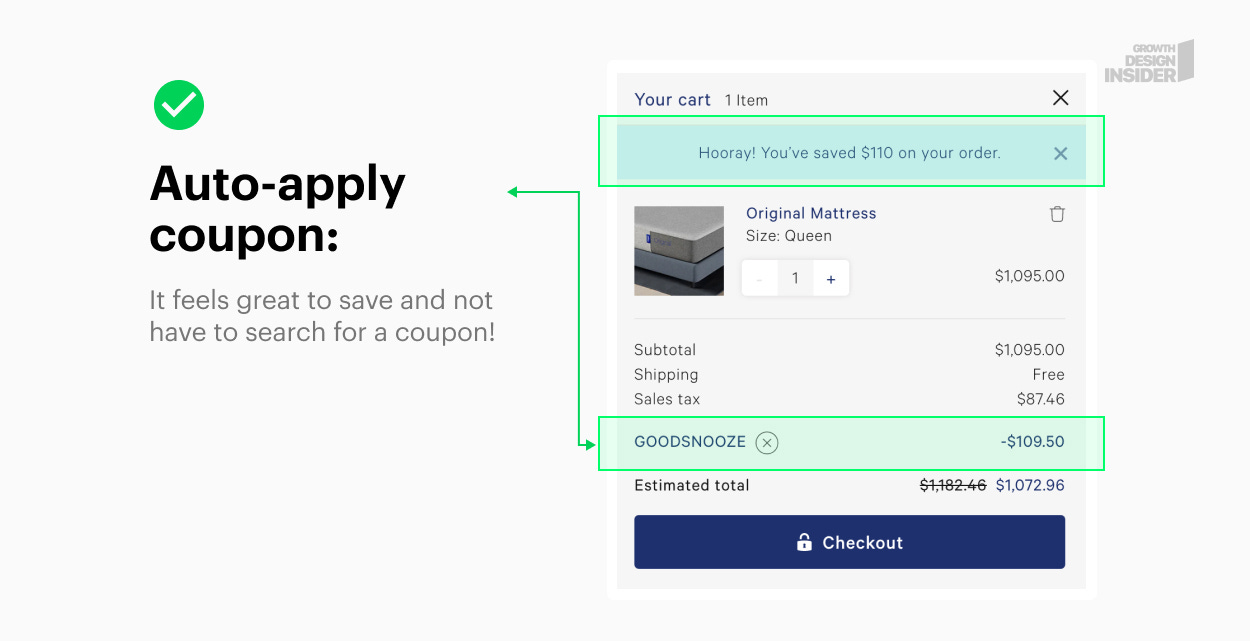
1. Auto-apply coupons in carts.
Casper.com does something awesome, they apply coupons automatically to the shopper’s cart. This eliminates the need to leave the site in search of a discount and does not require customers to have to memorize a code and enter in checkout.
Coupon Tips:
Make it easy to apply - if not automatically, at least with 1 click
Do not embed into images where the code cannot be copied and pasted (forcing people to memorize can lose you sales)
 |
2. Keep users logged in longer.
When was the last time you logged into your Netflix, Facebook, Twitter, or Amazon account? It’s probably been a while! Keeping users logged in longer reduces friction and helps them achieve their goals more quickly.
How long should you keep users logged in? It depends on the app.
Some apps are more sensitive - like banking, where you want to log people out when they are idle. Check with your industry’s best practices while keeping this test in mind.
 |
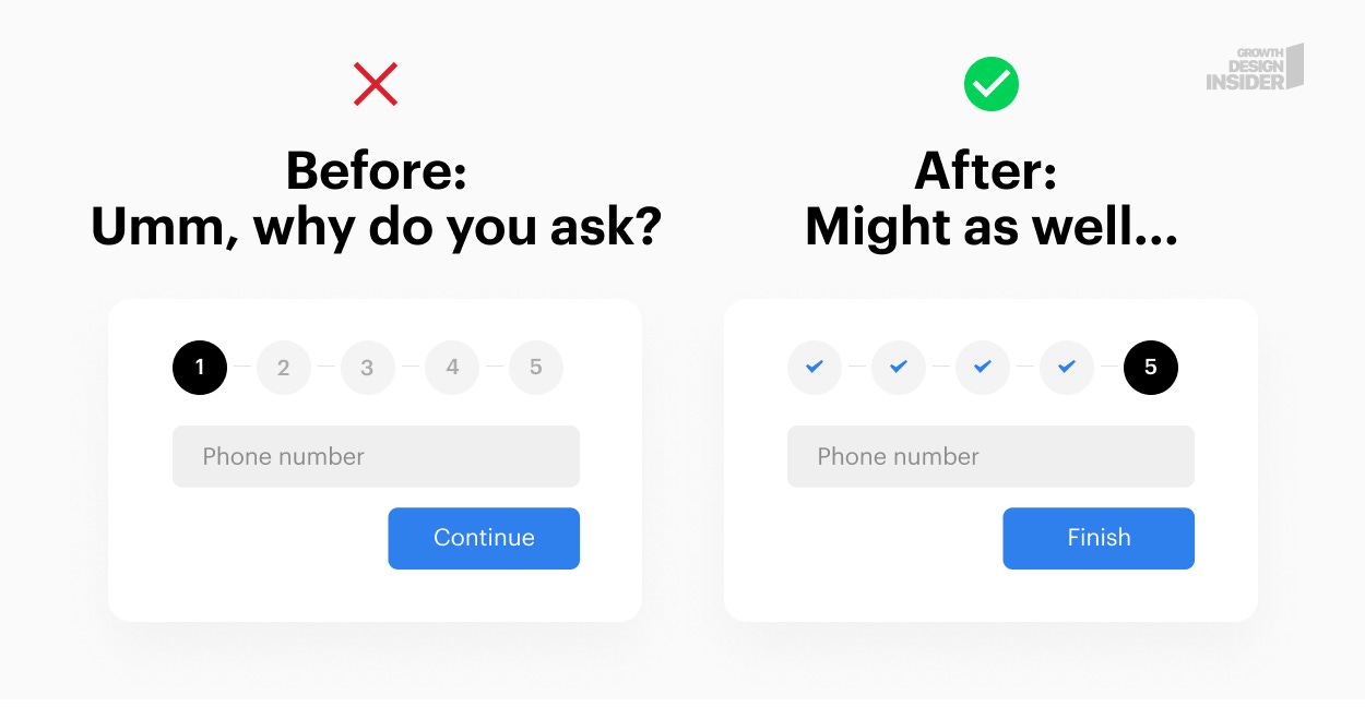
3. Save the hard ask questions for the end of the flow.
People get stuck on sensitive information screens if presented too early in the process. This is because they are not invested in the flow (spent little to no time) and have all the reasons to leave.
Test placing the sensitive information inputs at the end of your flow or closer to the end. The psychological principle of “need to complete” compels people to finish what they have started. Putting hard questions last keeps the vested person from leaving.
 |
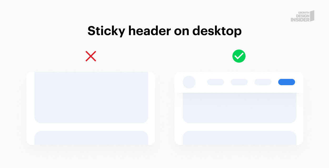
4. Sticky your headers on desktop.
This works particularly well on blogs where you have long-form content. Sticky a header with a call to action. When the person is reading the article and finds something helpful or related to your offer, they can quickly access it without having to search.
A couple of tips:
This is a sensitive topic with many opinions. Most people agree that sticky headers on Mobile devices can take up too much screen real estate. Be careful when adding to mobile — you can test, but be ready to abandon the idea quickly.
Try shrinking the header on scroll. If your header has a lot of padding, it may get too annoying too quickly. Shrinking padding, text and logos on scroll is a good way to minimize this annoyance.
The header should not distract from the content. Besides a button that stands out, try to keep it visually easy on the eyes.
 |
5. Indicate immediacy of action taken.
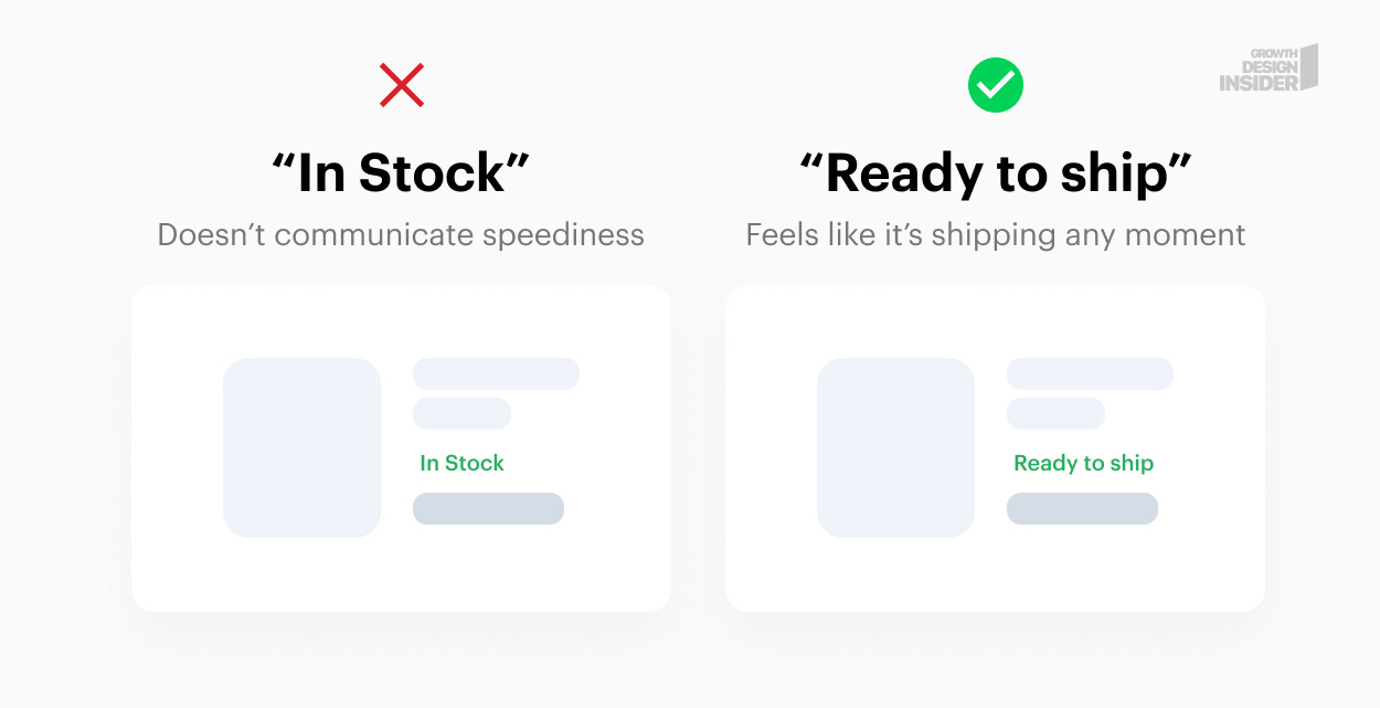 |
“In stock” (so what?) -> “Ready to Ship” (feels more immediate). Let people know when to expect something after they’ve taken action.
Other applications:
“Ships the same business day”
“Get it by {date}”
“We respond within 3 hours”
“Get immediate access”
“Easy 2 min mobile checkout”
“Instant download”
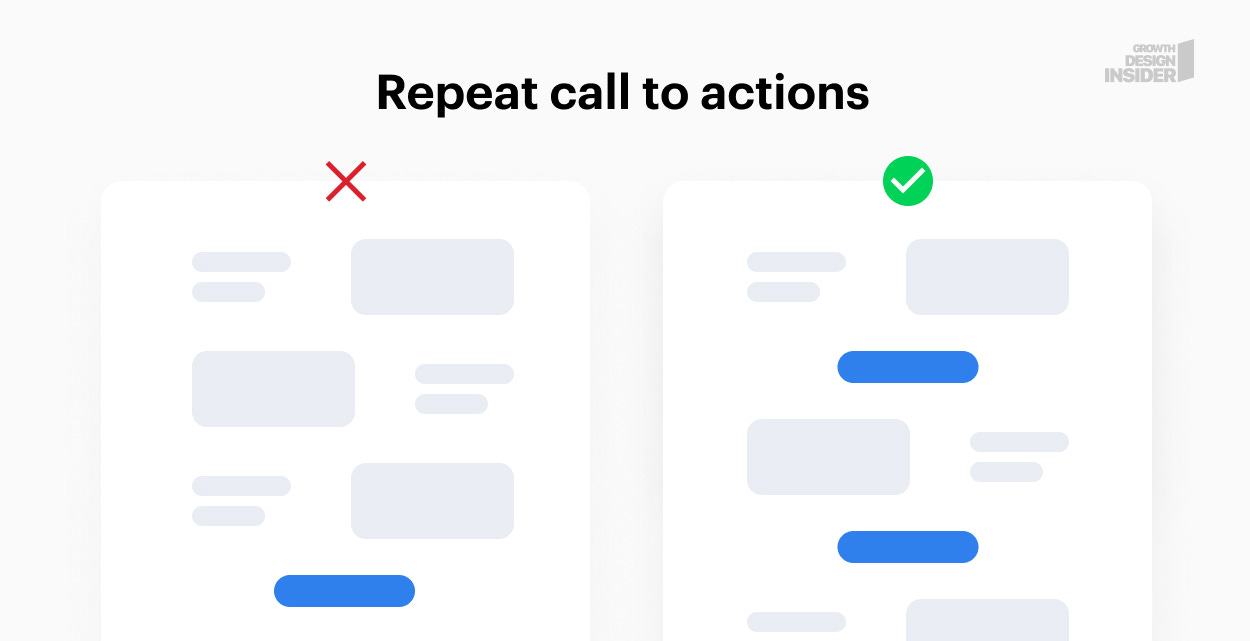
6. Repeat the call to action.
It may sound elementary, but something as simple as repeating your call to action section has been shown to reduce friction and increase conversions.
 |
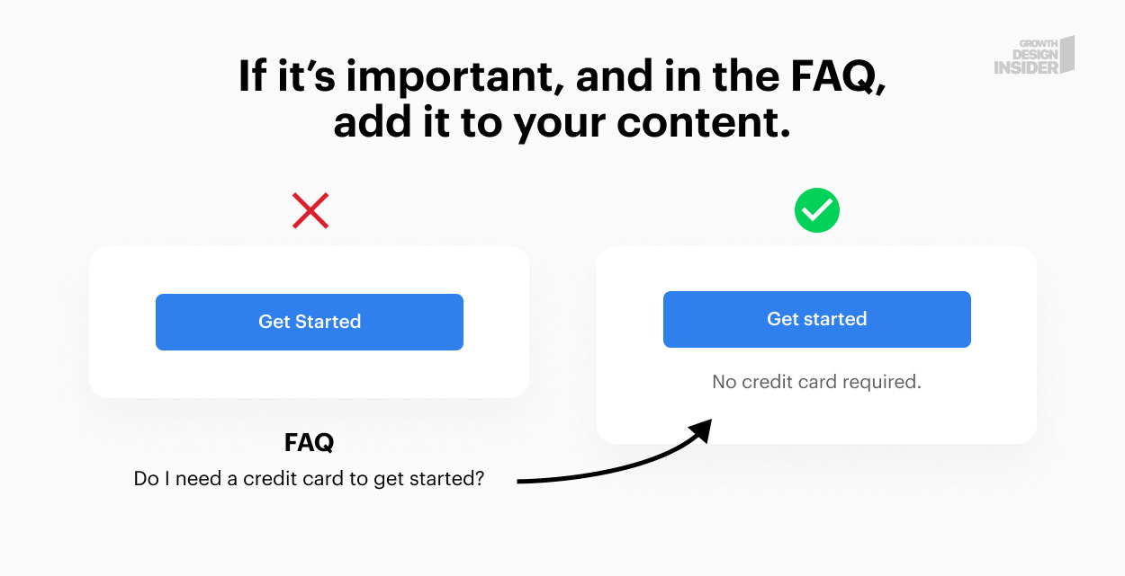
7. Take important info out of the FAQ and into your design.
If a question is asked often or is critical to decision making, add it to your content.
 |
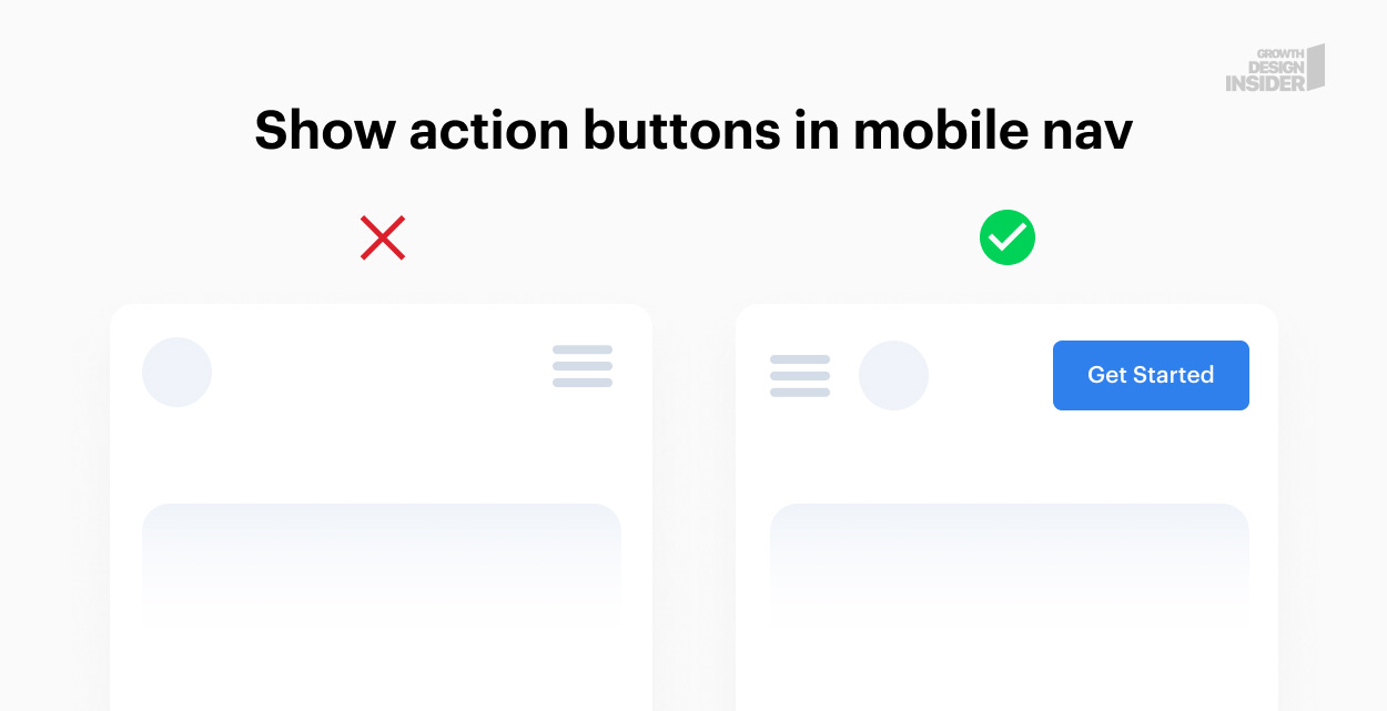
8. Make important items visible on mobile devices.
It’s very tempting to hide everything on mobile due to limited screen real estate. I’ve seen conversions go up significantly after important items are taken out of menus or unhidden from selections.
Items to test:
Call to action buttons
Navigation items to most frequented pages
Filter menus in e-commerce
 |
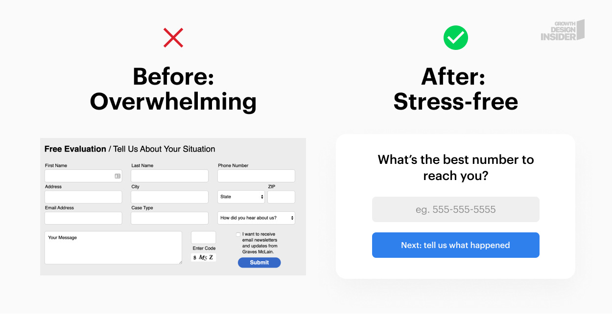
9. Break up long forms into individual steps.
This one has been a consistent winner for my clients and other growth designers I’ve spoken to: break up forms into simple steps.
When we see a large form, our mind’s cognitive load makes it more likely that we abandoned the process. Asking one question at a time focuses attention and makes the process palatable.
I had a client in the wellness space who saw a 300% increase in conversions after they took their standard boring form and turned it into a “personal assessment” - a sort of step by step quiz.
 |
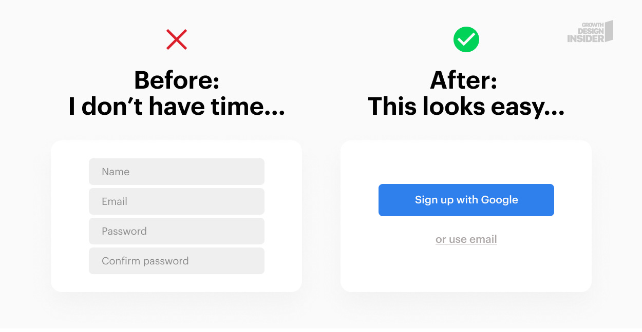
10. Offer social sign-ups and logins.
Social sign up options offer a reduced friction flow with fewer steps.
It’s also an excellent way to pre-populate information fields that save users time.
 |
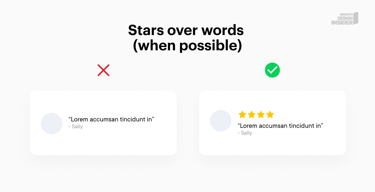
11. When possible, try showing a star rating.
This is more anecdotal so take it with a grain of salt. On multiple occasions, I’ve noticed that testimonials with star ratings tend to convert better than those without. I’ve run A/B tests for various clients to find this to be true. It may not work for everyone but if you have the traffic volume, it’s worth a test.
 |
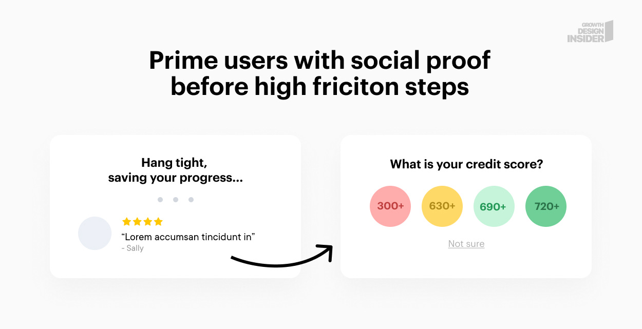
12. Prime users with social proof before high friction steps.
In Psychology, priming is defined as exposure to one stimulus influencing another. We can use this to our advantage to prime our visitors with a positive feeling before asking them to answer something difficult or sensitive.
This can also be accomplished with good copy, humor, and micro-interactions.
 |
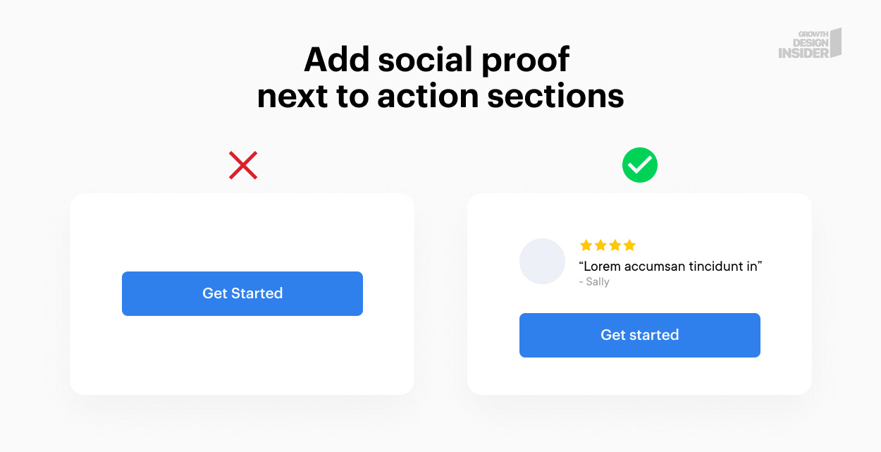
13. Add social proof next to the action items
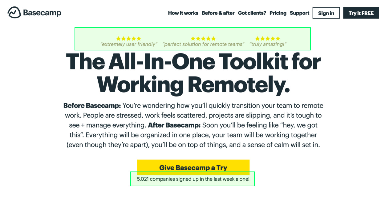
Most companies have social proof on their sites, but in many cases it’s hidden at the bottom of the page or in an unrelated section. Take these puppies out and put them next to buttons you’d like people to click.
 |
Check out this example from Basecamp:
This may be the first page I’ve ever come across that had reviews ON TOP of the headline 🤯
 |
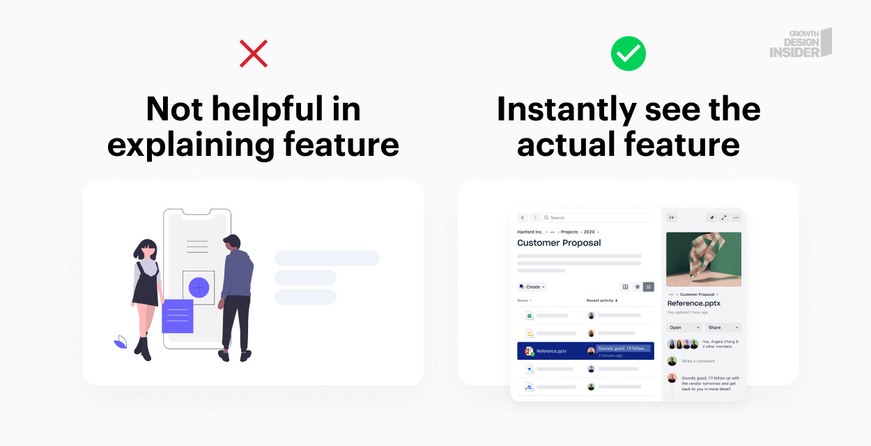
14. Showcase real product features instead of illustrations.
Illustrations are all the rage now. They look fantastic but do very little in terms of helping people understand your offer. Now, there are cases where illustrations work, especially if they demonstrate your product, but this applies to a very small percentage of companies.
Try these instead of illustrations:
Screenshots
Gifs or videos of features - as long as they are visually simple and not too long
Product video demo in your hero section. A simple, short video overview of your product (keep it under a minute) is far more effective than an illustration.
Avoid illustrated videos.
 |
Wow, you got to the end, high five! 🖐
If you found this useful, please subscribe for more tips and breakdowns like this one:
Feeling generous? Please retweet the thread or share with your network 🙏🙇
