Hey all,
A few quick announcements:
Thank you for subscribing and reading! It gives me the motivation to write more and share new insights.
I’m launching GDI PRO (a paid tier for people who wish to support me). The PRO version will contain 100% more insights so I hope you enjoy it! You can subscribe to GDI PRO already, the first issue is out!
I’m also working on a database of over 200 conversion optimization strategies and growth design tips.
If you want a sneak preview, click to tweet this newsletter and I’ll DM you a link on Twitter.
I’ll also give full access for free (priced at $57) to random people who retweet this.
Now, let’s talk about some strangely effective growth design:
📝 GDI #003 - Strangely Effective
So I checked the Growth Designers slack group while taking a break.
Gary asked if anyone knew of a simple HTML builder.
I didn't. So I searched and found NicePage.
Not wanting to be rude, I felt inclined to test it out.
Before I knew it, the damn thing forced me into a tutorial with no way out. No close, nothing.
#$@&%*! - I thought.
To escape hell, I clicked next next next as fast as I could.
To my surprise, the software actually felt intuitive. A simple glance at the tutorial seemed to have done the trick.
I was making a website, and the onboarding helped.
What was most likely an oversight by the developer turned out to be useful.
This got me thinking:
What are some strangely effective design patterns and choices that can lead to retention and growth?
Here are 3 that come to mind:
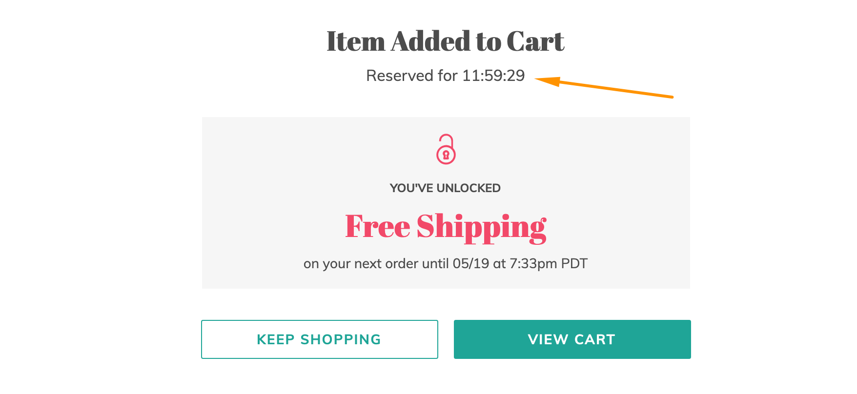
⏲ 1. Timers.
You gotta give it to urgency. It's very effective.
Every time I see a timer, my blood pressure rises and I'm inclined to hurry up.
Even if there's no reason to hurry. The thing works. Rather well.
Booking sites know this. They damn near abuse it. Not quite... though I'm sure there are fake timers out in the wild.
Booking sites can justify timers. They have to reserve the ticket and let it go if the user does not book. This is okay.
Who else does this?
Retail. ThreadUP is a great example:
 |
If you want to partake in this mental voodoo, I'd recommend keeping it honest. The last thing you want to do is engage in a dark pattern with a fake timer.
A legit way to do this is to hold an actual timed sale / deal. Be sure to end it when you say it ends, and don't run them one after another. You don't want to end up like those furniture stores who are going out of business every day...
💵 2. Pricing Hacks for Membership Products
I was about to repeat the same mistake Ramy Khuffash first made with Page Flows… until a friend recommended I re-work my new product tiers.
It turns out, when you charge monthly for a membership product, people FREAK OUT.
Ramy tried that. It backfired so hard he wanted to drop his project. Then he sold it as a lifetime access deal and people started buying.
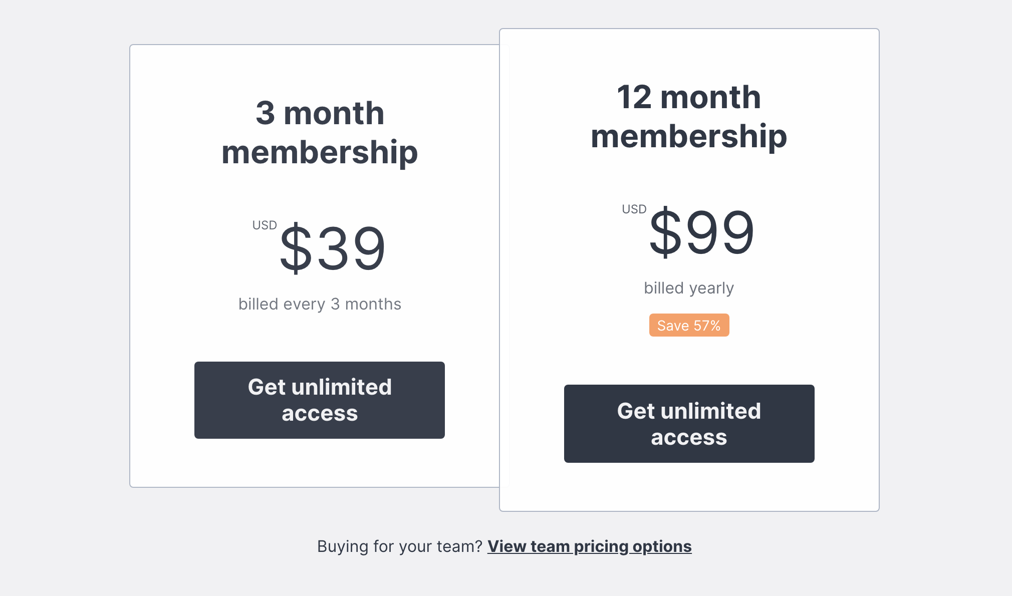
If you go to his website today, he’s got 2 tiers set up (not sure if he tested 3).
Moral of the story is: If traffic is there, but people aren’t buying — maybe it’s time to look at your pricing.
 |
Now Ramy sells a 3mo and a 12 mo membership.
Think about that…
People are PAYING MORE for the same product vs. paying monthly. I mean, C’MON! Whaaaaat?!
Oh… and he added a team pricing option. Brilliant!
Last I did the math, Ramy should be at over $6.5k monthly revenue now - not bad for something he was going to throw away entirely.
The mind is a weird thing. We won’t eat off the floor, but some of us will eat what drops on it. No, I am not that gross. Give me a break.
Psssst! I spoke to Ramy on Twitter and learned something new! This made me adjust my own price tiers. This and other insights will be available in the PRO version of this post. Subscribe to GDI PRO to find out.
😣 3. Forced onboarding
Remember NicePage? Yeah... they took it to the extreme. Having a close button would have been helpful.
Yet, I close tutorials all the time. Aaaaaand probably quit the apps when I can’t figure them out :/
What if making it less convenient to close an onboarding tutorial is beneficial to design, and to growth?
So I investigated. And found a gem...
Well, no. More like, a pot.
A pot of HONEY.
Not the kind that you spread on toast, but the kind that saves you money with coupons.
 |
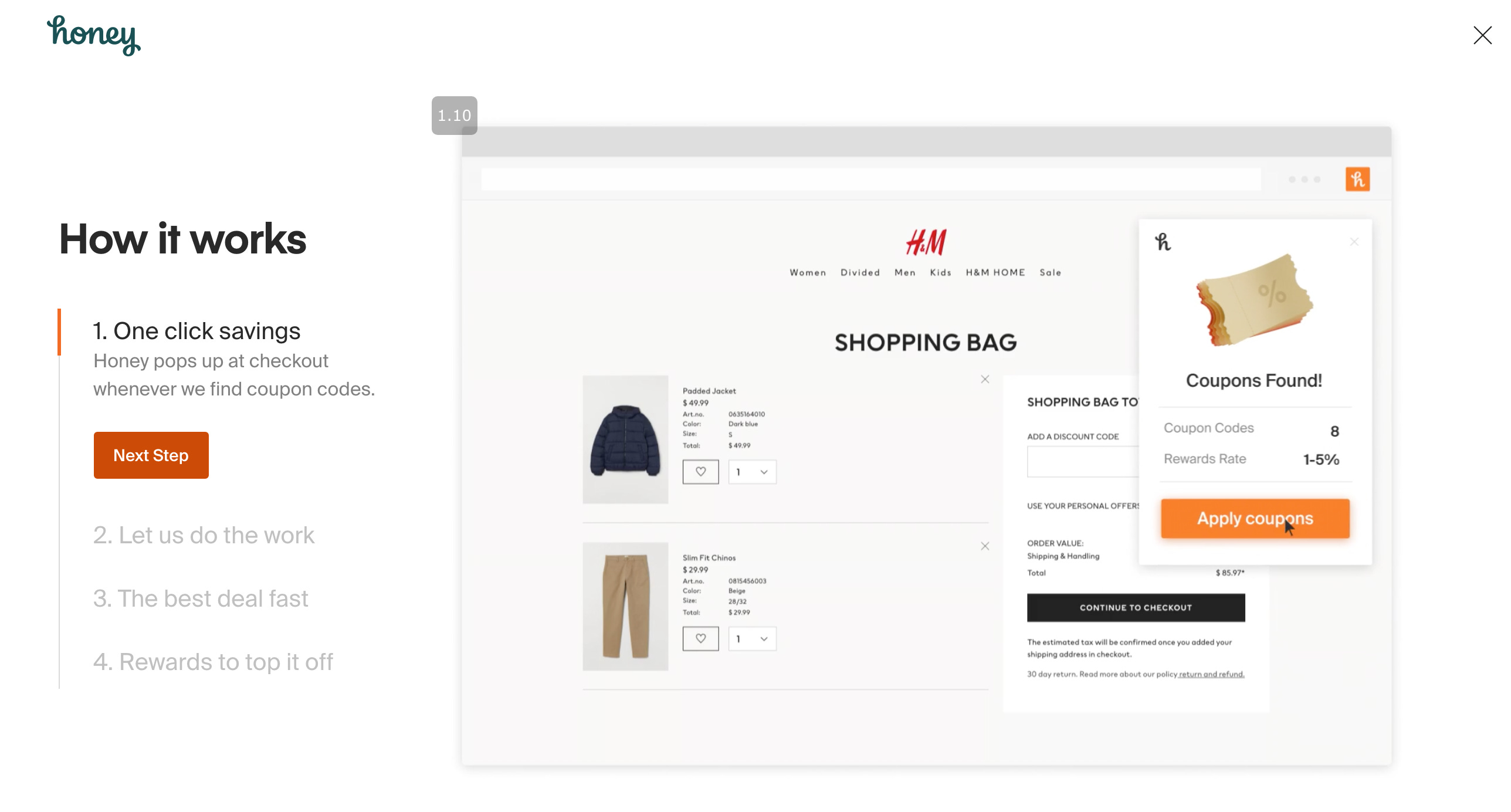
Here is an app with over 10 MILLION users that uses a similar onboarding pattern. They put the next steps NEAR the step.
And... it seems to work!
I paid more attention to those steps vs. having a next/ back button at say.. the top or the bottom of the screen.
Would I recommend copying them outright? No.
Worth a test? You bet!
When a person understands how to use the product, they are more likely to use it.
Signed, - captain obvious.
Want more growth insights?
Join GDI PRO and get 100% more takeaways and dorky humor ;)
Previous issues:
✈️ GDI #001 - Growth Design Takeaways from Scott’s Cheap Flights
🏁 GDI #002 - 14 ways to reduce friction for higher conversions
Still here?
Whew… this stuff takes time and I appreciate you reading. Like… seriously! Thank you!
If you feel you’ve gotten something out of this email, I would really appreciate you tweeting about GDI.
You can click to tweet to save time.
See you next time 👋🏻,
Gene
 |
