Fewer steps = better conversions, right?
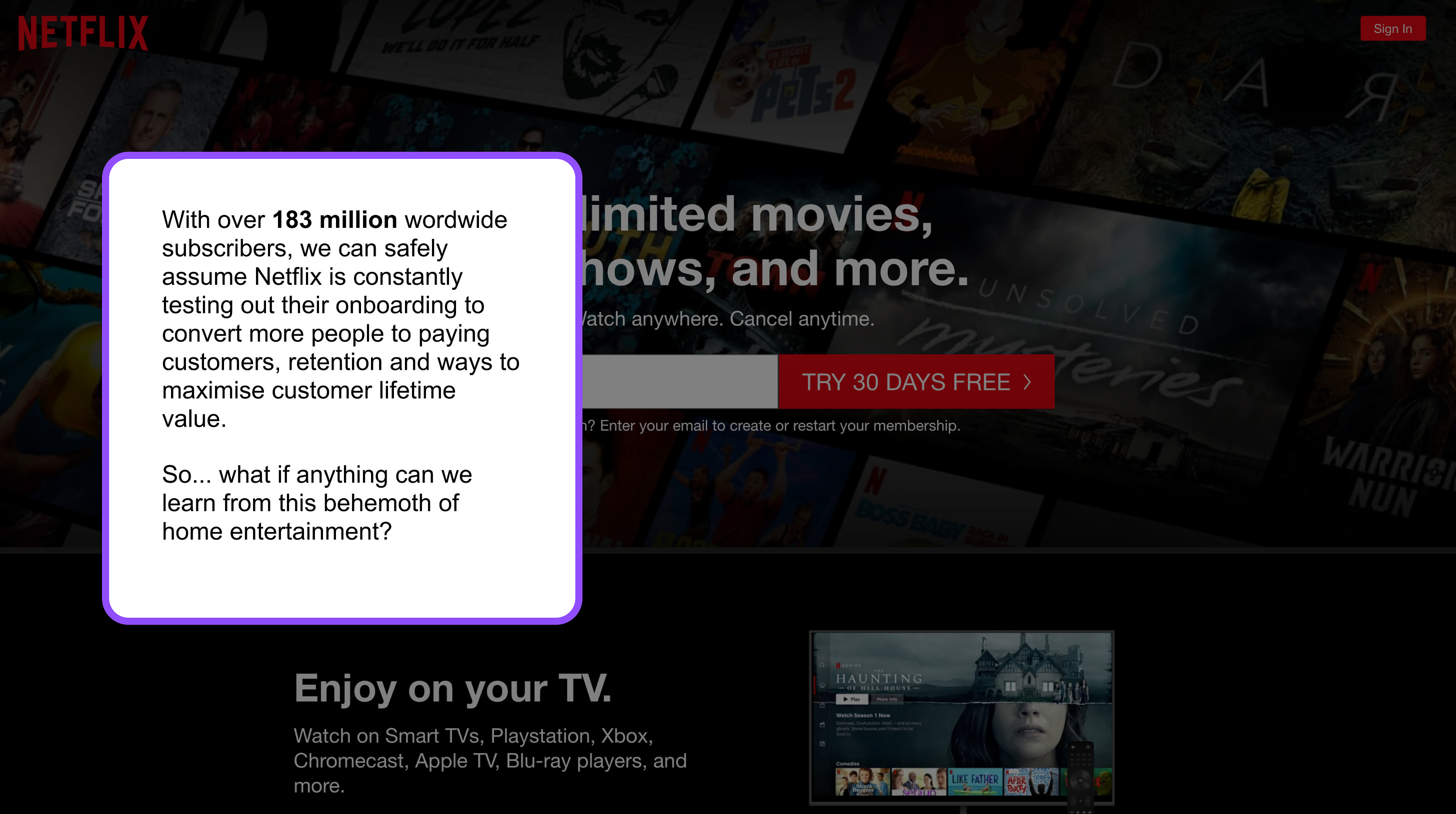
Well, why does Netflix break this rule and ADD additional steps into their signup flow??
It’s rather clever, but I won’t spoil it for you …
Click the image below to see the full breakdown or follow this link: 👇👇
 |
☝️☝️ (You can use your arrow ←→ keys for faster navigation)
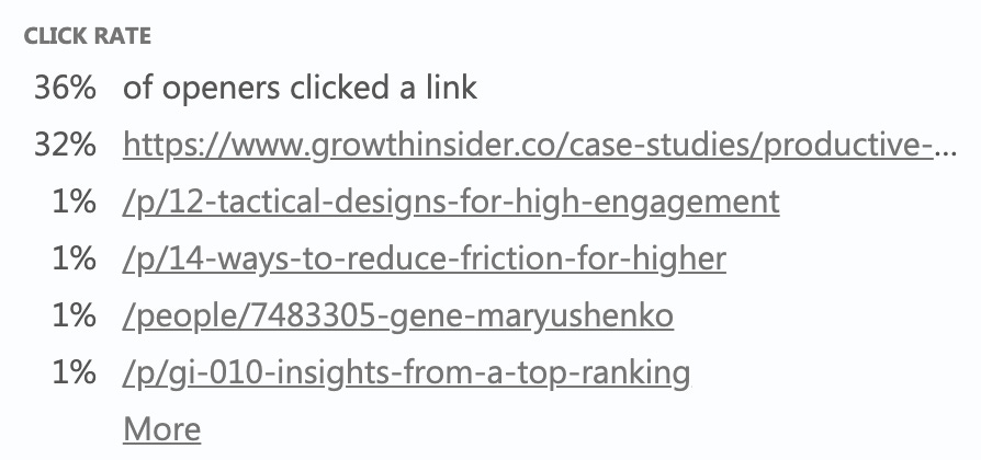
By the way, I found it interesting that only a 3rd of people opening these emails click on external links.
 |
All the more reason to say everything you need to say directly in the email. Sadly, I can’t do that with a large slideshow.
Before I go, I wanted to share a few cool reads from this week:
Andrea Bosoni shares how he’d grow The Wine List in his Zero to Marketing newsletter.
If I ruled the tweets - by Packy McCormick of Not Boring (basically, Twitter is confused about its identity and that’s stopping them from proper monetization).
Have a great rest of your week!
-Gene
 |
Join the club / share
If you haven’t already subscribed, be sure to do so. Your support motivates me to cover more topics that help startups grow! ⚡🚀 And if you are a subscriber, shares are appreciated ;)
Previous issues
Psssst! From now on I will include my email open rates below (no matter how embarrassing), so you can tell for yourself which headlines perform best!
🕵️♂️🇺🇸 GI #010: Insights from a top-ranking mobile app (56% of you opened this email)
🦹♂️ GI #009: 12 tactical designs for high engagement apps (50% opened)
👨💼 GI #008: The audience is the boss (50% opened)
🤦♀️ GI #007: 70 websites, biggest mistakes (56% opened)
🔔 GI #006: Triggers (49% opened)
🤑 GI #005: Steal this content strategy for 10x conversions (48% opened)
🧲 GI #004 - First Users. Newsletters. Content Repurposing. (54% opened)
⏲ GI #003 - Strangely Effective (59% opened)
🛹 GI #002 - 14 ways to reduce friction for higher conversions (59% opened)
✈ GI #001 - Growth Design Takeaways from Scott's Cheap Flights (100% open - sample only 3 people though!)
